This tutorial had originally sprouted from my tutor telling everyone to create a monochrome illustration, which would then be used for screenprinting on Friday. I will post a tutorial/guide/tips I learnt from that lesson, after my class on Friday. From my previous knowledge of screenprinting, I believe you have to create a black and white image that will act almost as a stencil, so that is what I have tried to keep in mind throughout this experimentation.
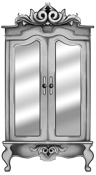
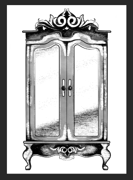
Starting with a piece I had digitally painted (tutorial on digital painting possibly coming soon?), which is of the wardrobe for my ‘Lion, the Witch and the Wardrobe’ project. With all the colour layers, I had grouped them all together then duplicated the group, I then flattened the second group. This was so that if anything went wrong during this experimentation process/phase, I would still have my original layers within the first group. I decided to keep the linework separate from the painting as I wanted my linework to remain clean and readable, I did not want it to possibly become distorted with one of the effects I’m about to show you.
For these techniques, you will be playing around with the flattened layer of colour, using filters from the ‘pixelate’ section within Photoshop. If you do not like any of the effects on your work, it is easy to undo by just going to edit and undo.
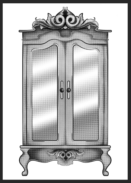
1.Colour Halftone
With this technique, it takes your image and pixelates it into rows of dots, which range from sizes, getting bigger in the deeper tones, and smaller in the lighter. You are able to change the size of these dots, making them finer or bigger, in the controls box that pops up before the change is made.
I personally liked this filter with a bigger scale of dots, as I feel when they are smaller, from a distance, the piece looks more square in the pattern, whereas when they’re bigger, it almost gives a pop art/comic type of effect.
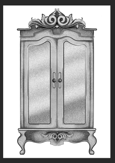
2.Mezzotint – Dots
For the mezzotint filter, there are three types in which you can try, one being dots, another being lines and another being strokes. Within these options, you can then chose whether you want the effect to be bolder or finer, etc.
As an example, with the piece below, I have used fine dots, and to me, it has made my design look more fuzzy, specifically in the darker areas, but you can see that it has almost a similar effect as adding noise.
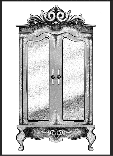
3.Mezzotint -Lines
This is one of the other mezzotint filters, the short lines. As you can see, it builds up the image using lines, they are closer together in the darker areas and further apart in the lighter, forming the contrast of the tonal piece
I don’t really enjoy the outcome of this filter as I feel it had made my piece look more patchy as opposed to blended. I feel I just prefer a neater approach with these filters, whereas this design looks more scratchy in a way.
4.Mezzotint – Strokes
This filter is quite similar to the mezzotint lines, however, I feel there are more areas of flat colour, you only really see the lines where the tones are changing, for instance from black to dark grey, dark grey to light grey, then light grey to white.
Although this filter is less fuzzy than the previous, I still feel it is a bit patchy moving from tone to tone, so it is not the style that I wish to work with, as I would want it to be neater and more refined.
5.Mosaic
Moving away from the mezzotint filters, in the example below, I have shown the Mosaic filter. As you can see, this pixelates the shading, the effect almost reminds me of inappropriate blurring that you would see on tv when the show would blur out product placement, a persons face, a rude hand gesture, or any type of nudity.
Although this filter does give a softer shading, the blockiness is not really a route that I want to take with my designs, so again, I will not be using this filter during this project, but its good to know its there.
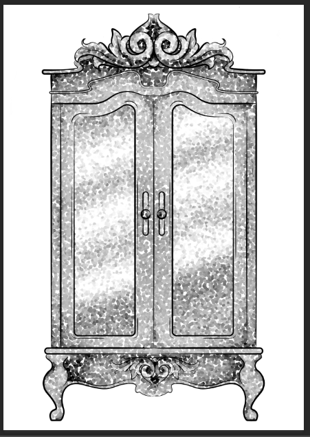
6.Pointillise
To me, this filter resembles monotone confetti being spilt over my design. I would like to see how this filter works with colour, as it could create some fun designs that I feel would appeal more to children, however it is not something I wish to use within my design.
I feel this filter would be similar to the halftone one, however, where the halftone works in rows of circles, this filter does not have a system, as there are circles overlapping each other, and I feel it works mostly on tones, as opposed to changing the sizes of the circles as I believe the halftone filter does.
Although I did not find a filter which had achieved the style that I desired, that being a crosshatch pattern, almost in the style of John Tenniel, as I need a design to use in the screenprinting class, I will choose the best of the results, for me this is the halftone filter, but I will expand the circle size a little, as I do not know how small the new printer for the screenprinting machine can go, and I do want my piece to be readable.
BONUS TIP
7. Illustrator
When experimenting with the sizes of the circles within the halftone filter, I had formed 3 versions, the first I believe being 10, second I believe is 12 and the third is 14, then I had asked my tutor for advice in which would be most readable, and which would most likely print the best on a screen, in which he had responded the second. I did like the first as it had more of a subtle blend, however, I don’t believe the new printer would have picked up such small detail.
As the original version of this effect was picking up the other tones within this piece, such as the grey tones, I decided to save the image from Photoshop, then take it into Illustrator. In this program, I then ‘image traced’ the image, which had ended up taking away all of the other tones, and had just left me with the black line or dot work. I did this step, as the last time I had screen printed, I recall the design had to be stencil-like, meaning that it could only be one colour, so I did not feel the piece would work correctly if I had left all of the other tones in.


One thought on “6 Techniques I Used To Create Monochrome Illustrations Digitally”