As a class, we have been asked to find and research some historical artists who we could potentially take inspiration from in our own work, and will also allow us to expand our knowledge of the industry from a historical view, looking at the trends which may have been present then and how they may have changed over time, and looking at the techniques/mediums/themes which were used and how I could learn from these artists and apply that knowledge to my own designs.
Over the years, throughout my coursework, I have continuously mentioned artists such as Aubrey Beardsley and Authur Rackham, as I love their work and I feel they have had a big influence on my own over the years. However, for this task, I did want to branch out and find new historical artists who I could learn more from, and who could potentially influence my work more.
Howard Pyle

He was an American illustrator who worked within the late 1800s to early 1900s. He had written his own children’s books which he illustrated himself as well as many other books and later started painting murals. It is said that the idea of how pirates dress nowadays initially originated from his work, as he wanted to create more flamboyant characters which were inspired by gypsies. I believe his depiction is a more romanticised version of a pirate as it is said if their clothing were as Pyle had illustrated, it would have been impractical.
Style
Within these two pieces specifically, I loved colour palettes and the softness to the pieces and when I think of romanticism this is what my mind goes to.
I believe there is a lot of emotion present within the artists work, for instance, in figure 1 the movement within the waves suggests the piece is a more action based narrative, whereas in figure 2, the sea is calm, it’s gentle, fitting the themes within the piece. I feel with the colour palettes used that it keeps a lightness to his paintings, but still communicates the story well.

Technique
Howard Pyle was primarily a painter, and I believe both of these pieces are oil paintings. I have never worked with the medium myself so I wouldn’t know how easy or hard it would be to make the soft blends in which he creates within his work. I, however, can’t deny that there is a lot of skill within his paintings, being able to use a lot of colour, creating movement, motion, showing realism and being able to create it so delicately while still conveying the emotions within the piece. His work is just so undeniably beautiful, and although he has more work that shows a lot more action, these two are my favourite of his work and were the attraction pieces that made me want to research him more and include him within this blog post.
My opinion
As I am soon to be working on quite a colourful project, The Wizard of Oz, I do want to take some inspiration from Pyle as I love the brightness of the colours and softness within the piece. It gives a dreamlike quality to his work, and that may be something I wish to translate within my own work when working on that project.
I have mentioned in previous projects that I would like to try using more traditional mediums, such as gouache or maybe even oil paints like Pyle someday, but as I do mostly work digital and have recently been working more blended tones as opposed to working in a cel-shaded style, I would like to start playing around with more brushes or settings, for instance with the opacity and flow, to see if I could potentially create a painting like these examples, using digital techniques.
My main take away from this artist is how he shows realism within his work, creating softness and dreamlike qualities with his colour palettes and painting methods. I am going to try take that information and apply it to my own work in the future.
Maxfield Parrish
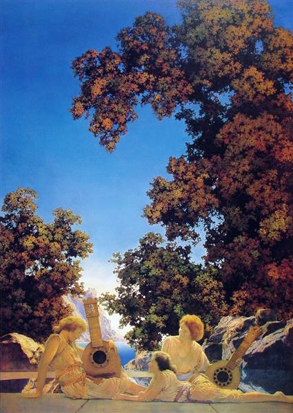
Following the work of Pyle, I also chose this artist because of his colour palette, but I also love that he worked with more mythological themes. Parrish was an American illustrator who worked in the early 1900s. He was one of the most popular artists of the Golden Age of Illustration, as well as Arthur Rackham and Howard Pyle, but was also apart of three other art movements, regionalism, symbolism and romanticism. These 3 movements I feel are very present within his work, in some pieces his composition reminds me of collage as he will have a beautiful scenic background, then position elements on top of it like characters or items, which can somewhat seem out of place but they do work. Like in figure 3 I feel the women look separate from the design but it’s not necessarily a bad thing, as the piece overall is so beautiful and the separation of the characters helps my eyes focus on them. I believe he did this with his colour palette as the warmer tones contrast against the cooler tones, but in between the two are the trees which have multiple tones of black, greens, reds and yellows so it complements both groups and makes the piece so attractive to the eye.
Style
I would say his style is definitely in the realm of realism, but there is a sense of magic to his work as there are dreamlike qualities to his pieces. In comparison to Howard Pyle, when I use the term ‘dream-like’, for Pyle I mean soft and airy, almost like a cloud, whereas with Parrish’s work, I feel it is less soft but has the whimsical nature of a dream.
What highlights these themes well was the artist’s knowledge of colour theory, as he would often use complementary colours, as seen in figure 4 which I believe adds more vibrancy and an overall sense of light and fun to his work. The bright colours within his work really help in attracting the audience’s eyes, but the artist knew when to stop, what other colours would need to be added as to not overpower the illustration. Referring back to figure 4 he has used a bright yellow against a deep blue which does help draw in the attention, but in between those colours he used quite neutral tones which helped in breaking up the tones, almost giving your eyes some breathing space.

Technique
I believe like Pyle, he used oil paints on canvas too, but whereas I feel Pyles work is soft and quite blended, I feel Parrish worked more realistically, as the people within the paintings could pass as photos, at least within figure 4, in figure 3 the women are quite godly, almost reminding me of Greek mythology, especially the way the characters are dress and how the sun is glowing down on them.
As I had mentioned before, I have not used this medium before so I do believe I would understand it until I did have more experience with it, or possibly watch a video/tutorial, as I know paints are different, for instance, I believe gouache dries lighter than it is laid down so it is a more buildable paint, but I think oil paints take longer to dry so you would have to work wet? I could be very wrong so I would definitely watch a video or do more research into it before trying myself especially as it is a pricey medium and I wouldn’t want it to go to waste. And that goes for both oil paints and gouache!
I would like to try creating digital paintings like this at some point, possibly within the new semester, but one day I would like to try out painting traditionally, and I would aspire to be at the level of Maxfield Parrish or Howard Pyle someday.
My opinion
Like with Pyle, as this Parrish uses beautiful and vibrant colour palettes, I would like to take inspiration from him for my Wizard of Oz project as I do want it to be a very colourful project. So this will mean thinking along the lines of Parrish, what colours may complement each other and attract the audiences attention and will I need to add more neutral tones to give the piece more breathing space.
I do enjoy working more realistically, but after discovering the work of Maxfield Parrish I will now try to find ways to make my work more vibrant and fun as I do really love the whimsical themes with his work.
Gustave Doré
This is a French illustrator who had worked within the mid-1800s and created finely detailed wood-engraved illustrations for books such as Inferno of Dante (1861), the large folio Bible (1866) and so on.

Style
Due to the methods he used, his work was primarily monotone, commonly printed with black ink and one of the first things I had noticed, was how incredibly detailed his illustrations are. At a distance, you could think that he had used pencils or graphite to create his work, however, when looking closer you notice all of the intricate lines which form up the tones but also give shape to the scenery or characters, for instance, if you look at the wings or the characters leg in figure 5 to the right, you can see the artist does not use a straight-lined crosshatching method but instead he curves the lines, which does help in creating shape and depth within the image as it does not look flat.
Doré worked within the period of realism and romanticism art movements, and I feel these are both very present in his work, what drew me to his work however was the religious and mythological themes, as he was able to bring the stories to life and as he does work in realism the characters are believable, which is already an amazing skill, but I assume his work would be even more mindblowing in his time, as it was before CGI and any of that technology, so the mythological beasts I see commonly on tv today, I don’t believe people of 1800s would ever have imagined, if it weren’t for artists like Doré.
Technique
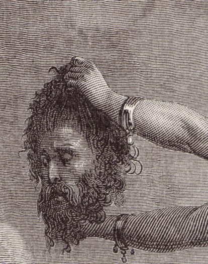
The artist engraved his illustrations into the wood which would then be printed onto paper. I assume he worked at a large scale due to the tiny and intricate details, (I mean just look at all the tiny dots and lines withing figure 6!) but this may be due to the way I know artists work today, as they will work at a larger scale to get all the details then they will reprint at a smaller size and the details are a lot finer. This method may not have been doable at those times, so if I imagine that his plates would have been printed directly into books, then he would have been working at a smaller scale than I would ever have imagined and it’s unbelievable. I could be wrong as I am not fully aware of his process, I just have brief knowledge of how the technique is created nowadays, but either way you can’t dispute that his work was very detailed and he definitely knew how to work with light sources as he wasn’t afraid to work with too much black and he was able to add the right amount of light, so that he was able to achieve depth within his work, creating the realism within his illustrations.
My opinion
This would have been a great artist to take inspiration from during my Lion, the Witch and the Wardrobe project, as I was working in monotone, experimenting with different printing methods and using a somewhat similar lining method to build up depth. Like I had mentioned however, I had been working in more of a straight-lined crosshatching style, whereas Doré was working with more curved lines which gave more shape to his design, and helped in making it look more realistic. I do not believe I would have had the time to work as intricate as he had, but by using a more curved line I believe I could have shown more shape in my own work, and it may have helped in making my work look less flat.
I have recently started to work more realistically in my own work, especially with portraits, so in the future, I may try to create a character in his style, but I may do so by working at a larger scale first then scaling down as to achieve the finer details, as I believe my hand would be too unsteady to create as clean of a piece as his.
