Melon and Lime Comics – MERRY CHRISTMAS!

This post has came a little later than we usually post, but that’s because IT’S CHRIIIISTMAS! Myself and Liam both celebrate this holiday and as a comic, I wanted to create a Christmas card inspired piece, but one that was inspired by the ones American families take, that just make you cringe.

I decided this comic would be a surprise for Liam, as I wanted to make it for him more than anyone else, as this was initially just comics between me and him but has become more open to the public so that they can also relate, as we have posted them on social media. But for Christmas, I wanted to make something special for him, but could also be posted on our Instagram.

So, I have created a cringey Christmas card style comic, which includes all members of our little family, Liam, myself, Arya, Tilly and Wednesday, and I have positioned each of the characters in the composition similar to an image I had found. 

I believe the inspiration for this piece had actually come from a photo of Will Ferrel, search ‘Will Ferrell photo’ on google and you will see the image I’m referencing, who in no way looked festive, but I believe it is where the idea for the style had come from.

As this is a festive piece, I had designed the comic in two ways, one with the usual black and white colour palette, and one with a pop of red for the Christmas jumpers and collars the characters and animals are wearing.

I do love this design as it is very much us and our little family. I feel like it is a good way to celebrate the holidays through our comics,  no matter what you celebrate. Although we don’t send out cards, I feel if we did, they would be like this. If I could change anything, I would possibly make the background less dark so that Wednesday would be more visible, however, I partially like the idea of him being as black as the night.

If you enjoy this comic and would like to see more of our work, feel free to have a look at our Instagram page @MelonandLimeComics. We hope you enjoy and we wish you a very Merry Christmas/Happy Holidays, from our family to yours!

‘Twas the week before Christmas…

If you have read my previous post, you will know how stressed I was trying to achieve my deadline for one of my projects, it wasn’t my real deadline, but it was the one I had set myself for that specific project. So, with this week, as it is probably the last week I can do work before getting lost in festivities, and having to clear my workspace away so that, to my mother’s delight, the dining table would be free again for the week between Christmas and New Years. Yes, I work at the dining table as my room is currently under construction and has been for a while, so I don’t really have elsewhere to work. So with these factors, I wanted to put all hands on deck to create 2 covers for the Penguin competition. This included sketching ideas, creating thumbnails for potential covers, then designing them digitally and refining them further.

I have surprised myself during this week, as I have managed to create 3 possible designs for the story Wonder by R. J. Palacio, technically 2 with the 3rd being a combination of both concepts, and I have created 2 possible designs for Norwegian Wood by Haruki Murakami.  I did start the process with 4 concepts for each book but have narrowed down my options when it came to creating them digitally. This was due to either time or lack of enthusiasm with the concept, but I do believe I have still given options within designs which would be more beneficial if I were working one to one with the client, but as I am not, and I am only allowed to submit one design per category, I will end up choosing the piece myself or my peers find most interesting or best advertise the stories.

During this week, I feel I have been confident when illustrating and coming up with concepts, however, when it came to adding in the text, I have found a lot of issues with the type getting lost within the illustrations and trying to find ways in which to make them stand out more. When talking to my peers, this was the biggest issue they had spotted, and luckily, one had given me suggestions about how I could improve on this.

From sending my friend all of the pieces shown above, she had circled both of the designs with eye patterns for the Wonder book, then the tree piece for Norwegian Wood and said that these were the pieces that would need to be worked on more as you wouldn’t be able to read them. With the designs for Wonder, she had suggested I remove some of the eyes so that they would be more of a border for the text as opposed to a background. As the pattern was somewhat uniform though, when doing this I felt it looked quite messy in a sense, the design no longer had a flow within the pattern and the eyes just looked more random in their positioning. She had not made any suggestions for the Norwegian Wood design, but she had liked the other option I had made for it, although she did spot a typo so I immediately corrected that. Another friend had suggested that the barcode on the back may not be readable from the design, so I also added in a white box over the design but under the information, so that it would be easier for a machine to read it. The white box was the same colour as the text, so did not look too obscure in the design as a whole, and sort of kept it cohesive.


After making the changes, probably even before then, I knew I had liked the more simple designs better, as they were more solid and there was less to question, for instance, it wouldn’t be a question of “what am I looking at”, “is the text readable”, etc. So the ones shown below are the ones I believe I will be submitting to the competition.
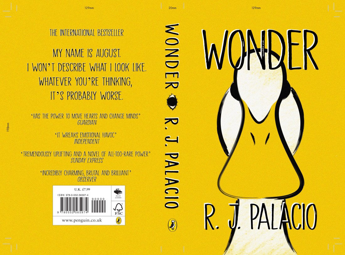
Template - Wonder.indd

The Wonder design

For this design, I did like the idea of people WONDERing (ha get it) why there was a duck on the cover when the story is about a little boy named August, but it does link to a section in where the boy is in the Principles office and notices his artwork on the wall. This artwork was for a class project in which the students had to make a self-portrait of themselves if they were an animal, and August had drawn a duck. When the Principle asks him “why a duck?” expecting a meaningful and in-depth answer, August just replies with “Its because I think I look like a duck.” I loved this section when I had read it and although I thought I was not going to try drawing the child, as the blurb of the book specifically says that he doesn’t want to describe himself as “whatever you’re thinking, its probably worse”, I thought this would be a fun way of representing the little boy, without trying to draw the accurate description.

Template - Norwegian Wood.indd

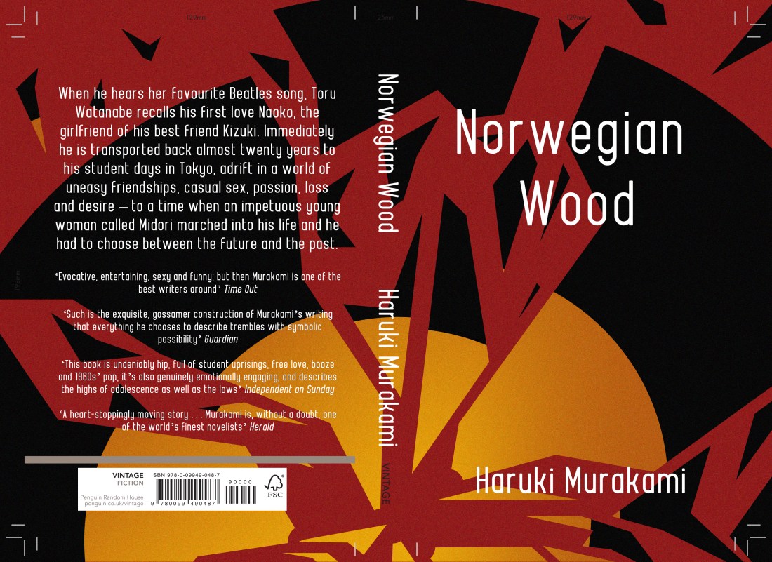
The Norwegian Wood design

There is a section within the book where the character is working at a record store and cuts himself on “one of the glass partitions in a record shelf” that was cracked, he then goes on to mention how the floor is covered in blood etc, so at the time this had made me think of this cover design. Although it had not exactly mentioned a broken record, this is what I had imagined when I had read the section, a record in shards, with a red background which would be the character’s blood.

This may not have been someones first thought of imagery after reading the book, but I felt since the title of the story is inspired by a song by The Beatles, ‘Norwegian Wood’, I felt the imagery was still valid to the story, and in a sense, it could be symbolic to the characters emotions and relationships throughout the story? (Potential spoiler? I’m sorry!) So I do like this design and concept, as I believe it is not an obvious choice and it is somewhat out of the box, but not too far as it still relates.

So still to do, as I have slightly worked backwards during this project, just trying to churn out the final designs as quick as I could with the time I have, I do have a lot of writing up to do. When working, I did have the artists and styles in mind that I wanted to use, but I just need to write this research up properly, discuss all of the choices I made throughout the process, etc, and I will need to make a final evaluation (which I will also post on here). This, however, will probably be done after Christmas, maybe pushing towards after New Years as well, as I had mentioned before, my working space is at the dining table, and during this time, my Mam does like it to be clear. I will keep my progression updated, but if I don’t post during that time, you now know why, so you can just imagine me living my best life, stuffing my face with festive food!

MERRY CHRISTMAS! OR HAPPY HOLIDAYS, WHATEVER YOU CELEBRATE! AND HAPPY NEW YEAR! 


Bibliography

Murakami, H. and Rubin, J. (2001). Norwegian wood. London: Harvill, p.263.

Palacio, R. (2013). Wonder. United Kingdom: Penguin Books Ltd, p.287.

The week from Hell.

Due to my incapability to follow my own timetable, which I had even reorganised after not managing to follow it the first time, this week was supposed to be the last week I had given myself to work on the House of Illustration, Book Illustration Competition, in which I had to create 3 illustrations and a book cover for the story ‘Howls Moving Castle’ by Diana Wynne Jones.

Instead, for the majority of this 3-week project, I spent a lot of time trying to catch up or finish off previous projects that I had fallen behind on. I also decided to work on an illustration which would be a gift for my boyfriends mum. This was supposed to be completed and printed for her birthday in September, but as we all know by now, I can’t follow my own time plans! So I said I would give it to her for Christmas instead, not that she knows (a blog post for this piece will be coming soon). So, the time I should have been spending on this project had been spent on others, but I refused to fall behind on the project starting next week, so I decided I had to finish this one by today!

In what should have been one week of researching, one week of creating concepts and experimenting and the final week creating the final design, I have basically had to do all of this in the space of a week.

When creating my pieces, I didn’t really have an idea of styles or techniques I was going to use, I had thought about artists, but I hadn’t thought about potential ways in which I could apply the styles or techniques to my own work, so basically in the process of creating my pieces, I have just been winging it, seeing “does this thing work? No, not really, scrap it! Does this? Okay, we’ll just roll with it”. I had kept doing right up until now.

I am currently happy with these designs, but I would say I do still need critique and outsiders perspectives so that I can potentially make further improvements. At this moment in time, however, I still have a lot of work to complete within other projects so this one may have to fall to the back of the pack. Because of this, I may not end up submitting my designs to the competition, as I’m not sure if it fits the standards of previous entries in the years before, especially not without further refinement. And since the competition does have a fee to enter, I feel it could be a waste of my money.

Even if I don’t submit these design to the competition, I will still include them in my portfolio, as through this project, I have been able to show more skills with narrative, and I have created more landscape designs, two areas of which I felt were lacking in my portfolio.

SO, what have we learnt from this post? I am my own worst enemy and I only have myself to blame! From this experience, I will strive to keep myself more organised and actually follow my own set time plans. I believe this information will be very important for when starting next semester, as I will try to plan out my time better, using my experience from this first semester, as I feel I will have more knowledge of my pace of working and what I am capable of doing in specific timeframes.

Melon and Lime Comics – The Dishes.

This week’s comic is based on one of Liam’s habits when he comes around to my house. As he eats inhumanly fast, he will always finish his food before me and whilst I’m still eating, he will get up and take his plate to the sink and wash it. Yes, it is nice that he washes up after himself, but no! He should be the guest when he comes to my home, and I should be the one washing the plates! And I would do if he allowed me time to actually finish my own food on my own plate.

dishes

I didn’t really enjoy creating this week’s comic, mostly because I have so much other work that needs to be completed for other projects, and I felt we were pushing for ideas. As we are creating comics on a weekly basis, I do feel that sometimes we will struggle for ideas, ones that we have not already done or ones that other comic artists haven’t already done themselves (that we know of).

I am glad that we came to this concept, as it is a reoccurring quirk in our relationship, and we do feel that others might be able to relate as well. But I do feel I could and should have done better in some of the frames.

As I am currently stressed with the other projects I have going on at the moment, when creating this comic, I had the mindset that I just needed to get the piece done and out of the way, so that I could get back and focus on my other work. So, because of this, I feel I didn’t put my best into it, I felt I very much had the ‘it’ll do’ mindset, and I am disappointed in myself that I didn’t do more and go back in to refine it.

I feel this could potentially be a reoccurring problem when working on multiple projects at once, but in the future, I will try to get rid of the ‘it’ll do’ mindset and put the right amount of effort into our comics. If I’m not happy with a piece in the future, I may hold off on posting it for a week, so that I can refine it further, bettering the quality and standard of it. However, if I do choose to do this, I do not want to fall into the trap of continuously doing it, or worrying too much about every piece, whether it is good enough to post etc so this will be something I have to think about if the issues of this week reoccur.

If you do by any chance enjoy this comic and would like to see more, please feel free to have a look at our Instagram @MelonandLimeComics, we appreciate any likes or follows that we get! I have also made a couple of blog posts about some of the newer comics, so if you would like to know more about the thought processes behind them, and how they have come to life, feel free to check those out too. Thank you!

I Opened up my Own Store!

Using Depop, I have created an account so that I can have a platform that I can sell my work from. If you want to know why I chose this platform you can click here to read my opinions on different selling sites.

As of yet, I have not made a sale through the app, but I have made a sale by working solely through PayPal and messaging the buyer. I was only confident enough to do this because I knew the person, but even then I felt I was being very awkward, as I’m not very business savvy and I am new to this world. But this may improve over time.

So working this way, I still charged the same amount for the product and p&p but in this case, Depop did not take their 10% cut of the payment, but I believe PayPal does still have a charge of 20p per transaction.

Anyways back to the exciting part, this buyer had wanted 2 of my zines, a multicoloured one and a black and white one, and when I had mentioned that I was also selling some riso prints, she had also wanted a wave print. From this buyer, I have made a total of £14.50 (p&p excluded) so I am so happy with this experience.

As I had stated in my previous post, one of the reasons I had chosen to use Depop was because I would be able to have control over the whole process, packaging the products myself and adding little personal touches where I could. So as shown below, are three photos, one of the contents of the order, then the other two are of the envelope. Although I would say the content is pretty standard as to what you would expect when purchasing prints etc, I wanted to personalise the envelope, adding in little drawings of flowers, which would relate back to the zine. I had also added a little ‘thank you’ on the back so that she would see it when opening. These are small personalisations, however, when I had received a personalised envelope from an artist, I felt that they had actually put love into their packaging, an indication that they actually cared about their clients and appreciation in a way.

48175122_361586474645178_1609465979731968000_n

I have now sent off the order, hoping that she gets it soon, and hoping that she is happy with her purchase. I also hope that more people will purchase my work, although I was a bit anxious with this one sale, I hope that the more I get, the more my confidence will grow with the process.

This being said, if you would like to have a look at the products I have for sale, you can click here for my Depop account, or you could send me a message on Instagram @Melon.R if you have PayPal and don’t wish to work through Depop.

Melon and Lime Comics – Holiday Traditions

As it is December now and the holiday season is upon us, this week myself and Liam decided to create a festive comic.

In this comic, Liam is asking what my favourite part of Christmas is, whether it’s the presents, which no, although I do like giving them, I wouldn’t mind not receiving them. Then he asks me if it’s the food, which I believe is amazing so could potentially be my close second favourite part, however still, the answer is no. My favourite tradition of the holidays, is having a movie marathon of The Hobbit and The Lord of the Rings trilogies, which we start on Christmas Eve eve, and as I believe it is a 20-hour marathon, it does take us to midday of Christmas Eve.

This was initially a tradition I had started with my brother, before the Hobbit movies even existed, so that we would stay up all night on Christmas Eve eve, making it easier for us to sleep on Christmas Eve, as the excitement would usually keep us up, so the lack of sleep from the marathon would usually knock us out instead.

When I had started seeing Liam, I introduced this tradition to him, and now for what will be the third year in a row, we will be keeping it alive. Hopefully actually surviving this year’s, and not accidentally falling asleep during The Two Towers at 2am. This year  I will ensure that there will be a lot of coffee involved and that we shall succeed!

In a sense, we wanted to create this piece so that our audience could get to know us better. Although we create comics that can be quite relatable, for other people or couples, we also want to shine a light on the quirks that are unique to us, that makes our relationship special. We hope that this will make our audience feel more connected, to know us as actual people with true quirks and habits, as opposed to just seeing characters that are seen as ‘relatable’.

There are a few things I like about this comic, such as the representation of the movie, with the fellowship of the ring on their journey, something that maybe only fans would be able to recognise, but I also love the frame with the Christmas tree and presents, as I just enjoy the little details and patterns, and it does make me feel festive, but in our own set style of the comics.

From last weeks comic, I did try to add more elements to the frames, trying to think more about backgrounds, mid ground and foreground, and I do actually prefer the frames which do have more in them. I feel my job for future comics, will be to not go overboard with the backgrounds or elements involved. Although I do enjoy the interest that it gives the specific frame, I do want to keep the comics as readable as possible, not giving any room for any confusion, so that the message can be communicated well throughout.

Just a little update..

I currently have only 5 weeks left of the first semester, before I have to hand in all of my projects for the development module. So, as I have been updating my blog, but not so much in terms of my progression, I thought I’d briefly talk about the work I’ve done so far, what I still need to do, and discuss the goals that I want to achieve, which will be more long-term based.

The Lion, the Witch and the Wardrobe

  • Research is complete – both directly from the book and my artist research.
  • I have created a mind map and chose the imagery I’d like to create.
  • Drawn up on of the quotes, the Wardrobe.
  • Experimented with digital techniques.
  • Experimented with different printing methods – screen printing, and adding foils, etching, Linocut, laser cut plate.
  • I’ve chosen that I want to create the rest of my illustrations with the laser cut plate technique as I feel I had gotten the cleanest results.

Still to do:

  • Create the other illustration with the printing method.
  • Possibly edit the outcomes digitally.
  • Mount them.
  • Evaluate the final products and project as a whole.


Inktober

  • I have completed the challenge, creating 31 illustrated characters for each day of October.
  • I have fixed or edited the designs digitally. Compiling them all into a zine format.
  • I’ve experimented with different forms of printing – through the colleges normal printer, reprographics and creating some on the zine.
  • With the finished products, I have begun to sell them online.

Still to do:

  • Write up some of the days – I have written them up on this blog, however, I feel I need to write them more formally and with much more information, for my actual project.
  • Write up the experimentation with printing methods. Opinions of the different outcomes of the zines.
  • Evaluate the final products and project as a whole.


House of Illustration – Howls Moving Castle

  • Read the book, highlighting areas and quotes that I could possibly illustrate.
  • Created sketches from the quotes.
  • Narrowed down my selection and had drawn thumbnails.
  • Narrowed down my selection yet again, so that I was left with 3 potential illustrations and 1 potential cover.
  • Started sketching the thumbnails digitally.

Still to do:

  • Write up artist research.
  • Refine the digital sketches with traditional line work.
  • Scan in the line work.
  • Colour digitally and potentially add a textured overlay.
  • Write up all of the progression, thoughts and opinions throughout.
  • Mount/submit the final designs.
  • Evaluate the final product and the project as a whole.


Penguin Illustration Awards

  • Read the children’s book – Wonder by R.J.Paolo
  • Read the adults fiction book – Norwegian Wood by Haruki Murakami.
  • Have thought about the imagery I could potentially illustrate for both of the books.
  • Have thought about the styles I could potentially use.

Still to do:

  • Actually start the project, not next week but the one after.
  • Write up research – from the books and potential artists/styles I will be using.
  • Form a mind map/mood board of potential imagery I could create.
  • Create 3 thumbnail sketches for each book.
  • Refine my choices and refine the designs digitally.
  • Choose which concept I think is best, possibly refine it more if needed.
  • Write up progression, thoughts and opinions throughout the project.
  • Mount and submit the final design.
  • Evaluate the final product and the project as a whole.


Long-Term Targets

  • Get better at time management. Thinking more practically, how long will it take me to work on a project, then follow my timetables as efficiently as I can.
  • Draw more full-length bodies. Over the year I feel I have gotten better at drawing faces, however, I do still struggle with the anatomy of the body, so I do wish to practise more in the future.
  • Boosting effort levels, getting rid of that ‘it’ll do’ attitude. I believe this can be done by just taking a break from my work then going back to it again with a fresh mindset, ready to make further improvements, as opposed to just being sick of the piece and wanting to just get it out of the way. I don’t think this can be done overnight, hence why it is in my long-term goals, as I feel in a way I will have to train my mind to do this more often, especially during future projects, in college and out.

Norweigan Wood – Review

For the Penguin Student Design Awards, I have been reading two books, one for the children fiction category and one for the adult’s fiction. The one I am about to review (or attempt to) is called Norweigan Wood by Haruki Murakami, and it is the adult fiction book.

Just a bit of pre-warning, I don’t know how to review books properly, as I don’t know how to give my opinion and explain what the story is about without giving away too much information or potential spoilers. Technically, I don’t know why I keep writing these reviews, but hey ho, here we go! POTENTIAL SPOILERS WARNING AHEAD!

Norweigan Wood is a story about a character named Toru Watanabe, who looks back on his younger/student days in Tokyo in the late 1960s. I believe the story is based on romance, but as opposed to a typical ‘boy meets girl’ scenario, the story does go more into depth with the complexities of relationships and life itself, discussing emotions and struggles between the characters etc. The story does contain some very sexual moments, but this was not my take away from the book as I feel it was more about the main characters daily life, his struggles, his connections between characters and things like that, as opposed to it just being an erotic novel, it had more of a storyline which by the end, I did feel quite invested in.

My initial thought about this book, as it is fictional, I had thought it was going to have more fictional themes, like fantasy or sci-fi, or anything along those lines, so whilst reading through the book, I could feel myself making assumptions of the direction I thought it could take. At one point, I did think that the girl he was interested in was going to turn out be a robot, but this was not the case and I do kind of feel bad for thinking so. Instead, the book was based on reality, set in the real world with characters you would think were real at some point, a world without robots, at least not ones that were mentioned? or any fantasy creatures, or ghosts or aliens or anything or the sort.

At the end of the story, there was a section which had explained that although the author Haruki Murakami has made more fantasy inspired books in his time, parts of this story were autobiographical in a way, as the author would be taking inspiration from his own days as a student. But although this story had some fans of his previous work questioning the more realistic themes of this one, he had explained that it was a challenge for himself, as real life is so complex but does have a simplicity to it, it has so many emotions and integrating parts to it, so I would imagine that it would be hard to make all of those elements seem simple, like ‘yes this book is based on the realities of life’ to the reader. So, in comparison to writing one of his other books, Murakami had found Norweigan Wood was the most challenging.

As I had mentioned, I did end up becoming quite emotionally invested in this book, with the characters day to day life, the emotions, experiences, thought process etc, so when I had finished, like with Howls Moving Castle, you can read my review of that here, I felt lost, it couldn’t end like that! I wanted to know more, what else happened to the character after the story finished, I did feel frustrated that I couldn’t follow him on his journey through life anymore.

I would recommend this book to a friend. If they don’t like the idea of the sexual themes and moments within the story, I would just tell them that I felt the actual story was worth the read. I feel the author has done an amazing job at capturing the reality and complexities of life, and he was able to explain them in such a way that was easy, readable and understandable. In a way that sucks you in and makes you feel emotionally invested to the characters journey.

Melon and Lime Comics – Pizza Conspiracies

In this week’s comic, me and Liam were having a conversation about the price and sizes of pizza, in which he had told me that the price of a 10″ pizza was the equivalent to half of a 14″. At this moment, I had not read him properly, (this was a conversation over text) and thought that he was saying that a 10″ and 14″ pizza had the same area, so because he was so adamant when I was telling him he was wrong, I did the math and was getting frustrated, until I reread his message where he had said HALF of a 14″ pizza was the equivalent of a 10″.

So, already frustrated with the conversation, especially having to do math for no reason, I wanted the conversation to just end and swap to something new. But Liam had other points to still discuss, as he felt (and I agreed with, but the laws of math were not on our side) that surely a 10″ pizza should be half of a 20″ pizza. Which started him explaining his conspiracies that the pizza companies are against us, a couple of days later, this being the subject of our new comic.

In this piece, I have shown our conversation in the present time, showing Liam’s enthusiasm and my lack of interest to the subject. In the second frame, I have then shown the both of us as elderly characters, the kitten Wednesday is still in my lap 60 years later, but is older. In my mind, he will outlive the both of us and this is not up for debate! And 60 years from now, I still see Liam bringing this subject back up in conversation, and myself still being sick of the subject, but in this time, he is even more adamant that the pizza companies are against us, as he has more elderly man rage (‘get off my lawn’ whilst waving his walking stick at children type of energy).

I was happy to work on this piece, as I feel I have tried to play around with backgrounds and scenery more. In the background of the second frame, I have drawn a fireplace with photos and ornaments scattered across the mantlepiece, for this, I had taken inspiration from my Grandmas home, which was similar to this setup, but I have exaggerated some of the elements. I had also added in rocking chairs, which myself and Liam have already agreed that we are purchasing as soon as we live together, we really are already old at heart, and behind them, I have also added in a zimmer frame for myself, then a walking stick hanging on the arm of Liam’s chair.

Although I was very happy with the background, it did seem to become slightly problematic when it had come to adding in the text. To overcome this problem, I had selected all of the layers for the background, then copied the selection as merged, then pasted them back into place. Now with the one layer, I had dimmed down the opacity, enough so that it was still visible, but still allowed the text to stand out. To help a little more, in a separate layer underneath the text, I used a watercolour brush in photoshop, (as it would give a softer approach, as to a quite harsh highlight of the text) then I started to build up a white base to make more contrast between the background and text.


If you like this comic and would like to see more, please have a look at our Instagram @MelonandLimeComics. We appreciate any and every like or follow we get. Thank you!

Design Philosophies

Thumbnails/Rough Sketching

  • I will always start my projects with quick initial sketches. I feel it is a good way to get initial ideas out on the page quick, then look back and start to develop the ideas from the starting point.


Research and Referencing

  • I mostly use Pinterest for inspiration, whether it is from illustrations, a colour palette, images of scenery or people.
  • If I need to find a specific pose/face to draw a person and you can’t/are too shy to ask someone to pose for you, Pinterest has a good source of imagery, I have seen a lot of dynamic poses for particular characters, but I mostly use it for reference images of people, you can check out my board by clicking here.


Including myself in my work

  • Enjoying what I do – if I am not enjoying the work I create, if I don’t feel enthusiastic about it, I do try to change elements so that I do like it, but if I have lost hope in a piece then I do not believe it is a good representation of myself.
  • If I do not feel at least 80% positive about a piece, with college work excluded, I do not show the work anywhere else. It may not necessarily be bad, but if I have no confidence to sell it then I believe I will constantly overthink the design and it will get worse and worse in my mind as I pick it apart more and more.
  • I would have said 100% but I don’t feel anyone is ever 100% confident about their work, there is always something they see that they think they could have improved on or changed, that no one else may be able to see.


Thinking outside of the box

  • Being able to work with a brief and/or client, giving them alternative options for the designs, possibly one that is more direct to the brief, one that is more biased to my own likes, and one that would be in between the two.
  • I always try to think outside of the box so that I am creating unique concepts, that can still link back to the brief, that would separate me from other illustrators/designers.


Problem-solving

  • Knowing my own weaknesses and figuring out ways to work around them, when I don’t have time to improve them on the spot.
  • Taking the time to learn from my weaknesses to create better work in future, potentially having fewer problems to solve.


Challenging myself

  • Whether it is with new techniques, mediums or programs I have not used before, or specific imagery that I am not used to drawing a lot, for instance, backgrounds or character work.


Final Checks

High standards

  • During college times, I feel I do hold my work to a higher standard than when I am working on personal projects at home, however, this is something that I am looking to change, so that I hold up all of my work to that high standard.
  • In the past I have had an ‘it’ll do’ mindset towards my personal work, especially when it has taken so long to create. Instead of taking a break and coming back to it later as to work on it further, I usually just say “its fine”, but I’m determined for this to end this year. When I am feeling the “it’ll do” moments now, I am going to take a break from the specific piece and just come back to it later; this will hopefully give me a fresh mindset and more energy when I come back to the piece.


Is the piece a good representation of myself?

  • Relating back to a previous point, if I am not confident behind a piece I don’t want it to be a representation of myself. Following the high standards point, if I have an “it’ll do” mindset to a piece then I should not be posting it as I know I can make improvements once I’ve taken a break and come back to it with fresh eyes. If I send out a ‘meh’ piece just for the sake of it, then ‘meh’ will be the response in return.


Does it communicate a specific message and does it communicate it effectively?

  • If I create a piece with a purpose to communicate a specific message then I have to be sure that it can be read and that the point will not be overlooked.