Inktober: Days 21-28

Day 21: Drain – Dandelion

43985779_1193916924110928_5358035894994912958_n

I’m not really sure on this character’s hairstyle, but I do feel the type of plant is identifiable.

For this prompt, I tried to think of plants that could possibly grow in drains, which led me to think of weeds, which led to thinking of dandelions. With the prompt as it is quite a yucky place, I decided to draw the yellow type of dandelion, as opposed to the wishy one, as I feel it is commonly known as the more annoying and less pretty version of the plant.

Like the plant, I think this character tries to be villainous but just ends up being more annoying than evil. I expect her to just turn up at unnecessary times, and instead of harming any of the other characters, she just ends up annoying them instead. This could potentially be a developing character, where the others discover that she has other emotional issues going on, which make her annoying tendencies more understandable. If I could relate this character to one from another tv series, I could potentially compare her to Peridot from Steven Universe, as she had started off on the evil side, but did not necessarily cause any real problems for the main characters, but was just more of an annoyance for them, but the character then developed and she became one of the crystal gems, converting to the good side.


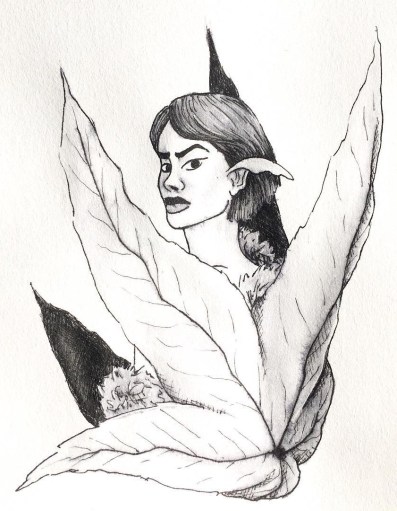
Day 22: Expensive – Kinabalu Orchid

43578463_1908359406140505_8052881774282917726_n

This flower had originally come from my search of the rarest flowers in the world, and as I had said with the ‘Precious’ prompt on day 9, I had found two flowers, the Kadupul and the Kinabalu Orchid, which I felt most inspired by, but had felt the Kinabalu Orchid would be better fitted for this prompt, as it looked more sinister than the other had.

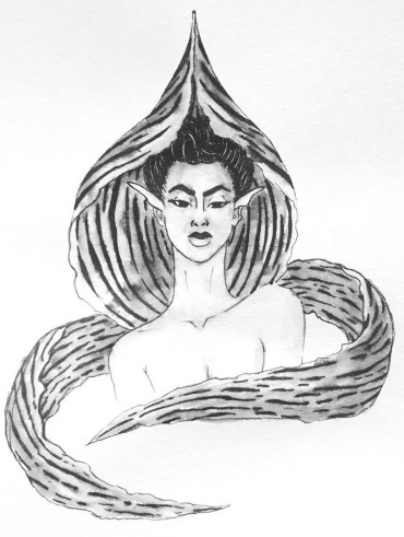
With this character, thinking of ‘Expensive’ I wanted to create a rich b*tch character, who would be more snobby and look down on all the other characters. In her eyes, she would be at the top of the hierarchy of the society, and everyone else would be peasants.

I enjoyed working on this character, as I was able to play around with patterns and new shapes, experimenting with how I could incorporate the unique flower into the character. Like with the ‘Cruel’ character, I wanted to use the main petal as a collar/hood, and with the two side petals, although they are usually sticking right out on the actual flower, I wanted to wrap them around the character, as if it was a fox scarf or expensive shawl of some sort, to give her more of the expensive look.


Day 23: Muddy – Daffodil 

43292113_360360371373823_703080925605083910_n

For ‘Muddy’ I thought of springtime, where the weather is still changing from rain to sun so there would be more mud, and the flowers that most commonly grow within this time are daffodils.

As I had loved working on the hair for the ‘bottle’ prompt on day 18, I wanted to do something similar within this piece, as to contrast with the lighter flowers.

With this piece, I knew that I did want to add actual mud splatters, however, I was scared of possibly going too overboard, so probably did go more light-handed than I could have, however, I am glad that I did, as they could pass off as freckles, meaning that they are just natural markings of the character, rather than she had been playing in the mud.

I’m starting to think that ‘Baby’s breath’, ‘Jasmine’ and now ‘Daffodil’ could possibly all be friends with one another, as I am imagining them to have similar traits and personalities. They are all quite carefree soles, with calming and caring personalities, so I do think they’d really fit well together.


Day 24: Chop – Cherry Blossom

44538823_250055122359011_7466049743999395746_n

With chop, I feel she would be quite a strict character, very organised and likes things being right. I could see her being a sergeant or police officer of some sort, being a character of authority. I assume she’d take care of the society, and properly discipline anyone out of line.

For the prompt, I had thought of flowers that grew on trees, which led to thinking of cherry blossoms. Although this character would have a beautiful exterior,  I can imagine her being very tough and possibly cold on the inside.


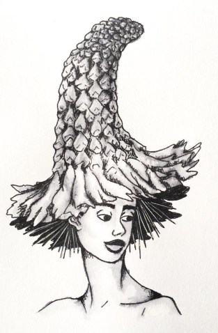
Day 25: Prickly – Thistle

44833020_468961213592626_2194932873311779686_n

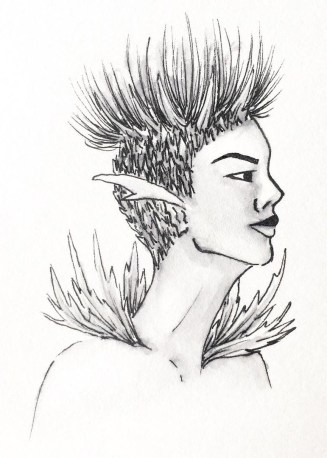
I did struggle slightly with the imagery for this character, trying to figure out how best to show the influence of the specific flower, being a thistle. So, in the end, I had chosen to give her a prickly leafed collar, and prickle all around her head with the flower section growing from the top. With this character, I had wanted to give her a more androgynous look, with a mixture of both masculine and feminine features. So, with the hair, I had decided to create a shaved sides with a high top sort of look, incorporating the flowers elements.

I enjoyed working on this character, as she is unlike any of the other characters I have created so far, and it kind of gave me the chance to work with a new face, creating an alternative look which is still relevant to women nowadays.

To see how this piece was made, and the method I use to create the other designs as well, I have created a blog post about my process.


Day 26: Stretch – Sunflower

43778850_320176052096600_6809819923661768525_n

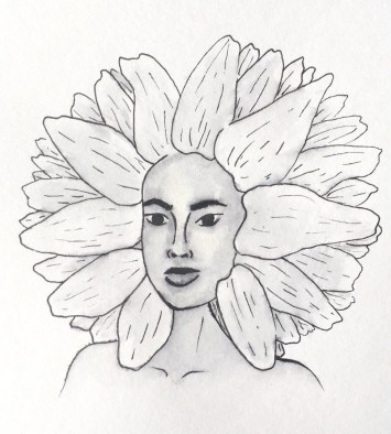
I struggled when coming up with a flower for this prompt, until my boyfriend had suggested a sunflower, explaining that it ‘stretches up to the sun’ which all plants do, however, this one is usually taller, so it made sense.

This is actually one of my favourite flowers, so I did want to justice. I wanted to create an almost afro silhouette with the petals of the flower, and create a darker toned character to match the bud of the sunflower.

Ideally, I would have liked the skin to be darker on this character, however, I was scared of the ink bleeding too much and leaving my character with a patchy and muddy mess. When creating my zine, I may try to recreate this character, going darker with the skin tone, to achieve the contrast that I had desired.


Day 27: Thunder – Thunder Lily

41516234_2211100269147346_3974982028563890547_n

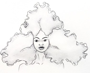
I don’t really like how this character turned out, although I feel she has an interesting silhouette like with the last piece, I do not feel she has enough contrast, especially as the original flower is so much darker in colour.

Again, when it comes to creating the zine, I will definitely be going back to this piece to darken up the petals, hopefully giving the piece and character more contrast and appeal to the eye.


Day 28: Gift – Roses

43704393_176606326614052_4395769119823814973_n

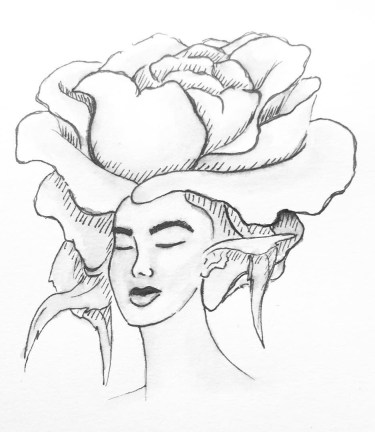
For this prompt, I had thought of flowers that were most commonly given as gifts, this being roses.

I see this character almost in the same light as the ‘Star’ prompt character that I had created on day 8, I feel she would be a sort of celebrity within her society, mostly because of her beauty. But, I see this character being very two-faced, in front of her fans, she is caring, loving and sickly sweet, yet behind closed doors, she is a diva and complete b*tch, especially to the people who work for her.

WE’RE BACK! Getting Back into Comics

Melon and Lime comics has been on a bit of a break whilst both me and my partner have gotten back into the swing of college but now, WE HAVE RETURNED! With a comic that gives a bit of an update as to what we’ve been up to whilst we’ve been away.

I’m so excited to get back into the flow of working on new comics again. We aren’t necessarily going to have a set day in which we will post as of yet, as we don’t want to make any promises we can’t keep, however, we will be attempting to create at least one comic per week.

If anyone reading enjoys this piece, we have more content on our Instagram @MelonandLimeComics, so please have a look, we promise there will be more content coming soon, now that we’re back into the rhythm of college, maybe? NO PROMISES! But we’re gonna try! We also plan to create a zine or book over the year, which we plan to release sometime in June next year, so keep an eye out for that too.


8 Tools I Use For Inktober

1.Pinterest

Pinterest has been my main source of inspiration throughout this project so far and during many previous projects. Over time I have built a collection of ‘Model Inspiration’ which include photos of different faces shapes, hairstyles different ethnicities and so on. I constantly refer to this board for inspiration, and if you were to look in it, you would most likely see the faces I have used as inspiration/reference during this challenge.

pinterest


2.Sketchbook

Throughout the challenge, I have been sketching each design out within my sketchbook, this allows me to make any changes necessary before I start inking the design.


3.A4 Light Pad

Once I am happy with the sketch, I rip out a page from the back of the book to create the inked design on, (yes my sketchbook is probably going to be very thin by the end of the challenge), then using an A4 light tray, which I had purchased from Amazon, and plugs into your computer or laptop with a USB, I start lining the sketch.


4.Derwent pens

For the inking process, I use Derwent Graphik Line Maker Drawing Pens, which are a pack of 6, varying from 0.05mm, to 0.8mm. I often use 0.1mm for the facial features, 0.2 for face or petal outlines, 0.05 for very fine details, sometimes even cross-hatched shading, and for flat black areas, I use 0.3 or 0.8.


5.Water + Paint brush

To add more shading with a softer blend, to the linework, I dip a thin paintbrush into a glass of water and bleed, drag and blend out some of the inked line work. If I feel it is bleeding too much or is too wet, I have often blotted it down with my sleeve or a piece of tissue.

44972115_2279412198755543_3778573181749559296_n


6.White pen

In some area, possibly where I have lost any highlights or the ink may have bled too much, once the piece is dry, I use a white ink pen and start adding back in the highlights or cleaning up some of the areas that may have come out too dark. If the white pen has gone slightly over some of the linework, I then just go back over with one of the fine liners.

45179285_292486278141594_8399343043123085312_n


7.Phone camera

Once the piece is complete, I take the design to a place which has good natural lighting, then take a picture of the piece using my iPhone camera. I do feel the lighting is an important factor, as you want to take the best photo you can of your design, and if taken too late on in the day, it can make your piece look more cool toned, or if you are using the lights within your house, I don’t know about yours, but mine are very orange/yellow, so would make my designs look too warm toned.


8.Whitagram for editing

With the photo, I then crop the design, making the illustration the only part visible, removing any background or any white, unused space from the page. I then take the photo into an app called Whitagram, which I originally solely used as to make my images square, for the way in which Instagram is set out, but for this project, I have also been using the editing tools within the app, playing with the lighting, exposure and shadows, as to make my pieces as white as possible.

This step would be much easier if I had scanned in the designs and edited them within Photoshop instead, however, I do not have a scanner at home, and as this was a daily challenge, I would not have been able to take advantage of the colleges each day of the week. So for the time being, I just have to make do with the resources I do have.

When it comes to creating my zine, however, I will be doing this step properly, by scanning in all of my designs and editing them with photoshop. I believe it will give me better results especially with quality, which I feel is very important for the product I will be producing, as I do want any potential buyers of the zine, to get their money worth.

Foiling

Following yesterdays class and blog post about screen printing, in the class, we had also learned how to foil your designs using that method, but I wanted to make a separate post about it as I have also used another technique for foiling in the past and wanted to discuss and compare the two methods.

Screen Printing

In yesterday’s blog post I did discuss the process of creating the screen and printing with it, so if this is something you are interested in or would like to know more about, please click here. So, following this process, instead of using printing medium, we used glue instead. By doing this, you did have to be more thorough with the cleaning of your screen, washing it as soon as possible because if you were to leave it to long, it could potentially dry and clog up your screen, making it unusable. Once the glue was printed onto the page, you would then choose a foil, which had come in multiple colours and tones, but for my piece, I had chosen to use a copperish colour. You would then place a sheet of your chosen foil over the glued sections, the colour/reflective side facing upwards, then sandwhiching the page and foil inbetween sheets of scrap paper, you then put it into the heat press for 30-60 seconds. Once you have removed this sandwich from the heatpress, wait for it to cool down slightly, then when you peel away the foil, it should have stuck to the glue and should reveal your design underneath.

50489412_309963246296030_8504261388993036288_n

Using a normal printer.

A while back, I had decided to make my mam a present which was based on a map of the areas where she has lived in her life. I had seen places online like ‘Not on the Highstreet’ doing this with a foiling effect, but instead of paying quite a bit of money for it, I decided I would just try to do it myself instead, using the facilities available to me within the college. At that time, I had no idea how I would go about making this effect, so I had gone to see Steph within the print room for her advice. She had suggested a technique where you would just print out the line work using a normal printer, then the foil would stick to it when under the heat press. So, after creating my line work, I printed it out onto a sheet of good paper with the normal printer in her room, I cut a sheet of foil which was big enough to cover the area of the design, then again, sandwiched the page and foil between sheets of scrap paper and placed it into the heat press for 30-60 seconds. Once done, I removed the foil and it had stuck down to the areas that were black in my design.

51424072_292910317950644_7496476359850459136_n

My opinion.

Although using the normal printer was a lot more efficient on time, and was a lot less messy as you didn’t have to worry about glue and cleaning screens etc, it did give a more subtle effect, as the foil appeared to be more crackled as opposed to full like I had achieved with the screen printing method. Overall I did have good experience with both techniques, however, if I were to use it again within my work, these would be factors that I have to consider, would I want the effect to be more subtle and still be able to make out the black line work underneath, or would I want the effect to be more solid?

All images are my own unless stated otherwise. Appologies that they may not best show the reflective qualities of the foil, I was going to upload a video, however this site thought otherwise. 

Screen Printing Class

When going into this class, I had did not have high hopes for it as the previous time that I had learnt the process, the outcomes did not come out the best, and the actual screen would fall apart after a couple of prints. However, in this class, we learnt a new process for making our screens, which did work a lot quicker and easier, and the screen actually lasted longer and gave better quality prints.

In the previous year, with our illustrations, we had to make them digitally and set them up within illustrator so that the image would be formed up of paths, but would be together in a compound shape. This was so that the design could run through the vinyl cutter, and it would recognise the paths and cut where needed. Once printed, you would then have to sit and weed out the sections of your design that you would want to be printed. I did actually enjoy this process, however, for time purposes, it wasn’t the best. When you had all the colour sections removed, you would then have to apply the vinyl to your screen by hand, which would often take two people to do as the screen was so big, and you would have to be meticulous with the process, making sure that there would be no air bubbles between the screen and vinyl, as this would potentially lead to your design bleeding when inked. Once the process of making your screen was complete, you would then place the screen facing down onto your paper but would have to use heavy weights or another person to hold the screen in place so that it wouldn’t move and potentially resulting in a bleed or smudge of your design. By working with another person, this also made it more awkward when pulling the ink down over the design, as it wasn’t just a smooth pull down, you would have to move around the arms that were holding your screen down. After all this effort, the screen would only last a couple of prints, at least in my own experience, as the ink would loosen the adhesive of the vinyl, which lead to some of my details falling off. Shown below are my results from this experience, which I hope show why I did not enjoy this experience and was not looking forward to trying it again.

HOWEVER, when beginning and learning this new process, it was SO much easier! When initially making the design, although I still had to make a monochrome design, as shown in my previous blog post, click here to see, I did not have to faff around with illustrator files, paths and compound shapes, I just needed to save my design as an A4 Jpeg.

When it came to creating the screen, we were all given frames which would be our own for the year. This would mean that we could repeat this process whenever we needed, as in previous years they have had a limited amount of screens, which could get damaged or take a while to dry after cleaning, so this would eliminate those issues, and if ours went missing, it would be of our own doing. With this frame, we were given a sheet of instructions to follow. Starting with it positioned so that there were two holes on the right and one in the top left corner, using double-sided tape, you’d then line all four sides. We were then given a sheet of mesh, which we stuck down onto the tape, making sure it was the rougher side facing upwards. This sheet acts as our screen and would be replaced from print to print. Using green tape, we then lined each side of the fame once again. This would ensure that the screen would not move during the process. With a craft knife and a cutting matt, we then carefully cut out the holes, the two on the right and one in the top left corner. Our screen was then ready for the design to be printed onto.

Using a new machine which burns the design onto the mesh, you would slot your frame into it, using the holes, then it would feed through, burning your design into the screen as it goes. I believe you do need to use a specific program for this to work, but it seemed simple enough to upload your Jpeg image and have it work. A couple of the other students did have issues with this process as they found the printer would glitch halfway through, but we discovered that this was due to the screen not being stable through the feeding process, as it would sometimes fall when coming out on the opposite side.

Below are images from the process of creating the screen, apologies if some are unclear as to what is going on within them.


When it had come to printing the designs, as the frame and screen were a lot thinner and lighter than the ones used in the previous process, it was no longer a two-man job to hold it in place, a couple of weights would suffice, meaning that when squeegeeing the ink down the screen, the process was a lot smoother.

The printing medium we had used was one part paint in the colour you wanted, I chose black as it fits with the style of work that I wish to create for the project, then two parts of acrylic medium. I believe the medium helped thin down the paint, making it a lot easier to transfer through the screen.  With a squeegee, you then put some of this medium in a line at the top of the screen, which should be faced downward on your page, then at a 45̊ angle, you then pull it down across your design. If you put too much medium, the print may bleed, but if you put too less, you may miss some details of your design. After a few runs, it is suggested that you wash your screen so that it does not get clogged, but once it is dry, you can go back to printing again.

This was unlike the previous process because if you were done with that screen, you would have to remove all of the vinyl, wash the screen, then you would not be able to print with the design again unless you went through the whole process of making your screen from vinyl once again.

Below are images of my results from this class, which as you can see I did experience a few learning curbs, using too much ink, or using the screen whilst it was still wet after cleaning, but I did get a few nice prints, and overall this class did give me a better perspective on the technique and process, and I do believe I will be using it again in the future. Potentially for final prints, but also for creating sellable products, as I believe it could be used to make good quality limited edition prints, bags, t-shirts, etc.

All images are my own unless stated otherwise.

The Lion, the Witch and the Wardrobe – Review

As a personal project, I wanted to illustrate the story of ‘The Lion, the Witch and the Wardrobe’ by C. S. Lewis, as on screen it was a childhood favourite, and I always had the chronicles of Narnia in my cupboard but never actually read it (or don’t recall ever reading it, it did seem to be bigger when I was little so probably scared me). But as I had never read it, I wanted to see if there were any differences from book to the screen adaptation like there is in many book adaptations nowadays, and I planned to illustrate the original story as opposed to the imagery I already knew from the movies or the very dated BBC version.

When actually reading the book, I was surprised but not in a good way. The story is very brief in its descriptions and I was disappointed in the lack of detail that was given, because since I didn’t want to work with the imagery I already knew, I was leaning on the details to give me a better vision of the scenery or characters so that I could interpret them in my own way.

In this case, for once, I had felt the movie and even the BBC program adaptation of the story was more detailed than the book and did give better visuals.

It was, however, an easy read, so would be better suited to a younger reader, so I could possibly be overanalysing it due to my age and level of reading.

When I think about other adventure/fantasy books that I have read, I like to compare this book against J. R. R. Tolkiens Lord of the Ring series, as where C. S. Lewis has next to no detail, on the other side of the spectrum Tolkien almost goes too much into detail in his descriptions, to the point where I did get a bit bored when reading. In C. S. Lewis’s case, it was an easy read but I feel the visuals it gave were basic and it almost seemed too fast-paced in a way.

With this book, I will try to take as much from the descriptions as possible, but I will probably illustrate more from my imagination or create a mood board to help me flesh out the visuals to my ideas.

In conclusion, ‘The Lion, the Witch and the Wardrobe’ is probably better suited to a younger reader, but I still feel it definitely lacks in detail and the movie, for once, was better than the book.

Inktober: Days 15-20

Day 15: Weak – Snowdrop

43067436_1937100623250216_770439901669026784_n

On this day, I was really struggling to draw a face, the angles were just not my friend and they were just a mess. As I was doing this at college, I decided to leave it until I got home and work on something else, even though this would give me the same dilemma as the previous week, potentially battling with the natural light available.

This, however, was not an issue, as when I had gotten home, I was able to power through and finally draw a face that I liked, then I was able to ink it and get a photo whilst there was still a good amount of light available.

This was not the initial flower that I had chosen to do for this prompt, I was originally going to create a daisy, but I believe due to the hassle I found when drawing the faces, I had forgotten the prompt and had unconsciously started drawing the flower, a snowdrop, that my mother had suggested when I had initially started planning the project.


Day 16: Angular – Aloe Vera

44290197_2222330818027004_8368284530149785261_n

This piece seems to be quite similar to the ‘Cruel’ character, as their bodies are both wrapped by their plant’s leaves. Because of this, I have decided that this character is ‘Cruels’ sister, but is not evil. Although she has a harsh ‘angular’ appearance, she is a healing character. Like the plant, it has a prickly exterior, but inside, it has the ability to soothe and heal burns.

With the design, I wanted to take advantage of the angular prompt, and experiment with shapes. Although with the face, I have kept to the overall aesthetic of my designs, with the hair, I feel I have unconsciously taken inspiration from a tattoo artist named GreemTattoo on Instagram, who uses bold black in their designs and often has quite blocky and angular style. I do really enjoy the literal approach I have taken from the prompt and have applied to this character.


Day 17: Swollen – Bleeding Heart

43578335_2291757197718695_7552956570976621068_n

This was another plant that I had not initially intended to work with, however, when looking at the original plant again, the ‘Gasteria plant’, I did not feel much inspiration in the imagery that I could create from it, so decided to head in a different direction.

Since this flower has a very distinct shape, I decided to have the character facing head-on, as to best show her silhouette, which hopefully makes the plant that she is influenced by, more identifiable. As the heart shape is supposed to look as if it is bleeding (hence the name) I tried to include the drop within the characters anatomy, making the collar bones deeper in a way, and shaping them more like a teardrop.

I imagine this character to be very strong and caring, almost like a mother or big sister type figure. I feel she would be a heart over mind person, she will care and support the other characters, but if something is troubling them, she will go to sort out the problem no matter the extent of the issue, listening to her heart more than her brain.


Day 18: Bottle – Baby’s Breath

43631747_1285170044958951_8800325775310248427_n

I LOVED creating the hair for this character. As the flower that I had chosen for this prompt, baby’s breath, can look soft almost like a cotton ball, I wanted to create hair that would resemble this quality. I also decided to keep it black, as it would contrast the white of the flower.

I do see that there are problems within the face, mostly in the eyes, so when refining the pieces later on, I will fix this issue. If it weren’t for this little problem, I think this piece would be one of my favourites, maybe a close second to the ‘Flowing’ character.

I see this character being similar to the Jasmine and Kadupul characters, as she would be quite airy and have a relaxing essence to her like Jasmine, but like Kadupul, she would be beautiful to look upon as she is quite child-like and angelic, untarnished by the world.


Day 19: Scorched – Kniphofia

42898414_1981665145459856_5347744395750187251_n

This plant was initially chosen because of its colours, as they usually have a deep red to a yellow gradient from top to bottom, which to me resembled the prompt. Although I could not show this element within my design, (as I am working in black and white during this challenge) I still decided to use this plant as inspiration, as it does have an interesting silhouette.

The finished character almost reminds me of the guards at Buckingham Palace so she could have a similar occupation in her society. As a guard, she could potentially work for the Kadupul character, protecting her from any of the villainous characters.


Day 20: Breakable – Brittlebush

43914488_503549043389607_4701929598695823898_n

This character is quite mysterious in her facial expressions, (not necessarily intended, but I’m going with it) and with the flower placement on her head, it looks more of a hat, so to me, this character could be a detective of some sorts, or a potentially a private investigator. I’ve recently started watching Jessica Jones so this may have been where the idea of occupation came from, even though my character does not resemble Jessica Jones in the slightest.

I feel this character may have the most personality from my creations so far, she makes you question the type of character she is, what is she looking at? What is she thinking about? Who is she? etc. I think she is one of my top 10’s, even though her prompt does not really relate to the backstory I have given her, as I don’t imagine this character being very weak or breakable, as I see her being more strong headed and fierce.


6 Techniques I Used To Create Monochrome Illustrations Digitally

This tutorial had originally sprouted from my tutor telling everyone to create a monochrome illustration, which would then be used for screenprinting on Friday. I will post a tutorial/guide/tips I learnt from that lesson, after my class on Friday. From my previous knowledge of screenprinting, I believe you have to create a black and white image that will act almost as a stencil, so that is what I have tried to keep in mind throughout this experimentation.

wardrobe.5
Original Digital Painting of the Wardrobe – No added filters.

Starting with a piece I had digitally painted (tutorial on digital painting possibly coming soon?), which is of the wardrobe for my ‘Lion, the Witch and the Wardrobe’ project. With all the colour layers, I had grouped them all together then duplicated the group, I then flattened the second group. This was so that if anything went wrong during this experimentation process/phase, I would still have my original layers within the first group. I decided to keep the linework separate from the painting as I wanted my linework to remain clean and readable, I did not want it to possibly become distorted with one of the effects I’m about to show you.

For these techniques, you will be playing around with the flattened layer of colour, using filters from the ‘pixelate’ section within Photoshop. If you do not like any of the effects on your work, it is easy to undo by just going to edit and undo.

1.Colour Halftone

With this technique, it takes your image and pixelates it into rows of dots, which range from sizes, getting bigger in the deeper tones, and smaller in the lighter. You are able to change the size of these dots, making them finer or bigger, in the controls box that pops up before the change is made.

I personally liked this filter with a bigger scale of dots, as I feel when they are smaller, from a distance, the piece looks more square in the pattern, whereas when they’re bigger, it almost gives a pop art/comic type of effect.

test3 colourhalftone

2.Mezzotint – Dots

For the mezzotint filter, there are three types in which you can try, one being dots, another being lines and another being strokes. Within these options, you can then chose whether you want the effect to be bolder or finer, etc.

As an example, with the piece below, I have used fine dots, and to me, it has made my design look more fuzzy, specifically in the darker areas, but you can see that it has almost a similar effect as adding noise.

test2 finedot

3.Mezzotint -Lines

This is one of the other mezzotint filters, the short lines. As you can see, it builds up the image using lines, they are closer together in the darker areas and further apart in the lighter, forming the contrast of the tonal piece

I don’t really enjoy the outcome of this filter as I feel it had made my piece look more patchy as opposed to blended. I feel I just prefer a neater approach with these filters, whereas this design looks more scratchy in a way.

test5 mezzoint shortlines

4.Mezzotint – Strokes

This filter is quite similar to the mezzotint lines, however, I feel there are more areas of flat colour, you only really see the lines where the tones are changing, for instance from black to dark grey, dark grey to light grey, then light grey to white.

Although this filter is less fuzzy than the previous, I still feel it is a bit patchy moving from tone to tone, so it is not the style that I wish to work with, as I would want it to be neater and more refined.

test1

5.Mosaic

Moving away from the mezzotint filters, in the example below, I have shown the Mosaic filter. As you can see, this pixelates the shading, the effect almost reminds me of inappropriate blurring that you would see on tv when the show would blur out product placement, a persons face, a rude hand gesture, or any type of nudity.

Although this filter does give a softer shading, the blockiness is not really a route that I want to take with my designs, so again, I will not be using this filter during this project, but its good to know its there.

test6 mosaic

6.Pointillise

To me, this filter resembles monotone confetti being spilt over my design. I would like to see how this filter works with colour, as it could create some fun designs that I feel would appeal more to children, however it is not something I wish to use within my design.

I feel this filter would be similar to the halftone one, however, where the halftone works in rows of circles, this filter does not have a system, as there are circles overlapping each other, and I feel it works mostly on tones, as opposed to changing the sizes of the circles as I believe the halftone filter does.

test4 pointilise

Although I did not find a filter which had achieved the style that I desired, that being a crosshatch pattern, almost in the style of John Tenniel, as I need a design to use in the screenprinting class, I will choose the best of the results, for me this is the halftone filter, but I will expand the circle size a little, as I do not know how small the new printer for the screenprinting machine can go, and I do want my piece to be readable.


BONUS TIP 

7. Illustrator

When experimenting with the sizes of the circles within the halftone filter, I had formed 3 versions, the first I believe being 10, second I believe is 12 and the third is 14, then I had asked my tutor for advice in which would be most readable, and which would most likely print the best on a screen, in which he had responded the second. I did like the first as it had more of a subtle blend, however, I don’t believe the new printer would have picked up such small detail.

As the original version of this effect was picking up the other tones within this piece, such as the grey tones, I decided to save the image from Photoshop, then take it into Illustrator. In this program, I then ‘image traced’ the image, which had ended up taking away all of the other tones, and had just left me with the black line or dot work. I did this step, as the last time I had screen printed, I recall the design had to be stencil-like, meaning that it could only be one colour, so I did not feel the piece would work correctly if I had left all of the other tones in.

Competition Briefs

Both briefs for the competitions I have planned to participate in during the first semester have now been announced.


House of Illustration – Book Illustration Competition 

They have announced that the book in which you have to illustrate and make a cover for, will be Howls Moving Castle by Diana Wynne Jones. I am excited about this, as I had loved the Studio Ghibli adaptation of the story, and never actually knew that it was originally a book, so I am excited that I can read it and possibly see the differences from book to movie.

My only issue with this brief, I feel, will be trying to forget the imagery I already know from the movie. I feel Studio Ghibli makes the most beautiful movies with incredible scenery and amazing characters, so as the imagery I already know is so strong, I feel I might struggle when it comes to making the story my own, forgetting the visuals I already associate to the story.

bic2019


For the Penguin Student Design Awards, 3 books have been announced, one for Adult fiction, one for Adult non-fiction and one for a Children’s book.

Adult fiction cover Award – The Establishment – Owen Jones

From a brief read of the description, this seems like a political based book, which is something I am not really interested in. Although it would get me out of my comfort zone, working with themes I have never explored before, its not something I feel excited about, or something that I want to get involved in. Yes politics are important, and I do vote, and I’m all for other people getting involved and I respect their passion towards it, but its just not something I’m personally interested in. So, I think I’ll be choosing to go with another book instead.


Adult non-fiction cover Award – Norwegian Wood – Haruki Murakami

This I believe is a love story, based on a character who is reflecting back on his student days, in the 60’s, in Tokyo.

When reading through this brief I kind of got excited, as I feel it could be a chance for me to create more oriental themed work, which I had enjoyed doing at the end of Level 5, but also possibly include styles or themes from the 60’s.


Children’s cover Award – Wonder – R. J. Palacio

This is a story which has recently been turned into a movie, which I have not seen yet, slightly because I thought it would potentially make me cry, (I’m a wuss with emotional movies). It is about a young boy with facial deformities, who I believe just wants to be an ordinary boy, being able to go to school and have friends, without being stared at.


I am currently torn between choosing the Children’s book or the Adult fiction book. On one hand, I don’t want to create too much child based work over the year, as I do want to cover more audiences within my portfolio this year, however, I don’t necessarily think Wonder is anything like the other children’s books I am planning to work with over the year, as I believe it has a deeper themes which are more based on real life as opposed to a fantasy world, so if I did choose to work with this brief,  I don’t think it would resemble any other work I create this year.

With the adult’s fiction brief, however, I do feel it is well suited to me, as I do love creating oriental based designs, and I would enjoy working exploring 60’s themes, colours, etc. However, this may be a con, as I would not be challenging myself and could potentially end up creating work similar to previous designs.

So my dilemma is, do I create yet another childrens book, even if it’s not like the others have planned and could potentially take me out of my comfort zone, or do I work with an adults book with themes that I know I would enjoy working with, but would be settling into my comforts.

After talking to my friend, who had told me more about Wonder, and actually made it an option, as I initially I was adamant about not doing the children’s category, I discussed my dilemma and she had suggested that I just get both, (she’s going to send me Wonder to borrow, and I’ll purchase Norwegian Wood) then she said “read them both, come up with 3 concepts each, then choose your favourite from there”, which is the best advice I have been given so far this year, and is why she is my best friend. She has solved my issue and made my path much clearer for this specific project.

Psda


Bibliography

House of Illustration (2018) Book Illustration Competiton [Online] Available from: https://houseofillustration.org.uk/get_involved/bic-2019 [Accessed on 17 Oct. 2018]

Penguin (2018) Student Design Awards [Online] Available from: https://www.penguin.co.uk/company/work-with-us/student-design-award/student-design-award-2019.html [Accessed on 17 Oct. 2018]


Inktober: Days 8-14

Day 8: Star – Star Flower

42004249_301247550705283_4169723086840321521_n

From the previous post, it seems that I had jinxed myself, as with this piece, I had struggled with time. As I was at college during the day, working on other projects, I believe I had gotten home at 4/5 and had to rush my piece so that I could take a photo of it within the natural light. At the time of this photo, the natural light was more cool toned than previous pieces had been, and although I tried to fix this problem when editing the photo (as to make it cohesive with the other pieces) I feel you can still see the difference when looking at them all together.

Other than the lighting, I also feel this character has more issues with the drawing, specifically with proportions and angles and so on. When completing this challenge and compiling the designs into one zine, I believe I will go back and try to fix this character, as I do see her potential, but do not believe I achieved it on this day.

The flower I had chosen for this prompt was pretty self-explanatory, and I wanted the character to have a ‘stardom’ quality to her. Imagining this character in the society I have created, I believe she would be a celebrity figure, whether that is in a good or bad way. I want her to be in the limelight in this society, but the other characters could have different opinions of her, depending on what they’ve heard or believe.


Day 9: Precious – Kadupul

42604998_258396621532786_7518244085548651287_n

With this character, I had searched the rarest flowers and had found two that I felt most inspired by, one being Kadupul, and the other being a Kinabalu Orchid. For this specific prompt, I felt the Kadupul would be better suited as it looked more gentle, whereas the Kinabalu looked more sinister in a way. The Kinabalu will be used for another prompt ‘expensive’ as I see that character being more snobby than I would the Kadupul.

I wanted this character to be quite doll-like, angelic in a sense as if she has been untarnished by the world. As a character I feel she would be a princess figure, the other people may not see her very often, as I imagine she is protected a lot of the time, but when they do see her, they are enchanted by her beauty and grace.


Day 10: Flowing – Water Lily

42496735_336919253745736_101372563669345908_n

This is my favourite piece so far, I am so happy with how she turned out! For the prompt ‘flowing’, I instantly thought of water, so had chosen a flower to fit the theme, this being a water lily.

When creating her, I wanted a similar petal hairstyle as my piece for the Chick and Hen character. However, with the reference I was using, the model had hair flowing across her face, so I decided to keep this element, and I am so happy that I did, as I believe in my design, the hair almost looks wet on her face and could resemble roots from the flower, as if she has just been taken straight out of the water.


Day 11: Cruel – Ricinus Communis

42169565_1730118407098644_6127418098687153093_n (1)

With this prompt, I wanted to create a villainous character who is very upright and has a scheming look on their face.

When looking at the plant, the Ricinus Communis, it had big leaves and red spiky balls. My initial idea was to have the leaf as a collar of some sort, then have the balls growing from the character. However, when drawing this piece, the leaf had become bigger than I had intended, wrapping around her body, as opposed to just her neck. I do still like the design though, as I feel she does still have the villainous appearance, which I feel the other characters would be afraid of.


Day 12: Whale – Pansies

43495896_251294502252069_1406366792041196933_n

The link between flower and prompt for this character is a bit farfetched. As I could not necessarily find a flower by searching ‘whale flower’ or ‘whale plant’, I tried thinking of colours, specifically from an Orca whale, with the black and white patterns. This had led me to pansies, as they often had a dark centre, which is then surrounded by white, and then followed by another colour.

Although I like the design for this character, I don’t really have a backstory for her as of yet. She does look like a quite strong character, but as of the prompt, it has not given me much inspiration as of this moment in time. But I will come back to her another time and try to develop her story further.


Day 13: Guarded – Pycnostachys Urticifloia (Blue Witches Hat)

42645374_1065626340284123_2190835388786580352_n

With this character, as the appearance of the flower suggests, (although the colour is not shown) she is a witchy type character, but not an evil one, I believe she is a good witch that helps others with spells, love, healing, etc, but her speciality is with protection spells, linking back to the prompt  of  ‘guarded’. I feel she is a kind character but has her guards up as other characters may not react well when finding out she is a witch, even if she is good.

There are some issues that I can see within this character, specifically within the face, so again, like with my ‘Star’ character, I do plan to fix and refine these issues, when compiling all of the characters together in a zine.


Day 14: Clock – Passion Flower

43778589_514936458972963_7010897365447628305_n

I enjoyed working with this specific plant as it had so many different elements to play with.

I feel I slightly lost control within the inking process, as there are a few shaky lines (especially on the shoulder) and when shading her face, the ink on her chin had bled too much up into her face, whereas I had wanted it to bleed down into her neck instead, creating more shadow, as opposed to a beard.

Again, when it comes to creating the zine, I will come back to this piece and refine these problem areas, whether it is just done digitally, or whether I redraw the character.


So far, I do love every character that I have created, and even with the ones that have gone slightly wrong, I do still see their potential, either with their stories or the imagery I have created. So, I will come back and fix these characters, once the challenge is out of the way and when I start concentrating more on the creation of the zine. If anyone does buy the zine, I want them to get their money worth, so with any imperfections I see, I want to fix these problems beforehand, so that when the buyer receives their product, they won’t find any issues and won’t question why they spent their money on it.