With the prompt, I had searched ‘flowers most commonly used in spells’ in which it had come up with a few suggestions, and for a while, I was back and forth between Yarrow and Lavender, however, I personally have not heard of yarrow a lot, so wanted to play around with that imagery.
I tried to approach this piece in a similar style to the bonsai tree pixie, but I feel it may be too similar, the only difference being the figure and the type of branches. I also feel I may have made the face too masculine, as the jaw is sharp, the neck wide and the shoulders do look broad. Although I felt this was an issue a couple of days ago, I have had time to reflect, and have since realised that the piece is not bad, as there are women who will have more masculine features, such as strong jawlines and are proud to have those features. So, through this piece, I have found that I don’t just have one face syndrome (a case in which an artist will unconsciously draw almost the same face in every design), I am able to work with different faces, features and shapes.
I imagine this character to be the owner of an apothecary in which other pixies will purchase medicine, or purchase ingredients for spells and so on.
I was really stumped with this prompt and how I could find a flower or plant that would relate to it, until I had searched ‘chicken plant’ in which the results had come up with a chick and hen plant, which is a type of succulent, which I believe has its name because they will often have one big plant, which I assume is the hen, which will be surrounded by a few little ones, which I assume are the hens.
For this character, I wanted to make it seem as if the plants were growing from her, so decided to plant a few big ones around her body, which would then be surrounded by the little ones. Then, instead of giving the character hair, I wanted to make it seem as if the leaves were her hair, so inevitably, I had given her a big succulent growing out of her head.
The ink within this piece had my bleeding issues than any of the previous ones, which I believe was due to all of the smaller leaves that I had drawn within the plants. Because of this issue, however, I have started to use a white ink pen within my designs, which has helped a lot, especially for covering up any accidental bleeds. I also feel it helped given the designs more lighter areas, particularly within this piece as I have been able to add highlights to specific leaves, which has helped break up a lot of the darkness from the ink.
This flower choice is based on the prompt ‘Drooling’. The plant itself produces a sap that attracts flies which I then believe it eats. When looking at photos of the plant, the sap does look like drops of drool, and I felt it would be fun to attempt to illustrate it, especially when using ink.
For this plant I had started by drawing out rough shapes for the curling spines, I then started adding in the little strands in which the sap would be produced from. Then with water and a paintbrush, I started bleeding out the ink, which had made the plant almost look more feathery and softer. Once the water and ink had dried, I then went in with my white pen, highlighting specific strands and adding in the sap drops to the end of them.
I do like this design as I have approached it in a different way to the previous designs, and believe the new technique has given her a more interesting look as she definitely has more contrast in comparison to the previous characters.
This character to me has a sense of ‘look but do not touch’ quality to her. I believe her beauty would draw other characters in, but like the flies with the actual plant, they would not have a very fortunate end.
I had chosen this flower when searching ‘plants which help you sleep’ in which one of the answers had suggested jasmine.
I wanted to keep this character very light and airy in comparison to the last piece, as to give her a more dreamlike and airy quality to her.
To me, this character would be very kind and gentle, but also quite ditsy and airy. I believe she would sleep more than any of the other characters, but when she is awake, she is a joy to be around because she gives off a quiet peaceful energy, letting other characters stresses disappear, even just for a little while.
WEEK ONE IS COMPLETE!
I have enjoyed doing each of the pieces so far and believe I have discovered a good flow/system for creating them. I don’t believe I have struggled much with timing as of yet, but in the weeks to come, when other projects start to run alongside this one, I feel I may begin to struggle more with timing, but I will soldier on, as I refuse to miss a day!
It is currently the day before my first deadline, and what have I found myself doing? Procrastinating! You would think that I would be panicking during this time, which I am, but the motivation to do work is just not here.
As a way to try and battle this issue, I had searched on google ‘How to stop procrastinating’ and the results had given me this one article which suggested ways in which you could ‘Get motivated to study’.Although this is an interesting article, and probably would help me in the long run over this final year, and possibly in life too, I had a brief read through and it had just made me want to hunt down my old DSi and play Dr Kawashimas Brain Training. This would be following step 13 of the article, exercising the brain.
I don’t believe this article is useful for me at this specific moment in time, as I am already in my procrastinating mindset, and it seems I’m just going to end up distracting myself more than I actually can.
I would, however, like come back to this article at later date though, possibly when I have less work to do and actually have free time to learn from it, as it could potentially stop me from having these moments again in the future.
As of this current deadline, all I have left to do is fluff out my research, by fluffing out, I just mean that I have already briefly written up the basics, I just need to go back in and add more detail. The ‘research’ includes artists and writing up all of the information I have found from each of the competitions that we were suggested, then discussing which I would like to do and which I would not.
I then need to give more narrative to my self-report, as I had bullet-pointed all of my strengths, weaknesses, opportunities and threats, but my tutor had suggested that I go into more depth, discussing why I believe my weaknesses are my weaknesses, how I will try to work on them over the year, what opportunities I will have to do so, and so on.
Then I just need to read through everything, make sure it actually makes sense and has not just come out of nowhere from auto-pilot Mel. Then I’ll add in all the photos, create a bibliography and list of illustrations at the end, then I should be dooooone; Once I’ve actually printed everything off at college as well, and have it all bound together. I’m gonna be fiiiiine, she says whilst still procrastinating and making this blog post.
Me with deadlines in general.
Bibliography
D. Wong (16 Aug. 2018) How to Get Motivated to Study: 23 Tips For Students Who Procrastinate. [Online] Available from https://www.daniel-wong.com/2018/04/23/get-motivated-to-study/ [Accessed on 07 Oct. 2018]
When starting this project, I had an idea of how I wanted to work, but it was not necessarily set in stone, as I have not worked solely with ink before. So, going into this first piece, I had planned to photocopy and enlarge the original sketch I had made for the prompt, then using a lightbox, I would transfer the design to paper. I had started by using loose ink to build up the tones and had planned to create the linework overtop once it had dried. This, however, is not what had happened, as when I was adding the washes of ink, I had ended up going too dark and could not blend it out properly, so decided to scrap that idea and try another method.
Because I am not used to working on large scale, especially traditionally (as I have mostly worked digitally in the past) I tried to start off small, by creating my linework with fine liners, using the original sketch as the base. Once the line work was done, I tried using water and a paintbrush as to bleed the ink, and shade with it. In some areas, I had not gotten the contrast that I desired, so had gone back in with more pen, drawing in more lines in the darker areas, then again, had added the water to darken the tones and blend it out.
As of the themes used with this character, as the original prompt was poisonous, I tried to create a pixie that would look somewhat suspicious. I like to think of her as an assassin type of character, one of which other pixies will potentially hire to kill off their enemies. The flower I had chosen for her theme was a foxglove, which is a poisonous plant that when digested can potentially cause problems with your heart or kidneys.
With the prompt tranquil, I wanted to incorporate a plant or flower that would relate or symbolise this theme, and it had made me think of bonsai trees. I believe it is often a peaceful process for people to take care of their bonsai trees, trimming leaves and caring for them in general. I see this character being a very wise and caring character who will always look after those around her.
After getting used to the process/method I would be using for this project, I had become more confident with it. Although it was still an experimental phase, I felt more confidence in having a better idea of what I would be doing.
I do like how this piece turned out, but if I were to change anything, I would possibly give her more shape with more branches on show. I do feel that how she looks now does hint at the type of pixie she is (meaning which plant she is based on) however it may have been better if there were more elements to suggest what she was.
From today’s prompt, ‘roast’, I instantly thought of coffee (probably due to my overall love and addiction for it) so I have searched and used images of the plant that it originates from, as reference for this pixie.
As I don’t believe there is much to this plant, other than the berries and the leaves, I have tried to incorporate both of these elements the best I can. So, I decided to position the leaves so that they’d almost form a type of hat, and had incorporated the berries around the pixies body, coming out through her hair, to look as if they were growing from her.
I do like this character as I see her as a mother type figure, one who cares for all but is a stern and strong pixie.
I believe in the future I will be taking these characters further and adapting their stories more as I feel I am already starting to form my stories about them, thinking how they would all potentially live together within one society.
I know it is only early days of this challenge, but I feel I have found my feet with the method I want to use, and I feel I am heading in the right direction in how I am taking the character, working with the original themes and incorporating the specific flowers into the pixies form. I am excited to see what else I will be creating in the days to come, and I’m excited to complete the challenge with all 31 pixies, being able to see them all together, and eventually compiling each of them into one zine.
My Aunty Dawn, not really my aunty but my mams closest friend who is basically my aunty, who I actually see more than my real relatives, has recently opened her own store in Stanley, which is called Purple Dragon, which sells unique gifts, which are quite gothic, spiritual and very fantasy inspired. This includes crystals, skulls, tarot cards, cushions, cups, journals, and there is even a section of her shop just dedicated to incense, which is another business she owns called House of Incense.
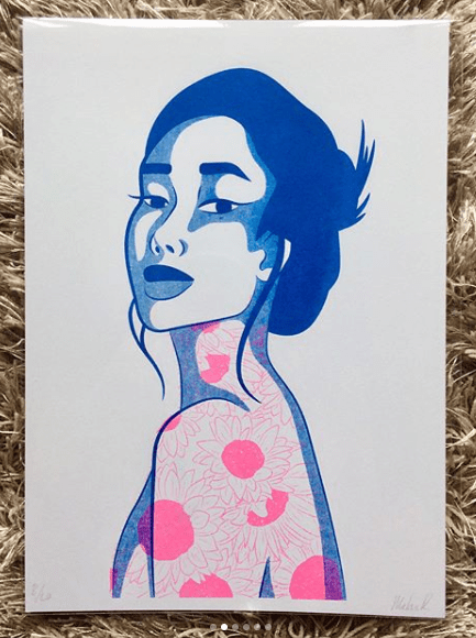
She recently came round and was talking with my mam about the shop, in which I inquired about the possibility of selling my work in her store. If this was anyone else, I probably would not have been as forward or as confident to even ask, but I showed her some of the prints I still had left from last years exhibition, and she said that she would take two and see how they would sell.
I then showed her some of my other work, and she has chosen a few other pieces that she would like me to print off, again she only asked for 2 of each, to see how they would sell, and she would let me know how it goes. The prints in which she wants are as shown below, and do give me a better understanding of what she would like to sell in her shop, and gives me a better idea of what else I could create for her if the prints do well and if she wants new designs. As you can see, she likes the colour green!
I’m so excited about this opportunity and do hope that the prints she has with her now do sell. If so, this will be my first experience with selling work outside of the college, and will potentially be the first steps in which I take to forming my own business and selling my own work. Aghhhh I’m excited about the future, I just need to print out the other illustrations she wants, and get them to her. I will keep you informed of how this venture goes.
Figure 1 – John Tenniel, Alice’s Adventures in Wonderland, 1865
This is an artist from the Golden Age of Illustration, who I would like to take inspiration from during my Lion, the Witch and the Wardrobe project. He had created the original illustrations for ‘Alice’s Adventures in Wonderland’ by Lewis Carroll.
From the illustrations specifically from this book, Tenniel’s style is semi-realistic but with the theme of the book, he has played around with surrealism, illustrating things that you would not exactly see in the real world, and exaggerating some of the characters proportions, as seen in figure 1.
I believe these illustrations were hand-drawn with pen and ink, but I believe when it came to mass production, the design was etched into a plate, so the illustration could be printed multiple times for hundreds of books.
Because of this factor, during my Lion, the Witch and the Wardrobe project, I want to experiment with different mediums, working traditionally with pen and ink, but also playing around with different printing techniques, such as screen printing, linocut printing, etching, and even creating a plate with the laser cutter that is available within the college.
Primarily, I do want to work in black and white for this project, however, I do plan to also play around with foils, possibly adding hints of gold or silver to the designs, potentially giving my pieces a more regal appearance that I believe will fit the theme of the story.
As the competitions are not yet known and I do not know what I will be creating, I want to keep an open mind of where I can go with these projects in sense of style and techniques I could use. I have however been enjoying the work of Ana Godis over the holidays, so would potentially like to use her work as inspiration for a project over the coming year.
I would explain her work as experimental in a way, although I believe she always works digitally, I’d say her style can differ from piece to piece, as for one, she could be creating a beautiful digital portrait which is very realistic, but in another piece, she could be working very stylised, almost ‘cartoony’? But in another piece, she could be combining the two styles, which probably sounds confusing, but she is able to execute the style so well!
Over the holiday, as she does post process videos along with her pieces,I have tried to learn from these videos, trying to follow her steps, as to improve my own technique, and I had created two digital paintings. I could still do with some further practice, however, I do feel the process had given me smoother results, in comparison to the digital painting I had done the year previously.
My own work – Fan art of Mathilda from Leon: The Professional
My own work – Fan art of Jack Torrance from The Shining
I feel as her style is so flexible, if I were to take inspiration from her work, I would be able to apply it to any project, including the competitions. Her work is illustrative but quite contemporary in style, so if I were to learn more from her techniques, I could potentially apply them to book illustrations or editorial themes or possibly even use them for advertising.
Ana Godis does have a Patreon in which I believe she does go into more depth with her process, the tools she uses etc. I personally am not subscribed as I do not use Patreon (as I feel it would be a black hole for me, following too many artists and probably spending all of my student loan within it, which is not something I am committed to doing as of yet) But, if you are interested in her work and do wish to learn more in-depth about her process and tools, here is her link: www.patreon.com/ana_godis
Like Ana Godis, I will potentially be taking inspiration from Rafael Mayani during my commercial projects.
In comparison to the previous artist, I believe his work is more contemporary, possibly more editorial-based, so I believe he would be most useful within the Association of Illustrators – World Illustration Awards competition, especially if I decide to work in the editorial category.
His style is minimal, easily readable and overall it is easy on the eyes. I believe I would most likely see his work in commercial settings, such as in magazines, in advertising, on posters, etc. In figure 3 specifically, he had created an illustration for a magazine, which was honouring the people who helped clean up and take care of others after the earthquake in Mexico in 2017. I believe by not giving his characters faces, it is not singling out any particular person who had helped but instead is celebrating the community as a whole, and the reader could potentially fill in the spaces themselves, imagining the people they know, if that makes sense?
When taking inspiration from his work, it will be with the minimal almost papercut style, as I do believe it is very readable, and it does attract the eye, which I do feel is an important factor if I were to create a piece that would advertise a specific article.
List of Illustrations
Figure 1 – Tenniel, J. (1865) Alice’s Adventures in Wonderland [Online] Available at: https://medium.com/alice-s-adventures-in-wonderland/sir-john-tenniel-s-classic-illustrations-of-alice-in-wonderland-2c3bbdca3a77 [Accessed on 24 Sep. 2018]
Figure 2 – Godis, A (04 Sep. 2018) [Online] Available from: https://www.instagram.com/p/BnTw8cOnCra/ [Accessed on 24 Sep. 2018]
Figure 3 – Mayani, R (13 Nov. 2018) [Online] Available from: https://www.instagram.com/p/BbceF5PFQLR/?taken-by=rmayani [Accessed on 24 Sep. 2018]
She is an illustrator who I would like to potentially take inspiration from when creating work for my ‘Wizard of Oz themed project. As her work is very textural in style, (as I believe she uses pencil for tonal work, then scans the design in and colours it digitally) I felt if I were to create work in a similar method, I would be able to create work that may appeal more to a younger audience, as they could potentially recognise the textures as mediums they use too.
Figure 1 – Tina Nass, 2017
Another reason that I had chosen this artist, is again, because of the methods and techniques she uses. As I have been playing around with traditional and digital skills in my own illustrations over the holidays, and I have been enjoying the process of doing so, but have felt that my designs have been on the more ‘sketchy’ side, not being up to my usual standard of quality (even though I do love the outcomes), I wanted to take inspiration and learn from Tina Nass’s particular process, to potentially help in creating more refined designs whilst using these techniques.
Like Tina Nass, I believe Nuria Tamarit works in a similar process, creating all of her linework and textural qualities by hand, then colouring the designs digitally. I will be using her work as well as Nass’s for inspiration during my ‘Wizard of Oz’ project, however, I will be taking more inspiration from her characters rather than her textures or methods.
Figure 2 – Nuria Tamarit, 2017
Her characters will typically have a cartoon aesthetic, with exaggerated anatomy, especially in the limbs. From looking at some of her pieces, I would say that she creates a lot of Amazonian type of figures, as they are lengthier in the leg, and thicker proportioned.
When taking inspiration from her work, I will be playing around with my own characters proportions and anatomy, seeing which areas that I can potentially exaggerate as to possibly give the characters more personality, for instance, when creating the cowardly lion, I could give him more of a barreled chest, as he is supposed to be a fighter, and I feel this element would help to suggest that quality.
Audra Auclair is one of my favourite artists, I have mentioned her countless of times in previous projects throughout this course, the art and design course beforehand, and I may have even mentioned her within my secondary school projects. I am in love with her work and proudly own 3 of her prints and the book ‘fragments’ that she had made.
Figure 3 – Audra Auclair, 2017
My reason for mentioning her yet again within this course is because I wanted to take inspiration from her inked illustrations, (especially from figure 3 to the left) for my own inktober designs. As I will be creating flower people/pixie type characters, I would like them to be quite delicate and soft in style, so I will try to take inspiration from this specific piece of work, creating my own characters with similar line weights, as I feel the use of fine liners within this piece, has possibly made it even more delicate, as it is less heavy than a brush-tip pen, which she has also used in the past.
Bibliography
A. Auclair. (2018) Instagram [Online] Available at: https://www.instagram.com/audraauclair/ [Accessed on 24 Sep. 2018]
Carrying on from the previous post, for the projects during semester two, I want to…
Produce chapter illustrations for ‘The Lion, the Witch and the Wardrobe’.
In this project, like with the Wizard of Oz project I have planned, I want to create work for a younger based audience, which I have not had a lot of experience working within the past. With this project, however, I want to create work for teens as opposed to children, working in what I believe to be more of a mature style, taking inspiration from John Tenniel’s illustrations in the original ‘Alice’s Adventures in Wonderland’ by Lewis Carroll.
As well as giving me more experience of working with a younger audience, (in a different approach to the Wizard of Oz project) I believe this project will allow me to play around and develop my skills with some printing techniques, such as screen printing, Linocut printing, etching, etc, I believe it will allow me to take full advantage of the facilities available to me within the college, such as the laser cutter, to create a plate in which I can print with.
In comparison to the other competitions I want to take part in, this one has multiple categories in which you can apply to. As well as children’s illustration, you also have the option of creating work for an editorial category, advertising, design, etc.
Like with the other projects, I believe the outcomes I create for this brief will help in expanding my portfolio of work throughout the year. At this moment in time, I am swaying more to the editorial category, as I feel it will allow me to work in more areas of the industry. For this category, I would potentially create an illustration for an article, trying to entice the viewer to read the article, but not give too much information so that the reader already feels like they know the story.
This is a competition that I will be taking part in for my third year in a row. The brief that they announce will have a specific theme in which I will have to work with, creating a narrative based illustration which will relate to or have been inspired by the specific theme.
In previous years, the themes have been ‘tales through others eyes’ and ‘tangled tales’. I believe the competition is pretty open in the sense that you are not limited to what you can potentially create. For instance, last year I had created my illustration using photography and embroidery, whereas in the year before I had created a surrealistic digital painting and a looped animation.
Because of the flexibility of this competition, being able to explore the theme and work in any possible medium, I am excited to take part again next year, but hopefully next time my work might actually be chosen. If not though, I will still enjoy the experience, and the work I create will still contribute to my portfolio.
The two projects which I want to do over the course of the year are…
Concentrating on branding and start to form a business, preparing for my career once I have left the comforts of college.
This project would include creating new business cards, forming a new set of portfolios, including a handheld a3 one, a website and a new portfolio book, these will also include all of the work that I have created over the year as well.
As of my potential business, I will be creating an online store (potentially in collaboration with one of the graphics students) and for this, I will be creating content that would be sold their, ie prints, pins, clothing, mugs, zines, stickers etc.
In the final month, I also plan to set time aside so that I can get ready for a final show, with this, I will possibly create new content to be put up in the exhibition, and this will also be the time in which I can start to order everything, so that it will come in time for the final show, such as the portfolio book, business cards, and any merchandise that I may have created with outside businesses.
And finally, I want to work on the weekly comics that both me and my partner had created together over the holidays, we named this collaboration Melon and Lime Comics.
Me and my partner have always been interested in mini-comics, most commonly from artists such as Ketnipz, Sarah Andersen and Catana Comics, sending their comics to each other saying ‘this is you’ or ‘me’, and we had even started to come up with our own ideas for potential comics, that we knew we would make someday, but had always kept pushing it off to the side, at least until summer had came. We had not really planned for this collaboration to go further than between the two of us, but one day, we decided to make our own Instagram and try posting the comics on there, to see if anyone else could possibly relate or find humour within our designs.
We have currently got a small following of 40ish people, however, I believe as we post more, our audience will eventually start to grow more. The problem is, as we are back at college, it is going to be more challenging to create content, as we are both going to struggle with time. So, this is why I wanted to incorporate this project into my year, so that I could allow myself the time to work on the comics, without feeling guilty because I am not going ‘college work’.
I do have high hopes for this collaboration as I feel we do have the potential to someday be at the level of the artists we admire, such as Ketnipz, Sarah Anderson and Catana Comics, but I feel it will only do well if we are to put the work and effort into it. I do love working on these comics because they are personal to my relationship, but I believe the themes are open enough that a lot of other people or couples can also relate to them. This collaboration has also allowed me to expand my work, exploring outside of my comfort zones, such as working with characters, minimalism, creating narratives and I have also been able to incorporate humour into the designs, which is something that I don’t believe I have ever done in my work before, or have even attempted to do before. Because of these developments within my own type of work, I am excited to continue working on these comics, seeing where else they could take me and what else we could potentially create in the future.
As these two last projects will be worked on over the space of the whole year, (I believe on Fridays for the branding project and Tuesdays for the comics) I will be solely keeping the progression, development and any potential research used, all updated within my blog, so you can keep your eyes peeled for those updates in the future.
Bibliography
The Association of Illustrators. (2018). World Illustration Awards. [Online] Available from https://theaoi.com/world-illustration-awards/ [Accessed on 20 Sep. 2018]
Cheltenham Illustration Awards. (2018). Cheltenham Illustration Awards. [Online] Available from: http://www.cheltenham-illustration-awards.com/ [ Accessed on 20 Sep. 2018]
For my final year of college, we have been given free reign to choose what projects and live briefs we want to participate in over the next year. I have decided to do four projects per semester, the commercial projects being shorter and the personal projects being longer. This will allow me to work to an industry type of deadline during the commercial projects, but create more developed/refined pieces for myself and portfolio within the personal projects. I also want to have two more projects that will run throughout the year, which I will be working on at least one day per week.
For the month of October, I will be creating an inked illustration on a daily bases, posting them on Instagram and hopefully end the month with 31 illustrations, if I do not falter or give up beforehand. These illustrations will all later be compiled into a zine/book, to later be sold on an online store.
I want to take part in this challenge so that I can develop my skills and gain more confidence with ink mediums, especially with my line control. I feel if I were to gain more confidence with this medium, I will be able to use it more in future projects, hopefully making my digital designs look less static, more organic and more unique to myself.
Create children’s illustrations for the book ‘The Wonderful Wizard of Oz’.
I chose this story to illustrate as it is a children’s book (which I believe is more commonly known as a movie) and I have wanted to create more work for a younger audience, as I have not done this a lot in previous projects, so feel it will help me expand my portfolio.
With the stories themes, characters and it specific colour palette, i.e. the ruby red slippers, the yellow brick road and emerald city, I believe with these elements, I will be able to create a set of illustrations unlike any of my previous work, filled with fun characters, vibrant colours and most importantly to me, the pieces will have a narrative, with characters interacting with one another and interacting with the scenery around them. I know I have not created any narrative pieces within my portfolio of work so this project will help in filling that area in which my portfolio is lacking.
This is a competition in which I will design a book cover for either a children’s book, an adults fiction, or an adults non-fiction book. As of this moment in time, the stories for each category have not been announced yet. However, once they are, I believe I will most likely be working with one of the adult books. This is so that my work for this project won’t clash with any other work I may create during this year, for instance, I already have in mind two child based projects that I want to take part in, so I feel if I were to choose the children’s book category for this project, the designs would potentially clash with one another. So, by choosing an adult book, I will be covering more audiences, hopefully helping expand my portfolio more.
Again this is another competition in which I will be designing a book cover, however, I will also be designing illustrations that will be submitted alongside it. In comparison to the previous competition mentioned, from looking at previous years entries, this competition seems more sophisticated in style, so I believe when I create my own designs, I would be working to a higher standard, possibly catering to a higher class of book lovers. Again, I believe this competition will allow me to expand my portfolio, creating work for a different audience and possibly working in new styles, but this will be determined once the specific story has been released.
Bibliography
House of Illustration. (2018). BIC 2018: Winners Gallery. [Online] Available at: https://www.houseofillustration.org.uk/get_involved/bic-2018-winners-gallery [Accessed on 20 Sep. 2018]
This year, it being my last in college, I want to make the most of it to improve my work. I will do this by trying new mediums and techniques, more so in the realm of traditional work as in the previous years I have mostly worked digitally. I also want to explore more areas of illustration, especially in the areas which my portfolio may be lacking, so I want to create more narrative based work, i.e book illustrations or covers, and I would like to create more editorial-based pieces, illustrations based on articles, current topics I feel strongly about, etc. Although I do enjoy creating pretty pieces with next to no context behind them, I do want to start creating more work that does contain stronger messages or can depict a story through them. I don’t feel I have done this a lot in my previous work, so would like to try to do so in my final year.
Strengths and Weaknesses:
I feel my current strengths are in digital work, but I have started trying to incorporate more traditional mediums, mostly within the linework. At the end of last year, I was using a Tombow calligraphy pen for my linework then colouring the pieces digitally, and during summer I wanted to be more experimental and had digitally coloured more sketch-based characters, either created with a pencil or a ball-point pen.
T. Hanuka, Spring Awakening (2017)
Another strength I believe is my colour palettes. I feel I have a good idea of colour theory, so I don’t tend to struggle when choosing a colour palette, but if I do, when working digitally I just have a play around with hue and saturation option in photoshop, until I reach a tone that I feel fits well with the others and allow the piece to be visually appealing to the eye. My palettes are usually inspired by the themes and/or content of the pieces I create, but I do also find inspiration from other artists, for instance, Tomer Hanuka has influenced a lot of my previous work as I love his work with colour. In his work, he uses quite a monochromatic palette, but then uses a complementary colour which helps offset the piece, and is very attractive to the eye. I have found a lot of inspiration from his work in the past and I feel I have learnt while doing so, so I have been able to form my own palettes from the knowledge of his, knowing which colours work well, what themes they may suggest, what other colours can I add to make the piece more intriguing or which I can add to make my work more easy on the eyes.
I believe my most common weakness is with traditional mediums. Before starting the course I did work more traditionally, using fine liners, markers, paints, pencils etc, but I feel as I have learnt more digital skills and my work has become more refined and of a higher standard over the years, I have lost more confidence with these mediums as the marks they make are a lot more set in stone than working digitally is, for instance, if you make a mistake digitally, you can just edit and undo it, but if you make a mistake with a traditional medium it is a lot harder to erase (unless you’re working with pencil).
I also had less confidence with traditional mediums when it came to linework as I felt my hand/line control would be a lot more wobbly than I intended, not creating as smooth of a line as I could in a program like Illustrator. I have however been trying to improve on my confidence with these issues, for instance in my last few projects last year, I had created the linework by hand, and although some of my lines were more wobbly than I would have liked, I would enjoy the overall piece as I felt they would be less static than my linework from illustrator was. Since not every line was smooth and perfect, I feel it added a more personal touch to my work and I would like to carry on creating my linework by hand, possibly using more mediums than fine liners or my Tombow pen in the future.
Like I had mentioned, I did try experimenting with sketch-based work in the holidays, so ideally I would like to try find a way to use these mediums and techniques but in a more refined way, so that my work would be of an industry standard and quality and would not look as ‘sketchy’.
Professional Development Plan:
As this first module is based around development, I would like to use it as a way to experiment and expand my knowledge. Ideally, I would like to take part in inktober, creating an inked illustration per day every day for the month of October, I believe it would help in improving my confidence with a traditional medium, specifically with my line control, but as I rarely work with ink, it would allow me to experiment with it, learning what marks I can make, if I can create gradients, etc, I’d be gaining more knowledge of the medium from my experience with it and potentially taking that information further into my future work.
Staying along the lines of traditional methods, I would also like to experiment more with printing methods, for instance, screenprinting, etching, linocut printing, printing with a laser cut plate, etc. With this, I would be gaining more knowledge in the form of output, how I could potentially create prints in the future, rather than just using a normal printer. I could potentially still work digitally with some of these methods, but if I were to output my illustrations through an alternative method to a normal printer, for instance using screenprint, it would add more of a personal touch to a possible product, being that I would have created it myself by hand and would have put more thought into how the design would work when printed, i.e with colours, specific layers, how they would be arranged and so on. In the past, I have not had great experiences with screenprinting, however, I know it is a common method used by other artists to create their own products i.e. prints, t-shirts, tote bags etc. so I do want to give it another try, to see if I just had a bad experience the first time, whether it was the design I was using, the method, if I was doing something wrong or whether screenprinting is just not for me?
As I mentioned before, I do want to create more narrative-based work, whether this is book illustrations, covers, or pieces with more backstory. Over the holidays we were asked to think about personal projects we’d like to do and I thought of making illustrations for the Wonderful Wizard of Oz and the Lion, the Witch and the Wardrobe. Both of these stories already have well-known imagery behind them, but I feel the imagery has mostly come from the movies as opposed to the books, so I want to read both of these books, see for myself if there are any differences from book to film, as is very common with movie adaptations, but I want to illustrate as true to the book’s descriptions as possible so that I may potentially give a fresh perspective to the stories, renewing them in my own style.
Looking into competitions for the more commercial side of this module, the ones coming soonest and the ones I feel most interested in are the more narrative-based ones. I have been looking into the Penguin Student Design Awards and House of Illustration – Book Illustration Competition. In both, I would be designing book covers, but for the House of Illustration one, I would also be creating a set of illustrations of the book they choose. In the Penguin Competition, you do get a choice in categories of stories, either adult’s fiction, adults non-fiction and children’s books.
So if I were to participate in both of these competitions, as well as my ideas for personal projects, I would be creating a lot of narrative-based work, but I would have to consider which routes to take, as I would not want my projects to clash or potentially come across as too similar, I do want to create a range of work for a range of different clients and audiences throughout this year.
As I assume my work is going to be based around existing stories, I believe my research will mostly be coming directly from the books, using quotes, finding characters, backgrounds and element descriptions straight from the sources so that I can create illustrations as accurate to the original stories as possible. I feel by not working from the imagery I already know that it will set me apart from other illustrations that may exist, especially if it is in context of a competition as other artists may rely too much on the imagery that is already known as opposed to reading the book themselves, especially if there is a time constraint.
As of other research, I mostly find style, artists or concept inspiration from social media, scrolling through the many artists I follow on Instagram or finding work/images on Pinterest, normally suggested to me by images I may have already pinned, or from a direct search of a theme. It may be due to being a Gen-Z…
(TANGENT – I like term post-millennial better for myself as although I missed the millennial status by 2 years, I do feel closer to those than the extremes of Gen-Z. I did probably grow up with more access to technology than the previous generation, but I believe I still had a ‘normal’ childhood without needing to have a phone in my hand, actually playing outside with my friends on a day to day basis. I hate when I see toddler nowadays with a tablet in their hands. I’m hoping that when my generation becomes parents, they will recognise this as a problem and will try to raise their children as they were. This in no way was supposed to be read as a hate to Gen-Z, I actually watched a video comparing millennials against Gen-Z’s and they did come out the more positive minded generation, I just don’t like the thought of being judged for having resources available to me now that older generations have not, but having that supposedly affect me in a negative way. All generations will have had factors that could have affected them, whether it has been war, politics, economy, but no one would want it to be held against them and told: “your generation is like … because of …” but the news especially loves to blame millennials and probably Gen-Z next for any changes going on, but they say it in such a negative light. I could make a whole seprate blog post about my views on this topic, but would you want to read that? Feel free to leave a comment if so! BACK TO THE TOPIC)
…but I love finding inspiration online, when I find new artwork on Pinterest, I love seeing the suggested images afterwards then falling down a rabbit hole of going from one piece to the next and to the next, by doing this I have formed a lot of ‘boards’ two of which I add to and use for inspiration the most you can go check them out here, one is of people, of all different ages, genders, nationalities and so on, and the other is of illustrations, these are pieces that I will have found over the past few years, which I enjoy for some reason or another, but I feel I can come back to at some point to use as inspiration. It’s actually funny when I don’t know what to create and I haven’t looked at the board for a while, as I do forget what is in there and I always refind something that I saved once upon a time which inspires a new concept, colour palette or style I want to use, and it does encourage me to create new work.
Anticipated Challenges:
Time management will always be a hidden challenge, especially with this year if I am estimating the dates of the competitions (when they start and their deadlines). As a module, I do need to plan out my semesters setting out my projects over the given timeframe so I will do my best to stick to the timetables I give myself. As to hopefully not have any issues with time, I do want to keep a planner with me at all times, keeping track of what I’m doing, what I still need to do, when does that task need to be achieved by and so on. I feel this will keep me more organised, keeping me on track of what needs to be done and when, and hopefully the organisation will encourage more workflow. In the past when I have not kept myself organised, I have battled with motivation, lost myself to procrastination and so on, but this year, my final one, I do want the best results for myself and I know I need to put in all the time, effort and motivation get myself those results. So I am determined to keep myself on track, and if I can achieve my goals with the least amount of stress, then that will be perfect.
If I am to work with multiple printing methods, another challenge could possibly be trying to book space within the printing room or the workshop. Since I am within a college with lots of other course and lots of other students, there may be times in which the print room or workshop will be full or the queue for the laser cutter will be too long, so to combat these potential problems, I will try to book a time in the print room if needed earlier on rather than later, as well as creating a plate on the laser cutter sooner rather than later. This will just ensure that I do not run out of time, I do not clash with any other classes and will have my prints created in time for the deadline.
List of Illustrations
Hanuka, T. (2017) Spring Awakening, The New Yorker. [Online] Available from: http://thanuka.com/#/spring/[Accessed on 17 Sep. 2018]
All other pieces are my own unless stated otherwise.
The Infographics Show. (2019). Millennials vs Generation Z – How Do They Compare & What’s the Difference?. YouTube. [online] Available at: https://www.youtube.com/watch?v=aqdm6aBUZII [Accessed 27 Apr. 2019].
Hello there! Welcome to my new blog, my name is Melissa Russell, also known as Mel and Melon.R on Instagram! I am currently studying in my third and final year of Illustration, looking forward to graduating with an Honours degree next year.
I chose to do this course as I already enjoyed creating illustrations but wanted to develop my knowledge of the industry, learning how I could transform my hobby into a career, and I also wanted to learn new skills and refine my work/style to a professional standard.
In terms of career, my goal is to become a freelance illustrator, working with multiple clients, but also running my own shop, in which I can sell products such as prints, tote bags, clothing, and so on.
I believe my inspiration can come from a lot of things, such as movies, books, pop-culture, mythology, colours, etc. Recently, I have fallen in love with Wes Andersen movies, the colour schemes mixed with the composition of the characters, props and scenery, have been set out so beautifully, that the films are art in their own right. Another useful source for inspiration that I commonly use during projects, would be Pinterest. As well as finding new artists, styles and stories, I also find photos of people, which have often influenced my characters. I have created a board of ‘Model inspirations’ in which I save photos of beautiful and unique looking people, which I often look through at a later dates, and have helped give me inspiration for a lot of projects in the past, whether it be story-wise, with colour schemes or helped me form overall characters.
In previous years I have mostly worked digitally, however, I have wanted to slowly get back into working with traditional mediums. So in my current process, I have started taking traditional elements, such as linework and painted textures, into photoshop where I will then colour the illustrations digitally. This to me is the perfect balance of traditional mediums and digital techniques, I am happy with the process at this moment in time but would enjoy exploring more ways in which I could further improve the method more.
My personal goals for this year is to not let stress get the better of me and to keep on track with my project work. Over the holidays, I discovered a good stress reliever for me, has been when I went to the gym for 1-2 hours three times per week. It helped me get out of the house, away from stresses at home, and out of my own head, at least for a couple of hours. Once I have gotten back into the routine and schedule of college, I do want to start going back to the gym, maybe on Tuesday and Wednesday mornings, and possibly Thursdays after my lessons. Other than improvements in my basic health, I feel it will also help improve on my mental health as well, as I just feel it would give me a good break during the week, it gives me time to stop overthinking about work, almost resetting my mindset, then I’d feel re-energised to get back on with the projects as soon as I got home.
My more career-based goals/overall goals for this year is to become more of a well-rounded illustrator, covering more areas of the illustration industry, creating work that I might have hidden from in the past, and also getting the bases of my shop/website created, so that when I do leave college, I will hopefully have a career doing what I love, whether as a freelance illustrator, self-employed and selling my work online, or a good mixture of both.
I will be posting at least once per week on this blog, if not more, however, if you want to find me on other social media platforms, you can find me at: