I’m a Youtuber?

Recently, since getting a new laptop and having a better download speed and stuff, I had been thinking more and more about streaming, possibly creating a twitch channel, as I would ideally like to have a chill channel where people could come along, listen to music with me and watch me working on projects, occasionally answering any questions if anyone had any. I know I personally love watching other artists processes so I thought it would be fun if I could stream or record my own, and potentially have my own audience who enjoys watching my process.

After discussing Twitch with my boyfriend, who has his own channel so has a better understanding of all the elements and components I’d need before starting, he told me that I would need to think about alert messages, banners, layout designs etc, that I could redesign to make my channel look more professional. Although I could do this, and still plan to, when he had explained youtube in comparison, it had sounded a whole lot easier, as all I would need to do is create a banner for my channel and an outro screen for my videos. So, with this, I had created both, and I started recording my process whilst working on a few projects. I had ended up using a program called Streamlabs as it would allow me to stream when I eventually get round to designing all of the components, but it also allowed me to just take screen recording whilst I was working on my illustrations.

The video above was my first and it is a speed painting of my monkey illustration for the AOI’s Northern Illustration Awards. In these videos, I do feel a sense of vulnerability as you are able to see mistakes that I make, but with that, you are also able to see how I work around and correct those errors. In a sense I feel by showing my process it would help the audience connect with me on more of a personal level, as they’re not just seeing a finalised product that I would usually post on my Instagram, they are seeing the full journey of the specific illustration, showing my thought process from sketch to the final outcome and the choices, mistakes and fixes I make throughout.

The next two videos are speed paints whilst working on my Wizard of Oz project. These are just two of the five videos that I have planned to create as I am generally recording, then forming the videos together as I go. I plan to have each of these videos in a playlist together, so once I have published them all, someone would just be able to go to my playlists and watch me work on this series of illustrations all in order, one after another.

I currently do not talk in these videos as I don’t really enjoy the sound of my own voice and I would probably end up babbling or something, making the video longer than it needed to be, so I don’t really have the confidence to talk within my videos yet. I believe it would be different if I were streaming as it would be more of a back and forth conversation with the audience as opposed to having to plan out what I’m going to say within the video first. I do plan to try talking more in future videos as it may help keep an audience interested and watching onwards, as just playing music might feel a little cold in a sense, or just boring in general. But as I do hope to grow with this channel, and in future with online streaming, I will be learning as I do so, hopefully growing with my own confidence in myself and my art, whilst my new audience hopefully grows too.

As of music, me and my partner both find royalty free music online, ones which I feel best fit the specific themes and tones of the illustrations, and he helps me add them into my videos. With both the video and the music compiled together, my laptop was not able to handle it within the specific program I was using, so Liam had offered to add the music using his computer and we would send the files back and forth. As he has helped me so much in creating my channel and videos, neither of which would be possible without him, I always try to credit him in the outro’s and recommend that my viewers should have a look at his channel. It is the least I could do for him in return.

In the process of making my channel and posting my videos, I had found and read a blog post which suggested: “25 Tips for a Successful Youtube Art Channel” (very much ‘nail on the head’ in terms of tips I was looking for). A lot of the points made I felt I had already known either because they were a bit obvious to me, maybe from all of my years using other social media platforms and learning how they work, but I may have also known about some of the points from watching other YouTubers and listening to their views about youtube and its algorithms. There were however a few points that I did/will try to learn from, for instance, using SEO techniques and putting more thought into my titles as I would want my videos to be found within peoples searches. Another tip was to make use of the playlists, which I am trying to do right now with my Wizard of Oz illustrations, as once they are all completed, people will be able to find them all together in one convenient playlist and will be able to binge-watch one after the other if they really wanted to.


Bibliography

Chie, T. (2016). 25 Tips For a Successful YouTube Art Channel. [Blog] Parka Blogs. Available at: https://www.parkablogs.com/content/25-tips-successful-youtube-art-channel [Accessed 4 Apr. 2019].

Russell, M. (2019). Monkey Illustration. Available at: https://www.youtube.com/watch?v=G4Ib2r6xXyU&t=50s [Accessed 20 Apr. 2019].

Russell, M. (2019). Dorothy’s Room – The Wizard of Oz Illustration Series. Available at: https://www.youtube.com/watch?v=iN5KEVSCA_o&t=22s [Accessed 20 Apr. 2019].

Russell, M. (2019). The Deadly Poppy Field – The Wizard of Oz Illustration Series. Available at: https://www.youtube.com/watch?v=OiRIKs9f_24 [Accessed 20 Apr. 2019].
We need to talk..

Ok, so since the end of Semester one I feel I have been slacking on my blog and not posting as regularly as I had. I believe this is because after the last hand in, I was so stressed that I felt I needed a bit of a break, one that I didn’t necessarily have the time for but kind of took anyway.

In the first couple of weeks I did create two pieces of work, one which was a commission (I believe I mentioned that I would be working on this in a previous blog post, ‘Evolution of the Cat’ click here to read) then the second piece I had worked on was for a ‘draw this in your style’ challenge on Instagram which you can also read about by clicking here. So technically I had been working, but not on the projects that I was supposed to be concentrating on, such as the live briefs and personal projects I had planned, like illustrating The Wonderful Wizard of Oz, focusing on branding (creating a website, portfolio, promo packs, merch and products, etc).brow2

At the start of the year I was also given the chance to have my work in a local exhibition ran by ‘A Canny Collective‘ which I felt was a great opportunity as I gained a lot of experience from both creating illustrations and setting them up for the show, then on the opening night I was working on the shop, so I also gained the experience of selling work in a more personal setting, selling one to one with the buyer as opposed to over a website. If you would like to read more about this exhibition, what I created and how the night went, I have made a blog post about it so again, please click here if you want to know more.

SO, now with the work that I’m actually supposed to be working on. I have currently been creating illustrations for the Wizard of Oz but throughout I have been struggling with the styles and techniques that I’ve wanted to use. I did initially create 5 basic sketches which at the time I did see some flaws, but with the pressure of time, I got lazy and just ignored them and thought I was ready for the next stages and that maybe the flaws would get better once I coloured the pieces and added more textures. After a well-needed discussion with my tutor, he knocked some sense into me and I knew that I had to stop being lazy and make the changes that I was choosing to ignore.

From this discussion, I started taking photos of me and my boyfriend to use as reference for the characters and I started using more images of animals and floral elements where needed. It’s fair to say that my sketchbook became a lot fuller as I was sketching different poses, angles and options for each illustration (I think this will be the first sketchbook in a while that I’m actually proud of, as I more recently I have just been going straight into digital work as opposed to sketching traditionally first). Once I was happy with the sketches, I started to create new layouts for each of the illustrations, keeping in mind my talk with David and how I should think about the narrative of the piece when trying to compose specific characters or elements.

After the thumbnail layouts were down, I started sketching the pieces digitally once again and the reference photos I had taken did come in very handy during this process. I then printed the pieces off, showed them to David, mostly for reassurance before I took them any further, he did make some suggestions, for instance with the Tin Woodsman piece, he suggested that I reframe it so that it would be more of a closeup shot, which I do feel helped convey more action between the characters as the previous layout did seem quite open now looking back, which may have looked more calm than what I was intending.

Once I made the adjustments suggested I went to the light box and started transferring the sketch to paper and once lined I’d add in the textures. For this process I used pencil, I started with a 4H for both the lining and the textures, then when I needed darker areas I used a 5B. After testing multiple pencils in my sketchbook, I mostly liked the H’s as they gave more of the texture I wanted, whereas the B’s were more soft so they gave more of a smooth texture.

After I had completed the traditional part of this project, for now, we shall see if I need to go back and do anything else, I scanned in each illustration, set it within the document size that I wanted and now they are ready to colour.

This is the point I’m currently at, but during the colouring phase, I do want to record the process as I feel it may be satisfying to watch and I do want to start posting speed painting videos online, potentially streaming the process online as well through twitch.

The main elements of my to-do list at this moment in time is to:

  • Complete my Wizard of Oz illustrations
  • Start working on AOI’s Northern Illustration competition (more on that coming soon in a separate blog post)
  • Create an illustration or sequential piece for Cheltenham illustration awards (I will go into more depth and make a blog post about this too)
  • Focus on self-branding, this leads on to the next point which is..
  • Creating a portfolio book. I still have the pages from the one I made last year, so in the new one I will just be adding my more recent work, but I definitely want to change my old cover, hence how this links to the previous point as I need to focus on what my brand is and how best to communicate that through a cover.
  • Creating a website. I hope that I will be able to show my portfolio and have a working shop on the site.
  • Making work for the final show. I don’t necessarily know what I want to create for this yet or if I’m just going to use work from one of my current projects, but once I get a better idea of the space, how/if we’re framing our work, I may have more inspiration as to what I can create.
  • The last on this list is merchandise. For the final show, I did want to make new products that I could potentially sell on the night, whether this is new prints, T-shirt’s, enamel pins, badges etc. The reason this is last however is that I feel it should be my last priority as the work above has more consequences if I don’t manage to complete them.


Bibliography

A Canny Collective. (2019) [Online] Available from: https://www.instagram.com/p/Bt19GO7lEG5/ [Accessed on 03 April. 2019]

All other work is my own unless stated otherwise.

Little Journey Home

On my little journey home from college, when the bus goes across the high-level bridge, I have recently noticed some artwork on the side of a building that now always catches my eye.

business cards woman

The piece is of a woman wearing a fabric formed of multiple patterns and she has a blue circle behind her head which helps attract your eyes to her face. I believe what initially attracted me to this art is that it had reminded me of my own work, a piece I had created for the window in my classes studio last year, of a woman with a floral pattern of tattoos running up her body. (This piece is also currently being used on my business cards too).

When seeing this artwork by ‘Hushartist’ on my way home, just sitting on the bus, it made me think of the potential I could have with my own work, possibly working on a larger scale and one day, another person may find it, do some research into who created it then they would find me.

I like this piece so much as yes it is a style I relate to, I love soft illustrations of women combined with bold patterns, especially in this piece how the artist has made the woman black and white with the pop of colour surrounding her, not drowning her out but helping draw your eyes to her beauty instead. But I also like this piece because I saw it on the side of a building underneath the Tyne bridge, which led me into researching it, finding out which building it was on ‘By the River Brew Co’ which is a brewery and tap, a restaurant and so on which I never even knew existed, and finding the artist and seeing their other work. So with this one piece of art, it did a good job in advertising, both the place and the artist, as it was able to grab my attention from two bridges over on a moving bus.


List of Illustrations

My own work. (2018)

Hushartist. (2018) [online] Available from: https://www.instagram.com/p/BnRNyrhBq4g/ [Accessed on 01 April. 2019]

By The River Co. (2018) [online] Available from: https://www.instagram.com/p/BnHESTnFK66/ [Accessed on 01 April. 2019]

Guest Artist at A Canny Collectives Exhibition

This was an amazing opportunity I was offered, to be a guest artist with a group named ‘A canny Collective’, who are running an exhibition showcasing their work within a gallery space, all pieces of which have the theme of Valentines, as they planned for it to run on the same week, starting on Monday the 11th.

The group themselves had planned everything out, viewed the space, cleared it out, fixed it up a bit, thought about how they were going to advertise it, made posters/flyers and stuck them up and handed them out around town and within the college, made social media pages and posts, and they just planned out everything that you could think of, that they wanted to have done for the opening night and the gallery space in general.

If you want to read more about their process or experience, you can read about it by clicking:

  • here for Katie Marshals experience
  • here for Phil Hughes
  • here for Nicole Nicholsons
  • and here for Adam Rowlinsons

In a couple of weeks running up to the exhibition, the group had gone to see the place and had tried to plan out where their own work would be set up. They had then realised how much open space they would still have, so had decided to recruit guest artists to fill the extra areas. This had meant that me and another artist called Igor Tavares, would showcase our work at the event, Igor actually live painted on the opening night so there was a next level of entertainment in a sense. 

So with the theme of Valentines, I wanted to focus on self-love in the form of body positivity. Although I feel strong in the message of body positivity, everyone having confidence within their own figures, there was an ulterior motive with these designs, as I wanted to use this project as to better my skills with anatomy, but as I had a shorter timeframe to work with, I decided to illustrate in more of a minimal style.

Using reference imagery and following a tutorial/guide from a video by an artist named Chelsea Gracei (which I had discussed in a previous post, click here to read) from my base sketch, I had formed simple lines to suggest the individual bodies, showing the curves or muscle tones of the specific character. These would then contrast well against the white silhouette of the figure, which was composed against a floral pattern in a circular or diamond shape which would best fit the specific figure.

I do like these illustrations as I feel they are strong, very feminine and I believe they are empowering as they celebrate women of all different figures. I enjoyed working on these pieces as they are more minimal than my usual work, and I feel they are strong, focusing solely on each specific body shape. I did not give these figures any facial features, as I wanted the audience to potentially relate themselves to a certain figure, whereas I believe by giving them faces they would have been less interpretable  I was proud that I was able to create these pieces within a short amount of time as this opportunity, to have my work exhibited within a local exhibition, was too good of an offer to pass up and I’m so appreciative of the group for giving me this chance.

In the future, I would like to expand on this mini project, creating even more body types, potentially drawing more men, as people of all genders, ages etc, do struggle with body positivity, so I would like to make my work all-inclusive, representing people of all different body shapes, no matter what gender, age, ethnicity, etc.

The opening night was good, I was happy to be working on the stall, selling my own work as well as the other artists. I am more of an introvert, so I enjoyed taking a backseat with all of the social interaction. It would have been a good chance to network with other people, but I had enjoyed gaining the experience of selling work one to one with the customers, as it is something I would be interested in doing again in the future, setting a stall up within a market, or even selling at a convention. By working on the stall, I was still able to interact with the people at the event, especially when they would ask if I was ‘Mel, the artist behind the figures’ (I believe they got my name from the zine catalogue that the group had made, so I was taken aback at first like ‘waiiit, HOW DO YOU KNOW MY NAME?) so I feel I did still gain some of the networking side of the experience, but maybe in a less forward sense, meaning that I was not making an effort to go out and socialise but my social interactions ended up happening more naturally.

In conclusion, I do feel I gained a lot of experience from taking part in this exhibition, whether it was working to a shorter time frame, working with themes I do feel strongly about and showing a positive light on all body shapes and sizes, printing and helping set up the space or selling one to one on the stall. I loved being a part of this exhibition and I am so grateful to the Canny Collective group for giving me this opportunity.

If you would like to follow the group, I have shown one of their posts below, but if you would like to follow the artists individually, you can click here for Katie Marshall, here for Nicole Nicholson, here for Phil Hughes and here for Adam Rowlinsons. They are amazing illustrators, so I do recommend giving them a look.


Reading List

Hughes, P. (2019). Week 22: Ready to Rumble. [Blog] Vonfrankenstank. Available at: https://philhughesillustrator.wordpress.com/2019/04/19/week-22-ready-to-rumble/ [Accessed 20 Apr. 2019].

Marshall, K. (2019). A Canny Exhibition: How it went. [Blog] Nostic Art. Available at: https://nosticart.wordpress.com/2019/02/20/a-canny-exhibition-how-it-went/ [Accessed 28 Feb. 2019].

Nicholson, N. (2019). The Team Behind A Canny Collective. [Blog] Witchita Art. Available at: https://witchitaarts.wordpress.com/2019/01/24/update-a-canny-collective/ [Accessed 28 Feb. 2019].

Rowlinson, A. (2019). Valentine’s Exhibition – Set Up. [Blog] AHROW Art. Available at: https://ahrowart.wordpress.com/2019/02/04/valentines-exhibition-set-up/ [Accessed 28 Feb. 2019].

I can’t draw.

As a class, we had watched a TED talk by Graham Shaw in which he was talking about peoples perceptions about drawing. In this talk, he discusses how everyone can draw its basically just your own doubts that prevent you from doing so or improving your skills. In the talk, he does give a follow along example explaining his theory in which he gets the audience to draw characters with him, resulting in a lot of people realising they can draw. I am not going to show my results from the experiment as I just feel they’re a mess. They were fine in the beginning but then they just went downhill quick. I believe this was because I don’t work as fluid as Shaw does with his characters, so was more focused on trying to get the lines right and when he was onto the next steps, I had already created a mess. So no, I will not be showing my results, but I definitely think the talk is worth a watch and you may be intrigued to see what you could create, especially if you are one of those people who think you cannot draw.

I feel when people use this quote of “I can’t draw”, which usually follows “omg, you’re so good, I can’t even draw a…” they just assume that it is a natural gift that you must have been born with. This at least was not the case for myself. When I was younger, I don’t believe I was good at drawing but I did enjoy the process so I just kept going. I am quite a perfectionist with my work, and always have been, a trait which I believe I’ve gained from my Mum, thanks, mum! so after making a drawing, I would usually get disheartened when I could see the issues, but this wouldn’t stop me from drawing entirely, I would just try to keep improving.

In my teens, I would regularly use a site called DRAGOART, which I believe is still active to this day, and posts step by step tutorials of how to draw certain characters, icons, images, etc, which are usually inspired by current trends with the media and pop culture. From these tutorials, I would be able to draw the image quite well, but I would focus more on trying to replicate the image as opposed to actually trying to learn from the process. So, once I had noticed this when I would try to draw something that wasn’t from the tutorial,  I did start to try learning from the process, specifically from the beginning steps in which you form the image using shapes. From this day I believe this is still how I work, but over time I have improved my skills by learning the fundamentals of art first, and a lot of practice, more from real life or proper reference photos, as opposed to working from someone else characters/art. In my opinion, as an artist, you should never stop learning or improving or wanting to learn or improve. I feel if you reach the point where you think that you have nothing more to learn or no more areas for improvement, then there would be no purpose for creating work. You would have reached your peak, where else would there be to go from there?

I myself know that I have a lot of areas to improve within my work, and a lot of new techniques and mediums that I want to explore, and although things may not work out, I will be excited to see how my art grows within the next 10 years, or 5 or 1, or even just within a couple of months. Below I have shown two illustrations of mine, the one on the left being one I had made in 2013 when I was 14-15? I remember how proud I was of it at the time, but looking back now, I’m sooooo happy with how much my work, style and aesthetic has grown since, especially when looking at the piece on the right, from late 2018, where I have drawn a more anatomically correct and more aesthetic character of my own, instead of just imitating someone else’s.

In conclusion, from watching the TED talk, I do believe that anyone can draw, they’ve just got to be willing to put the doubts aside and put the time into it for it to look as “good” as someone else’s they may compliment. I can’t think of any artist who was just magically gifted at their craft, at least not with a little practice at first. If I try to think about it in other terms, you don’t just learn maths overnight, you practise and practise over the space of basically 16 years, and once you’ve mastered counting, you then go on to adding, subtracting, timetables, division, then algebra gets thrown in and all sorts of equation stuff. So with this example, an artist is always improving, but it does take that understand and practice in order to do so.

Bibliography

Dragoart.com. (2016) How to Draw, Draw Step by Step.. [online] Available at: https://www.dragoart.com/ [Accessed 6 Feb. 2019].

Garner, C. (2017). Why Should You Study The Fundamentals of Art?. [online] Medium. Available at: https://medium.com/the-art-squirrel/why-should-you-study-the-fundamentals-of-art-1368efcbf446 [Accessed 6 Feb. 2019].

Shaw, G. (2015). Graham Shaw: Why people believe they can’t draw. Available from: https://www.ted.com/talks/graham_shaw_why_people_believe_they_can_t_draw [Accessed 6 Feb. 2019]

All images are my own unless stated otherwise.

Organisation Method

This week, my boyfriend had gone to therapy and had come back with information he felt I could find useful too. In these sessions, they discuss ways in which you could overcome stress, and in this weeks, they were talking about ways in which you could plan out your day/week/month more efficiently, in order to help become more organised, which would hopefully result in less stress. As I had struggled a lot through semester one with my timekeeping and organisation, my boyfriend felt that what he had learnt could be very helpful for me within the second semester.

He had been taught a method which I believe was mentioned in a book called Eat that Frog and is called the ABCDE model. With this, you write out a list of everything you need to do, again, this could be over the space of a day, week, month or even a year, but once you have your list, you then start to categorise each of the tasks according to which is more of a priority.

A is a task of highest priority, one that you need to do or will risk big consequences. If there are multiple tasks which fall into this category, you then label them A1, A2, A3 and so on. Within the method, these tasks are known as the frogs.

B is a task which you should complete, but the consequences are slightly milder than with A tasks. These are referred to as the tadpoles because although they are lesser than the frogs if you leave them too long, they will turn into frogs.

C tasks are ones that are nice to do but don’t necessarily have any consequences to them. I see this as being a task that I would prefer to be doing as opposed to A and B’s, but should not as they are not on the top of my list of priorities.

D tasks are ones that you can delegate to someone else. This one may work better in terms of life tasks, as opposed to work tasks as I do mainly work by myself, so don’t imagine being able to delegate my work to anyone else.

And finally, E tasks are ones which can essentially be eliminated from the list and no difference would be made. According to the method, this could relate to a task you wanted to achieve at a specific time, but you feel it is no longer an issue.

The method does go on to discuss rules, but these fall along the lines of only working on the tasks in order, for instance not working on a B task before an A, or a C task before a B. It also mentions that self-discipline is the key to following the method, making sure that you are seeing all of the tasks through to the end, in exact order from A all the way to C.

I do like the sound of this method and do plan to use it throughout the second semester, as I feel it could potentially help me a lot, keeping me organised and hopefully less stressed, as I will have a better visualisation of my priorities and things I have to achieve. I will try creating a list for the day, a list for the week, and a list for the overall project. By creating one for the whole project I feel it would be more brief, but when getting to the day to day tasks, they will be more direct and specific as to what I need/want to achieve on that said day.


Bibliography 

Tracy, B. (2001). Eat that frog!. The ABCDE Model.


IT’S CRUNCH TIME!

It’s now a week before the deadline and guess who still has a lot of work to do? ME! But is that a surprise? PROBABLY NOT!

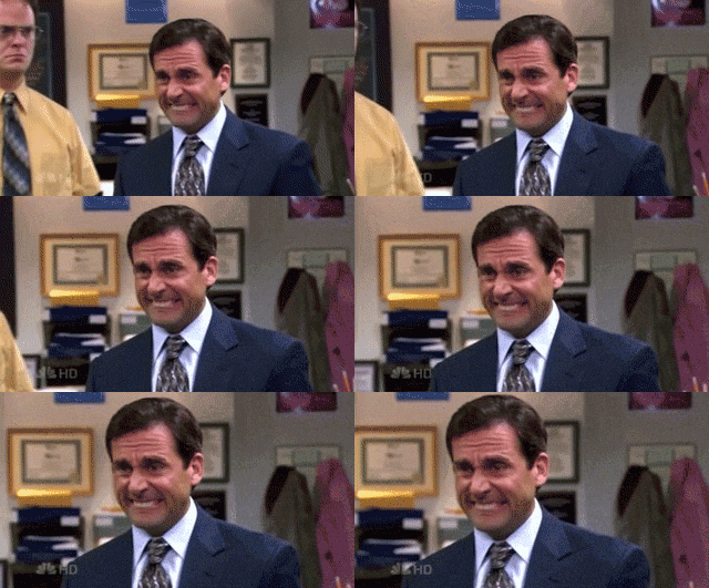
(Giphy, 2015)

As it has been the holidays, I felt myself falling into the trap of procrastination, using the excuse of “it’s Christmas!” or “it’s New Years!” far too much. Although I did need this break for my sanity, I did feel the guilt when I would just be sitting around not doing work, when I knew full well that I could.

I had started my break for the holidays on the 22nd of December, after completing illustrations and a cover design for the House of Illustration competition and creating potential covers for the Penguin Student Awards Competition. So, getting back into the swing of things earlier this week, on January the 2nd, I realised that I had and still have a lot of writing up to do.

Today, I have only just finished writing up all of the days for Inktober. Although I have made blog posts about each of the days, I felt for academic purposes, I would have to write them up more formally and in more detail for hand-in.  So with this project, all I have left to do is to write up the process of making the zines, how I formatted the pages for printing, the different printing methods which I tried, what went well, what had not, which I had decided to use for final products etc. I then need to evaluate the final product and project as a whole, then that should be one project out of the way.

I’m going to be honest now, the rest of the projects aren’t as close to being completed as I would have hoped, and I do have a lot of writing up to do in the upcoming week.

House of Illustration project, I still need to:

  • Ask my peers for their opinions, if there are any changes I should make.
  • Potentially make the changes they suggest.
  • Get the illustration and cover ready for submission in the format the competition wants.
  • Print and mount the final design for hand-in.
  • Write up artist/influences
  • Write up creation process (I did take screenshots throughout, so this should make it easier to recall the steps I took and choices I made)
  • Evaluate the final design and the project as a whole.


Penguin Student Design project, I still need to:

  • Ask my peers for their opinions, if there are any changes I should make.
  • Potentially make the changes they suggest.
  • Get the Cover/s ready for submission in the format the guidelines of the competition state.
  • Print and mount the final design for hand-in.
  • Write up artist/influences
  • Write up creation process (I did take screenshots throughout, so this should make it easier to recall the steps I took and choices I made)
  • Evaluate the final design and the project as a whole.


The Lion, the Witch and the Wardrobe project, I still need to:

  • Write up my experiences with the different printing methods, how they work, what I enjoyed, what I did not etc.
  • Compare the printing methods.
  • Make new designs with the best printing method (if I have the time to do so).
  • Evaluate the final products and the project as a whole.


So from this to do list, my plan for the week is to write up my projects whilst I’m at home, then whilst I am at college I will focus on practical work. The reason I don’t want to write up my work at college is because I feel I am easily distracted, zoning in and out of work a lot, often losing my place or sentence etc, but when I’m at home, it is quieter and although there is a potential threat of tv, during deadline week this is not an issue, as stress me is on the ball! Or at least tries to be!

So whilst I am at college, I think I will try to get the final illustrations for the Lion, the Witch and the Wardrobe project, as the facilities I need are within the college, so I feel it will be the best use for my time.

Final Notes

I probably will get all of my work complete in time, but the more that I think I won’t, the more stress I will put on myself, meaning more pressure, meaning more focus on the work, meaning ALL WORK COMPLETED ON TIME. Let’s hope!

I am always surprised at how much work I get done the day before a deadline as the pressure pushes me through, and I always end up handing in on time. Myself and stress just work together well, it’s probably not the healthiest of relationships, but if it works it works! If it ain’t broke, don’t fix it! But ideally, I’m gonna try better to not leave all of my work till the last minute in the next semester/deadline, 2019 should be the stress-free year!.. Starting January 15th!

Bibliography

Giphy. (2015). Awkward Michael Scott Gif [online] Available at: https://giphy.com/gifs/jOpLbiGmHR9S0 [Accessed 06 Jan. 2018].

Evolution of the Cat

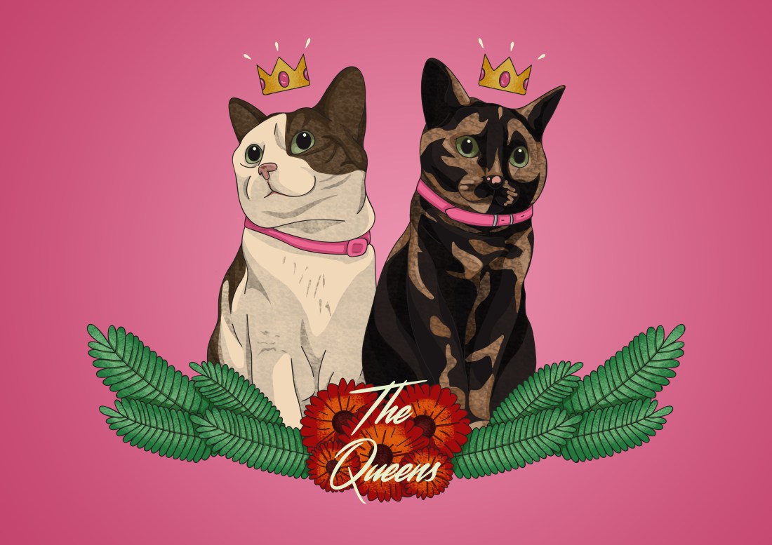
2016 – Arya and Tilly

chriiiiiiistmas

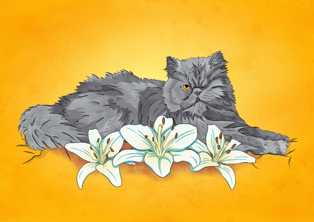
2017 – Percy

tk2

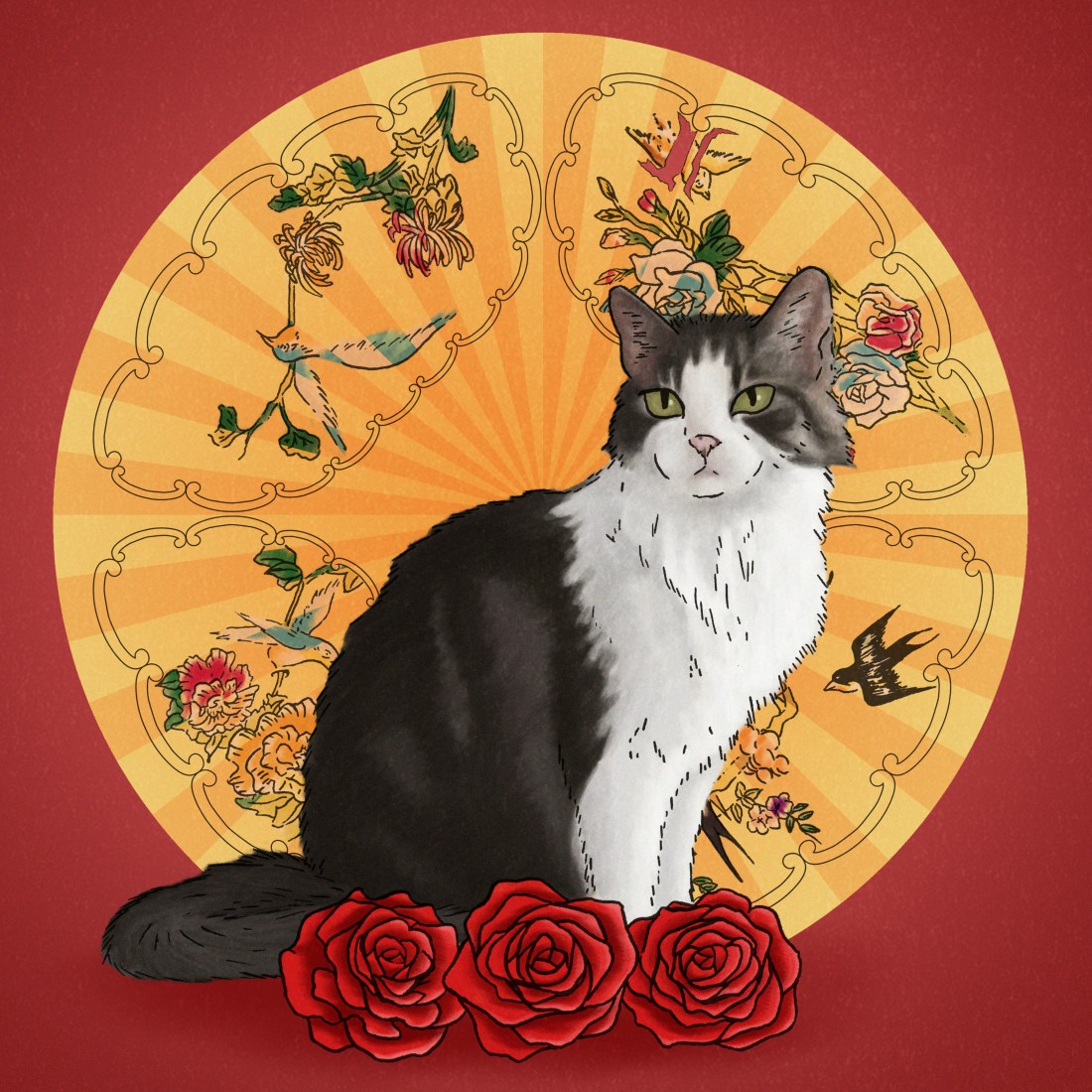
2018 – Labyrinth

labyrinth4

2019 – Trixie and Mia (COMING SOON)

Over the past 3 years, I have created a cat portrait per year, and have already planned another which will be a commisioned piece at the start of next year, for my boyfriend or his family.

As the pieces have had some time between one another, I feel you can somewhat see the growth of my style from piece to piece, so I wanted to show that within my blog. In the first, I was starting to use a cel-shading method a lot in my work and this piece was quite experimental, as I still wanted to use the style, but did not want the cats to look flat, so decided to play around with some textured brushes. In the second piece, I have used a similar method to colour, but I feel it does look a lot softer, and I have built up separate layers of colour as to give the cat a fluffier appearance.

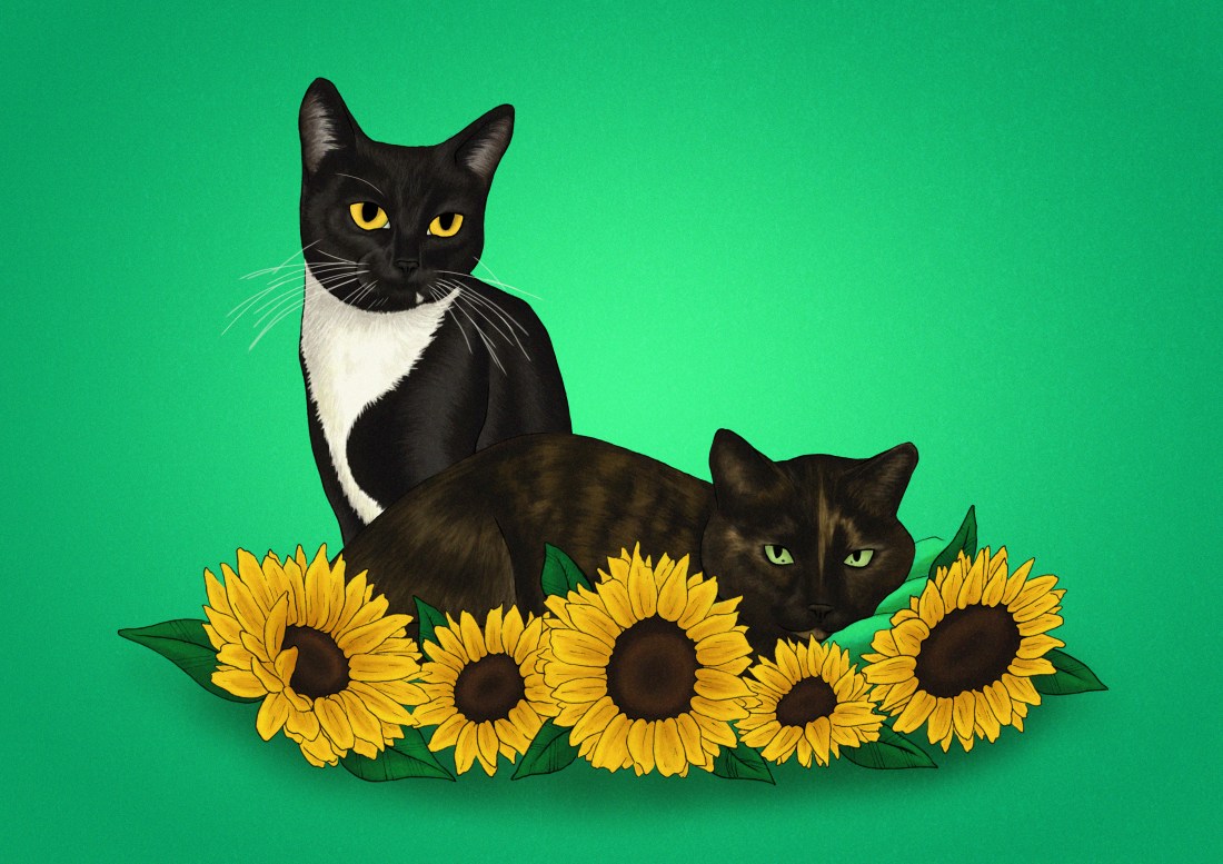
Now, looking at the illustration I have recently created, I feel as I have been experimenting more with digital painting, and I have been inspired by artists such as Ana Godis, following her process etc, in this design, I have moved away from the cel-shading style, creating a more blended and somewhat more realistic illustration. By doing this technique, I don’t want my work to become too airbrushed which is how I feel a lot of digital paintings can look, so to try battle this, I tried to use brushes that would give the design texture and could give it a more realistic look, as opposed to looking too smooth and somewhat flat.

I like being able to see all of these illustrations together as I feel they do show my progression within my work. I feel since they are all cats, you are able to see my skill development better, but since they are different types of cats, some with shorter hair, some with long and each with their own individual patterns, you can somewhat see my thought process, what methods I may have used to give the impression of the length of their fur as I have made each of them unique in themselves, I have not just stuck to one formula of ‘THIS IS THE METHOD YOU HAVE TO USE’ I have experimented with each of the cats/designs.

Although I plan to start working on the next illustration on the 15th of January, the day after my deadline, and that is not too far off the time that I have created my most recent piece, I am excited to experiment with the new cats, seeing how best to create their fur, patterns and feature etc.

If you are reading this blog, and like my work, and you do have your own pets or know someone who might want an illustration of theirs, feel free to comment down below, or contact me through Instagram @Melon.rMy college timetable may be an issue, but I would be willing to work with you, to figure out a timeslot, if you were to commision me.  

I Opened up my Own Store!

Using Depop, I have created an account so that I can have a platform that I can sell my work from. If you want to know why I chose this platform you can click here to read my opinions on different selling sites.

As of yet, I have not made a sale through the app, but I have made a sale by working solely through PayPal and messaging the buyer. I was only confident enough to do this because I knew the person, but even then I felt I was being very awkward, as I’m not very business savvy and I am new to this world. But this may improve over time.

So working this way, I still charged the same amount for the product and p&p but in this case, Depop did not take their 10% cut of the payment, but I believe PayPal does still have a charge of 20p per transaction.

Anyways back to the exciting part, this buyer had wanted 2 of my zines, a multicoloured one and a black and white one, and when I had mentioned that I was also selling some riso prints, she had also wanted a wave print. From this buyer, I have made a total of £14.50 (p&p excluded) so I am so happy with this experience.

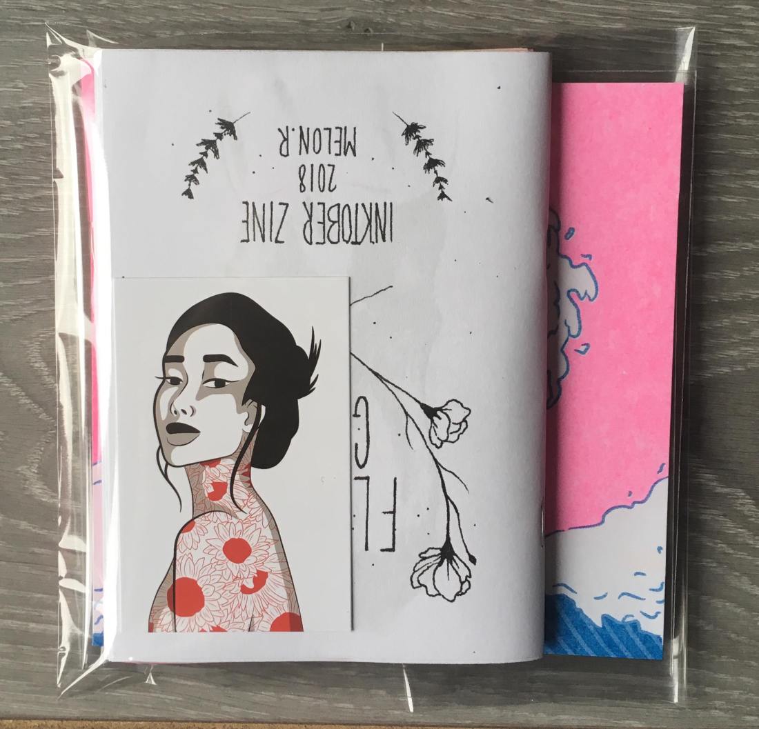
As I had stated in my previous post, one of the reasons I had chosen to use Depop was because I would be able to have control over the whole process, packaging the products myself and adding little personal touches where I could. So as shown below, are three photos, one of the contents of the order, then the other two are of the envelope. Although I would say the content is pretty standard as to what you would expect when purchasing prints etc, I wanted to personalise the envelope, adding in little drawings of flowers, which would relate back to the zine. I had also added a little ‘thank you’ on the back so that she would see it when opening. These are small personalisations, however, when I had received a personalised envelope from an artist, I felt that they had actually put love into their packaging, an indication that they actually cared about their clients and appreciation in a way.

48175122_361586474645178_1609465979731968000_n

I have now sent off the order, hoping that she gets it soon, and hoping that she is happy with her purchase. I also hope that more people will purchase my work, although I was a bit anxious with this one sale, I hope that the more I get, the more my confidence will grow with the process.

This being said, if you would like to have a look at the products I have for sale, you can click here for my Depop account, or you could send me a message on Instagram @Melon.R if you have PayPal and don’t wish to work through Depop.

Vistaprint Review

In May/June of this year, for my end of year exhibition, through Vistaprint, I had created a portfolio book and a set of business cards.

Although I have had a change of heart with the design/pattern of the original business cards and the cover of the portfolio book, I do not believe that was the fault of Vistaprint, as I actually loved the quality of my products, and the time in which it took to deliver the items was quite efficient. Vistaprint are specific on their website about their delivery times and for me, the estimated delivery dates were spot on.

It was from my experience with this company, (and the enticing black Friday sales) that I had wanted to use the site again, as to order new business cards. I had also checked out a company called ‘Moo’, as suggested by one of my tutors, but when comparing prices, at that current time, Vistaprint was cheaper for the quantity of product I was getting. I believe with Moo, I could get 50 for the price of £15, whereas on Vistaprint I could get 100 for the same price, this including the extra price for the design on both sides. 

If anything, when designing the product on the layout of the website, I wish you could zoom in to see for yourself if the quality of your image is good or not, rather than the site just saying ‘this image is good quality’. I believe if I was able to do this, I would have been able to see that the original business cards I had created in May/June, were a bit blurry in the text, and I may have been able to make changes at that time, as opposed to ordering them then noticing the problem after it was too late. However, I probably still would have fallen out of love with the overall design, so it’s all good.

Review of the product.

My business cards have arrived, 3 business days after ordering them; I had ordered them on Friday night, the 23rd, and the delivery date was estimated to be for the 30th, but they have come today on Wednesday the 28th, so I have had good experiences with their deliveries, both with this order and my previous. I believe the delivery times do change depending on the item you’re expecting, for instance with my last order, I had ordered both my cards and book at the same time, but the cards had arrived well before my book, but I do feel they are good with their estimated times, if not better as shown by my early delivery today.

I was so nervous to receive these cards after my previous experience, but when opening the box, the quality is SOOOO much better than my last business cards! This just proves to me that it was just a problem on my side, with the quality of the image within my last set of business cards, as opposed to the problem coming from the companies end.

Now looking over the card, if I can nitpick at anything, I would say that the black and grey tones have come out a bit warmer than I had intended, but its not a huge problem in my eyes, it would have been more annoying if it had only happened in a specific area, or only on one side, however as it is the same throughout and on both sides, there is more cohesion to it so it is less noticeable.

Personal opinions (Not concerning the company)

I am absolutely IN LOVE with the results of these prints! I feel in comparison to my previous business cards, it is much more simple, minimal and professional, but still shows my work and what a potential client can expect from me. I feel with my old business cards, they were a bit too overpowering and did not really show my work within the design. Although yes, I did create the pattern, I do not feel it was visible enough for someone to say ‘ooh yes, I like this person’s work’, so I do like these new cards, as it is almost like a product in itself.

In the past, I have collected other artists business cards, as it is still a piece of their artwork, so I feel in a similar way, if someone were to take my business card, they could potentially want to keep it, as it is a piece of my artwork in itself, even if it is smaller than my average print.

I feel I will be much more confident to give people my business cards now, as I am more happy with the design and quality of the imagery, whereas I was a bit more embarrassed to give away my cards previously, as I was less proud of the design and the text did have a slight blur, so I did not feel as if it were the best representation of myself.