If you have read my previous post, you will know how stressed I was trying to achieve my deadline for one of my projects, it wasn’t my real deadline, but it was the one I had set myself for that specific project. So, with this week, as it is probably the last week I can do work before getting lost in festivities, and having to clear my workspace away so that, to my mother’s delight, the dining table would be free again for the week between Christmas and New Years. Yes, I work at the dining table as my room is currently under construction and has been for a while, so I don’t really have elsewhere to work. So with these factors, I wanted to put all hands on deck to create 2 covers for the Penguin competition. This included sketching ideas, creating thumbnails for potential covers, then designing them digitally and refining them further.
I have surprised myself during this week, as I have managed to create 3 possible designs for the story Wonder by R. J. Palacio, technically 2 with the 3rd being a combination of both concepts, and I have created 2 possible designs for Norwegian Wood by Haruki Murakami. I did start the process with 4 concepts for each book but have narrowed down my options when it came to creating them digitally. This was due to either time or lack of enthusiasm with the concept, but I do believe I have still given options within designs which would be more beneficial if I were working one to one with the client, but as I am not, and I am only allowed to submit one design per category, I will end up choosing the piece myself or my peers find most interesting or best advertise the stories.
During this week, I feel I have been confident when illustrating and coming up with concepts, however, when it came to adding in the text, I have found a lot of issues with the type getting lost within the illustrations and trying to find ways in which to make them stand out more. When talking to my peers, this was the biggest issue they had spotted, and luckily, one had given me suggestions about how I could improve on this.
From sending my friend all of the pieces shown above, she had circled both of the designs with eye patterns for the Wonder book, then the tree piece for Norwegian Wood and said that these were the pieces that would need to be worked on more as you wouldn’t be able to read them. With the designs for Wonder, she had suggested I remove some of the eyes so that they would be more of a border for the text as opposed to a background. As the pattern was somewhat uniform though, when doing this I felt it looked quite messy in a sense, the design no longer had a flow within the pattern and the eyes just looked more random in their positioning. She had not made any suggestions for the Norwegian Wood design, but she had liked the other option I had made for it, although she did spot a typo so I immediately corrected that. Another friend had suggested that the barcode on the back may not be readable from the design, so I also added in a white box over the design but under the information, so that it would be easier for a machine to read it. The white box was the same colour as the text, so did not look too obscure in the design as a whole, and sort of kept it cohesive.
After making the changes, probably even before then, I knew I had liked the more simple designs better, as they were more solid and there was less to question, for instance, it wouldn’t be a question of “what am I looking at”, “is the text readable”, etc. So the ones shown below are the ones I believe I will be submitting to the competition.

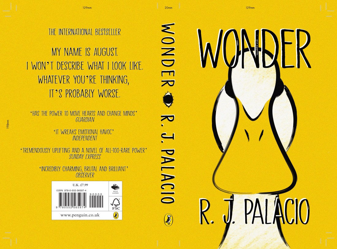
The Wonder design
For this design, I did like the idea of people WONDERing (ha get it) why there was a duck on the cover when the story is about a little boy named August, but it does link to a section in where the boy is in the Principles office and notices his artwork on the wall. This artwork was for a class project in which the students had to make a self-portrait of themselves if they were an animal, and August had drawn a duck. When the Principle asks him “why a duck?” expecting a meaningful and in-depth answer, August just replies with “Its because I think I look like a duck.” I loved this section when I had read it and although I thought I was not going to try drawing the child, as the blurb of the book specifically says that he doesn’t want to describe himself as “whatever you’re thinking, its probably worse”, I thought this would be a fun way of representing the little boy, without trying to draw the accurate description.

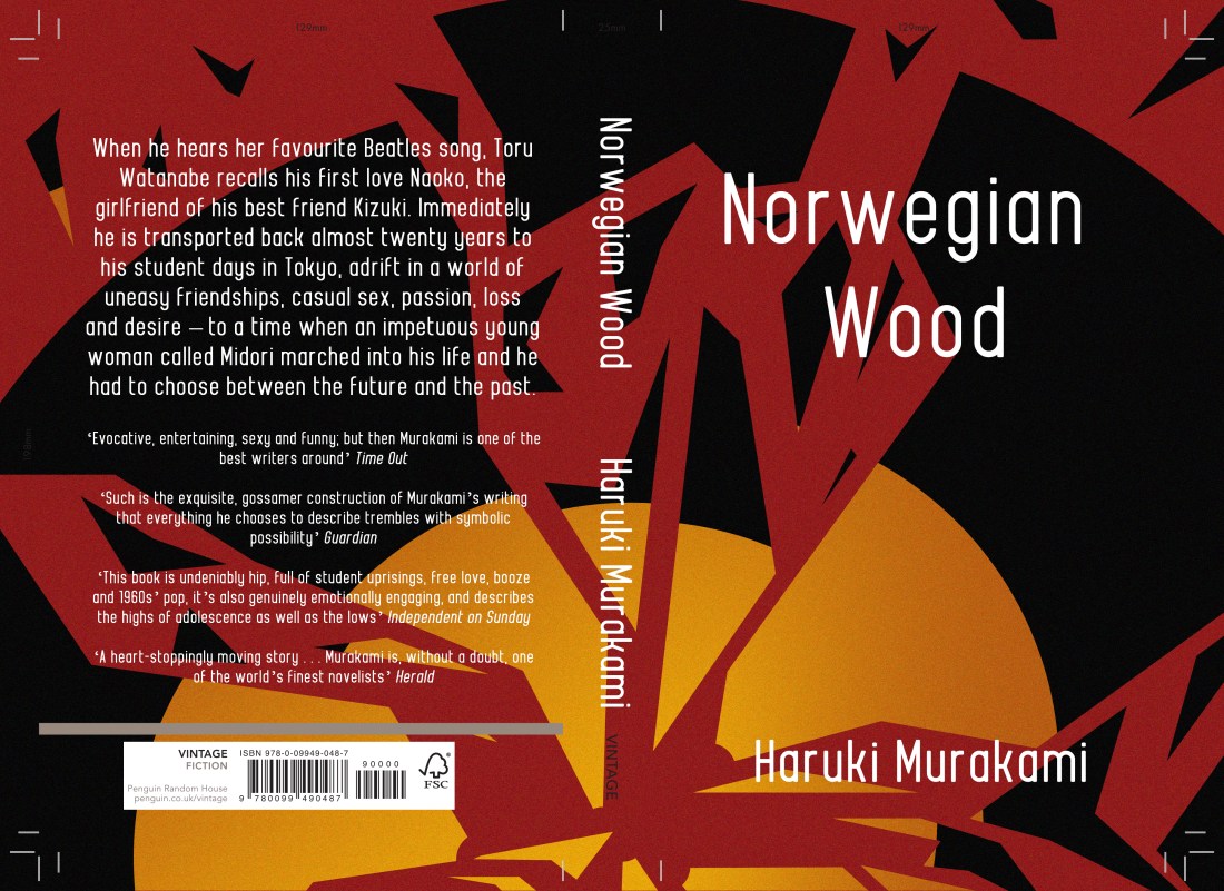
The Norwegian Wood design
There is a section within the book where the character is working at a record store and cuts himself on “one of the glass partitions in a record shelf” that was cracked, he then goes on to mention how the floor is covered in blood etc, so at the time this had made me think of this cover design. Although it had not exactly mentioned a broken record, this is what I had imagined when I had read the section, a record in shards, with a red background which would be the character’s blood.
This may not have been someones first thought of imagery after reading the book, but I felt since the title of the story is inspired by a song by The Beatles, ‘Norwegian Wood’, I felt the imagery was still valid to the story, and in a sense, it could be symbolic to the characters emotions and relationships throughout the story? (Potential spoiler? I’m sorry!) So I do like this design and concept, as I believe it is not an obvious choice and it is somewhat out of the box, but not too far as it still relates.
So still to do, as I have slightly worked backwards during this project, just trying to churn out the final designs as quick as I could with the time I have, I do have a lot of writing up to do. When working, I did have the artists and styles in mind that I wanted to use, but I just need to write this research up properly, discuss all of the choices I made throughout the process, etc, and I will need to make a final evaluation (which I will also post on here). This, however, will probably be done after Christmas, maybe pushing towards after New Years as well, as I had mentioned before, my working space is at the dining table, and during this time, my Mam does like it to be clear. I will keep my progression updated, but if I don’t post during that time, you now know why, so you can just imagine me living my best life, stuffing my face with festive food!
MERRY CHRISTMAS! OR HAPPY HOLIDAYS, WHATEVER YOU CELEBRATE! AND HAPPY NEW YEAR!
Bibliography
Murakami, H. and Rubin, J. (2001). Norwegian wood. London: Harvill, p.263.
Palacio, R. (2013). Wonder. United Kingdom: Penguin Books Ltd, p.287.


