We need to talk..

Ok, so since the end of Semester one I feel I have been slacking on my blog and not posting as regularly as I had. I believe this is because after the last hand in, I was so stressed that I felt I needed a bit of a break, one that I didn’t necessarily have the time for but kind of took anyway.

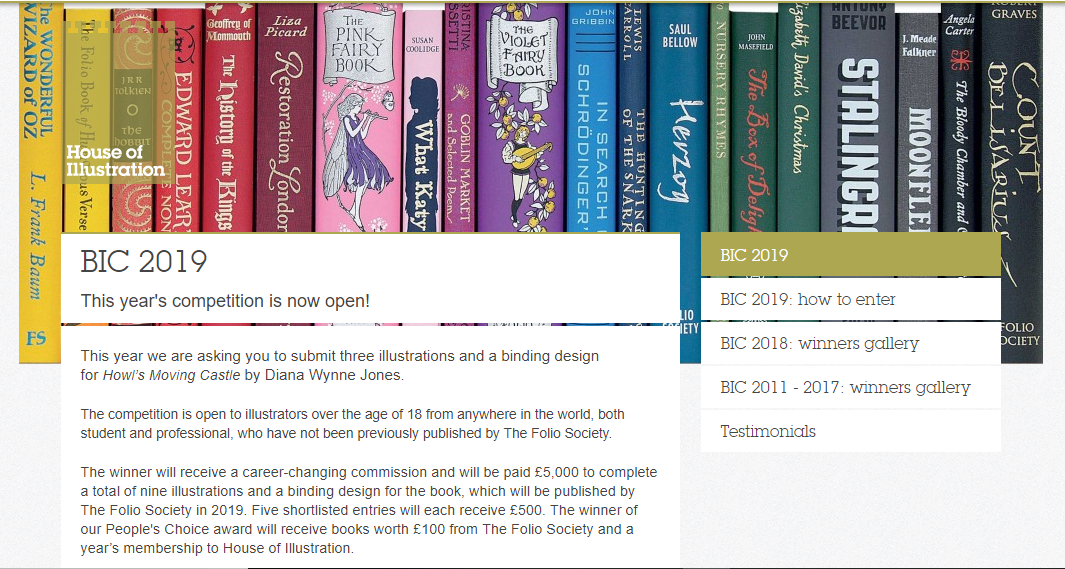
In the first couple of weeks I did create two pieces of work, one which was a commission (I believe I mentioned that I would be working on this in a previous blog post, ‘Evolution of the Cat’ click here to read) then the second piece I had worked on was for a ‘draw this in your style’ challenge on Instagram which you can also read about by clicking here. So technically I had been working, but not on the projects that I was supposed to be concentrating on, such as the live briefs and personal projects I had planned, like illustrating The Wonderful Wizard of Oz, focusing on branding (creating a website, portfolio, promo packs, merch and products, etc).brow2

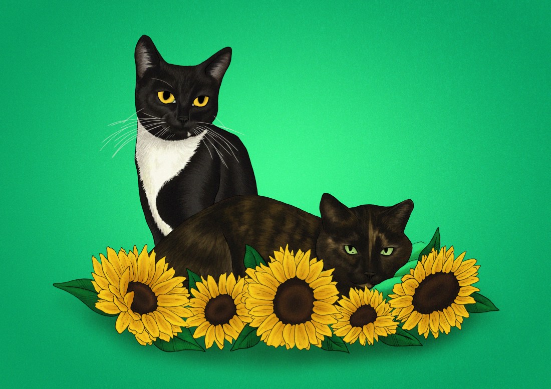
At the start of the year I was also given the chance to have my work in a local exhibition ran by ‘A Canny Collective‘ which I felt was a great opportunity as I gained a lot of experience from both creating illustrations and setting them up for the show, then on the opening night I was working on the shop, so I also gained the experience of selling work in a more personal setting, selling one to one with the buyer as opposed to over a website. If you would like to read more about this exhibition, what I created and how the night went, I have made a blog post about it so again, please click here if you want to know more.

SO, now with the work that I’m actually supposed to be working on. I have currently been creating illustrations for the Wizard of Oz but throughout I have been struggling with the styles and techniques that I’ve wanted to use. I did initially create 5 basic sketches which at the time I did see some flaws, but with the pressure of time, I got lazy and just ignored them and thought I was ready for the next stages and that maybe the flaws would get better once I coloured the pieces and added more textures. After a well-needed discussion with my tutor, he knocked some sense into me and I knew that I had to stop being lazy and make the changes that I was choosing to ignore.

From this discussion, I started taking photos of me and my boyfriend to use as reference for the characters and I started using more images of animals and floral elements where needed. It’s fair to say that my sketchbook became a lot fuller as I was sketching different poses, angles and options for each illustration (I think this will be the first sketchbook in a while that I’m actually proud of, as I more recently I have just been going straight into digital work as opposed to sketching traditionally first). Once I was happy with the sketches, I started to create new layouts for each of the illustrations, keeping in mind my talk with David and how I should think about the narrative of the piece when trying to compose specific characters or elements.

After the thumbnail layouts were down, I started sketching the pieces digitally once again and the reference photos I had taken did come in very handy during this process. I then printed the pieces off, showed them to David, mostly for reassurance before I took them any further, he did make some suggestions, for instance with the Tin Woodsman piece, he suggested that I reframe it so that it would be more of a closeup shot, which I do feel helped convey more action between the characters as the previous layout did seem quite open now looking back, which may have looked more calm than what I was intending.

Once I made the adjustments suggested I went to the light box and started transferring the sketch to paper and once lined I’d add in the textures. For this process I used pencil, I started with a 4H for both the lining and the textures, then when I needed darker areas I used a 5B. After testing multiple pencils in my sketchbook, I mostly liked the H’s as they gave more of the texture I wanted, whereas the B’s were more soft so they gave more of a smooth texture.

After I had completed the traditional part of this project, for now, we shall see if I need to go back and do anything else, I scanned in each illustration, set it within the document size that I wanted and now they are ready to colour.

This is the point I’m currently at, but during the colouring phase, I do want to record the process as I feel it may be satisfying to watch and I do want to start posting speed painting videos online, potentially streaming the process online as well through twitch.

The main elements of my to-do list at this moment in time is to:

  • Complete my Wizard of Oz illustrations
  • Start working on AOI’s Northern Illustration competition (more on that coming soon in a separate blog post)
  • Create an illustration or sequential piece for Cheltenham illustration awards (I will go into more depth and make a blog post about this too)
  • Focus on self-branding, this leads on to the next point which is..
  • Creating a portfolio book. I still have the pages from the one I made last year, so in the new one I will just be adding my more recent work, but I definitely want to change my old cover, hence how this links to the previous point as I need to focus on what my brand is and how best to communicate that through a cover.
  • Creating a website. I hope that I will be able to show my portfolio and have a working shop on the site.
  • Making work for the final show. I don’t necessarily know what I want to create for this yet or if I’m just going to use work from one of my current projects, but once I get a better idea of the space, how/if we’re framing our work, I may have more inspiration as to what I can create.
  • The last on this list is merchandise. For the final show, I did want to make new products that I could potentially sell on the night, whether this is new prints, T-shirt’s, enamel pins, badges etc. The reason this is last however is that I feel it should be my last priority as the work above has more consequences if I don’t manage to complete them.


Bibliography

A Canny Collective. (2019) [Online] Available from: https://www.instagram.com/p/Bt19GO7lEG5/ [Accessed on 03 April. 2019]

All other work is my own unless stated otherwise.

‘Twas the week before Christmas…

If you have read my previous post, you will know how stressed I was trying to achieve my deadline for one of my projects, it wasn’t my real deadline, but it was the one I had set myself for that specific project. So, with this week, as it is probably the last week I can do work before getting lost in festivities, and having to clear my workspace away so that, to my mother’s delight, the dining table would be free again for the week between Christmas and New Years. Yes, I work at the dining table as my room is currently under construction and has been for a while, so I don’t really have elsewhere to work. So with these factors, I wanted to put all hands on deck to create 2 covers for the Penguin competition. This included sketching ideas, creating thumbnails for potential covers, then designing them digitally and refining them further.

I have surprised myself during this week, as I have managed to create 3 possible designs for the story Wonder by R. J. Palacio, technically 2 with the 3rd being a combination of both concepts, and I have created 2 possible designs for Norwegian Wood by Haruki Murakami.  I did start the process with 4 concepts for each book but have narrowed down my options when it came to creating them digitally. This was due to either time or lack of enthusiasm with the concept, but I do believe I have still given options within designs which would be more beneficial if I were working one to one with the client, but as I am not, and I am only allowed to submit one design per category, I will end up choosing the piece myself or my peers find most interesting or best advertise the stories.

During this week, I feel I have been confident when illustrating and coming up with concepts, however, when it came to adding in the text, I have found a lot of issues with the type getting lost within the illustrations and trying to find ways in which to make them stand out more. When talking to my peers, this was the biggest issue they had spotted, and luckily, one had given me suggestions about how I could improve on this.

From sending my friend all of the pieces shown above, she had circled both of the designs with eye patterns for the Wonder book, then the tree piece for Norwegian Wood and said that these were the pieces that would need to be worked on more as you wouldn’t be able to read them. With the designs for Wonder, she had suggested I remove some of the eyes so that they would be more of a border for the text as opposed to a background. As the pattern was somewhat uniform though, when doing this I felt it looked quite messy in a sense, the design no longer had a flow within the pattern and the eyes just looked more random in their positioning. She had not made any suggestions for the Norwegian Wood design, but she had liked the other option I had made for it, although she did spot a typo so I immediately corrected that. Another friend had suggested that the barcode on the back may not be readable from the design, so I also added in a white box over the design but under the information, so that it would be easier for a machine to read it. The white box was the same colour as the text, so did not look too obscure in the design as a whole, and sort of kept it cohesive.


After making the changes, probably even before then, I knew I had liked the more simple designs better, as they were more solid and there was less to question, for instance, it wouldn’t be a question of “what am I looking at”, “is the text readable”, etc. So the ones shown below are the ones I believe I will be submitting to the competition.

Template - Wonder.indd

The Wonder design

For this design, I did like the idea of people WONDERing (ha get it) why there was a duck on the cover when the story is about a little boy named August, but it does link to a section in where the boy is in the Principles office and notices his artwork on the wall. This artwork was for a class project in which the students had to make a self-portrait of themselves if they were an animal, and August had drawn a duck. When the Principle asks him “why a duck?” expecting a meaningful and in-depth answer, August just replies with “Its because I think I look like a duck.” I loved this section when I had read it and although I thought I was not going to try drawing the child, as the blurb of the book specifically says that he doesn’t want to describe himself as “whatever you’re thinking, its probably worse”, I thought this would be a fun way of representing the little boy, without trying to draw the accurate description.

Template - Norwegian Wood.indd

The Norwegian Wood design

There is a section within the book where the character is working at a record store and cuts himself on “one of the glass partitions in a record shelf” that was cracked, he then goes on to mention how the floor is covered in blood etc, so at the time this had made me think of this cover design. Although it had not exactly mentioned a broken record, this is what I had imagined when I had read the section, a record in shards, with a red background which would be the character’s blood.

This may not have been someones first thought of imagery after reading the book, but I felt since the title of the story is inspired by a song by The Beatles, ‘Norwegian Wood’, I felt the imagery was still valid to the story, and in a sense, it could be symbolic to the characters emotions and relationships throughout the story? (Potential spoiler? I’m sorry!) So I do like this design and concept, as I believe it is not an obvious choice and it is somewhat out of the box, but not too far as it still relates.

So still to do, as I have slightly worked backwards during this project, just trying to churn out the final designs as quick as I could with the time I have, I do have a lot of writing up to do. When working, I did have the artists and styles in mind that I wanted to use, but I just need to write this research up properly, discuss all of the choices I made throughout the process, etc, and I will need to make a final evaluation (which I will also post on here). This, however, will probably be done after Christmas, maybe pushing towards after New Years as well, as I had mentioned before, my working space is at the dining table, and during this time, my Mam does like it to be clear. I will keep my progression updated, but if I don’t post during that time, you now know why, so you can just imagine me living my best life, stuffing my face with festive food!

MERRY CHRISTMAS! OR HAPPY HOLIDAYS, WHATEVER YOU CELEBRATE! AND HAPPY NEW YEAR! 


Bibliography

Murakami, H. and Rubin, J. (2001). Norwegian wood. London: Harvill, p.263.

Palacio, R. (2013). Wonder. United Kingdom: Penguin Books Ltd, p.287.

The week from Hell.

Due to my incapability to follow my own timetable, which I had even reorganised after not managing to follow it the first time, this week was supposed to be the last week I had given myself to work on the House of Illustration, Book Illustration Competition, in which I had to create 3 illustrations and a book cover for the story ‘Howls Moving Castle’ by Diana Wynne Jones.

Instead, for the majority of this 3-week project, I spent a lot of time trying to catch up or finish off previous projects that I had fallen behind on. I also decided to work on an illustration which would be a gift for my boyfriends mum. This was supposed to be completed and printed for her birthday in September, but as we all know by now, I can’t follow my own time plans! So I said I would give it to her for Christmas instead, not that she knows (a blog post for this piece will be coming soon). So, the time I should have been spending on this project had been spent on others, but I refused to fall behind on the project starting next week, so I decided I had to finish this one by today!

In what should have been one week of researching, one week of creating concepts and experimenting and the final week creating the final design, I have basically had to do all of this in the space of a week.

When creating my pieces, I didn’t really have an idea of styles or techniques I was going to use, I had thought about artists, but I hadn’t thought about potential ways in which I could apply the styles or techniques to my own work, so basically in the process of creating my pieces, I have just been winging it, seeing “does this thing work? No, not really, scrap it! Does this? Okay, we’ll just roll with it”. I had kept doing right up until now.

I am currently happy with these designs, but I would say I do still need critique and outsiders perspectives so that I can potentially make further improvements. At this moment in time, however, I still have a lot of work to complete within other projects so this one may have to fall to the back of the pack. Because of this, I may not end up submitting my designs to the competition, as I’m not sure if it fits the standards of previous entries in the years before, especially not without further refinement. And since the competition does have a fee to enter, I feel it could be a waste of my money.

Even if I don’t submit these design to the competition, I will still include them in my portfolio, as through this project, I have been able to show more skills with narrative, and I have created more landscape designs, two areas of which I felt were lacking in my portfolio.

SO, what have we learnt from this post? I am my own worst enemy and I only have myself to blame! From this experience, I will strive to keep myself more organised and actually follow my own set time plans. I believe this information will be very important for when starting next semester, as I will try to plan out my time better, using my experience from this first semester, as I feel I will have more knowledge of my pace of working and what I am capable of doing in specific timeframes.

Howls Moving Castle – Review

SPOILER WARNING! Possibly? If you have not read the story or have not seen the movie, there could potentially be spoilers within this blog. There may not be, but the warning is there just in case!

After finishing this book I have found that I have personal issues with letting go. I loved this story so much that I just wanted it to keep going, I wanted to know what else happened, even if it was just following the characters day to day life. This book had me well and truly hooked, and I’m sad that it is over and I can’t read onwards.

I had also come across this issue when watching Bohemian Rhapsody, I have become so drawn in by the people and the story, that I want to find out more about Queen and the members, especially Freddie, I just want to know more of their story, I want to know everything! I went to see the movie on Halloween, and since, I have been watching old interviews or documentaries, or interviews from the cast of Bohemian Rhapsody, etc, pretty much on a daily basis, it’s becoming a problem. If you haven’t seen the movie, I would definitely recommend!

Anyways, moving away from my tangent and getting back to the review at hand, I loved this story. I was going to try explaining the story, but I could not find the words to do so, to do it justice, or not give away too much of the story, so quoting from the book’s blurb by Diana Wynne Jones:

“In the land of Ingary, where seven-league boots and cloaks of invisibility really exist. Sophie Hatter attracts the unwelcome attention of the Witch of the Waste, who puts a curse on her. Determined to make the best of things, Sophie Travels to the one place where she might get help – the moving castle which hovers on the nearby hills.

But the castle belongs to the dreaded Wizard Howl whose appetite, they say, is satisfied only by the hearts of young girls” (Diana Wynne Jones, 2009)

The book managed to suck me in, not with the battles between Howl and the Witch or Sophie and the Witch, but more within the simplicities of the everyday happenings within Sophie’s life, because there was always something new happening, whether it was her conversations with Michael, Calcifer or even her disputes with Howl, there would always be a new interest within that day, whether Sophie was (SPOILERS?) jumping from place to place with seven-league boots, accidentally growing Howls suit too long,  getting lost around Kingsbury, the list just goes on and it is what I believe made the book so much fun to read, the battling with the Witch was just a bonus.

The book is different from Studio Ghiblis adaptation, although I did personally enjoy the book more, as I felt I learnt more about the characters than the movie had given, I do believe they are both amazing in their own rights.

DEFINITE SPOILERS AHEAD!

There have been changes made in the process of turning the story into a movie, some more obvious than others such as:

  • Studio Ghibli have definitely added their overall aesthetic to the movie, such as
    • the appearance of the characters and the castle. In the book, I believe Michael is supposed to be older, whereas, in the movie, Markl seems quite young, but does disguise himself as an older wizard a lot.
    • the castle is a lot more creature looking within the movie, with elements that could suggest eyes, a mouth and possibly wings, whereas the author had described a more typical castle, which is blockier with turrets and chimneys etc.
    • the Witches henchmen have a more blob-like appearance, they do not have faces so it is quite creepy.
  • The theme of war is more present within the movie. According to an interview at the end of the book, the author had said that this was Miyazaki’s influence as he “crammed the story full of flying machines and war scenes” which was based on a brief mention of war from the king in the story. This explains why:
    • Howl is more part of the war. He is more heroic in this adaptation, as he did seem quite cowardly within the book, not really wanting to work with the king.
    • Although the witch is still a threat in the movie and does still kind of do what she had intended within the book, I believe the King is more of a threat that the characters worry about, as the king wants Howl so that he will turn into a beast and fight in his war.
  • There was also a change with where the black door led. In the movie, it was to a memory of Howls childhood, whereas in the book, the door led to Howls family’s home in modern-day Wales, which REALLY took me by surprise. From the movie, I was not expecting it at all, and actually enjoyed discovering more about Howls life and his family.
  • Sophie’s magic in the book was not really present in the movie? She had the ability to talk to objects to give them power, for instance, her cane had a protection charm which had kept her safe and helped her in defeating the witch.
  • The girls family wasn’t really a big part, although you briefly met Lettie within the bake shop, it did not really go into depth, talking about how she had two sisters, Lettie and Martha, who were both sent to do different apprenticeships, one in a bakery, the other being trained in magic, but they swapped places, so that Martha was the one in the Bakery, and she was actually in love with Michael.
  • The scarecrow was waaaay more friendly in the movie, whereas, in the book, he terrified the characters, and even made Sophie’s old heart shiver.
  • As I have mentioned, the Witch was not as much of a threat, but Howl was not being chased or running away from a curse sent by the Witch that would potentially catch up with him. The Witch actually seems more weak within the movie, so it makes sense when Sophie takes pity on her and takes her in, not due to better judgment.

These are just some of the many changes from the book to Studio Ghiblis adaptation of it, but I am in no way saying that one is better than the other, because although you may have more information from the book, Studio Ghibli has given such a beautiful visualisation of the characters and scenery etc, for instance, you are actually able to see Sophie’s age changing throughout, and see what howl can see, whereas, in the book, you just find out that he has known about her curse the whole time.

If you have not read the book or have not seen the movie or both, after reading all of my spoiler warnings, I definitely would recommend doing both. If you have read the book but not watched the movie, do it! If you have seen the movie but have not read the book, do it! Both are so amazing in their own right so I would not recommend one above the other, you should just watch and read both!


Bibliography

Howls Moving Castle. (2004). [Film] Directed by H. Miyazaki. Japan: Studio Ghibli.

Jones, D. W. (2009) Howls Moving Castle. London: HarperCollins. Blurb.

Jones, D. W. (2009) Howls Moving Castle. London: HarperCollins. Anime and Author.


Competition Briefs

Both briefs for the competitions I have planned to participate in during the first semester have now been announced.


House of Illustration – Book Illustration Competition 

They have announced that the book in which you have to illustrate and make a cover for, will be Howls Moving Castle by Diana Wynne Jones. I am excited about this, as I had loved the Studio Ghibli adaptation of the story, and never actually knew that it was originally a book, so I am excited that I can read it and possibly see the differences from book to movie.

My only issue with this brief, I feel, will be trying to forget the imagery I already know from the movie. I feel Studio Ghibli makes the most beautiful movies with incredible scenery and amazing characters, so as the imagery I already know is so strong, I feel I might struggle when it comes to making the story my own, forgetting the visuals I already associate to the story.

bic2019


For the Penguin Student Design Awards, 3 books have been announced, one for Adult fiction, one for Adult non-fiction and one for a Children’s book.

Adult fiction cover Award – The Establishment – Owen Jones

From a brief read of the description, this seems like a political based book, which is something I am not really interested in. Although it would get me out of my comfort zone, working with themes I have never explored before, its not something I feel excited about, or something that I want to get involved in. Yes politics are important, and I do vote, and I’m all for other people getting involved and I respect their passion towards it, but its just not something I’m personally interested in. So, I think I’ll be choosing to go with another book instead.


Adult non-fiction cover Award – Norwegian Wood – Haruki Murakami

This I believe is a love story, based on a character who is reflecting back on his student days, in the 60’s, in Tokyo.

When reading through this brief I kind of got excited, as I feel it could be a chance for me to create more oriental themed work, which I had enjoyed doing at the end of Level 5, but also possibly include styles or themes from the 60’s.


Children’s cover Award – Wonder – R. J. Palacio

This is a story which has recently been turned into a movie, which I have not seen yet, slightly because I thought it would potentially make me cry, (I’m a wuss with emotional movies). It is about a young boy with facial deformities, who I believe just wants to be an ordinary boy, being able to go to school and have friends, without being stared at.


I am currently torn between choosing the Children’s book or the Adult fiction book. On one hand, I don’t want to create too much child based work over the year, as I do want to cover more audiences within my portfolio this year, however, I don’t necessarily think Wonder is anything like the other children’s books I am planning to work with over the year, as I believe it has a deeper themes which are more based on real life as opposed to a fantasy world, so if I did choose to work with this brief,  I don’t think it would resemble any other work I create this year.

With the adult’s fiction brief, however, I do feel it is well suited to me, as I do love creating oriental based designs, and I would enjoy working exploring 60’s themes, colours, etc. However, this may be a con, as I would not be challenging myself and could potentially end up creating work similar to previous designs.

So my dilemma is, do I create yet another childrens book, even if it’s not like the others have planned and could potentially take me out of my comfort zone, or do I work with an adults book with themes that I know I would enjoy working with, but would be settling into my comforts.

After talking to my friend, who had told me more about Wonder, and actually made it an option, as I initially I was adamant about not doing the children’s category, I discussed my dilemma and she had suggested that I just get both, (she’s going to send me Wonder to borrow, and I’ll purchase Norwegian Wood) then she said “read them both, come up with 3 concepts each, then choose your favourite from there”, which is the best advice I have been given so far this year, and is why she is my best friend. She has solved my issue and made my path much clearer for this specific project.

Psda


Bibliography

House of Illustration (2018) Book Illustration Competiton [Online] Available from: https://houseofillustration.org.uk/get_involved/bic-2019 [Accessed on 17 Oct. 2018]

Penguin (2018) Student Design Awards [Online] Available from: https://www.penguin.co.uk/company/work-with-us/student-design-award/student-design-award-2019.html [Accessed on 17 Oct. 2018]