It’s now a week before the deadline and guess who still has a lot of work to do? ME! But is that a surprise? PROBABLY NOT!
(Giphy, 2015)
As it has been the holidays, I felt myself falling into the trap of procrastination, using the excuse of “it’s Christmas!” or “it’s New Years!” far too much. Although I did need this break for my sanity, I did feel the guilt when I would just be sitting around not doing work, when I knew full well that I could.
I had started my break for the holidays on the 22nd of December, after completing illustrations and a cover design for the House of Illustration competition and creating potential covers for the Penguin Student Awards Competition. So, getting back into the swing of things earlier this week, on January the 2nd, I realised that I had and still have a lot of writing up to do.
Today, I have only just finished writing up all of the days for Inktober. Although I have made blog posts about each of the days, I felt for academic purposes, I would have to write them up more formally and in more detail for hand-in. So with this project, all I have left to do is to write up the process of making the zines, how I formatted the pages for printing, the different printing methods which I tried, what went well, what had not, which I had decided to use for final products etc. I then need to evaluate the final product and project as a whole, then that should be one project out of the way.
I’m going to be honest now, the rest of the projects aren’t as close to being completed as I would have hoped, and I do have a lot of writing up to do in the upcoming week.
House of Illustration project, I still need to:
Ask my peers for their opinions, if there are any changes I should make.
Potentially make the changes they suggest.
Get the illustration and cover ready for submission in the format the competition wants.
Print and mount the final design for hand-in.
Write up artist/influences
Write up creation process (I did take screenshots throughout, so this should make it easier to recall the steps I took and choices I made)
Evaluate the final design and the project as a whole.
Penguin Student Design project, I still need to:
Ask my peers for their opinions, if there are any changes I should make.
Potentially make the changes they suggest.
Get the Cover/s ready for submission in the format the guidelines of the competition state.
Print and mount the final design for hand-in.
Write up artist/influences
Write up creation process (I did take screenshots throughout, so this should make it easier to recall the steps I took and choices I made)
Evaluate the final design and the project as a whole.
The Lion, the Witch and the Wardrobe project, I still need to:
Write up my experiences with the different printing methods, how they work, what I enjoyed, what I did not etc.
Compare the printing methods.
Make new designs with the best printing method (if I have the time to do so).
Evaluate the final products and the project as a whole.
So from this to do list, my plan for the week is to write up my projects whilst I’m at home, then whilst I am at college I will focus on practical work. The reason I don’t want to write up my work at college is because I feel I am easily distracted, zoning in and out of work a lot, often losing my place or sentence etc, but when I’m at home, it is quieter and although there is a potential threat of tv, during deadline week this is not an issue, as stress me is on the ball! Or at least tries to be!
So whilst I am at college, I think I will try to get the final illustrations for the Lion, the Witch and the Wardrobe project, as the facilities I need are within the college, so I feel it will be the best use for my time.
Final Notes
I probably will get all of my work complete in time, but the more that I think I won’t, the more stress I will put on myself, meaning more pressure, meaning more focus on the work, meaning ALL WORK COMPLETED ON TIME. Let’s hope!
I am always surprised at how much work I get done the day before a deadline as the pressure pushes me through, and I always end up handing in on time. Myself and stress just work together well, it’s probably not the healthiest of relationships, but if it works it works! If it ain’t broke, don’t fix it! But ideally, I’m gonna try better to not leave all of my work till the last minute in the next semester/deadline, 2019 should be the stress-free year!.. Starting January 15th!
If you have read my previous post, you will know how stressed I was trying to achieve my deadline for one of my projects, it wasn’t my real deadline, but it was the one I had set myself for that specific project. So, with this week, as it is probably the last week I can do work before getting lost in festivities, and having to clear my workspace away so that, to my mother’s delight, the dining table would be free again for the week between Christmas and New Years. Yes, I work at the dining table as my room is currently under construction and has been for a while, so I don’t really have elsewhere to work. So with these factors, I wanted to put all hands on deck to create 2 covers for the Penguin competition. This included sketching ideas, creating thumbnails for potential covers, then designing them digitally and refining them further.
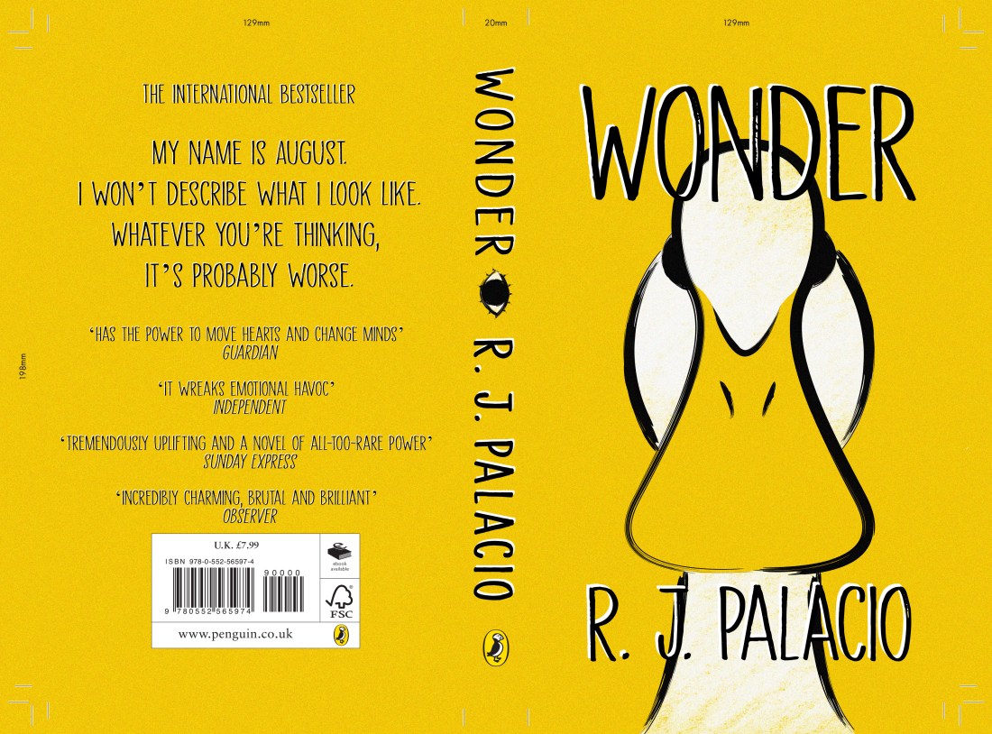
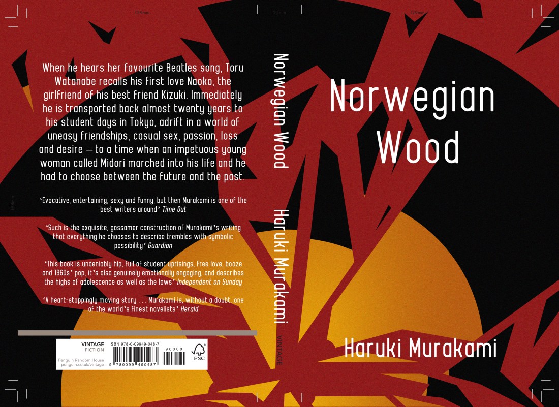
I have surprised myself during this week, as I have managed to create 3 possible designs for the story Wonder by R. J. Palacio, technically 2 with the 3rd being a combination of both concepts, and I have created 2 possible designs for Norwegian Wood by Haruki Murakami. I did start the process with 4 concepts for each book but have narrowed down my options when it came to creating them digitally. This was due to either time or lack of enthusiasm with the concept, but I do believe I have still given options within designs which would be more beneficial if I were working one to one with the client, but as I am not, and I am only allowed to submit one design per category, I will end up choosing the piece myself or my peers find most interesting or best advertise the stories.
During this week, I feel I have been confident when illustrating and coming up with concepts, however, when it came to adding in the text, I have found a lot of issues with the type getting lost within the illustrations and trying to find ways in which to make them stand out more. When talking to my peers, this was the biggest issue they had spotted, and luckily, one had given me suggestions about how I could improve on this.
From sending my friend all of the pieces shown above, she had circled both of the designs with eye patterns for the Wonder book, then the tree piece for Norwegian Wood and said that these were the pieces that would need to be worked on more as you wouldn’t be able to read them. With the designs for Wonder, she had suggested I remove some of the eyes so that they would be more of a border for the text as opposed to a background. As the pattern was somewhat uniform though, when doing this I felt it looked quite messy in a sense, the design no longer had a flow within the pattern and the eyes just looked more random in their positioning. She had not made any suggestions for the Norwegian Wood design, but she had liked the other option I had made for it, although she did spot a typo so I immediately corrected that. Another friend had suggested that the barcode on the back may not be readable from the design, so I also added in a white box over the design but under the information, so that it would be easier for a machine to read it. The white box was the same colour as the text, so did not look too obscure in the design as a whole, and sort of kept it cohesive.
After making the changes, probably even before then, I knew I had liked the more simple designs better, as they were more solid and there was less to question, for instance, it wouldn’t be a question of “what am I looking at”, “is the text readable”, etc. So the ones shown below are the ones I believe I will be submitting to the competition.
The Wonder design
For this design, I did like the idea of people WONDERing (ha get it) why there was a duck on the cover when the story is about a little boy named August, but it does link to a section in where the boy is in the Principles office and notices his artwork on the wall. This artwork was for a class project in which the students had to make a self-portrait of themselves if they were an animal, and August had drawn a duck. When the Principle asks him “why a duck?” expecting a meaningful and in-depth answer, August just replies with “Its because I think I look like a duck.” I loved this section when I had read it and although I thought I was not going to try drawing the child, as the blurb of the book specifically says that he doesn’t want to describe himself as “whatever you’re thinking, its probably worse”, I thought this would be a fun way of representing the little boy, without trying to draw the accurate description.
The Norwegian Wood design
There is a section within the book where the character is working at a record store and cuts himself on “one of the glass partitions in a record shelf” that was cracked, he then goes on to mention how the floor is covered in blood etc, so at the time this had made me think of this cover design. Although it had not exactly mentioned a broken record, this is what I had imagined when I had read the section, a record in shards, with a red background which would be the character’s blood.
This may not have been someones first thought of imagery after reading the book, but I felt since the title of the story is inspired by a song by The Beatles, ‘Norwegian Wood’, I felt the imagery was still valid to the story, and in a sense, it could be symbolic to the characters emotions and relationships throughout the story? (Potential spoiler? I’m sorry!) So I do like this design and concept, as I believe it is not an obvious choice and it is somewhat out of the box, but not too far as it still relates.
So still to do, as I have slightly worked backwards during this project, just trying to churn out the final designs as quick as I could with the time I have, I do have a lot of writing up to do. When working, I did have the artists and styles in mind that I wanted to use, but I just need to write this research up properly, discuss all of the choices I made throughout the process, etc, and I will need to make a final evaluation (which I will also post on here). This, however, will probably be done after Christmas, maybe pushing towards after New Years as well, as I had mentioned before, my working space is at the dining table, and during this time, my Mam does like it to be clear. I will keep my progression updated, but if I don’t post during that time, you now know why, so you can just imagine me living my best life, stuffing my face with festive food!
MERRY CHRISTMAS! OR HAPPY HOLIDAYS, WHATEVER YOU CELEBRATE! AND HAPPY NEW YEAR!
Bibliography
Murakami, H. and Rubin, J. (2001). Norwegian wood. London: Harvill, p.263.
Palacio, R. (2013). Wonder. United Kingdom: Penguin Books Ltd, p.287.
For the Penguin Student Design Awards, I have been reading two books, one for the children fiction category and one for the adult’s fiction. The one I am about to review (or attempt to) is called Norweigan Wood by Haruki Murakami, and it is the adult fiction book.
Just a bit of pre-warning, I don’t know how to review books properly, as I don’t know how to give my opinion and explain what the story is about without giving away too much information or potential spoilers. Technically, I don’t know why I keep writing these reviews, but hey ho, here we go! POTENTIAL SPOILERS WARNING AHEAD!
Norweigan Wood is a story about a character named Toru Watanabe, who looks back on his younger/student days in Tokyo in the late 1960s. I believe the story is based on romance, but as opposed to a typical ‘boy meets girl’ scenario, the story does go more into depth with the complexities of relationships and life itself, discussing emotions and struggles between the characters etc. The story does contain some very sexual moments, but this was not my take away from the book as I feel it was more about the main characters daily life, his struggles, his connections between characters and things like that, as opposed to it just being an erotic novel, it had more of a storyline which by the end, I did feel quite invested in.
My initial thought about this book, as it is fictional, I had thought it was going to have more fictional themes, like fantasy or sci-fi, or anything along those lines, so whilst reading through the book, I could feel myself making assumptions of the direction I thought it could take. At one point, I did think that the girl he was interested in was going to turn out be a robot, but this was not the case and I do kind of feel bad for thinking so. Instead, the book was based on reality, set in the real world with characters you would think were real at some point, a world without robots, at least not ones that were mentioned? or any fantasy creatures, or ghosts or aliens or anything or the sort.
At the end of the story, there was a section which had explained that although the author Haruki Murakami has made more fantasy inspired books in his time, parts of this story were autobiographical in a way, as the author would be taking inspiration from his own days as a student. But although this story had some fans of his previous work questioning the more realistic themes of this one, he had explained that it was a challenge for himself, as real life is so complex but does have a simplicity to it, it has so many emotions and integrating parts to it, so I would imagine that it would be hard to make all of those elements seem simple, like ‘yes this book is based on the realities of life’ to the reader. So, in comparison to writing one of his other books, Murakami had found Norweigan Wood was the most challenging.
As I had mentioned, I did end up becoming quite emotionally invested in this book, with the characters day to day life, the emotions, experiences, thought process etc, so when I had finished, like with Howls Moving Castle, you can read my review of that here, I felt lost, it couldn’t end like that! I wanted to know more, what else happened to the character after the story finished, I did feel frustrated that I couldn’t follow him on his journey through life anymore.
I would recommend this book to a friend. If they don’t like the idea of the sexual themes and moments within the story, I would just tell them that I felt the actual story was worth the read. I feel the author has done an amazing job at capturing the reality and complexities of life, and he was able to explain them in such a way that was easy, readable and understandable. In a way that sucks you in and makes you feel emotionally invested to the characters journey.
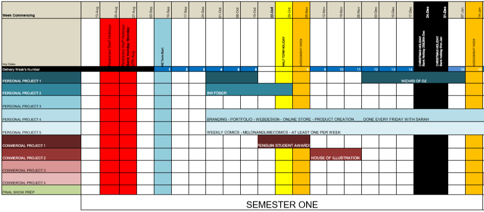
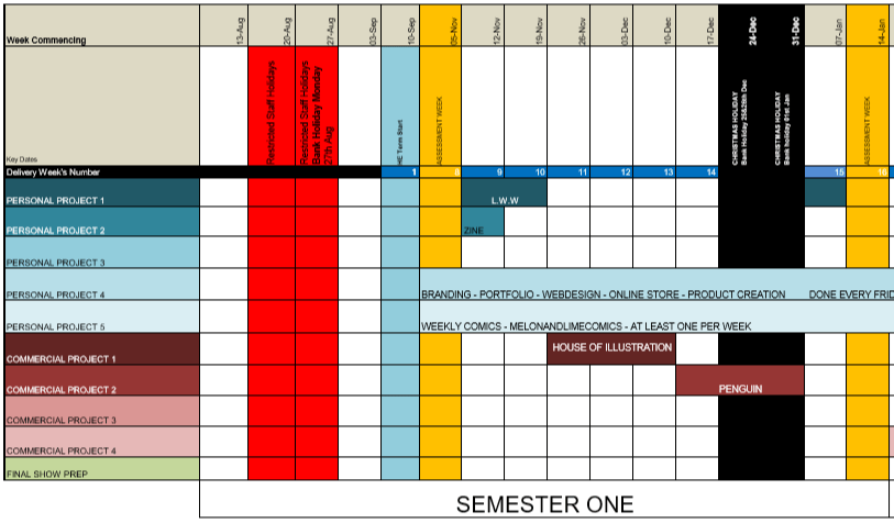
9 weeks into the first semester and I’m already not following the timetable I had originally planned within my proposal for the year.
Original Timetable (Before I had switched the Wizard of Oz project with the L.W.W project in Semester 2)
I believe this is due to multiple confusing factors from the beginning till now, one of them being that I have chosen to read all of the books. After finishing The Lion the Witch and the Wardrobe, and realising how long it had taken, (which wasn’t exactly long, but longer than I had initially expected) I decided to start reading ‘Howls Moving Castle’ for the House of Illustration competition, then after I finished that, I started and am currently reading Norwegian Wood, but I still have to read Wonder, both books being apart of the Penguin competition.
Another factor to my confusion is that my tutor has been wanting specific things done by a certain point, such as a statement of intents or the research for the projects, so instead of working at my own pace, following my set timetable, I have been trying to complete them all at once which has not done me very well.
So, with these factors, I feel I have just gotten confused in which project I should be working on, so probably have not done as much as I could have if I were specifically concentrating on one.
SO, with 9 weeks left, (8 now that I am posting this) I am going to replan my timetable so that I can properly concentrate on one project at a time.
New and Improved Timetable, Starting 12/11/18
Inktober – I have spent wayyyy too long on this project, so this week (and possibly a bit of next) I am going to try round off this project, getting the zines printed, making sure that everything is fully annotated, making an evaluation, and just getting this project out of the way so that I can concentrate on the others properly.
The Lion, the Witch and the Wardrobe – I know I need time to work within the college, using the facilities available, so I believe I am going to work on this project next week, then break off for a month or so to do the competitions, then during the last 2 weeks before deadline, I will print my final designs and round off the project
House of Illustration – 3 (now 2) weeks from now, I plan to focus on my House of Illustration project, creating a book cover and set of illustrations for the book ‘Howls Moving Castle, over a 3-week time period. This time will be spent on researching, sketching, experimenting, then producing the final designs.
Penguin Student Design Awards – 6 (now 5) weeks from now, I will start working on yet another competition, which again I plan to do within a 3-week timeframe. Again, I will be working in a similar routine/method to the previous project, researching, sketching, experimenting, then producing the final designs, however, this time I will be doing this process with two books, one being Wonder by R. J. Palacio, and Norweigan Wood by Haruki Murakami.
I hope that with this new timetable, that there will be less confusion, I will be able to focus on one project at a time, and inevitably, I will be able to get more work done.
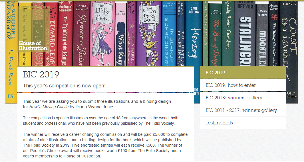
They have announced that the book in which you have to illustrate and make a cover for, will be Howls Moving Castle by Diana Wynne Jones. I am excited about this, as I had loved the Studio Ghibli adaptation of the story, and never actually knew that it was originally a book, so I am excited that I can read it and possibly see the differences from book to movie.
My only issue with this brief, I feel, will be trying to forget the imagery I already know from the movie. I feel Studio Ghibli makes the most beautiful movies with incredible scenery and amazing characters, so as the imagery I already know is so strong, I feel I might struggle when it comes to making the story my own, forgetting the visuals I already associate to the story.
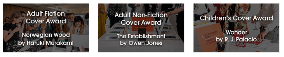
For the Penguin Student Design Awards, 3 books have been announced, one for Adult fiction, one for Adult non-fiction and one for a Children’s book.
Adult fiction cover Award – The Establishment – Owen Jones
From a brief read of the description, this seems like a political based book, which is something I am not really interested in. Although it would get me out of my comfort zone, working with themes I have never explored before, its not something I feel excited about, or something that I want to get involved in. Yes politics are important, and I do vote, and I’m all for other people getting involved and I respect their passion towards it, but its just not something I’m personally interested in. So, I think I’ll be choosing to go with another book instead.
Adult non-fiction cover Award – Norwegian Wood – Haruki Murakami
This I believe is a love story, based on a character who is reflecting back on his student days, in the 60’s, in Tokyo.
When reading through this brief I kind of got excited, as I feel it could be a chance for me to create more oriental themed work, which I had enjoyed doing at the end of Level 5, but also possibly include styles or themes from the 60’s.
Children’s cover Award – Wonder – R. J. Palacio
This is a story which has recently been turned into a movie, which I have not seen yet, slightly because I thought it would potentially make me cry, (I’m a wuss with emotional movies). It is about a young boy with facial deformities, who I believe just wants to be an ordinary boy, being able to go to school and have friends, without being stared at.
I am currently torn between choosing the Children’s book or the Adult fiction book. On one hand, I don’t want to create too much child based work over the year, as I do want to cover more audiences within my portfolio this year, however, I don’t necessarily think Wonder is anything like the other children’s books I am planning to work with over the year, as I believe it has a deeper themes which are more based on real life as opposed to a fantasy world, so if I did choose to work with this brief, I don’t think it would resemble any other work I create this year.
With the adult’s fiction brief, however, I do feel it is well suited to me, as I do love creating oriental based designs, and I would enjoy working exploring 60’s themes, colours, etc. However, this may be a con, as I would not be challenging myself and could potentially end up creating work similar to previous designs.
So my dilemma is, do I create yet another childrens book, even if it’s not like the others have planned and could potentially take me out of my comfort zone, or do I work with an adults book with themes that I know I would enjoy working with, but would be settling into my comforts.
After talking to my friend, who had told me more about Wonder, and actually made it an option, as I initially I was adamant about not doing the children’s category, I discussed my dilemma and she had suggested that I just get both, (she’s going to send me Wonder to borrow, and I’ll purchase Norwegian Wood) then she said “read them both, come up with 3 concepts each, then choose your favourite from there”, which is the best advice I have been given so far this year, and is why she is my best friend. She has solved my issue and made my path much clearer for this specific project.
Bibliography
House of Illustration (2018) Book Illustration Competiton [Online] Available from: https://houseofillustration.org.uk/get_involved/bic-2019 [Accessed on 17 Oct. 2018]
Penguin (2018) Student Design Awards [Online] Available from: https://www.penguin.co.uk/company/work-with-us/student-design-award/student-design-award-2019.html [Accessed on 17 Oct. 2018]
This year, it being my last in college, I want to make the most of it to improve my work. I will do this by trying new mediums and techniques, more so in the realm of traditional work as in the previous years I have mostly worked digitally. I also want to explore more areas of illustration, especially in the areas which my portfolio may be lacking, so I want to create more narrative based work, i.e book illustrations or covers, and I would like to create more editorial-based pieces, illustrations based on articles, current topics I feel strongly about, etc. Although I do enjoy creating pretty pieces with next to no context behind them, I do want to start creating more work that does contain stronger messages or can depict a story through them. I don’t feel I have done this a lot in my previous work, so would like to try to do so in my final year.
Strengths and Weaknesses:
I feel my current strengths are in digital work, but I have started trying to incorporate more traditional mediums, mostly within the linework. At the end of last year, I was using a Tombow calligraphy pen for my linework then colouring the pieces digitally, and during summer I wanted to be more experimental and had digitally coloured more sketch-based characters, either created with a pencil or a ball-point pen.
T. Hanuka, Spring Awakening (2017)
Another strength I believe is my colour palettes. I feel I have a good idea of colour theory, so I don’t tend to struggle when choosing a colour palette, but if I do, when working digitally I just have a play around with hue and saturation option in photoshop, until I reach a tone that I feel fits well with the others and allow the piece to be visually appealing to the eye. My palettes are usually inspired by the themes and/or content of the pieces I create, but I do also find inspiration from other artists, for instance, Tomer Hanuka has influenced a lot of my previous work as I love his work with colour. In his work, he uses quite a monochromatic palette, but then uses a complementary colour which helps offset the piece, and is very attractive to the eye. I have found a lot of inspiration from his work in the past and I feel I have learnt while doing so, so I have been able to form my own palettes from the knowledge of his, knowing which colours work well, what themes they may suggest, what other colours can I add to make the piece more intriguing or which I can add to make my work more easy on the eyes.
I believe my most common weakness is with traditional mediums. Before starting the course I did work more traditionally, using fine liners, markers, paints, pencils etc, but I feel as I have learnt more digital skills and my work has become more refined and of a higher standard over the years, I have lost more confidence with these mediums as the marks they make are a lot more set in stone than working digitally is, for instance, if you make a mistake digitally, you can just edit and undo it, but if you make a mistake with a traditional medium it is a lot harder to erase (unless you’re working with pencil).
I also had less confidence with traditional mediums when it came to linework as I felt my hand/line control would be a lot more wobbly than I intended, not creating as smooth of a line as I could in a program like Illustrator. I have however been trying to improve on my confidence with these issues, for instance in my last few projects last year, I had created the linework by hand, and although some of my lines were more wobbly than I would have liked, I would enjoy the overall piece as I felt they would be less static than my linework from illustrator was. Since not every line was smooth and perfect, I feel it added a more personal touch to my work and I would like to carry on creating my linework by hand, possibly using more mediums than fine liners or my Tombow pen in the future.
Like I had mentioned, I did try experimenting with sketch-based work in the holidays, so ideally I would like to try find a way to use these mediums and techniques but in a more refined way, so that my work would be of an industry standard and quality and would not look as ‘sketchy’.
Professional Development Plan:
As this first module is based around development, I would like to use it as a way to experiment and expand my knowledge. Ideally, I would like to take part in inktober, creating an inked illustration per day every day for the month of October, I believe it would help in improving my confidence with a traditional medium, specifically with my line control, but as I rarely work with ink, it would allow me to experiment with it, learning what marks I can make, if I can create gradients, etc, I’d be gaining more knowledge of the medium from my experience with it and potentially taking that information further into my future work.
Staying along the lines of traditional methods, I would also like to experiment more with printing methods, for instance, screenprinting, etching, linocut printing, printing with a laser cut plate, etc. With this, I would be gaining more knowledge in the form of output, how I could potentially create prints in the future, rather than just using a normal printer. I could potentially still work digitally with some of these methods, but if I were to output my illustrations through an alternative method to a normal printer, for instance using screenprint, it would add more of a personal touch to a possible product, being that I would have created it myself by hand and would have put more thought into how the design would work when printed, i.e with colours, specific layers, how they would be arranged and so on. In the past, I have not had great experiences with screenprinting, however, I know it is a common method used by other artists to create their own products i.e. prints, t-shirts, tote bags etc. so I do want to give it another try, to see if I just had a bad experience the first time, whether it was the design I was using, the method, if I was doing something wrong or whether screenprinting is just not for me?
As I mentioned before, I do want to create more narrative-based work, whether this is book illustrations, covers, or pieces with more backstory. Over the holidays we were asked to think about personal projects we’d like to do and I thought of making illustrations for the Wonderful Wizard of Oz and the Lion, the Witch and the Wardrobe. Both of these stories already have well-known imagery behind them, but I feel the imagery has mostly come from the movies as opposed to the books, so I want to read both of these books, see for myself if there are any differences from book to film, as is very common with movie adaptations, but I want to illustrate as true to the book’s descriptions as possible so that I may potentially give a fresh perspective to the stories, renewing them in my own style.
Looking into competitions for the more commercial side of this module, the ones coming soonest and the ones I feel most interested in are the more narrative-based ones. I have been looking into the Penguin Student Design Awards and House of Illustration – Book Illustration Competition. In both, I would be designing book covers, but for the House of Illustration one, I would also be creating a set of illustrations of the book they choose. In the Penguin Competition, you do get a choice in categories of stories, either adult’s fiction, adults non-fiction and children’s books.
So if I were to participate in both of these competitions, as well as my ideas for personal projects, I would be creating a lot of narrative-based work, but I would have to consider which routes to take, as I would not want my projects to clash or potentially come across as too similar, I do want to create a range of work for a range of different clients and audiences throughout this year.
As I assume my work is going to be based around existing stories, I believe my research will mostly be coming directly from the books, using quotes, finding characters, backgrounds and element descriptions straight from the sources so that I can create illustrations as accurate to the original stories as possible. I feel by not working from the imagery I already know that it will set me apart from other illustrations that may exist, especially if it is in context of a competition as other artists may rely too much on the imagery that is already known as opposed to reading the book themselves, especially if there is a time constraint.
As of other research, I mostly find style, artists or concept inspiration from social media, scrolling through the many artists I follow on Instagram or finding work/images on Pinterest, normally suggested to me by images I may have already pinned, or from a direct search of a theme. It may be due to being a Gen-Z…
(TANGENT – I like term post-millennial better for myself as although I missed the millennial status by 2 years, I do feel closer to those than the extremes of Gen-Z. I did probably grow up with more access to technology than the previous generation, but I believe I still had a ‘normal’ childhood without needing to have a phone in my hand, actually playing outside with my friends on a day to day basis. I hate when I see toddler nowadays with a tablet in their hands. I’m hoping that when my generation becomes parents, they will recognise this as a problem and will try to raise their children as they were. This in no way was supposed to be read as a hate to Gen-Z, I actually watched a video comparing millennials against Gen-Z’s and they did come out the more positive minded generation, I just don’t like the thought of being judged for having resources available to me now that older generations have not, but having that supposedly affect me in a negative way. All generations will have had factors that could have affected them, whether it has been war, politics, economy, but no one would want it to be held against them and told: “your generation is like … because of …” but the news especially loves to blame millennials and probably Gen-Z next for any changes going on, but they say it in such a negative light. I could make a whole seprate blog post about my views on this topic, but would you want to read that? Feel free to leave a comment if so! BACK TO THE TOPIC)
…but I love finding inspiration online, when I find new artwork on Pinterest, I love seeing the suggested images afterwards then falling down a rabbit hole of going from one piece to the next and to the next, by doing this I have formed a lot of ‘boards’ two of which I add to and use for inspiration the most you can go check them out here, one is of people, of all different ages, genders, nationalities and so on, and the other is of illustrations, these are pieces that I will have found over the past few years, which I enjoy for some reason or another, but I feel I can come back to at some point to use as inspiration. It’s actually funny when I don’t know what to create and I haven’t looked at the board for a while, as I do forget what is in there and I always refind something that I saved once upon a time which inspires a new concept, colour palette or style I want to use, and it does encourage me to create new work.
Anticipated Challenges:
Time management will always be a hidden challenge, especially with this year if I am estimating the dates of the competitions (when they start and their deadlines). As a module, I do need to plan out my semesters setting out my projects over the given timeframe so I will do my best to stick to the timetables I give myself. As to hopefully not have any issues with time, I do want to keep a planner with me at all times, keeping track of what I’m doing, what I still need to do, when does that task need to be achieved by and so on. I feel this will keep me more organised, keeping me on track of what needs to be done and when, and hopefully the organisation will encourage more workflow. In the past when I have not kept myself organised, I have battled with motivation, lost myself to procrastination and so on, but this year, my final one, I do want the best results for myself and I know I need to put in all the time, effort and motivation get myself those results. So I am determined to keep myself on track, and if I can achieve my goals with the least amount of stress, then that will be perfect.
If I am to work with multiple printing methods, another challenge could possibly be trying to book space within the printing room or the workshop. Since I am within a college with lots of other course and lots of other students, there may be times in which the print room or workshop will be full or the queue for the laser cutter will be too long, so to combat these potential problems, I will try to book a time in the print room if needed earlier on rather than later, as well as creating a plate on the laser cutter sooner rather than later. This will just ensure that I do not run out of time, I do not clash with any other classes and will have my prints created in time for the deadline.
List of Illustrations
Hanuka, T. (2017) Spring Awakening, The New Yorker. [Online] Available from: http://thanuka.com/#/spring/[Accessed on 17 Sep. 2018]
All other pieces are my own unless stated otherwise.
The Infographics Show. (2019). Millennials vs Generation Z – How Do They Compare & What’s the Difference?. YouTube. [online] Available at: https://www.youtube.com/watch?v=aqdm6aBUZII [Accessed 27 Apr. 2019].