(End of Year Evaluation) Reflective Practice Presentation – Part 2

In part one of this post I had reflected on my performance in my reflective practice presentation, it wasn’t really the best experience, but you can click here if you would like to read more about it. In this post, I will be going through each of my slides along with the script I made, but I have added more detail as I am able to go into more depth on my blog, but in the presentation, I did have a time limit so the initial script was more brief. If you have read my previous post then you will know how well the script and time limit worked for me.

Slide1

1

For this final year I had set myself goals that I wanted to achieve.

I created two learning plans for both semesters, the reason for this is that with semester one I had more of a plan than I did with semester 2, for instance I knew which competitions I would be doing and had a better idea of when they would be released.

Starting with learning plan one. I wanted more experience and confidence with traditional mediums, as I have tended to work more digitally in the past.

Another goal was to work with more narrative based projects, creating book covers or illustrating stories, as this is an area my portfolio that was lacking, and I wanted to expand.

If you would like to read more about my learning plan for semester one, you can click here.


Slide2

2

In the first project, Inktober, I had created an inked illustration every day for the month of October.

I used fine liners for the line work and then with a brush and water, I bled the ink which allowed me to create tone and shadows within my characters.

I chose to illustrate flower girls as this was imagery I was confident with, and a theme which I believed would last me the full month.

Other than viewing previous art for Inktober, there was not a lot of research needed for this project, but I had used reference images of women and flowers to help inform my designs.

By the end of this project I did feel a lot more confident with the medium. There were a few times where the ink may have bled or faces/features may have been drawn wrong, but I was able to fix these errors digitally and I was able to create a zine of the 31 illustrations which I have sold since. If you would like to purchase a zine you can have a look at my store at: www.melon-r.com/shop-1


Slide3

3

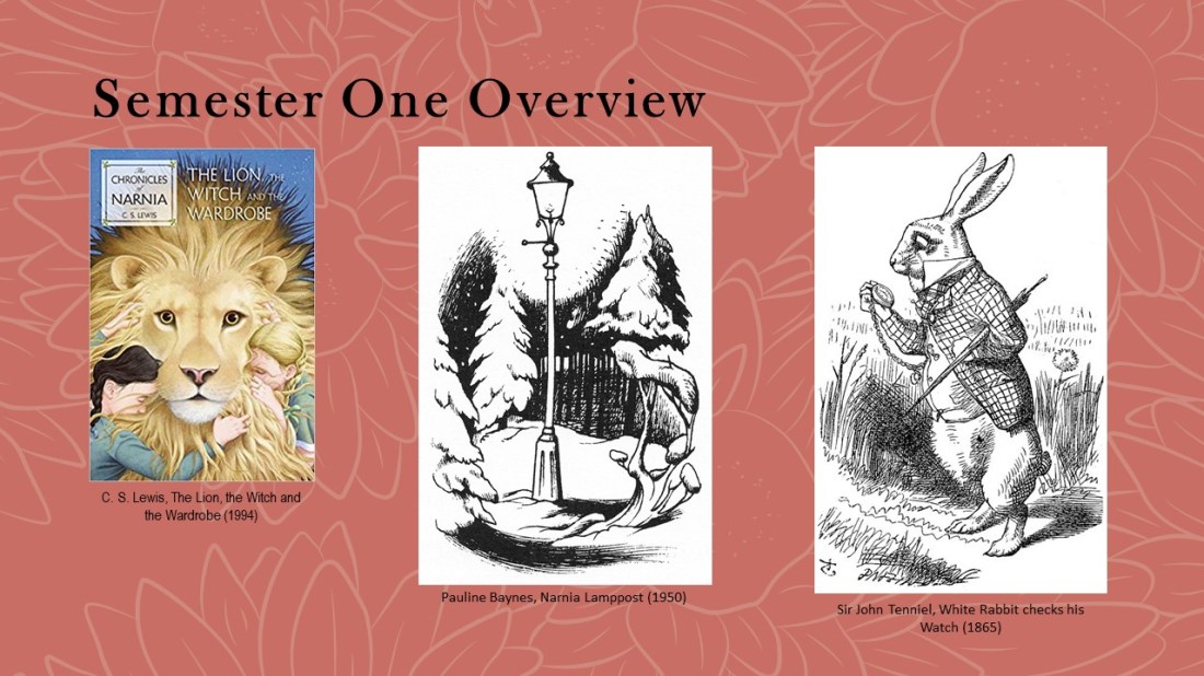
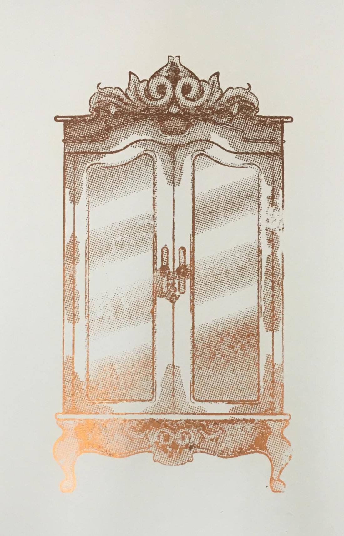
Moving onto the next project: the Lion, the Witch and the Wardrobe, I wanted to experiment with multiple printing techniques to give me more experience for potential output methods that I could use in the future. I also wanted to work with more narrative, following the goals set within my learning plan.

For research, I quoted directly from the book so that I could create accurate depictions of the story, rather than creating illustrations from the imagery I already knew. Initially, I was inspired by Sir John Tenniel and his intricate line work but had later found Pauline Baynes, who was the original illustrator of the Lion, the Witch and the Wardrobe, had worked in a similar style, but she had incorporated colour into her designs which I did not want to do with my own design so I felt my designs would still be different from illustrations already created for the story.


Slide4

4

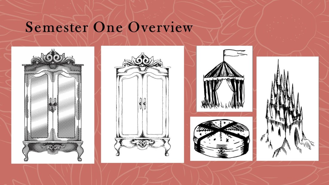
When I first started this project, I felt I had started strong, using the wardrobe imagery to test out each of the printing methods, I.e. screen-printing, etching, using a laser cut plate and lino printing.

With the inclusion of more projects, however, I do feel I lost momentum and felt like I rushed the pieces to the right in the last couple of weeks/days.

Given more time I would’ve refined the last pieces by creating them in illustrator, drawing the line work by hand then using the laser cut method to print them, as I had felt this was the best and cleanest methods from my wardrobe print tests. I believe the addition of illustrator would have made the pieces more proportional, fixing the errors within the symmetry and potentially making the linework straighter and cleaner.


Slide5

5

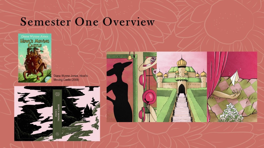
My next project was the House of Illustrations Book Illustration Competition. I had to create a set of 3 illustrations and a book cover for howls moving castle. Again this was narrative based brief, so it fit within the goals of my first learning plan. The only research that I had done for this project was just reading the book so that I again, could create an accurate depiction of the story, as opposed to working with content I may have already seen, for instance with Studio Ghibli’s adaptation of the book. (If you want to know my opinion of the original book and the movie adaptation, also listing the differences between the two, you can read about that here.)

Not researching other artists and styles may have been my downfall during this project as I did struggle when creating the pieces as I didn’t have a strong concept of the styles I wanted to use. I did, however, enjoy my choice of colour palette, as it is easy on the eyes and translates the themes of the book well, showing the magical essence without it being too being direct. The palace piece is my favourite, as I love the symmetry and perspective and it is how I had envisioned the king’s palace within the book. I have been able to translate my thoughts onto the page.


Slide6

6

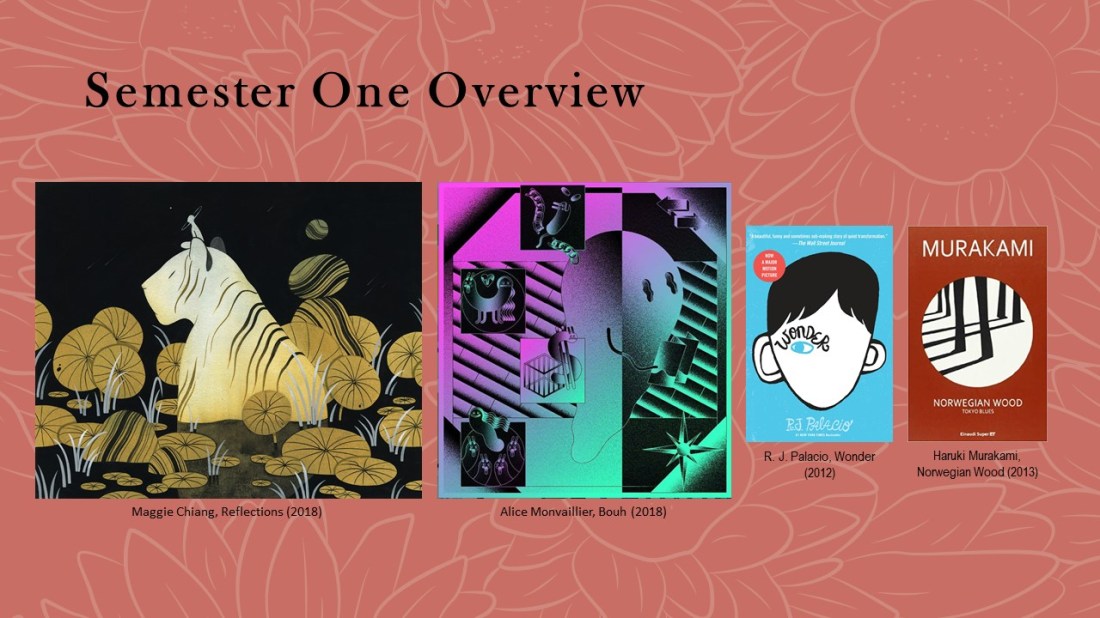
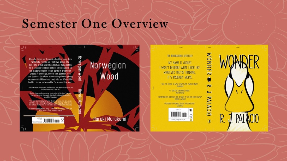
For the next project which was also a competition, this time for the Penguin Student Design Awards, I created 2 book covers for 2 separate categories; the adult’s fiction which was Norwegian Wood and the children’s book was Wonder.

For research I looked at entries from previous years, looking for common trends that I could potentially apply to my own work. I had noticed that a lot of the covers were minimal, and some had a noise effect applied, this had led me to think of artists such as Maggie Chiang and Alice Monvaillier as I believed their styles would work well among the other entries, so would be a good source of inspiration for myself during this project.

Again, I had read both of the books as research.  This allowed me to get a better understanding of the stories so that I could know the type of content I would be creating for the covers, especially considering both books have completely different themes and audiences.


Slide7

7

These are the two covers I created. I did complete them within a short amount of time, but I don’t feel as if they look rushed and I feel like these are a lot different from my usual style, as they are minimalistic within the colour pallets and imagery, which are styles/palettes that I have tried to dip into but have not fully achieved until these two creations.

I had struggled a lot with the text and titles, being able to make them readable against the illustrations. In the future, I will consider the type a lot further in advance so that I can work my illustrations around the text, instead of just trying to work the text around the images as I had in this project.


Slide8

8

My weaknesses from the first semester were definitely to do with my time keeping and having too many projects in general which ended up overlapping, causing me confusion and stress.

From the first learning plan, I did achieve the goals I had set, working more traditionally and creating more narrative based pieces, so in the next learning plan my goal was to still try working more traditionally, this time using pencils, but I also wanted to create more thought-provoking pieces, that could potentially lean more towards the area of editorial.

I also wanted to use the last semester to focus on my branding, this would mean making a website, business cards, promo packs, merch etc. So that I had a base that I could grow from once I’ve finished the course.

From this point onwards, I vowed to not overlap any more projects, focusing on just one at a time. With the time plan I created for semester two, I was going to work more loosely with it, not having anything set in stone as at that time I still didn’t know when the competitions would be announced.


Slide9

9

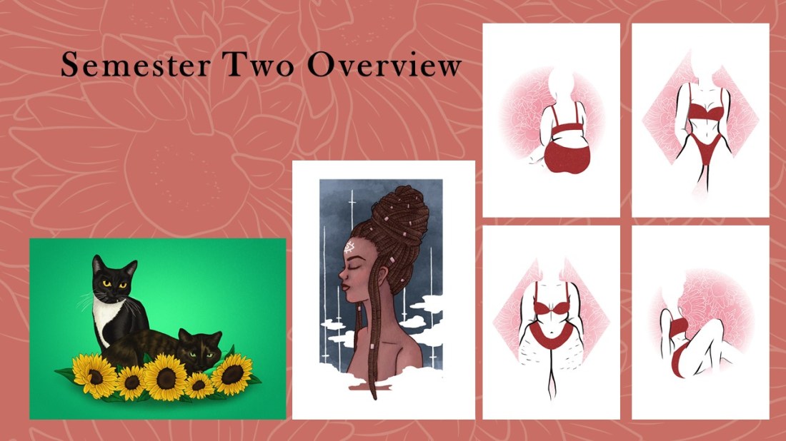
These are unplanned side projects which I ended up spending more time on than I necessarily had.

The first on the left was a commission piece for my friend.

The second was a ‘draw this in your style’ challenge in which I had to recreate an artist’s drawing in my own style, the piece here being a recreation of Chelsea Gracei’s work.

Then the final pieces on the right were a collection I created for ‘A Canny Collective’ which was a local exhibition that I was asked to be a guest artist for.

Although I had spent longer on these pieces than I should have, I do feel like I gained a lot of experience from them, especially with the exhibition pieces, as there was a whole process of creating the pieces and setting them up within the space, but I also worked on the stall on the opening night, so I was able to gain more experience of selling my own and others work one to one, which is something I do believe I will do again in the future. All of these pieces will also go towards my portfolio, hopefully allowing me to show more range of style, techniques and skill within it.


Slide10

10

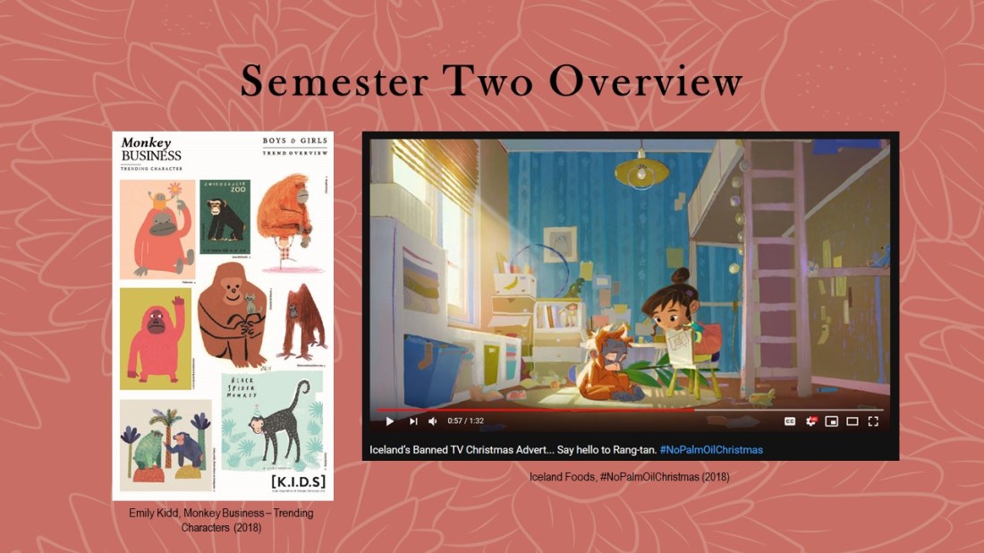
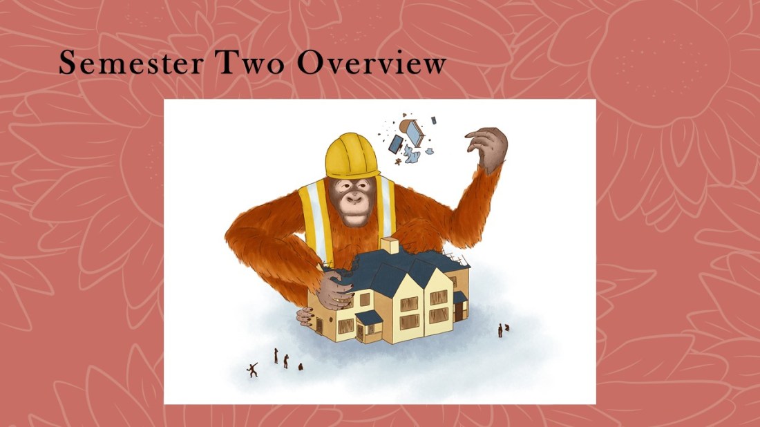
My goal with this specific project was to create a more thought-provoking illustration, which links back to the goals I set in my second learning plan.

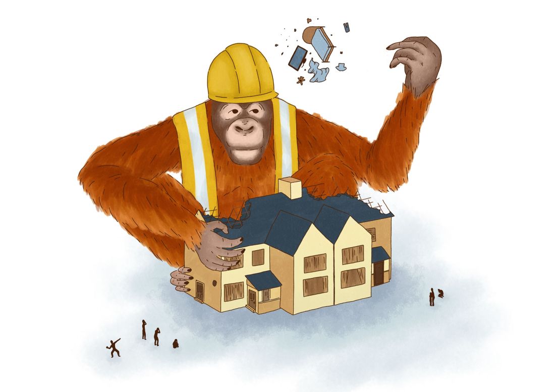
For the Northern Illustration Awards, a competition by the AOI, the brief was ‘monkey.’ When searching Pinterest for inspiration I came across the image on the left, and in the corner saw an orangutan which had been created in a looser style which helped suggest the animal’s fur. I wanted to work in a similar style to create my own monkey, but I did want to use a stronger theme. Thinking of Orangutans, it had reminded me of the banned Iceland advert, in which it discusses the destruction of rainforests (the orangutan’s habitats) for palm oil.


Slide11

11

Within this piece, I wanted to show a role reversal between humans and the orangutans, they being the ones that are destroying our homes with such carelessness instead.

I enjoyed working on this piece as it was more experimental and I was able to work more loosely. I was able to play around with different brushes, (in the end, I had used a gouache brush for the fur and a ‘scratchy pen’ for the linework, both from Kyle T. Webster brush packs) and these, in turn, allowed me to build up my own impression of fur, which helped give a sense of realism but the style was still loose and quite painterly for digital art.

I designed this piece to fit within a white page, so it is more minimal in that sense, but this factor could potentially make it more editorial as I could imagine it fitting within a magazine as an illustration for an article.

With this illustration, I had recorded the process and created my first ever YouTube video which was a speed paint of this piece. I do want to carry on uploading more speed paint process videos, potentially giving more information in the form of a voice-over, but one day I do want to live stream as well as/opposed to recording, as I believe I would prefer to talk live to an audience, having an active conversation as I go, rather than feeling like I am talking to myself in a voice over.


Slide12

12

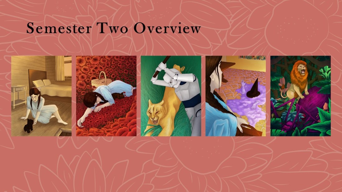
The next project was the Wizard of Oz, my goal with this project was to work more traditionally using pencil and then colouring the pieces digitally as I believed it would give me a better choice in colour palette. With this project, I did want to work with a more fun and vibrant colour palette than I may have used before, as I wanted my pieces to suit the colour themes suggested within the story, such as ‘Emerald City’ and the ‘yellow brick road’.

The idea for the mediums and techniques were initially inspired by Tina Nass, but as my project developed and I moved to a more realistic style within the project, I tended to take more inspiration from an artist named Chantal Hores as she still works with the same mediums and techniques as Tina Nass, however her style is more realistic, especially with her characters.

Again, my research had come directly from the book, finding quotes that would allow me to create an accurate depictions as possible, but in this project I did find it more useful as the movie adaptations were not completely true to the descriptions within the book, for instance, the famous ruby red slippers were actually silver in the story.


Slide13

13

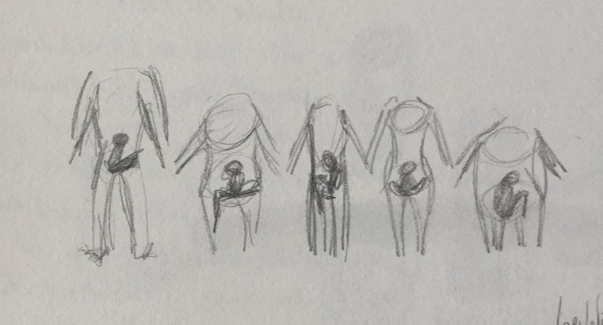
These pieces have come a long way from the start, as I had originally sketched them out in a layout that looked flat and boring, I later repositioned and redrew the pieces using my own reference photos, as well as reference images online (more so for the animals) which allowed me to create more organic and dynamic viewpoints within my illustrations.

I’m extremely proud of the outcomes as there is a strong narrative throughout, one that I wouldn’t have thought that I would have been able to achieve at the beginning of the year. I love the colours as they are vibrant and express the themes of Oz. I did try to stay away from the known imagery when working on these pieces, and I do believe I’ve created my own unique interpretations of the story.

I loved the style of work and mediums that I had used and I hope to use them again more often in the future. If I find myself in a spot again where I feel my composition or layout of a piece is a bit boring, I will try to take my own reference images again, exploring different viewpoints and angles etc, so that I can potentially create more dynamic illustrations which are less boring and flat in the future.


Slide15

14

Branding has a lot of components within it, for instance I needed to create business cards, a website, a portfolio, creative CV and products and all of these would go into a promo pack which would be sent off to potential clients and or agencies.

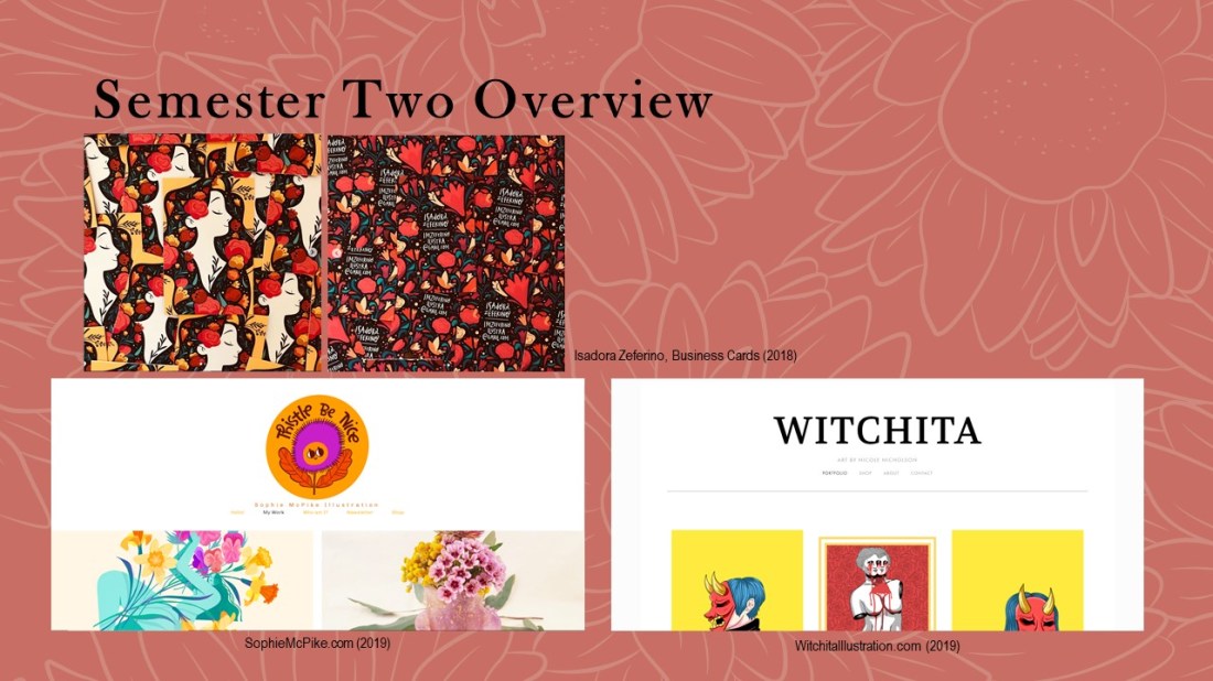
As far as research goes, I initially started the process of creating my business cards within semester one, so that they could be sent off with my zines. I was inspired by an artist named Isadora Zererino as on her cards she has an illustration on the front and her information on the back, they are also portrait, which is something that I hadn’t seen very often and this is how I wanted my own to be laid out.

When creating websites, I was researching as I was going, looking at how other artists laid their work out, what their buttons were, how they ordered them, and how they described themselves in their about pages etc. For this, I had used Sophie McPike and Nicole Nicholson’s (who is a student in my class and made her site first) websites as inspiration. I also took information from a talk we had with someone from AOI who had explained that a client will make their impression of you within the first couple of seconds of looking at your website, so it’s good to have 6-9 pieces on display on the front page.


Slide14

15

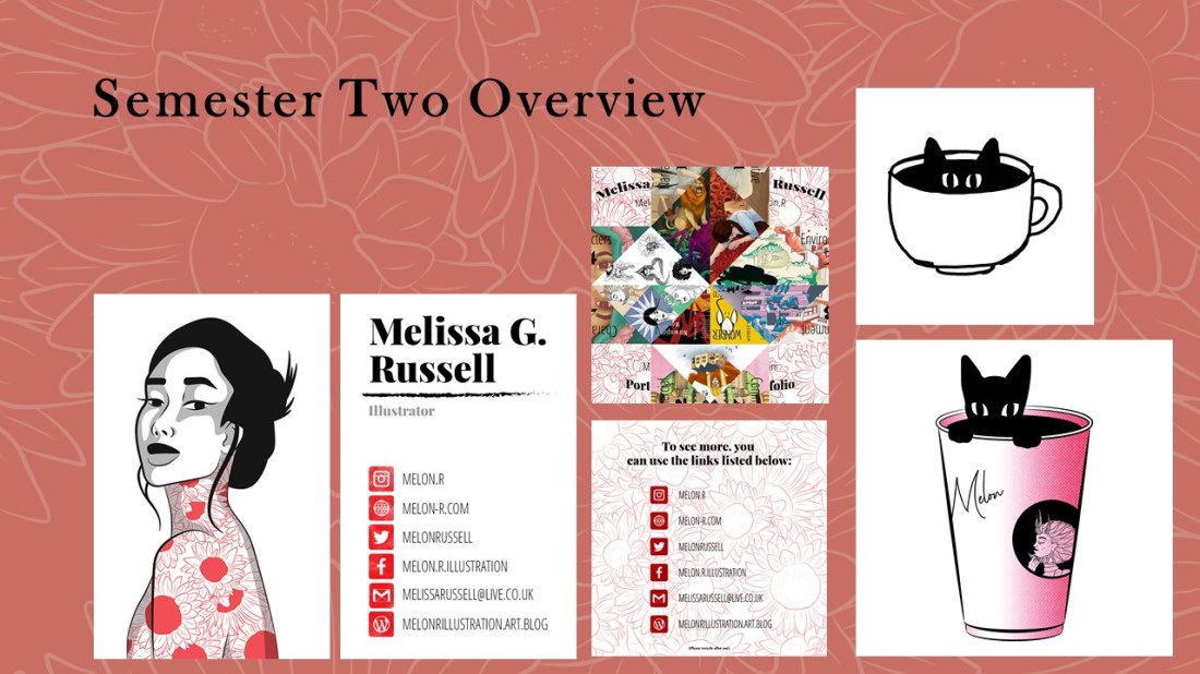
On this slide, to the left, I have shown my current business card with my website included which wasn’t present in semester one.

A mini-portfolio, which is actually a paper fortune teller. I felt this would be an interesting piece for someone to receive in my promo pack as it is a unique way for them to view mini clips of my work. On the back, I did provide links so that the receiver would be able to look at my portfolio more in depth, seeing the pieces that I have cropped down for this mini-portfolio in more detail.

The two pieces on the right side are merchandise ideas. On the top is a sketch of a potential pin. I want to create these in wood using the laser cutter in the workshop as ordering enamel pins is not in my budget or audience range at this moment in time. Maybe in the future, if I do build more of an audience, I could have a pre-order or made-to-buy system which would allow me to make a profit and would ensure that none would go to waste.

The second image on the right is going to be a sticker, potentially a little print.
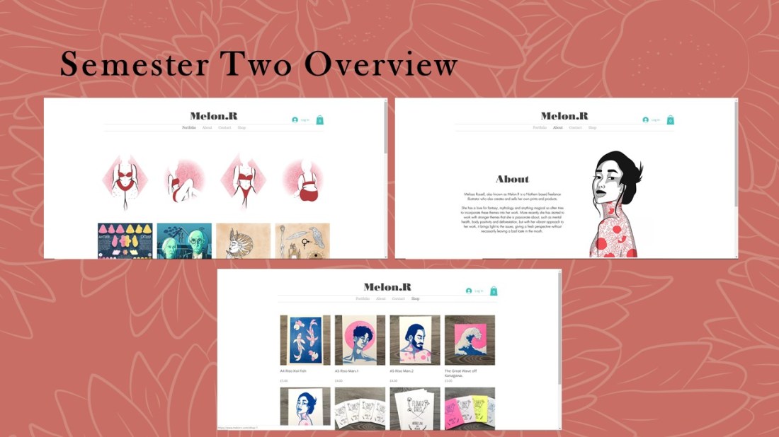
 

Slide16

16

These are pages from my website. I still have work that needs to be added to the portfolio but I will want them to fit within a layout that is organised by colour or theme, which I believe will make the website more aesthetically pleasing to the eye, so I can potentially catch a client’s attention within the first couple of seconds, as the member of AOI had suggested. The website also has a shop which I do plan to work from in the future.


Slide17

17

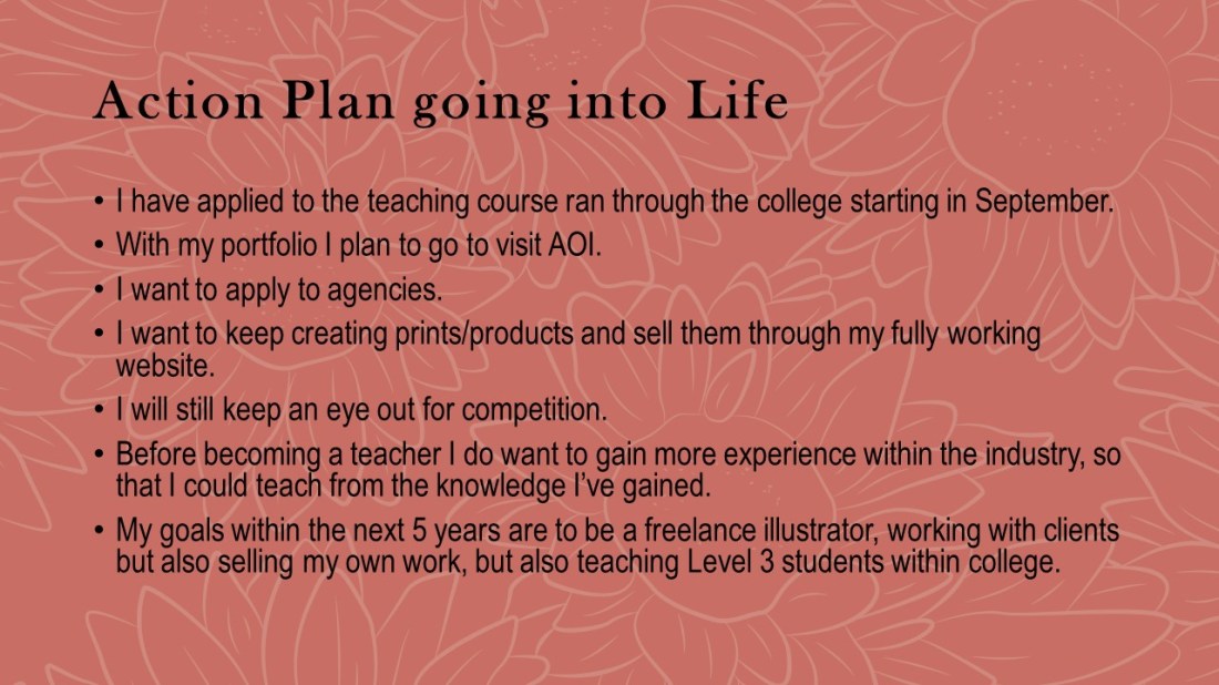
Going into the future, I have applied for a teaching course within the college that will start in September. Before teaching properly, I do wish to have more experience in the industry so that I can teach from my knowledge and experience that I may have gained.

With my portfolio, I plan to visit the AOI to get a review and more information about which direction it should go, if I need to take anything out, if I need to add anything more and so on.

I will also be applying to agencies hoping to get more freelance based work.

I will be continuing to create products and selling them through my website.

I will still try to keep an eye out for competitions.

I will also continue creating YouTube videos, ones that are more in-depth with voiceovers added. I also want to live stream more, having a more relaxed experience, potentially talking one to one with my audience as I create my work.

Overall my goal for the next 5 years is to be a freelance illustrator, working with clients and potentially have an agent. I will also be creating and selling my own work on the side, as well as hopefully teaching level 3 students within a college.


Slide18

18

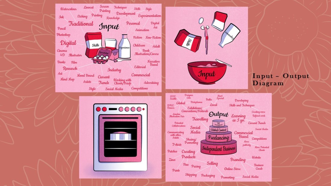
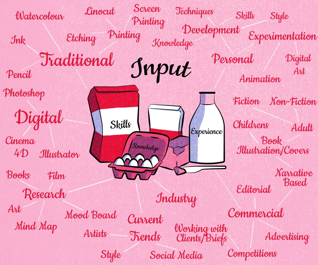
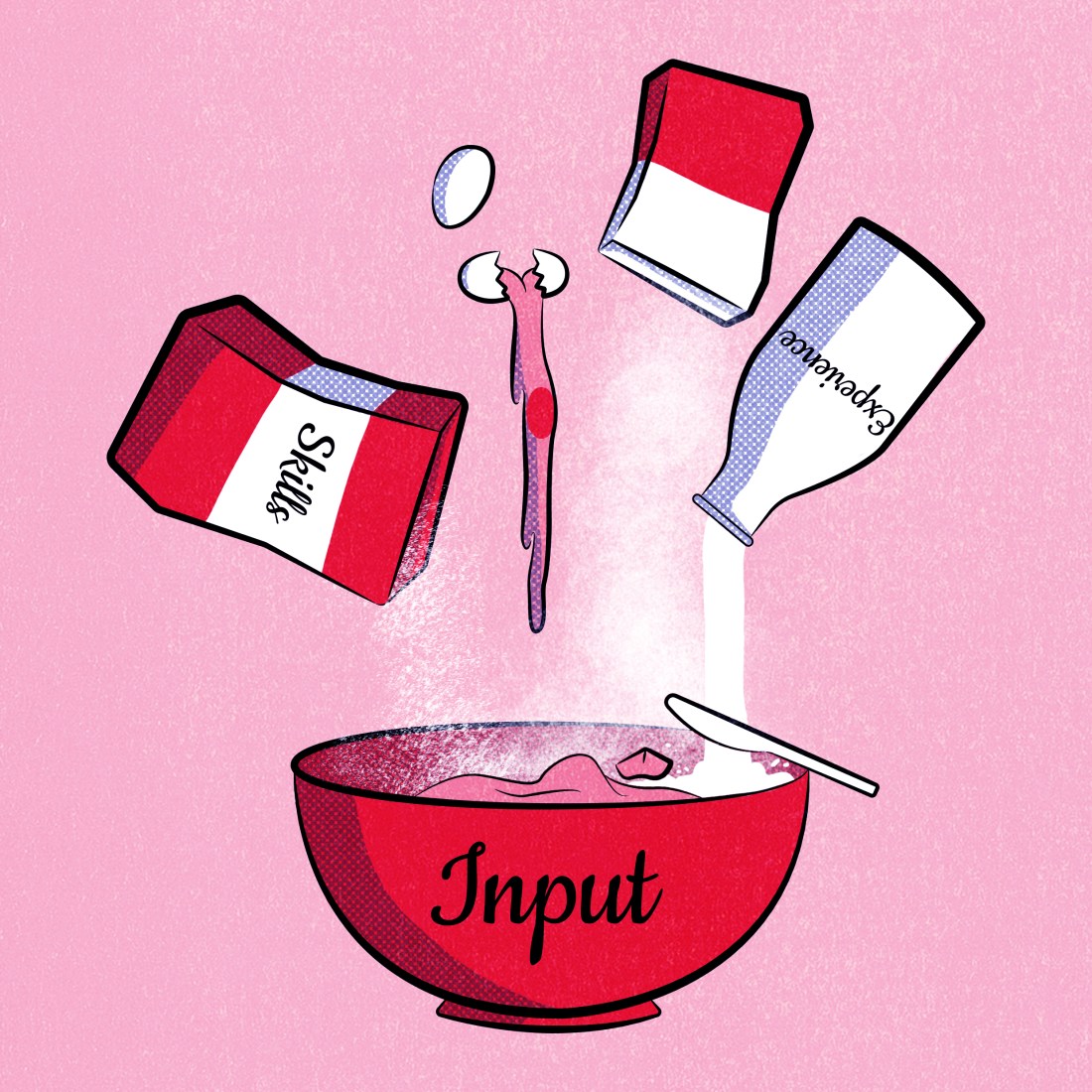
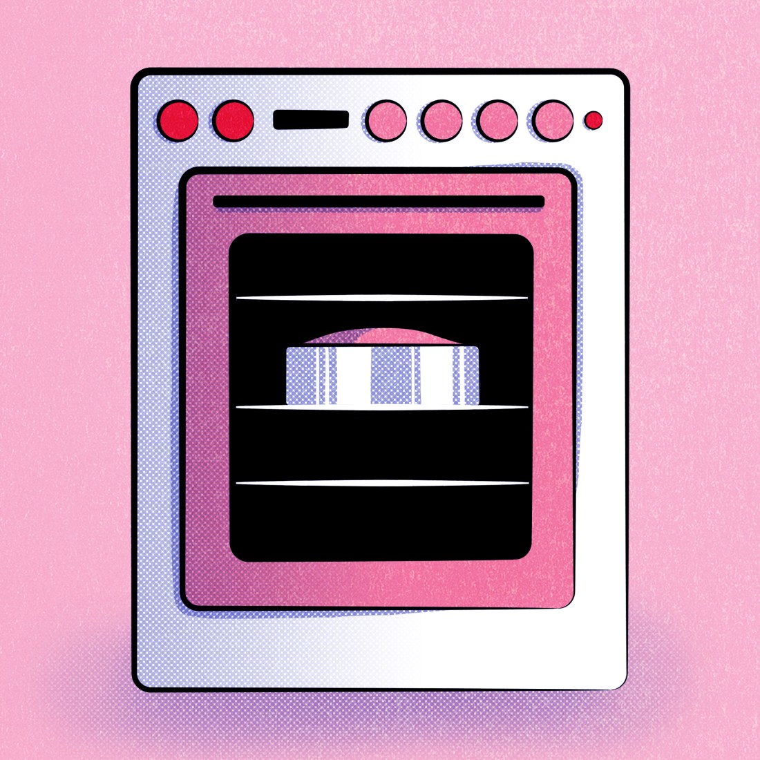
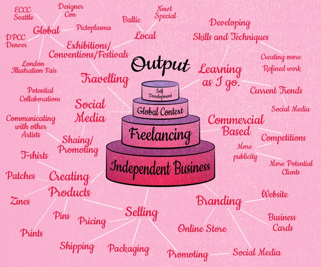
Following on with more self-reflection, I created a couple of diagrams within the space of the year that are up on my blog. This one is an input and output diagram, it describes the skills, knowledge and experience that goes into my work and what is output from it, being anything to do with business, freelance work, self-development and live briefs.

If you would like to read more about my Input-Output diagram, click here.

Slide19

19

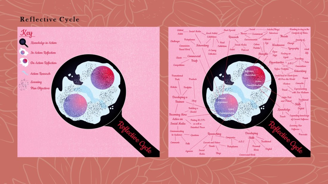
This next diagram is my reflective cycle, it shows my process of planning a project, the research that goes into it, my action plan, the actual practical work and the experience from said practical work. This then carries on and the cycle starts again.

The explanations of both of these diagrams are on my blog, as I wanted to have an easier explanation for someone who may not understand these types of reflective practices, but may want to understand my process of working, thinking etc.

If you would like to read more about my Reflective Cycle, click here.


Slide20

20:

This is my bibliography. Thanks for your time do you have any questions?

Although this was more directed at my presentation if you do have any questions feel free to comment and I will try to answer as best as I can!


List of Illustrations

These are all jpeg images of the slides from my Reflective Practice Presentation. Within the slides, I have cited the images that were not mine, so if an image does not have a caption, it is my own work.
Figure 1.Amazon (1994). The Lion, the Witch and the Wardrobe: C. S. Lewis. [image] Available at: https://www.amazon.com/Lion-Witch-Wardrobe-Chronicles-Narnia/dp/0064404994/ref=sr_1_1?crid=1ZYCJ0GH8FLC2&keywords=the+lion+the+witch+and+the+wardrobe&qid=1556748222&s=books&sprefix=the+lion+%2Cstripbooks-intl-ship%2C236&sr=1-1 [Accessed 1 May 2019].
Figure 2.Baynes, P. (1950). Narnia Lamppost. [image] Available at: https://www.paulinebaynes.com/?what=artifacts&image_id=532&cat=69 [Accessed 1 May 2019].
Figure 3.Tenniel, J. (1865). White Rabbit checks his Watch. [image] Available at: https://medium.com/alice-s-adventures-in-wonderland/sir-john-tenniel-s-classic-illustrations-of-alice-in-wonderland-2c3bbdca3a77 [Accessed 1 May 2019].
Figure 4.Amazon (2008). Howls Moving Castle: Diana Wynne Jones. [image] Available at: https://www.amazon.com/Howls-Moving-Castle-Diana-Wynne/dp/0061478784/ref=sr_1_1?crid=1U66801S7NAFP&keywords=howls+moving+castle&qid=1556747151&s=books&sprefix=howls%2Cstripbooks-intl-ship%2C219&sr=1-1 [Accessed 1 May 2019].
Figure 5.Chiang, M. (2018). Reflections. [image] Available at: http://www.hellomaggiec.com/2018/3vwq57poq1ezpl0a78wkarcwx3qiae [Accessed 1 May 2019].
Figure 6.Monvaillier, A. (2018). Bouh. [image] Available at: https://www.instagram.com/p/BhdoARQD1jA/ [Accessed 1 May 2019].
Figure 7.Amazon (2012). Wonder: R. J. Palacio. [image] Available at: https://www.amazon.com/Wonder-R-J-Palacio/dp/0375869026 [Accessed 1 May 2019].
Figure 8.Amazon (2013). Norwegian Wood: Haruki Murakami. [image] Available at: https://www.amazon.com/Norwegian-Wood-Tokyo-Blues-Italian/dp/8806216465/ref=sr_1_12?crid=IINWGD0DLUSW&keywords=norwegian+wood&qid=1556746704&s=books&sprefix=norwe%2Cstripbooks-intl-ship%2C259&sr=1-12 [Accessed 1 May 2019].
Figure 9.Kidd, E. (2018). Monkey Business – Trending Characters. [Blog] Emily Kiddy. Available at: http://frame.bloglovin.com/?post=6540277057&blog=3758402&group=0&frame=1&frame_type=none&avpp=true&context=&context_ids=&feed_order=&click=0&user=0 [Accessed 1 May 2019].
Figure 10.Iceland Foods (2018). Iceland’s Banned TV Christmas Advert… Say hello to Rang-tan. #NoPalmOilChristmas. Available at: https://www.youtube.com/watch?v=JdpspllWI2o [Accessed 1 May 2019].
Figure 11.Nass, T. (2017). [image] Available at: https://www.instagram.com/p/BcFQm-hHS6I/ [Accessed 2 May 2019].
Figure 12.Nass, T. (2017). [image] Available at: https://www.instagram.com/p/BcFQm-hHS6I/ [Accessed 2 May 2019].
Figure 13.Horeis, C. (2019). [image] Available at: https://www.instagram.com/p/BuG3ws5F53Y/ [Accessed 2 May 2019].
Figure 14.Horeis, C. (2019). [image] Available at: https://www.instagram.com/p/BuG3ws5F53Y/ [Accessed 2 May 2019].
Figure 15.Amazon (2015). The Wizard of Oz: L. Frank Baum. [image] Available at: https://www.amazon.co.uk/Wizard-Oz-L-Frank-Baum/dp/1604335424/ref=sr_1_14?keywords=wizard+of+oz+book&qid=1557071553&s=gateway&sr=8-14 [Accessed 2 May 2019].
Figure 16.Zeferino, I. (2019). Business Cards. [image] Available at: https://www.instagram.com/p/BqSkrJllskE/ [Accessed 2 May 2019].
Figure 17.Zeferino, I. (2019). Business Cards. [image] Available at: https://www.instagram.com/p/BqSkrJllskE/ [Accessed 2 May 2019].
Figure 18.McPike, S. (2019). Work — Thistle Be Nice. [online] Thistle Be Nice. Available at: http://www.sophiemcpike.com/mywork [Accessed 2 May 2019].
Figure 19.Nicholson, N. (2019). WITCHITA. [online] Witchita Illustration. Available at: https://witchitaillustrations.com/ [Accessed 2 May 2019].

AOI Monkey

The project:

This was a last minute competition suggested to the class by our tutor who thought it would be a great opportunity for us to submit a design to. When he had suggested it, I believe there were only a couple of weeks till the deadline, so it would have to be a quick project and turnaround.

The competition is run by the Association of Illustrators and is called the Northern Illustration Awards, so only northern-based emerging/established illustrators could apply. The theme of the competition is monkeys, which is inspired by a local story in Hartlepool, wherein the time of the Napoleonic Wars, the people of Hartlepool had hung a monkey as they believed it to be a French spy. You did not have to illustrate this story, all you had to do was illustrate a monkey.

Following the themes of my Cheltenham Illustration Awards project, in this one, I had also wanted to work with deeper themes, I did not just want to make a pretty picture of a monkey to submit, as I felt countless of illustrators will have done with such an open brief, I did want my design to have more meaning.

When scrolling through illustrations of monkeys on Pinterest, I had discovered one that I had liked and it was of an orangutan and had been created in a loose tactile style which helped in creating an impression of the monkey’s fur. This piece had actually reminded me of the banned Iceland advert which had gone viral around Christmas time, which was about deforestation for palm oil, which in turn means the loss of habitats for orangutans.

This had inspired the direction in which I wanted to take with my monkey illustration. For my piece, I wanted to show a role reversal between the orangutans and us humans, showing what it would be like if they were the ones destroying our homes and livelihoods for their own benefits, whether it be for food, drink or even shower products.

With this illustration, I wanted to shed more light to the issue, maybe in less of a direct way than showing the audience an image of deforestation, but instead, creating more digestible imagery which is prettier but is still able to get the message across. Most of the time people will ignore images of problems going on in the world, such as deforestation and loss of habitats for wildlife, as it is easier for them to go on with their day imagining that its not actually happening, but with my piece, it is more vibrant in terms of palette, so will attract the audiences eyes, and the content is not so violent the the audience want to ignore it, but instead they may take in the message easier, especially if they have a fresh perspective of the issue.

My message with this piece is ‘How would you feel?’. How would you feel if your home was destroyed without a second thought, if your livelihood, memories, comfort or even the feeling of safety had been taken away in the blink of an eye? I imagine it would not feel good, so why can we not show this empathy towards animals and in this case the orangutans. They may be animals, but they need homes, stability and a sense of comfort within their daily habits and needs, as much as we humans do.

_2


If you would like to see how I created this illustration, I had recorded the process and made a speed paint video which I had posted to YouTube as my first video, hopefully being my first of many and my first step towards a successful YouTube channel.

Strengths 

I do feel this illustration is unique in comparison to any piece I have made before. I had worked in a more looser style, experimenting with new brushes from Kyle T. Webster packs, and I feel I was able to create the impression of fur by building the tone, stroke and textures up gradually, which I feel helped my monkey look more realistic in a sense, but he does still have a more painterly look to him as well.

I loved my colour palette in this piece and it was actually inspired by a free paint swatch booklet, (the current Crown colour guide) that I had gotten from Homebase in the weekend before creating this piece. I had loved the pale toned blues within one of the room guides and I felt the orange of the orangutan would complement the tones well, so these were my main tones and I tried to work around them to make a cohesive design that would attract the eye and be very pleasing to it.

Weaknesses 

My biggest issue with this piece was trying to get the orangutans anatomy and proportions correct. Everything that I knew about the human anatomy had to be thrown out of the window for this character as their limbs are longer, bodies are more round and they barely have a neck. So, every time I tried to draw this orangutan, he would look wrong, but that was because I was comparing him to a human, so I just tried to get him looking as correct as I possibly could, which in the end, I do think I did a pretty good job? Maybe. I won’t really know until I’ve seen a real orangutan sitting in that exact position for myself.

Opportunities

By submitting this illustration to the competition, I may be able to get more recognition from the AOI, who I do plan to work with more in the future when I become a member with them. If I were to win, my work would be showcased within a gallery space in Hartlepool, being seen by other illustrators, both who I assume are also emerging or established, but it can also be seen by potential clients, but either way, it would be good publicity which could help my audience grow.

When I post the piece on social media, once the competition is over and the winners have been announced, as I’m not sure if you’re allowed to have it online beforehand, I will be using hashtags to reach a wider range of audiences, but this may allow me to reach more activist based groups or people who have the same views on the subject, so I may be able to learn more about the issue from them and ways in which I can help the cause, whether it’s swapping to alternative products that do not contain palm oil, or going out of my way to do even more. Since creating this piece, I have become more passionate about the issue at hand and I would like to make a change, so I would like to be more informed about the problem so that I can help more and inform others about the issues with more confidence.

Threats

The main threat I feel I would have from this illustration would be that I am a hypocrite with the message, as I do still use products that contain palm oil, so from the audience’s perspective, if I myself am still using the products, why should the audience stop. In response to this, I would say that with this piece, it’s not really aimed at the common public, as palm oil is in so many products that it would be hard to just stop buying them or find alternatives, so I aim this illustration at the people higher up, such as the companies that make the products, as I feel they need to start finding alternative methods rather than using palm oil as consumers don’t really know what is in the products they are purchasing half of the time, but the companies know what ingredients are going into their products and the devastation it has caused within the rainforests. It may cost time and money to remake the products with an alternative ingredient, but in the long run, it would be worth it, as it would not just be saving the homes of thousands of animals including the orangutans, it would also help in saving our planet.


Future Goals and Targets.

I loved working on this piece, with the style, techniques and stronger message behind it, so in the future, I would like to create more illustrations with stronger messages, ones that I do feel passionate about and can get behind.

With the style and techniques, I feel I had discovered my direction with this illustration just whilst experimenting, so I would like to treat more projects like this in the future, trying out multiple brushes and colour palettes before I even start working on the illustration, so that I have a better idea of the direction I’m taking with my piece and I have more confidence in doing so.


Bibliography

Crown Paints. (2019). Colours. [online] Available at: https://www.crownpaints.co.uk/colours [Accessed 9 Apr. 2019].

Iceland Foods (2018). Iceland’s Banned TV Christmas Advert… Say hello to Rang-tan. #NoPalmOilChristmas. Available at: https://www.youtube.com/watch?v=JdpspllWI2o [Accessed 9 Apr. 2019].

Russell, M. (2019). Monkey Illustration. Available at: https://www.youtube.com/watch?v=G4Ib2r6xXyU&t=50s [Accessed 9 Apr. 2019].

All other images are my own unless stated otherwise.

Cheltenham Concepts

For the Cheltenham Illustration Awards, with the theme of ‘unity’, I wanted to create an illustration with a deeper meaning and a stronger message behind it. I had not created a lot of illustrations like this in the past, so had wanted to gain more experience with that type of illustration in this project. A lot of these ideas were thought from the perspective of a group of people coming together to fix certain issues, showing the theme of unity through group efforts.

59941370_333654900616821_6856225688114954240_n.jpg

Concept 1 – This concept was a little basic in a sense, I feel like it would be expected from the theme of unity. I had sketched a silhouette of two people holding hands and inside the shape would be layers of people of all different backgrounds and walks of life, differentiating by their gender, ethnicity, job role, sexuality, etc.

I did like the idea behind this concept but did not feel the message was the direction that I wanted to go with as I did want to look even deeper into worldly issues, bringing light to them through my illustrations.

Concept 2 – This idea was inspired by an illustration I had found on Pinterest of a figure trapped within a glass dome, so I felt this would be a good representation of what it may feel like to be trapped within your own mind, and for my piece, to better express the theme of unity, I wanted the piece to be sequential, showing the figure getting help from others in the end, whether it be from professionals or just his friends. When putting more thought into the specific type of glass, as that could have more symbolisation in itself, it had made me think of a campaign called ‘Be in your Mates Corner’ ran by Time to change, in which they had made beer mats with the message:

“Is there a mate missing around this table? Reach out to him.” – (Time to Change, 2019)

This campaign was directed at a male audience as suicide is the main cause of death in men under 50, and this campaign was directed to fight the stigma behind mental health in men as some may feel that they shouldn’t talk about their problems as it may make them weaker. This advertisement was fighting the stigma and opening the conversation about male mental health issues, so with my own illustrations, I wanted to try to do this too, carrying on that conversation and potentially showing that there is light at the end of the tunnel if you allow others in, whether it is from professional help or just from friends.

Concept 3 – This concept was inspired by an artist named Lauren Carney, or DizzyLittleDotty on Instagram, who had formed a portrait of a character made from multiple characters of different backgrounds, ethnicities, etc. The artist had created this piece to celebrate international women’s day of 2018, so the piece had consisted purely of female figures, so with my own piece, I wanted to take her concept and try to be even more inclusive, having male representation as well as women, showing unity through all people.

In my version, the character had ended up looking similar to Frankenstein’s monster, so scarier than I had intended, as opposed to empowering as I feel Carney’s piece is. I did decide that I would not be taking this concept any further as I believe the illustration shown below is already a great representation and is uplifting as opposed to a horror show like my version.

60213365_395083394412689_9010448693853159424_n.jpg

Concept 4 – Is based on another illustration I had found on Pinterest, which was of a woman in a social setting, but inside of her was a curled up figure who seemed to be scared of being within that setting and had anxiety that she would have to communicate with others or potentially feared that everyone was looking at her or talking about her.

With my own piece, I had the idea to show multiple people holding hands, people of all different shapes and sizes, but within them, all was a scared little version of themselves. This was supposed to symbolise that no matter what you may look like on the outside, whether you’re a big buff guy like Terry Cruise or have the figure of McLovin (I know he’s a fictional character but that is the only name I will use for that actor), all of us have that person within us that is scared, maybe who has anxiety, problems with overthinking, depression and so on. Despite these versions of us, however, we still need to overcome them, no matter how long or hard that challenge may be, and together we stand in union ready to help one another through our struggles.

60330243_2162535213865224_7218479503490678784_n.jpg

Concept 5 – This concept was suggested by my partner when I had asked him for ideas of illustrations that I could make with deeper meanings to them. He had suggested that I draw a beach with the waves gently washing inwards and back out, but as they would do this, they would wash up children’s toys. This was to symbolise the children that may not have made the journey when escaping Syria on the boats/rafts, the toys having belonged to those children.

This concept is very deep and it does make me sad when thinking about it. Before my partner had mentioned this idea, I do think that I was blissfully unaware of this issue, but by creating the visuals, it has given me more perspective on the situation and more realisation as to the horrible problems going on within the world.

Although this was a strong concept, I did not feel it had a lot of connection to the theme of unity, (which was solely my fault as I had not mentioned the theme to my partner, I had just asked for ideas for an illustration with a deeper meaning, which he had come through on) so, I had not decided to carry this concept onwards. I do however want to potentially come back to it at a later date, as I do believe that by illustrating this piece, I could bring more light to the topic, making more people aware of the issue.

ugh

With these concepts, I had chosen to take concept 2 further, illustrating the piece in more detail. However, this had not worked out well as I felt I had lost connection with the original theme, and whilst illustrating it, I did not have a style in mind that I wanted to achieve, so I had lost more and more confidence in the whole piece as I was going. With the timeframe and still having other projects to complete, I felt myself caring less and less about this project and with the direction that it was going, I had not enjoyed the thought of it at all, so I had made the decision to just cut it off before I spent any more time on it. When I had tried to make the piece better, I just felt like I was polishing a turd, so just felt there was no point in carrying on.

I do like the concept behind this piece as I do feel it is strong, but I feel I need more time to play around with the imagery within, illustrating something that I am proud of, as opposed to just getting the piece done and out of the way. I believe as it is a strong message, it does deserve strong imagery as well so that it is able to best communicate the specific message to the audience.

As well as this concept, at a later date, I would like to come back to the others as well, maybe working more outside of the theme of unity, as I feel I will have more freedom, being able to play around a bit more with the imagery as I will not need to try to make the concepts work towards the theme and be confined to it.


Reading List

Russell, M. (2019). All together now: Tales of Unity. [online] Pinterest. Available at: https://www.pinterest.co.uk/melon628/all-together-now-tales-of-unity/ [Accessed 21 Mar. 2019].

Time to Change (2019). Be in your Mates Corner. [online] The Independent. Available at: https://www.independent.co.uk/life-style/health-and-families/men-mental-health-coaster-twitter-viral-time-to-change-campaign-suicide-depression-a8319796.html [Accessed 21 Mar. 2019].

List of Figures

Carney, L. (2018). International Women’s Day. [image] Available at: https://www.instagram.com/p/BgCmATIjtVb/ [Accessed 21 Mar. 2019].

All other images are my own unless stated otherwise.

I can’t draw.

As a class, we had watched a TED talk by Graham Shaw in which he was talking about peoples perceptions about drawing. In this talk, he discusses how everyone can draw its basically just your own doubts that prevent you from doing so or improving your skills. In the talk, he does give a follow along example explaining his theory in which he gets the audience to draw characters with him, resulting in a lot of people realising they can draw. I am not going to show my results from the experiment as I just feel they’re a mess. They were fine in the beginning but then they just went downhill quick. I believe this was because I don’t work as fluid as Shaw does with his characters, so was more focused on trying to get the lines right and when he was onto the next steps, I had already created a mess. So no, I will not be showing my results, but I definitely think the talk is worth a watch and you may be intrigued to see what you could create, especially if you are one of those people who think you cannot draw.

I feel when people use this quote of “I can’t draw”, which usually follows “omg, you’re so good, I can’t even draw a…” they just assume that it is a natural gift that you must have been born with. This at least was not the case for myself. When I was younger, I don’t believe I was good at drawing but I did enjoy the process so I just kept going. I am quite a perfectionist with my work, and always have been, a trait which I believe I’ve gained from my Mum, thanks, mum! so after making a drawing, I would usually get disheartened when I could see the issues, but this wouldn’t stop me from drawing entirely, I would just try to keep improving.

In my teens, I would regularly use a site called DRAGOART, which I believe is still active to this day, and posts step by step tutorials of how to draw certain characters, icons, images, etc, which are usually inspired by current trends with the media and pop culture. From these tutorials, I would be able to draw the image quite well, but I would focus more on trying to replicate the image as opposed to actually trying to learn from the process. So, once I had noticed this when I would try to draw something that wasn’t from the tutorial,  I did start to try learning from the process, specifically from the beginning steps in which you form the image using shapes. From this day I believe this is still how I work, but over time I have improved my skills by learning the fundamentals of art first, and a lot of practice, more from real life or proper reference photos, as opposed to working from someone else characters/art. In my opinion, as an artist, you should never stop learning or improving or wanting to learn or improve. I feel if you reach the point where you think that you have nothing more to learn or no more areas for improvement, then there would be no purpose for creating work. You would have reached your peak, where else would there be to go from there?

I myself know that I have a lot of areas to improve within my work, and a lot of new techniques and mediums that I want to explore, and although things may not work out, I will be excited to see how my art grows within the next 10 years, or 5 or 1, or even just within a couple of months. Below I have shown two illustrations of mine, the one on the left being one I had made in 2013 when I was 14-15? I remember how proud I was of it at the time, but looking back now, I’m sooooo happy with how much my work, style and aesthetic has grown since, especially when looking at the piece on the right, from late 2018, where I have drawn a more anatomically correct and more aesthetic character of my own, instead of just imitating someone else’s.

In conclusion, from watching the TED talk, I do believe that anyone can draw, they’ve just got to be willing to put the doubts aside and put the time into it for it to look as “good” as someone else’s they may compliment. I can’t think of any artist who was just magically gifted at their craft, at least not with a little practice at first. If I try to think about it in other terms, you don’t just learn maths overnight, you practise and practise over the space of basically 16 years, and once you’ve mastered counting, you then go on to adding, subtracting, timetables, division, then algebra gets thrown in and all sorts of equation stuff. So with this example, an artist is always improving, but it does take that understand and practice in order to do so.

Bibliography

Dragoart.com. (2016) How to Draw, Draw Step by Step.. [online] Available at: https://www.dragoart.com/ [Accessed 6 Feb. 2019].

Garner, C. (2017). Why Should You Study The Fundamentals of Art?. [online] Medium. Available at: https://medium.com/the-art-squirrel/why-should-you-study-the-fundamentals-of-art-1368efcbf446 [Accessed 6 Feb. 2019].

Shaw, G. (2015). Graham Shaw: Why people believe they can’t draw. Available from: https://www.ted.com/talks/graham_shaw_why_people_believe_they_can_t_draw [Accessed 6 Feb. 2019]

All images are my own unless stated otherwise.

Input-Output – Illustrated Diagram

As a task, the class was asked to reflect on themselves and their workflow, thinking in terms of an input and output system. We had to think of what goes into our work, i.e skills, research, experience etc. And then think about what all these elements allow me to create within my work, so this relates to my business, creating a product, selling that product, branding, socialising, promoting myself and so on.

Once we had thought about this, we then had to create a diagram. As of the Illustration we were to think about imagery that worked in a similar way, meaning that it would have an input and output system. When I got told about this theory, my first thought was of Cat in the Hat, how they had the ‘KUPKAKE-INATOR!’ in which you could make cupcakes out of anything!

“Anything?”

“Yes anything!”

“Anyythiing?”

“I’ll get you and it’ll look like a bloody accident!”

(Cat in the Hat, 2003)

So, in my head, I imagined the input going all into a machine, then the output becomes the amazing cupcakes in the process.

This idea had developed through the drawing phase, but the concept was still the same, the ingredients are all the elements in which go into my input, then the final cake is my output, each layer dedicated to a specific area in which my workflow leads to.

inputinge=redoutputsovenoutput

For the input, the main influences within my work process I believe come from my skills, knowledge and experience. Each of these elements can link back to one another, like how my knowledge can grow from the experience, more experience can help improve on skills, etc. From each of these elements, however, I have expanded on them, showing more detail of what factors go into my work.

With the output, I have categorised things that are produced from my work, and have separated them into layers of cake, the bottom is my small business that I wish to expand on, which includes all of the elements that would go into that, such as branding, selling, packaging, promoting myself, and actually creating the product I would sell. The next is based on freelancing, which I would associate more as a commercial side of my work, as I would be working more one to one with a client/brief. The third layer is based on a global context, i.e. where I could potentially show/sell my work, but it would also mean connecting more with other artists and businesses on more of a global scale. This could be done either through social media or travelling around the world to events like pictoplasma, or even going to conventions like Designer Con, which a few of the artists I follow attended last year.  The final layer is Self Development, as I do always try to improve on my work with every piece, whether its trying new techniques, playing around with colour pallets, or experimenting with current trends. I have actually tried to do that with this diagram, as I believe the colour halftone effect is quite popular at this moment in time due to the release of ‘Spider-man: Into the Spider-Verse’, so have tried to incorporate the pattern within the shading.


Bibliography

Cat in the Hat. (2003). [film] Directed by B. Welch. Universal Pictures.


IT’S CRUNCH TIME!

It’s now a week before the deadline and guess who still has a lot of work to do? ME! But is that a surprise? PROBABLY NOT!

(Giphy, 2015)

As it has been the holidays, I felt myself falling into the trap of procrastination, using the excuse of “it’s Christmas!” or “it’s New Years!” far too much. Although I did need this break for my sanity, I did feel the guilt when I would just be sitting around not doing work, when I knew full well that I could.

I had started my break for the holidays on the 22nd of December, after completing illustrations and a cover design for the House of Illustration competition and creating potential covers for the Penguin Student Awards Competition. So, getting back into the swing of things earlier this week, on January the 2nd, I realised that I had and still have a lot of writing up to do.

Today, I have only just finished writing up all of the days for Inktober. Although I have made blog posts about each of the days, I felt for academic purposes, I would have to write them up more formally and in more detail for hand-in.  So with this project, all I have left to do is to write up the process of making the zines, how I formatted the pages for printing, the different printing methods which I tried, what went well, what had not, which I had decided to use for final products etc. I then need to evaluate the final product and project as a whole, then that should be one project out of the way.

I’m going to be honest now, the rest of the projects aren’t as close to being completed as I would have hoped, and I do have a lot of writing up to do in the upcoming week.

House of Illustration project, I still need to:

  • Ask my peers for their opinions, if there are any changes I should make.
  • Potentially make the changes they suggest.
  • Get the illustration and cover ready for submission in the format the competition wants.
  • Print and mount the final design for hand-in.
  • Write up artist/influences
  • Write up creation process (I did take screenshots throughout, so this should make it easier to recall the steps I took and choices I made)
  • Evaluate the final design and the project as a whole.


Penguin Student Design project, I still need to:

  • Ask my peers for their opinions, if there are any changes I should make.
  • Potentially make the changes they suggest.
  • Get the Cover/s ready for submission in the format the guidelines of the competition state.
  • Print and mount the final design for hand-in.
  • Write up artist/influences
  • Write up creation process (I did take screenshots throughout, so this should make it easier to recall the steps I took and choices I made)
  • Evaluate the final design and the project as a whole.


The Lion, the Witch and the Wardrobe project, I still need to:

  • Write up my experiences with the different printing methods, how they work, what I enjoyed, what I did not etc.
  • Compare the printing methods.
  • Make new designs with the best printing method (if I have the time to do so).
  • Evaluate the final products and the project as a whole.


So from this to do list, my plan for the week is to write up my projects whilst I’m at home, then whilst I am at college I will focus on practical work. The reason I don’t want to write up my work at college is because I feel I am easily distracted, zoning in and out of work a lot, often losing my place or sentence etc, but when I’m at home, it is quieter and although there is a potential threat of tv, during deadline week this is not an issue, as stress me is on the ball! Or at least tries to be!

So whilst I am at college, I think I will try to get the final illustrations for the Lion, the Witch and the Wardrobe project, as the facilities I need are within the college, so I feel it will be the best use for my time.

Final Notes

I probably will get all of my work complete in time, but the more that I think I won’t, the more stress I will put on myself, meaning more pressure, meaning more focus on the work, meaning ALL WORK COMPLETED ON TIME. Let’s hope!

I am always surprised at how much work I get done the day before a deadline as the pressure pushes me through, and I always end up handing in on time. Myself and stress just work together well, it’s probably not the healthiest of relationships, but if it works it works! If it ain’t broke, don’t fix it! But ideally, I’m gonna try better to not leave all of my work till the last minute in the next semester/deadline, 2019 should be the stress-free year!.. Starting January 15th!

Bibliography

Giphy. (2015). Awkward Michael Scott Gif [online] Available at: https://giphy.com/gifs/jOpLbiGmHR9S0 [Accessed 06 Jan. 2018].

Evolution of the Cat

2016 – Arya and Tilly

chriiiiiiistmas

2017 – Percy

tk2

2018 – Labyrinth

labyrinth4

2019 – Trixie and Mia (COMING SOON)

Over the past 3 years, I have created a cat portrait per year, and have already planned another which will be a commisioned piece at the start of next year, for my boyfriend or his family.

As the pieces have had some time between one another, I feel you can somewhat see the growth of my style from piece to piece, so I wanted to show that within my blog. In the first, I was starting to use a cel-shading method a lot in my work and this piece was quite experimental, as I still wanted to use the style, but did not want the cats to look flat, so decided to play around with some textured brushes. In the second piece, I have used a similar method to colour, but I feel it does look a lot softer, and I have built up separate layers of colour as to give the cat a fluffier appearance.

Now, looking at the illustration I have recently created, I feel as I have been experimenting more with digital painting, and I have been inspired by artists such as Ana Godis, following her process etc, in this design, I have moved away from the cel-shading style, creating a more blended and somewhat more realistic illustration. By doing this technique, I don’t want my work to become too airbrushed which is how I feel a lot of digital paintings can look, so to try battle this, I tried to use brushes that would give the design texture and could give it a more realistic look, as opposed to looking too smooth and somewhat flat.

I like being able to see all of these illustrations together as I feel they do show my progression within my work. I feel since they are all cats, you are able to see my skill development better, but since they are different types of cats, some with shorter hair, some with long and each with their own individual patterns, you can somewhat see my thought process, what methods I may have used to give the impression of the length of their fur as I have made each of them unique in themselves, I have not just stuck to one formula of ‘THIS IS THE METHOD YOU HAVE TO USE’ I have experimented with each of the cats/designs.

Although I plan to start working on the next illustration on the 15th of January, the day after my deadline, and that is not too far off the time that I have created my most recent piece, I am excited to experiment with the new cats, seeing how best to create their fur, patterns and feature etc.

If you are reading this blog, and like my work, and you do have your own pets or know someone who might want an illustration of theirs, feel free to comment down below, or contact me through Instagram @Melon.rMy college timetable may be an issue, but I would be willing to work with you, to figure out a timeslot, if you were to commision me.  

Foiling

Following yesterdays class and blog post about screen printing, in the class, we had also learned how to foil your designs using that method, but I wanted to make a separate post about it as I have also used another technique for foiling in the past and wanted to discuss and compare the two methods.

Screen Printing

In yesterday’s blog post I did discuss the process of creating the screen and printing with it, so if this is something you are interested in or would like to know more about, please click here. So, following this process, instead of using printing medium, we used glue instead. By doing this, you did have to be more thorough with the cleaning of your screen, washing it as soon as possible because if you were to leave it to long, it could potentially dry and clog up your screen, making it unusable. Once the glue was printed onto the page, you would then choose a foil, which had come in multiple colours and tones, but for my piece, I had chosen to use a copperish colour. You would then place a sheet of your chosen foil over the glued sections, the colour/reflective side facing upwards, then sandwhiching the page and foil inbetween sheets of scrap paper, you then put it into the heat press for 30-60 seconds. Once you have removed this sandwich from the heatpress, wait for it to cool down slightly, then when you peel away the foil, it should have stuck to the glue and should reveal your design underneath.

50489412_309963246296030_8504261388993036288_n

Using a normal printer.

A while back, I had decided to make my mam a present which was based on a map of the areas where she has lived in her life. I had seen places online like ‘Not on the Highstreet’ doing this with a foiling effect, but instead of paying quite a bit of money for it, I decided I would just try to do it myself instead, using the facilities available to me within the college. At that time, I had no idea how I would go about making this effect, so I had gone to see Steph within the print room for her advice. She had suggested a technique where you would just print out the line work using a normal printer, then the foil would stick to it when under the heat press. So, after creating my line work, I printed it out onto a sheet of good paper with the normal printer in her room, I cut a sheet of foil which was big enough to cover the area of the design, then again, sandwiched the page and foil between sheets of scrap paper and placed it into the heat press for 30-60 seconds. Once done, I removed the foil and it had stuck down to the areas that were black in my design.

51424072_292910317950644_7496476359850459136_n

My opinion.

Although using the normal printer was a lot more efficient on time, and was a lot less messy as you didn’t have to worry about glue and cleaning screens etc, it did give a more subtle effect, as the foil appeared to be more crackled as opposed to full like I had achieved with the screen printing method. Overall I did have good experience with both techniques, however, if I were to use it again within my work, these would be factors that I have to consider, would I want the effect to be more subtle and still be able to make out the black line work underneath, or would I want the effect to be more solid?

All images are my own unless stated otherwise. Appologies that they may not best show the reflective qualities of the foil, I was going to upload a video, however this site thought otherwise. 

Screen Printing Class

When going into this class, I had did not have high hopes for it as the previous time that I had learnt the process, the outcomes did not come out the best, and the actual screen would fall apart after a couple of prints. However, in this class, we learnt a new process for making our screens, which did work a lot quicker and easier, and the screen actually lasted longer and gave better quality prints.

In the previous year, with our illustrations, we had to make them digitally and set them up within illustrator so that the image would be formed up of paths, but would be together in a compound shape. This was so that the design could run through the vinyl cutter, and it would recognise the paths and cut where needed. Once printed, you would then have to sit and weed out the sections of your design that you would want to be printed. I did actually enjoy this process, however, for time purposes, it wasn’t the best. When you had all the colour sections removed, you would then have to apply the vinyl to your screen by hand, which would often take two people to do as the screen was so big, and you would have to be meticulous with the process, making sure that there would be no air bubbles between the screen and vinyl, as this would potentially lead to your design bleeding when inked. Once the process of making your screen was complete, you would then place the screen facing down onto your paper but would have to use heavy weights or another person to hold the screen in place so that it wouldn’t move and potentially resulting in a bleed or smudge of your design. By working with another person, this also made it more awkward when pulling the ink down over the design, as it wasn’t just a smooth pull down, you would have to move around the arms that were holding your screen down. After all this effort, the screen would only last a couple of prints, at least in my own experience, as the ink would loosen the adhesive of the vinyl, which lead to some of my details falling off. Shown below are my results from this experience, which I hope show why I did not enjoy this experience and was not looking forward to trying it again.

HOWEVER, when beginning and learning this new process, it was SO much easier! When initially making the design, although I still had to make a monochrome design, as shown in my previous blog post, click here to see, I did not have to faff around with illustrator files, paths and compound shapes, I just needed to save my design as an A4 Jpeg.

When it came to creating the screen, we were all given frames which would be our own for the year. This would mean that we could repeat this process whenever we needed, as in previous years they have had a limited amount of screens, which could get damaged or take a while to dry after cleaning, so this would eliminate those issues, and if ours went missing, it would be of our own doing. With this frame, we were given a sheet of instructions to follow. Starting with it positioned so that there were two holes on the right and one in the top left corner, using double-sided tape, you’d then line all four sides. We were then given a sheet of mesh, which we stuck down onto the tape, making sure it was the rougher side facing upwards. This sheet acts as our screen and would be replaced from print to print. Using green tape, we then lined each side of the fame once again. This would ensure that the screen would not move during the process. With a craft knife and a cutting matt, we then carefully cut out the holes, the two on the right and one in the top left corner. Our screen was then ready for the design to be printed onto.

Using a new machine which burns the design onto the mesh, you would slot your frame into it, using the holes, then it would feed through, burning your design into the screen as it goes. I believe you do need to use a specific program for this to work, but it seemed simple enough to upload your Jpeg image and have it work. A couple of the other students did have issues with this process as they found the printer would glitch halfway through, but we discovered that this was due to the screen not being stable through the feeding process, as it would sometimes fall when coming out on the opposite side.

Below are images from the process of creating the screen, apologies if some are unclear as to what is going on within them.


When it had come to printing the designs, as the frame and screen were a lot thinner and lighter than the ones used in the previous process, it was no longer a two-man job to hold it in place, a couple of weights would suffice, meaning that when squeegeeing the ink down the screen, the process was a lot smoother.

The printing medium we had used was one part paint in the colour you wanted, I chose black as it fits with the style of work that I wish to create for the project, then two parts of acrylic medium. I believe the medium helped thin down the paint, making it a lot easier to transfer through the screen.  With a squeegee, you then put some of this medium in a line at the top of the screen, which should be faced downward on your page, then at a 45̊ angle, you then pull it down across your design. If you put too much medium, the print may bleed, but if you put too less, you may miss some details of your design. After a few runs, it is suggested that you wash your screen so that it does not get clogged, but once it is dry, you can go back to printing again.

This was unlike the previous process because if you were done with that screen, you would have to remove all of the vinyl, wash the screen, then you would not be able to print with the design again unless you went through the whole process of making your screen from vinyl once again.

Below are images of my results from this class, which as you can see I did experience a few learning curbs, using too much ink, or using the screen whilst it was still wet after cleaning, but I did get a few nice prints, and overall this class did give me a better perspective on the technique and process, and I do believe I will be using it again in the future. Potentially for final prints, but also for creating sellable products, as I believe it could be used to make good quality limited edition prints, bags, t-shirts, etc.

All images are my own unless stated otherwise.