This post has came a little later than we usually post, but that’s because IT’S CHRIIIISTMAS! Myself and Liam both celebrate this holiday and as a comic, I wanted to create a Christmas card inspired piece, but one that was inspired by the ones American families take, that just make you cringe.
I decided this comic would be a surprise for Liam, as I wanted to make it for him more than anyone else, as this was initially just comics between me and him but has become more open to the public so that they can also relate, as we have posted them on social media. But for Christmas, I wanted to make something special for him, but could also be posted on our Instagram.
So, I have created a cringey Christmas card style comic, which includes all members of our little family, Liam, myself, Arya, Tilly and Wednesday, and I have positioned each of the characters in the composition similar to an image I had found.
I believe the inspiration for this piece had actually come from a photo of Will Ferrel, search ‘Will Ferrell photo’ on google and you will see the image I’m referencing, who in no way looked festive, but I believe it is where the idea for the style had come from.
As this is a festive piece, I had designed the comic in two ways, one with the usual black and white colour palette, and one with a pop of red for the Christmas jumpers and collars the characters and animals are wearing.
I do love this design as it is very much us and our little family. I feel like it is a good way to celebrate the holidays through our comics, no matter what you celebrate. Although we don’t send out cards, I feel if we did, they would be like this. If I could change anything, I would possibly make the background less dark so that Wednesday would be more visible, however, I partially like the idea of him being as black as the night.
If you enjoy this comic and would like to see more of our work, feel free to have a look at our Instagram page @MelonandLimeComics. We hope you enjoy and we wish you a very Merry Christmas/Happy Holidays, from our family to yours!
If you have read my previous post, you will know how stressed I was trying to achieve my deadline for one of my projects, it wasn’t my real deadline, but it was the one I had set myself for that specific project. So, with this week, as it is probably the last week I can do work before getting lost in festivities, and having to clear my workspace away so that, to my mother’s delight, the dining table would be free again for the week between Christmas and New Years. Yes, I work at the dining table as my room is currently under construction and has been for a while, so I don’t really have elsewhere to work. So with these factors, I wanted to put all hands on deck to create 2 covers for the Penguin competition. This included sketching ideas, creating thumbnails for potential covers, then designing them digitally and refining them further.
I have surprised myself during this week, as I have managed to create 3 possible designs for the story Wonder by R. J. Palacio, technically 2 with the 3rd being a combination of both concepts, and I have created 2 possible designs for Norwegian Wood by Haruki Murakami. I did start the process with 4 concepts for each book but have narrowed down my options when it came to creating them digitally. This was due to either time or lack of enthusiasm with the concept, but I do believe I have still given options within designs which would be more beneficial if I were working one to one with the client, but as I am not, and I am only allowed to submit one design per category, I will end up choosing the piece myself or my peers find most interesting or best advertise the stories.
During this week, I feel I have been confident when illustrating and coming up with concepts, however, when it came to adding in the text, I have found a lot of issues with the type getting lost within the illustrations and trying to find ways in which to make them stand out more. When talking to my peers, this was the biggest issue they had spotted, and luckily, one had given me suggestions about how I could improve on this.
From sending my friend all of the pieces shown above, she had circled both of the designs with eye patterns for the Wonder book, then the tree piece for Norwegian Wood and said that these were the pieces that would need to be worked on more as you wouldn’t be able to read them. With the designs for Wonder, she had suggested I remove some of the eyes so that they would be more of a border for the text as opposed to a background. As the pattern was somewhat uniform though, when doing this I felt it looked quite messy in a sense, the design no longer had a flow within the pattern and the eyes just looked more random in their positioning. She had not made any suggestions for the Norwegian Wood design, but she had liked the other option I had made for it, although she did spot a typo so I immediately corrected that. Another friend had suggested that the barcode on the back may not be readable from the design, so I also added in a white box over the design but under the information, so that it would be easier for a machine to read it. The white box was the same colour as the text, so did not look too obscure in the design as a whole, and sort of kept it cohesive.
After making the changes, probably even before then, I knew I had liked the more simple designs better, as they were more solid and there was less to question, for instance, it wouldn’t be a question of “what am I looking at”, “is the text readable”, etc. So the ones shown below are the ones I believe I will be submitting to the competition.
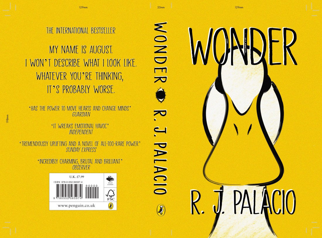
The Wonder design
For this design, I did like the idea of people WONDERing (ha get it) why there was a duck on the cover when the story is about a little boy named August, but it does link to a section in where the boy is in the Principles office and notices his artwork on the wall. This artwork was for a class project in which the students had to make a self-portrait of themselves if they were an animal, and August had drawn a duck. When the Principle asks him “why a duck?” expecting a meaningful and in-depth answer, August just replies with “Its because I think I look like a duck.” I loved this section when I had read it and although I thought I was not going to try drawing the child, as the blurb of the book specifically says that he doesn’t want to describe himself as “whatever you’re thinking, its probably worse”, I thought this would be a fun way of representing the little boy, without trying to draw the accurate description.
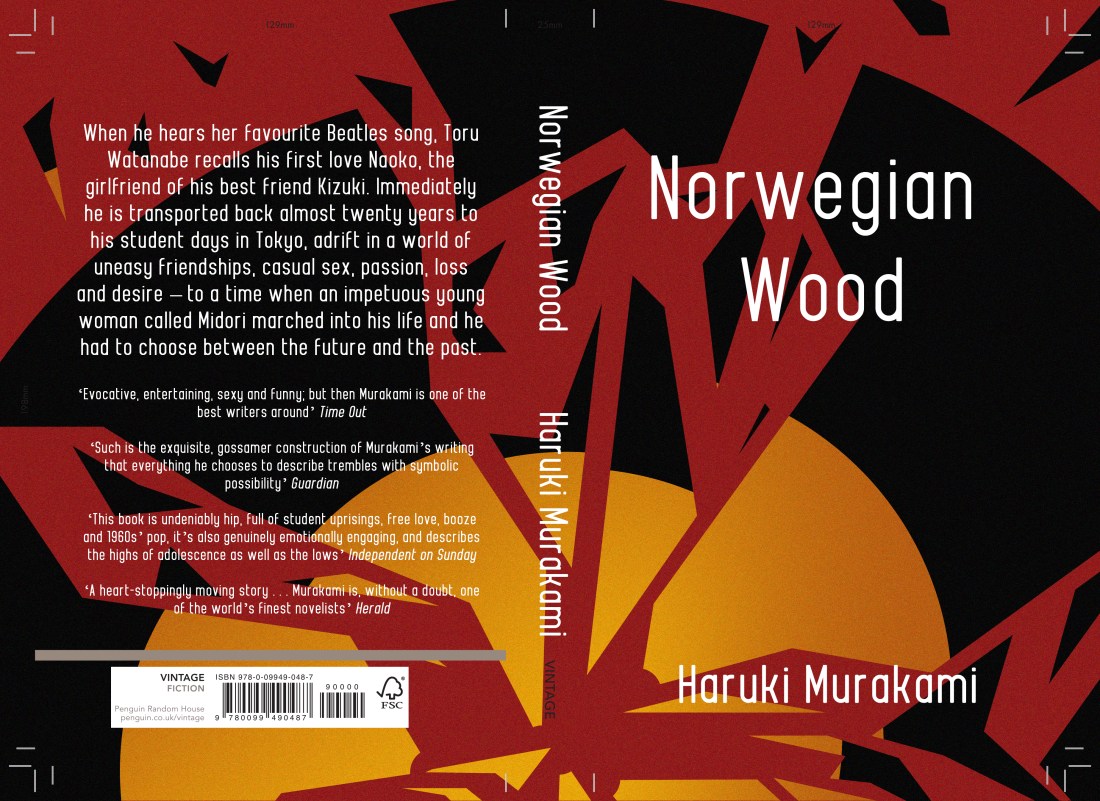
The Norwegian Wood design
There is a section within the book where the character is working at a record store and cuts himself on “one of the glass partitions in a record shelf” that was cracked, he then goes on to mention how the floor is covered in blood etc, so at the time this had made me think of this cover design. Although it had not exactly mentioned a broken record, this is what I had imagined when I had read the section, a record in shards, with a red background which would be the character’s blood.
This may not have been someones first thought of imagery after reading the book, but I felt since the title of the story is inspired by a song by The Beatles, ‘Norwegian Wood’, I felt the imagery was still valid to the story, and in a sense, it could be symbolic to the characters emotions and relationships throughout the story? (Potential spoiler? I’m sorry!) So I do like this design and concept, as I believe it is not an obvious choice and it is somewhat out of the box, but not too far as it still relates.
So still to do, as I have slightly worked backwards during this project, just trying to churn out the final designs as quick as I could with the time I have, I do have a lot of writing up to do. When working, I did have the artists and styles in mind that I wanted to use, but I just need to write this research up properly, discuss all of the choices I made throughout the process, etc, and I will need to make a final evaluation (which I will also post on here). This, however, will probably be done after Christmas, maybe pushing towards after New Years as well, as I had mentioned before, my working space is at the dining table, and during this time, my Mam does like it to be clear. I will keep my progression updated, but if I don’t post during that time, you now know why, so you can just imagine me living my best life, stuffing my face with festive food!
MERRY CHRISTMAS! OR HAPPY HOLIDAYS, WHATEVER YOU CELEBRATE! AND HAPPY NEW YEAR!
Bibliography
Murakami, H. and Rubin, J. (2001). Norwegian wood. London: Harvill, p.263.
Palacio, R. (2013). Wonder. United Kingdom: Penguin Books Ltd, p.287.
Due to my incapability to follow my own timetable, which I had even reorganised after not managing to follow it the first time, this week was supposed to be the last week I had given myself to work on the House of Illustration, Book Illustration Competition, in which I had to create 3 illustrations and a book cover for the story ‘Howls Moving Castle’ by Diana Wynne Jones.
Instead, for the majority of this 3-week project, I spent a lot of time trying to catch up or finish off previous projects that I had fallen behind on. I also decided to work on an illustration which would be a gift for my boyfriends mum. This was supposed to be completed and printed for her birthday in September, but as we all know by now, I can’t follow my own time plans! So I said I would give it to her for Christmas instead, not that she knows (a blog post for this piece will be coming soon). So, the time I should have been spending on this project had been spent on others, but I refused to fall behind on the project starting next week, so I decided I had to finish this one by today!
In what should have been one week of researching, one week of creating concepts and experimenting and the final week creating the final design, I have basically had to do all of this in the space of a week.
When creating my pieces, I didn’t really have an idea of styles or techniques I was going to use, I had thought about artists, but I hadn’t thought about potential ways in which I could apply the styles or techniques to my own work, so basically in the process of creating my pieces, I have just been winging it, seeing “does this thing work? No, not really, scrap it! Does this? Okay, we’ll just roll with it”. I had kept doing right up until now.
I am currently happy with these designs, but I would say I do still need critique and outsiders perspectives so that I can potentially make further improvements. At this moment in time, however, I still have a lot of work to complete within other projects so this one may have to fall to the back of the pack. Because of this, I may not end up submitting my designs to the competition, as I’m not sure if it fits the standards of previous entries in the years before, especially not without further refinement. And since the competition does have a fee to enter, I feel it could be a waste of my money.
Even if I don’t submit these design to the competition, I will still include them in my portfolio, as through this project, I have been able to show more skills with narrative, and I have created more landscape designs, two areas of which I felt were lacking in my portfolio.
SO, what have we learnt from this post? I am my own worst enemy and I only have myself to blame! From this experience, I will strive to keep myself more organised and actually follow my own set time plans. I believe this information will be very important for when starting next semester, as I will try to plan out my time better, using my experience from this first semester, as I feel I will have more knowledge of my pace of working and what I am capable of doing in specific timeframes.
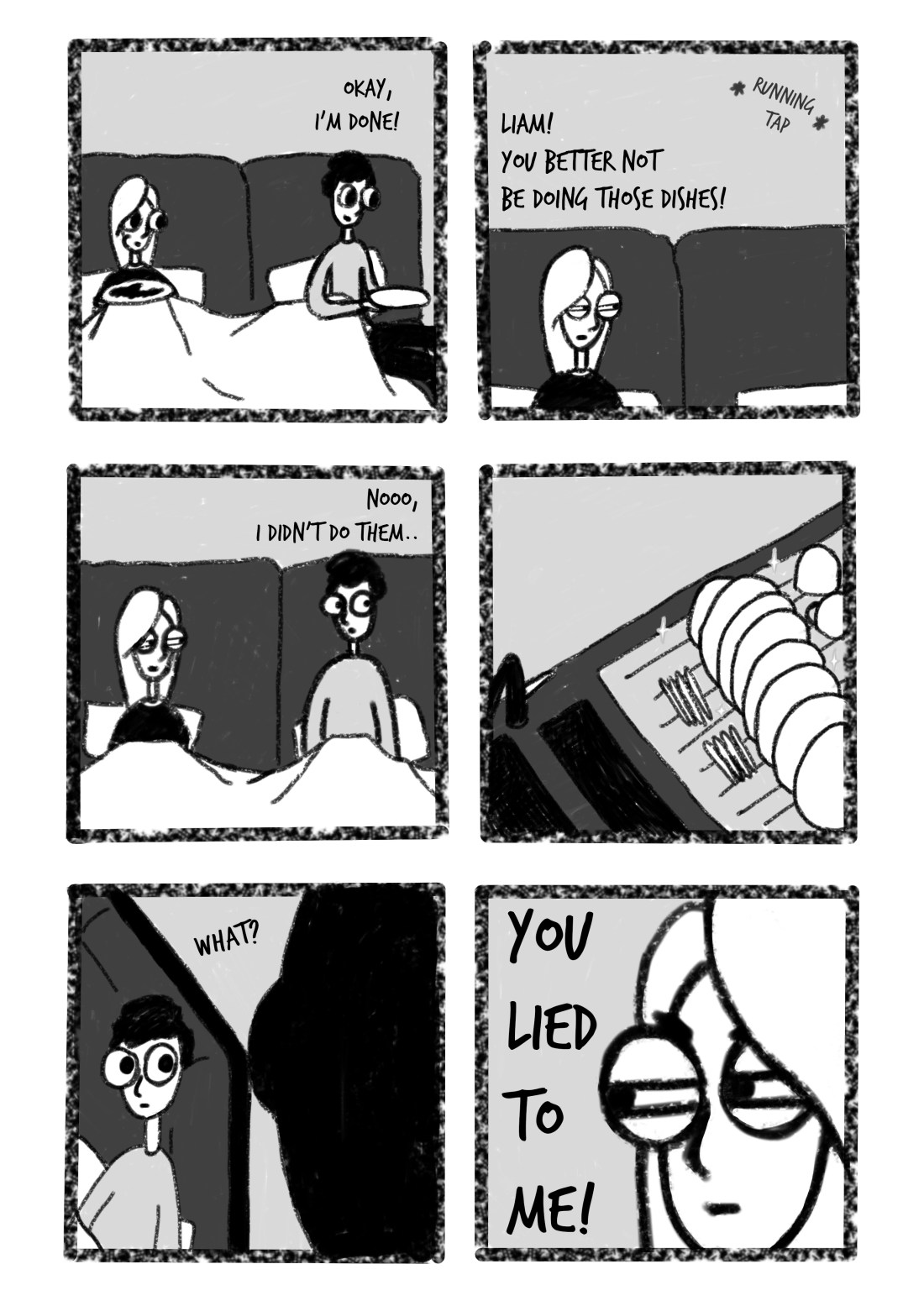
This week’s comic is based on one of Liam’s habits when he comes around to my house. As he eats inhumanly fast, he will always finish his food before me and whilst I’m still eating, he will get up and take his plate to the sink and wash it. Yes, it is nice that he washes up after himself, but no! He should be the guest when he comes to my home, and I should be the one washing the plates! And I would do if he allowed me time to actually finish my own food on my own plate.
I didn’t really enjoy creating this week’s comic, mostly because I have so much other work that needs to be completed for other projects, and I felt we were pushing for ideas. As we are creating comics on a weekly basis, I do feel that sometimes we will struggle for ideas, ones that we have not already done or ones that other comic artists haven’t already done themselves (that we know of).
I am glad that we came to this concept, as it is a reoccurring quirk in our relationship, and we do feel that others might be able to relate as well. But I do feel I could and should have done better in some of the frames.
As I am currently stressed with the other projects I have going on at the moment, when creating this comic, I had the mindset that I just needed to get the piece done and out of the way, so that I could get back and focus on my other work. So, because of this, I feel I didn’t put my best into it, I felt I very much had the ‘it’ll do’ mindset, and I am disappointed in myself that I didn’t do more and go back in to refine it.
I feel this could potentially be a reoccurring problem when working on multiple projects at once, but in the future, I will try to get rid of the ‘it’ll do’ mindset and put the right amount of effort into our comics. If I’m not happy with a piece in the future, I may hold off on posting it for a week, so that I can refine it further, bettering the quality and standard of it. However, if I do choose to do this, I do not want to fall into the trap of continuously doing it, or worrying too much about every piece, whether it is good enough to post etc so this will be something I have to think about if the issues of this week reoccur.
If you do by any chance enjoy this comic and would like to see more, please feel free to have a look at our Instagram @MelonandLimeComics, we appreciate any likes or follows that we get! I have also made a couple of blog posts about some of the newer comics, so if you would like to know more about the thought processes behind them, and how they have come to life, feel free to check those out too. Thank you!
As it is December now and the holiday season is upon us, this week myself and Liam decided to create a festive comic.
In this comic, Liam is asking what my favourite part of Christmas is, whether it’s the presents, which no, although I do like giving them, I wouldn’t mind not receiving them. Then he asks me if it’s the food, which I believe is amazing so could potentially be my close second favourite part, however still, the answer is no. My favourite tradition of the holidays, is having a movie marathon of The Hobbit and The Lord of the Rings trilogies, which we start on Christmas Eve eve, and as I believe it is a 20-hour marathon, it does take us to midday of Christmas Eve.
This was initially a tradition I had started with my brother, before the Hobbit movies even existed, so that we would stay up all night on Christmas Eve eve, making it easier for us to sleep on Christmas Eve, as the excitement would usually keep us up, so the lack of sleep from the marathon would usually knock us out instead.
When I had started seeing Liam, I introduced this tradition to him, and now for what will be the third year in a row, we will be keeping it alive. Hopefully actually surviving this year’s, and not accidentally falling asleep during The Two Towers at 2am. This year I will ensure that there will be a lot of coffee involved and that we shall succeed!
In a sense, we wanted to create this piece so that our audience could get to know us better. Although we create comics that can be quite relatable, for other people or couples, we also want to shine a light on the quirks that are unique to us, that makes our relationship special. We hope that this will make our audience feel more connected, to know us as actual people with true quirks and habits, as opposed to just seeing characters that are seen as ‘relatable’.
There are a few things I like about this comic, such as the representation of the movie, with the fellowship of the ring on their journey, something that maybe only fans would be able to recognise, but I also love the frame with the Christmas tree and presents, as I just enjoy the little details and patterns, and it does make me feel festive, but in our own set style of the comics.
From last weeks comic, I did try to add more elements to the frames, trying to think more about backgrounds, mid ground and foreground, and I do actually prefer the frames which do have more in them. I feel my job for future comics, will be to not go overboard with the backgrounds or elements involved. Although I do enjoy the interest that it gives the specific frame, I do want to keep the comics as readable as possible, not giving any room for any confusion, so that the message can be communicated well throughout.
In this week’s comic, me and Liam were having a conversation about the price and sizes of pizza, in which he had told me that the price of a 10″ pizza was the equivalent to half of a 14″. At this moment, I had not read him properly, (this was a conversation over text) and thought that he was saying that a 10″ and 14″ pizza had the same area, so because he was so adamant when I was telling him he was wrong, I did the math and was getting frustrated, until I reread his message where he had said HALF of a 14″ pizza was the equivalent of a 10″.
So, already frustrated with the conversation, especially having to do math for no reason, I wanted the conversation to just end and swap to something new. But Liam had other points to still discuss, as he felt (and I agreed with, but the laws of math were not on our side) that surely a 10″ pizza should be half of a 20″ pizza. Which started him explaining his conspiracies that the pizza companies are against us, a couple of days later, this being the subject of our new comic.
In this piece, I have shown our conversation in the present time, showing Liam’s enthusiasm and my lack of interest to the subject. In the second frame, I have then shown the both of us as elderly characters, the kitten Wednesday is still in my lap 60 years later, but is older. In my mind, he will outlive the both of us and this is not up for debate! And 60 years from now, I still see Liam bringing this subject back up in conversation, and myself still being sick of the subject, but in this time, he is even more adamant that the pizza companies are against us, as he has more elderly man rage (‘get off my lawn’ whilst waving his walking stick at children type of energy).
I was happy to work on this piece, as I feel I have tried to play around with backgrounds and scenery more. In the background of the second frame, I have drawn a fireplace with photos and ornaments scattered across the mantlepiece, for this, I had taken inspiration from my Grandmas home, which was similar to this setup, but I have exaggerated some of the elements. I had also added in rocking chairs, which myself and Liam have already agreed that we are purchasing as soon as we live together, we really are already old at heart, and behind them, I have also added in a zimmer frame for myself, then a walking stick hanging on the arm of Liam’s chair.
Although I was very happy with the background, it did seem to become slightly problematic when it had come to adding in the text. To overcome this problem, I had selected all of the layers for the background, then copied the selection as merged, then pasted them back into place. Now with the one layer, I had dimmed down the opacity, enough so that it was still visible, but still allowed the text to stand out. To help a little more, in a separate layer underneath the text, I used a watercolour brush in photoshop, (as it would give a softer approach, as to a quite harsh highlight of the text) then I started to build up a white base to make more contrast between the background and text.
If you like this comic and would like to see more, please have a look at our Instagram @MelonandLimeComics. We appreciate any and every like or follow we get. Thank you!
This comic is based on a recent event, in which I had gone to see Liam in a play called ‘Education, Education, Education’. He had performed so well in this play, making everyone laugh, there were even moments when myself and his sister couldn’t stop laughing, sometimes at inappropriate moments, which we had apologised afterwards, but I was so proud of him and said so in detail after the play, in which he replied with a simple ‘Thank you’.
It has been a concept of ours for a while to create a comic about our talents, but we could never think of a way in which best to design it so that it was not too cringy or too braggy about ourselves.
So, with this comic, I had shown my experience with his show, then compared it to when Liam had come to my exhibition, which I believe was a similar experience but roles were reversed, him being proud of me, and my response of a modest ‘thank you’.
I did have worries if this comic would fit within our work, as it is not as humorous as our previous comics have been. However, Liam had reassured me that our comics our about relatability, and shows that as a couple we do support one another, we are essentially each other’s biggest fans, which I agree that other couples would be able to relate to.
When designing this comic, I did have struggles with anatomy. Although our characters are more cartoony and not exactly anatomically correct, I did struggle with certain poses, especially in the 3rd and 6th frame, trying to express the emotion of excitement and modesty/shyness of the characters. I believe I did get the characters to a place that I’m ok with, but anatomy and poses will definitely be something that I will have to work on whilst producing these comics, as I do want my characters to be able to communicate a specific emotion from their poses, as well as their expressions.
If you enjoy this comic and would like to see more, please have a look at our Instagram @MelonandLimeComics, we appreciate any likes or follows that we get! I have also made a couple of blog posts about some of the newer comics, so if you would like to know more about the thought processes behind them, and how they have come to life, feel free to check those out too. Thank you!
This one is about Liam’s cat named Tilly, who I have practically adopted since first ever meeting her, seeing that she OBVIOUSLY loves me more!
Me and Liam were talking about the comics and how Wednesday (my kitten) has been a main character in most of the comics so far, but Liam also has two other cats that live in his room, who I also class as my children, so we wanted to introduce these characters into our comics too. This week we decided to start with Tilly.
Tilly is the type of cat that you have to be patient with, she pretty much hates everyone, including me when we first met (she’d just run and hide from me), but once she got to know me better, and I learned more about her tendencies, she let me cuddle her (at her specific times only) and has ended up sleeping on me most nights.
Liam and Tilly, on the other hand, have more of a love-hate relationship, I guess because he has to live with her all the time, and I’m just blinded by heart goggles, but she tends to do things that anger him more, such as jumping onto his PC, knocking things over, etc, but I seem to be more patient with her, which is why I believe she loves me more, other than the fact I feed her meat.
So, me and Liam had wanted to express this relationship and introduce Tilly into our comics, and to our audience, expressing her personality as best as we could.
I did have similar struggles when it came to producing these comics as I had last week, (i.e. my computer running slower, especially when it came to colouring) but since I knew this would be an issue again, I was somewhat more prepared, in the sense that I knew what was to come, so I would say that I got slightly less stressed than I had in the previous week.
If you are enjoying our comics and would like to see more, please check out our Instagram @Melonandlimecomics. We do hope to make and post at least one comic per week. We hope you enjoy!
This tutorial had originally sprouted from my tutor telling everyone to create a monochrome illustration, which would then be used for screenprinting on Friday. I will post a tutorial/guide/tips I learnt from that lesson, after my class on Friday. From my previous knowledge of screenprinting, I believe you have to create a black and white image that will act almost as a stencil, so that is what I have tried to keep in mind throughout this experimentation.
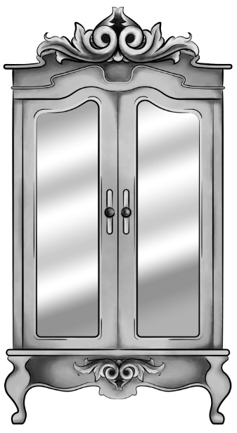
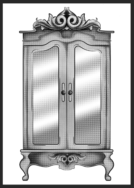
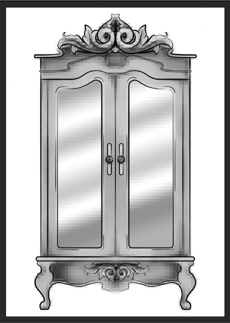
Original Digital Painting of the Wardrobe – No added filters.
Starting with a piece I had digitally painted (tutorial on digital painting possibly coming soon?), which is of the wardrobe for my ‘Lion, the Witch and the Wardrobe’ project. With all the colour layers, I had grouped them all together then duplicated the group, I then flattened the second group. This was so that if anything went wrong during this experimentation process/phase, I would still have my original layers within the first group. I decided to keep the linework separate from the painting as I wanted my linework to remain clean and readable, I did not want it to possibly become distorted with one of the effects I’m about to show you.
For these techniques, you will be playing around with the flattened layer of colour, using filters from the ‘pixelate’ section within Photoshop. If you do not like any of the effects on your work, it is easy to undo by just going to edit and undo.
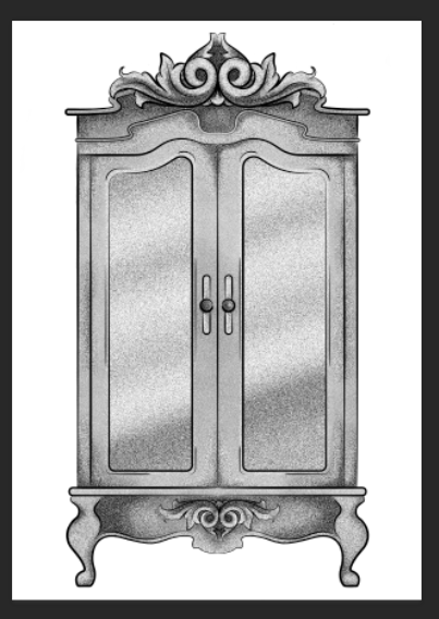
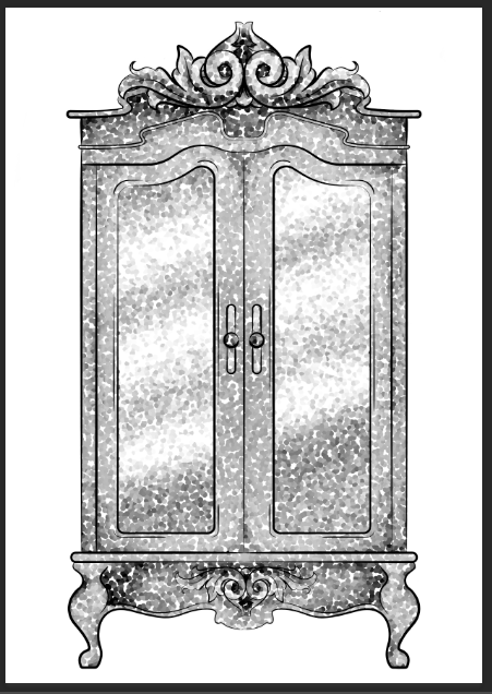
1.Colour Halftone
With this technique, it takes your image and pixelates it into rows of dots, which range from sizes, getting bigger in the deeper tones, and smaller in the lighter. You are able to change the size of these dots, making them finer or bigger, in the controls box that pops up before the change is made.
I personally liked this filter with a bigger scale of dots, as I feel when they are smaller, from a distance, the piece looks more square in the pattern, whereas when they’re bigger, it almost gives a pop art/comic type of effect.
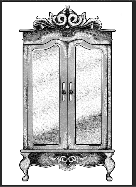
2.Mezzotint – Dots
For the mezzotint filter, there are three types in which you can try, one being dots, another being lines and another being strokes. Within these options, you can then chose whether you want the effect to be bolder or finer, etc.
As an example, with the piece below, I have used fine dots, and to me, it has made my design look more fuzzy, specifically in the darker areas, but you can see that it has almost a similar effect as adding noise.
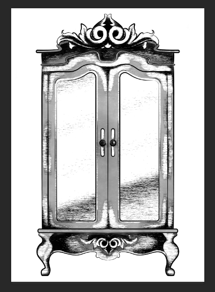
3.Mezzotint -Lines
This is one of the other mezzotint filters, the short lines. As you can see, it builds up the image using lines, they are closer together in the darker areas and further apart in the lighter, forming the contrast of the tonal piece
I don’t really enjoy the outcome of this filter as I feel it had made my piece look more patchy as opposed to blended. I feel I just prefer a neater approach with these filters, whereas this design looks more scratchy in a way.
4.Mezzotint – Strokes
This filter is quite similar to the mezzotint lines, however, I feel there are more areas of flat colour, you only really see the lines where the tones are changing, for instance from black to dark grey, dark grey to light grey, then light grey to white.
Although this filter is less fuzzy than the previous, I still feel it is a bit patchy moving from tone to tone, so it is not the style that I wish to work with, as I would want it to be neater and more refined.
5.Mosaic
Moving away from the mezzotint filters, in the example below, I have shown the Mosaic filter. As you can see, this pixelates the shading, the effect almost reminds me of inappropriate blurring that you would see on tv when the show would blur out product placement, a persons face, a rude hand gesture, or any type of nudity.
Although this filter does give a softer shading, the blockiness is not really a route that I want to take with my designs, so again, I will not be using this filter during this project, but its good to know its there.
6.Pointillise
To me, this filter resembles monotone confetti being spilt over my design. I would like to see how this filter works with colour, as it could create some fun designs that I feel would appeal more to children, however it is not something I wish to use within my design.
I feel this filter would be similar to the halftone one, however, where the halftone works in rows of circles, this filter does not have a system, as there are circles overlapping each other, and I feel it works mostly on tones, as opposed to changing the sizes of the circles as I believe the halftone filter does.
Although I did not find a filter which had achieved the style that I desired, that being a crosshatch pattern, almost in the style of John Tenniel, as I need a design to use in the screenprinting class, I will choose the best of the results, for me this is the halftone filter, but I will expand the circle size a little, as I do not know how small the new printer for the screenprinting machine can go, and I do want my piece to be readable.
BONUS TIP
7. Illustrator
When experimenting with the sizes of the circles within the halftone filter, I had formed 3 versions, the first I believe being 10, second I believe is 12 and the third is 14, then I had asked my tutor for advice in which would be most readable, and which would most likely print the best on a screen, in which he had responded the second. I did like the first as it had more of a subtle blend, however, I don’t believe the new printer would have picked up such small detail.
As the original version of this effect was picking up the other tones within this piece, such as the grey tones, I decided to save the image from Photoshop, then take it into Illustrator. In this program, I then ‘image traced’ the image, which had ended up taking away all of the other tones, and had just left me with the black line or dot work. I did this step, as the last time I had screen printed, I recall the design had to be stencil-like, meaning that it could only be one colour, so I did not feel the piece would work correctly if I had left all of the other tones in.
Figure 1 – John Tenniel, Alice’s Adventures in Wonderland, 1865
This is an artist from the Golden Age of Illustration, who I would like to take inspiration from during my Lion, the Witch and the Wardrobe project. He had created the original illustrations for ‘Alice’s Adventures in Wonderland’ by Lewis Carroll.
From the illustrations specifically from this book, Tenniel’s style is semi-realistic but with the theme of the book, he has played around with surrealism, illustrating things that you would not exactly see in the real world, and exaggerating some of the characters proportions, as seen in figure 1.
I believe these illustrations were hand-drawn with pen and ink, but I believe when it came to mass production, the design was etched into a plate, so the illustration could be printed multiple times for hundreds of books.
Because of this factor, during my Lion, the Witch and the Wardrobe project, I want to experiment with different mediums, working traditionally with pen and ink, but also playing around with different printing techniques, such as screen printing, linocut printing, etching, and even creating a plate with the laser cutter that is available within the college.
Primarily, I do want to work in black and white for this project, however, I do plan to also play around with foils, possibly adding hints of gold or silver to the designs, potentially giving my pieces a more regal appearance that I believe will fit the theme of the story.
As the competitions are not yet known and I do not know what I will be creating, I want to keep an open mind of where I can go with these projects in sense of style and techniques I could use. I have however been enjoying the work of Ana Godis over the holidays, so would potentially like to use her work as inspiration for a project over the coming year.
I would explain her work as experimental in a way, although I believe she always works digitally, I’d say her style can differ from piece to piece, as for one, she could be creating a beautiful digital portrait which is very realistic, but in another piece, she could be working very stylised, almost ‘cartoony’? But in another piece, she could be combining the two styles, which probably sounds confusing, but she is able to execute the style so well!
Over the holiday, as she does post process videos along with her pieces,I have tried to learn from these videos, trying to follow her steps, as to improve my own technique, and I had created two digital paintings. I could still do with some further practice, however, I do feel the process had given me smoother results, in comparison to the digital painting I had done the year previously.
My own work – Fan art of Mathilda from Leon: The Professional
My own work – Fan art of Jack Torrance from The Shining
I feel as her style is so flexible, if I were to take inspiration from her work, I would be able to apply it to any project, including the competitions. Her work is illustrative but quite contemporary in style, so if I were to learn more from her techniques, I could potentially apply them to book illustrations or editorial themes or possibly even use them for advertising.
Ana Godis does have a Patreon in which I believe she does go into more depth with her process, the tools she uses etc. I personally am not subscribed as I do not use Patreon (as I feel it would be a black hole for me, following too many artists and probably spending all of my student loan within it, which is not something I am committed to doing as of yet) But, if you are interested in her work and do wish to learn more in-depth about her process and tools, here is her link: www.patreon.com/ana_godis
Like Ana Godis, I will potentially be taking inspiration from Rafael Mayani during my commercial projects.
In comparison to the previous artist, I believe his work is more contemporary, possibly more editorial-based, so I believe he would be most useful within the Association of Illustrators – World Illustration Awards competition, especially if I decide to work in the editorial category.
His style is minimal, easily readable and overall it is easy on the eyes. I believe I would most likely see his work in commercial settings, such as in magazines, in advertising, on posters, etc. In figure 3 specifically, he had created an illustration for a magazine, which was honouring the people who helped clean up and take care of others after the earthquake in Mexico in 2017. I believe by not giving his characters faces, it is not singling out any particular person who had helped but instead is celebrating the community as a whole, and the reader could potentially fill in the spaces themselves, imagining the people they know, if that makes sense?
When taking inspiration from his work, it will be with the minimal almost papercut style, as I do believe it is very readable, and it does attract the eye, which I do feel is an important factor if I were to create a piece that would advertise a specific article.
List of Illustrations
Figure 1 – Tenniel, J. (1865) Alice’s Adventures in Wonderland [Online] Available at: https://medium.com/alice-s-adventures-in-wonderland/sir-john-tenniel-s-classic-illustrations-of-alice-in-wonderland-2c3bbdca3a77 [Accessed on 24 Sep. 2018]
Figure 2 – Godis, A (04 Sep. 2018) [Online] Available from: https://www.instagram.com/p/BnTw8cOnCra/ [Accessed on 24 Sep. 2018]
Figure 3 – Mayani, R (13 Nov. 2018) [Online] Available from: https://www.instagram.com/p/BbceF5PFQLR/?taken-by=rmayani [Accessed on 24 Sep. 2018]