I can’t draw.

As a class, we had watched a TED talk by Graham Shaw in which he was talking about peoples perceptions about drawing. In this talk, he discusses how everyone can draw its basically just your own doubts that prevent you from doing so or improving your skills. In the talk, he does give a follow along example explaining his theory in which he gets the audience to draw characters with him, resulting in a lot of people realising they can draw. I am not going to show my results from the experiment as I just feel they’re a mess. They were fine in the beginning but then they just went downhill quick. I believe this was because I don’t work as fluid as Shaw does with his characters, so was more focused on trying to get the lines right and when he was onto the next steps, I had already created a mess. So no, I will not be showing my results, but I definitely think the talk is worth a watch and you may be intrigued to see what you could create, especially if you are one of those people who think you cannot draw.

I feel when people use this quote of “I can’t draw”, which usually follows “omg, you’re so good, I can’t even draw a…” they just assume that it is a natural gift that you must have been born with. This at least was not the case for myself. When I was younger, I don’t believe I was good at drawing but I did enjoy the process so I just kept going. I am quite a perfectionist with my work, and always have been, a trait which I believe I’ve gained from my Mum, thanks, mum! so after making a drawing, I would usually get disheartened when I could see the issues, but this wouldn’t stop me from drawing entirely, I would just try to keep improving.

In my teens, I would regularly use a site called DRAGOART, which I believe is still active to this day, and posts step by step tutorials of how to draw certain characters, icons, images, etc, which are usually inspired by current trends with the media and pop culture. From these tutorials, I would be able to draw the image quite well, but I would focus more on trying to replicate the image as opposed to actually trying to learn from the process. So, once I had noticed this when I would try to draw something that wasn’t from the tutorial,  I did start to try learning from the process, specifically from the beginning steps in which you form the image using shapes. From this day I believe this is still how I work, but over time I have improved my skills by learning the fundamentals of art first, and a lot of practice, more from real life or proper reference photos, as opposed to working from someone else characters/art. In my opinion, as an artist, you should never stop learning or improving or wanting to learn or improve. I feel if you reach the point where you think that you have nothing more to learn or no more areas for improvement, then there would be no purpose for creating work. You would have reached your peak, where else would there be to go from there?

I myself know that I have a lot of areas to improve within my work, and a lot of new techniques and mediums that I want to explore, and although things may not work out, I will be excited to see how my art grows within the next 10 years, or 5 or 1, or even just within a couple of months. Below I have shown two illustrations of mine, the one on the left being one I had made in 2013 when I was 14-15? I remember how proud I was of it at the time, but looking back now, I’m sooooo happy with how much my work, style and aesthetic has grown since, especially when looking at the piece on the right, from late 2018, where I have drawn a more anatomically correct and more aesthetic character of my own, instead of just imitating someone else’s.

In conclusion, from watching the TED talk, I do believe that anyone can draw, they’ve just got to be willing to put the doubts aside and put the time into it for it to look as “good” as someone else’s they may compliment. I can’t think of any artist who was just magically gifted at their craft, at least not with a little practice at first. If I try to think about it in other terms, you don’t just learn maths overnight, you practise and practise over the space of basically 16 years, and once you’ve mastered counting, you then go on to adding, subtracting, timetables, division, then algebra gets thrown in and all sorts of equation stuff. So with this example, an artist is always improving, but it does take that understand and practice in order to do so.

Bibliography

Dragoart.com. (2016) How to Draw, Draw Step by Step.. [online] Available at: https://www.dragoart.com/ [Accessed 6 Feb. 2019].

Garner, C. (2017). Why Should You Study The Fundamentals of Art?. [online] Medium. Available at: https://medium.com/the-art-squirrel/why-should-you-study-the-fundamentals-of-art-1368efcbf446 [Accessed 6 Feb. 2019].

Shaw, G. (2015). Graham Shaw: Why people believe they can’t draw. Available from: https://www.ted.com/talks/graham_shaw_why_people_believe_they_can_t_draw [Accessed 6 Feb. 2019]

All images are my own unless stated otherwise.

Draw This in Your Style Challenge.

The project:

This was a mini side project which I may not have exactly had the time for but had wanted to take part in, which was a challenge on social media where an artist would post their own work using the hashtag DrawThisInYourStyle and their followers would redraw the artists work in their own style and prefered methods/techniques. There were plenty of illustrators who were posting their work around this time, but the one that had caught my eye the most was a character by Chelsea Gracei.

This piece had felt within the realm of my own work, as I do enjoy creating female portraits, especially from the shoulders up, as you may have seen throughout my inktober posts, but it still felt enough of a challenge that it would push me slightly out of my comfort zone, creating imagery that I may not have thought to before and figuring out how to translate Gracei’s character into my own ‘style’.

For the first part of this process, I had followed the steps I had used to create my inktober flower girls, which I had written up in a blog post so you can read all about it by clicking here.

Once I had the traditional elements done, I took a photo of the piece and started to colour the character and her background digitally using a watercolour textured brush. I tried to work straight from the colour palette of the original piece, but I had made my own tweaks here and there to make it my own, as I did want more contrast or more vibrancy within my own palette. With the swords and clouds, I had drawn these elements with a fine liner and in my design, I had played around with some of the overlay options and had set them so that it would look as if the imagery had been cut out of the blue background, so the white would be a stark contrast against the deeper blues. As a final touch, I had tried to blend both the traditional textures and the digital colouring together more seamlessly by applying a noise filter.

drawthisinyourstyle3.jpg

Strengths 

Although this project was a detour from the projects I should have been working on, I do feel it was a quick project as I was able to create this piece within a day and posted it only 2 days after the artist had posted the original design.

When comparing my work to the original illustration, I do feel I have met the challenge, recreating the artist’s character in my own style, even though I hadn’t thought that I really had a style,  and I feel I have taken the themes, imagery and colour palette and have made the piece my own, standing apart from the other submissions. There were a lot of other amazing entries to this artists challenge, but I feel my style and version of the character does stand out well among the others.

Through this project, I was able to experiment more mixing traditional and digital techniques as I have enjoyed doing in the past, but with this illustration, I feel I was able to achieve a higher standard than I have with previous work, so I do believe it shows that I am learning and developing my skills so that I will be able to work with these techniques more often in the future, working more and more to an industry standard.

Weaknesses 

The illustration is a bit rough in some areas, but I believe this is more in the transition from traditional mediums to digital colouring, for instance, the linework may seem more patchy in colour, especially where I have tried to clean up the edges but may have gone in a bit too far revealing the tone of the original linework. the white areas that I have cut out are also not as smooth as I would have liked, but saying this, if they were smooth it may have made the design look more static, as when looking at the design as a whole, I do feel the rougher and more traditional outline is more cohesive with the traditional textures and digital brushes that I had used.

Opportunities

As this project is based on social media, I am putting my work out there which will potentially help in the growth of my audience. As I have used the artists specific hashtag for this challenge and have also tagged her in my work, if she sees and likes my interpretation, she could possibly look through my other posts and maybe end up following me, but that might be a little too high of my hopes. What may be more achievable, however, is that I know she has been sharing other entries for her challenge on her Instagram stories, so she could post my version of her work on there, showing it to her own audience who may like my version of the original piece and like it or potentially follow me from it.

Threats

I don’t really know if this is a threat or not, but I had not really had much input in the content of this illustration as all of the elements were already given to me, I just had to redraw them in my style. So someone could argue that I did not show a lot of creativity within this piece, as I had not put so much thought into it, but I do believe I have managed to put enough of myself into the artwork that I have made the illustration my own, so hopefully no one would need to argue this matter. I do think the original piece was beautiful though, as why I had chosen to redraw it, so I was happy to work with the imagery she had already created and apply my own style to it.


Future Goals and Targets. 

Now that I know I can work to a higher quality when mixing both traditional and digital techniques, I would like to do so more often in the future, potentially in upcoming projects, as I do enjoy the process a lot and I love the textures that I am able to achieve with it.

If this challenge becomes popular again and another artist that I follow post a #DrawThisInYourStyle challenge of their own, I would like to take part in it again, but I would possibly like to take on more of a challenging piece, moving more out of my comfort zones and seeing what I can create maybe with subjects that I am less confident with.


Reading List

Russell, M. (2018). 8 Tools I use For Inktober. [Blog] MelonRIllustration. Available at: https://melonrillustration.art.blog/2018/10/25/8-tools-i-use-for-inktober/ [Accessed 28 Jan. 2019].

List of Figures

Gracei, C. (2019). Instagram. [image] Available at: https://www.instagram.com/p/BtEVIEjBNKy/ [Accessed 28 Jan. 2019].

All other images are my own unless stated otherwise.

Input-Output – Illustrated Diagram

As a task, the class was asked to reflect on themselves and their workflow, thinking in terms of an input and output system. We had to think of what goes into our work, i.e skills, research, experience etc. And then think about what all these elements allow me to create within my work, so this relates to my business, creating a product, selling that product, branding, socialising, promoting myself and so on.

Once we had thought about this, we then had to create a diagram. As of the Illustration we were to think about imagery that worked in a similar way, meaning that it would have an input and output system. When I got told about this theory, my first thought was of Cat in the Hat, how they had the ‘KUPKAKE-INATOR!’ in which you could make cupcakes out of anything!

“Anything?”

“Yes anything!”

“Anyythiing?”

“I’ll get you and it’ll look like a bloody accident!”

(Cat in the Hat, 2003)

So, in my head, I imagined the input going all into a machine, then the output becomes the amazing cupcakes in the process.

This idea had developed through the drawing phase, but the concept was still the same, the ingredients are all the elements in which go into my input, then the final cake is my output, each layer dedicated to a specific area in which my workflow leads to.

inputinge=redoutputsovenoutput

For the input, the main influences within my work process I believe come from my skills, knowledge and experience. Each of these elements can link back to one another, like how my knowledge can grow from the experience, more experience can help improve on skills, etc. From each of these elements, however, I have expanded on them, showing more detail of what factors go into my work.

With the output, I have categorised things that are produced from my work, and have separated them into layers of cake, the bottom is my small business that I wish to expand on, which includes all of the elements that would go into that, such as branding, selling, packaging, promoting myself, and actually creating the product I would sell. The next is based on freelancing, which I would associate more as a commercial side of my work, as I would be working more one to one with a client/brief. The third layer is based on a global context, i.e. where I could potentially show/sell my work, but it would also mean connecting more with other artists and businesses on more of a global scale. This could be done either through social media or travelling around the world to events like pictoplasma, or even going to conventions like Designer Con, which a few of the artists I follow attended last year.  The final layer is Self Development, as I do always try to improve on my work with every piece, whether its trying new techniques, playing around with colour pallets, or experimenting with current trends. I have actually tried to do that with this diagram, as I believe the colour halftone effect is quite popular at this moment in time due to the release of ‘Spider-man: Into the Spider-Verse’, so have tried to incorporate the pattern within the shading.


Bibliography

Cat in the Hat. (2003). [film] Directed by B. Welch. Universal Pictures.


Learning Plan: Semester Two

Overall Objective:

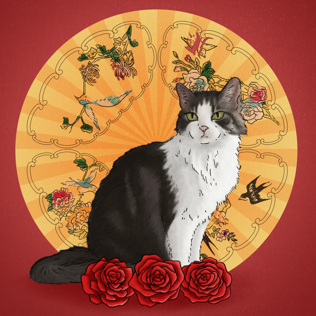
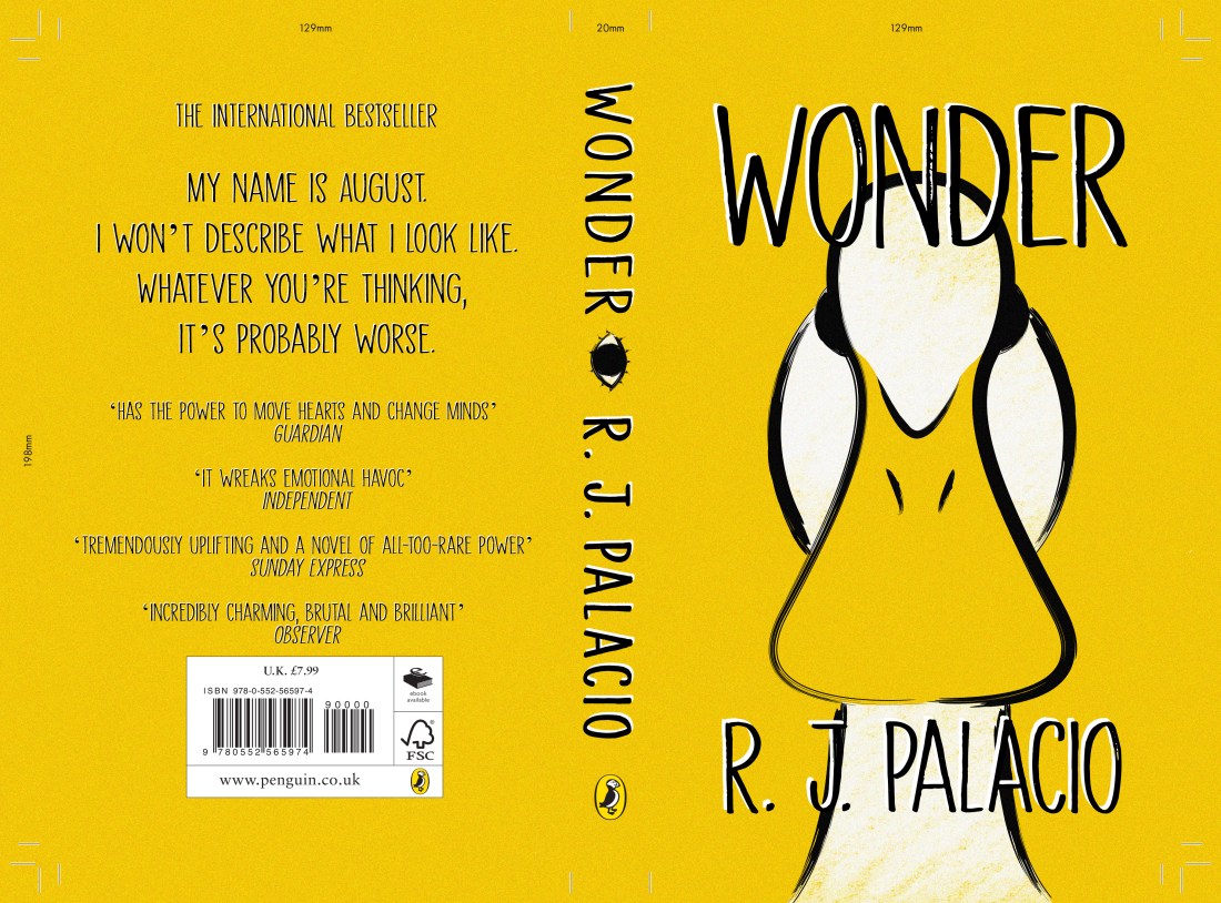
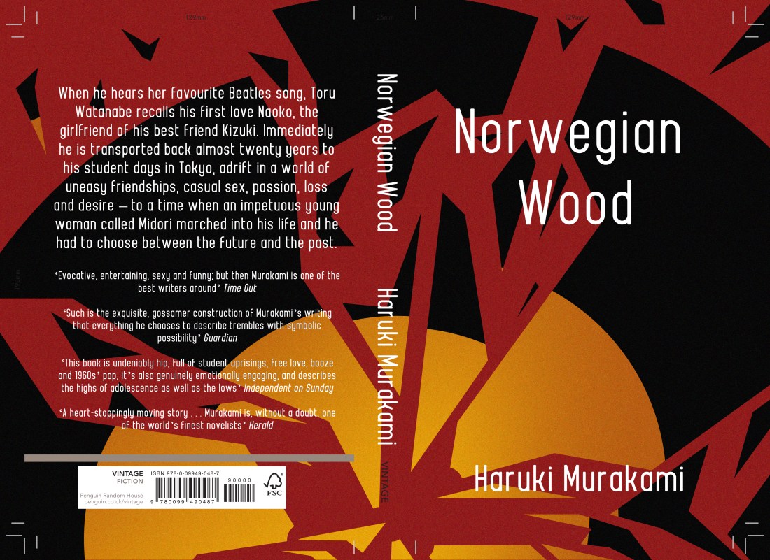
Since the last learning plan I created back at the beginning of semester 1, I believe I did achieve some of my goals within that time and have made improvements within my work. My main goal with this year is still to keep on improving, but within semester one I was able to gain more confidence with traditional mediums and printing techniques, I did this through my inktober challenge and the Lion, the Witch and the Wardrobe project. I was also able to achieve my goal of creating more narrative based illustrations, as again, I had created chapter illustrations for the story of the Lion, the Witch and the Wardrobe, I made two book covers for the Penguin Student Design Awards, these were based on Wonder (the children’s book category) and Norwegian Wood (for the adults fiction category) and finally, I did make a set of 3 illustrations for House of Illustrations Book Illustration Competition, which were based on the book Howls Moving Castle, which I had also made a cover for.

In my previous learning plan, click here to read, I had mentioned that I would like to potentially create more editorial pieces, so as I could not do this during the first semester, I would like to try create something along those lines this time. I wouldn’t necessarily be illustrating an article, but I would like to create a piece with a deeper meaning, possibly more thought-provoking as this is not an area that I have really ventured in as of yet, but by doing so I may be able to show themes or communicate current topics that I feel strongly about through my work, potentially allowing the audience to get to know me better.

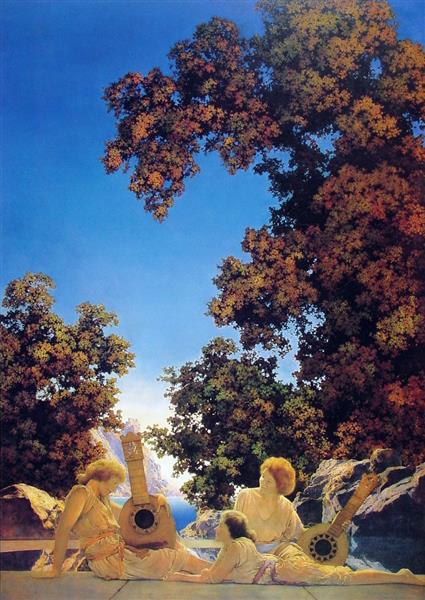
As I had worked on the Lion, the Witch and the Wardrobe project during semester one instead of the Wizard of Oz one as I had initially planned (I swapped the two around as I felt the LWW project would be better suited to the module as it was going to be more experimental testing out the multiple printing techniques) this semester I will be working on the Wizard of Oz series, and I still wish to work somewhat in the style of Tina Nass, who I had mentioned in a previous blog post which you can read here.  This means again I will be working with more traditional mediums, this time pencil, which hopefully I will gain more confidence with.

In my original proposal for the year, I had planned to work on branding throughout the year, and although I did redesign my business cards, created a depop and did sell two inktober zines along with a couple of prints, there is still a lot more that I want to create before finishing college later this year. This includes: creating a website, (including my portfolio and possibly a shop) creating more products, i.e. prints, t-shirts, pins, bags, stickers and so on. Then working on a promo pack which I can send to possible clients/agencies, I believe this will include a creative cv, business card, a print, stickers, a pin and then I want to create a sort of box that will contain all of these elements.

I did have a better experience with screenprinting so I believe this will be the main method used to create my products especially for the fabric based items like the t-shirts and tote bags, for the prints, however, I may use the risograph. In the past when I have created riso prints, I have really enjoyed how the textures and colours turned out, especially since I used a bright pink combined with a deep blue, so when making my prints I may stick with this form of output as when imagining all of my prints together (old and new) there will be a sense of uniform, right now I’m not sure if that is a good or bad thing though but I will give it more thought closer to the time.

Strengths and Weaknesses:

From the last module, my biggest issue was that my projects ended up overlapping one another, which ended up making me more confused and more stressed towards the end of semester two. I believe this was because I was reading the books one straight after the other, so when I should have been focusing on just one project I would be reading a book for another and feeling like I should be taking notes and creating work for that specific story. So this may not be as much of a problem within semester two if I am not working with as many books, but I will still try my best to remain organised and on top of things, and just focus on one project at a time.

I believe my strengths last semester were my book covers for the Penguin competition, I was able to create them within a short space of time and do feel they are of an industry standard. What I underestimated when starting and initially planning this year was the time frame of the projects. I had thought that since the personal projects were of my own doing that they could be done quicker, however, I had found that they were actually the lengthier projects. Since the commercial ones did have set deadlines I believe I had more incentive to finish them, but with the personal ones, as I did not have a set deadline for myself, I believe there was more time and room for doubt and I always felt I could add more or make changes and so on, but that took time and time which I did not have. Saying this, however, I believe the most improvements came from the personal projects as I did become more confident working traditional, specifically with ink, lining my designs with fine liners then bleeding the ink out with water as to create tone within my work. I also gained more experience and knowledge with certain printing methods, I learnt what worked well and what did not, i.e laser cutting plates as one had not worked as well as the other, as the ink had bled into the sections that were supposed to be left white. This project also renewed my faith in screenprinting, you can read about it here, so it does encourage me to use it more as an output method in the future.


Professional Development Plan:

Within the next few months, I do want to create more commercial work, exploring more areas of illustration such as editorial, so that I can expand my portfolio and potentially gain experience from doing so. I will attempt to do this through competitions and live briefs, the only one I am currently aware of and interested in is the Cheltenham Illustration Awards, which I have created work for in the past, but I hope to find more competitions as the module goes on, as some may not have been announced yet and may come out later in the year. If this is the case then I may have to make quick turnarounds so that the potential addition of another project won’t clash with the ones I already have set in place.

As of my personal projects, my goal is to create a series of illustrations based on the story of The Wonderful Wizard of Oz, so with this project I will gain more experience showing narrative within my work, (in a different sense to how I worked in the previous module, for instance, I want to show the characters continuously from one piece to another, whereas in the previous projects I just drew backgrounds, items or a created a slight suggestion of a character) but in this project I also want to try working more traditionally, using pencil to create the linework and textures within the piece, then I would scan each of the illustrations to colour them digitally, adding the vibrant colour palette that the story already suggests, for instance, the yellow brick road, the emerald city and so on. (I would have also mentioned the ruby red slippers, however, in the book the shoes are actually silver).

When focusing on my branding, I’m sure I will gain a lot of knowledge from that experience as well, as I have never made a website before, I’ve never created pins, screen-printed designs onto clothing and so on. I feel I will also learn more about myself, as to create your own branding I feel you do have to do a lot of self-reflection, thinking about your style of work, what imagery you feel would best suit you, how best to sell yourself and your work through elements such as business cards, websites or creative cv’s. Then there is more thought about promo pack’s, who would you be sending them off to? Agencies, potential clients? You have to consider who you feel your work is best suited to and who would most likely give you a job. All of this I believe will help more once I’ve left college, as I feel it will create a strong base in which I can establish myself as a freelance illustrator, applying to agencies, gaining work, but also selling work like prints, pins or t-shirts etc, on the side as I will hopefully have more knowledge of how to make/where I am able to get these products after this project, for instance, if I am to order pins or any product for that matter, from online, if I have a bad experience I will know not to use a company again, but if it is a good experience I will have a reliable source to create more products with.

Research:

In terms of research, I don’t believe there will be as much as I had in the previous module. With my Wizard of Oz project, I do intend to read the book and take quotes directly from it, so that I can illustrate the specific scenes as accurate as possible. I also intend to research artists, looking more into their process, how they may create their work, and I will try to take in that knowledge and apply it to my own work in my own style.

For the more unknown projects, I believe I will mostly be forming research from social media, for instance, Pinterest or Instagram, finding artists, illustration styles, colour palettes, or images to inspire my own work. When doing this, I do try to go in more depth, researching the artists and their processes, inspiration or thought process behind the piece more. If I do work with stronger themes (as I intend to) I will be doing more research into that theme as well, because although I may feel strongly about it, I would want to know all the facts and information first before creating the piece, so that I could best communicate the issue and strongly stand behind it if someone were to question it or if they wanted to know more information.  This information could potentially be sourced from websites, articles, blogs, interviews and so on.

Anticipated Challenges:

Time again may be a big challenge, but I believe with this module I am going to work more loosely with my timetable. In the last module, my projects did overlap too much which did get me confused and did cause more stress as I ended up trying to work on multiple projects at once. Although this was a bad experience, I do believe I learnt from it, as I feel I now have a better idea of how long my commercial projects may last in comparison to my personal projects, as I was able to produce commercial work a lot quicker as I felt I was more critical of my personal work and since I didn’t have as short of a deadline, I was allowed to be more critical, but that allowed me to take more time on the project, time which I did not necessarily have. SO, with this next module, my projects will not overlap with one another and I will only be focusing on one at a time. When I say that I am going to be working more loosely with the timetable, however, I mean that  I’m going to try making a loose plan of what I believe the dates will be, for instance, what time competitions will be released, how long I will be giving myself on certain projects, but as this module is more unknown, these deadlines will not be set in stone, and if the competitions are announced earlier or later than expected, it will be alright as I can swap around some of my personal projects times. This may seem like a recipe for disaster but it does make sense in my head. My main goal for the next couple of months is to just solely work on one project at a time, without any overlapping, and if I can do that I will be happy.

Another possible challenge will be with access to resources, especially when it comes to the last couple of months as a lot of the courses within the college will be trying to print or produce products for their own deadlines. This may make it harder to use the print room, the workshop, or the printers within CAAD. So as an attempt to battle this, I will try to produce everything earlier, at least within time for my own deadline. This means printing for my portfolio, producing merch: if I use screenprinting for t-shirts or tote bags, if I create another laser cut plate for prints, if I need to use the risograph. The closer it gets to the deadline I feel it will be harder to use these resources so I will try to plan in advance.


All images used are my own unless stated otherwise.


3 Historical Illustrators I Recently Discovered

As a class, we have been asked to find and research some historical artists who we could potentially take inspiration from in our own work, and will also allow us to expand our knowledge of the industry from a historical view, looking at the trends which may have been present then and how they may have changed over time,  and looking at the techniques/mediums/themes which were used and how I could learn from these artists and apply that knowledge to my own designs.

Over the years, throughout my coursework, I have continuously mentioned artists such as Aubrey Beardsley and Authur Rackham, as I love their work and I feel they have had a big influence on my own over the years. However, for this task, I did want to branch out and find new historical artists who I could learn more from, and who could potentially influence my work more.

Howard Pyle 

an-attack-on-a-galleon.jpg!Large
Fig.1. Howard Pyle, An Attack on a Galleon (1905)

He was an American illustrator who worked within the late 1800s to early 1900s. He had written his own children’s books which he illustrated himself as well as many other books and later started painting murals. It is said that the idea of how pirates dress nowadays initially originated from his work, as he wanted to create more flamboyant characters which were inspired by gypsies. I believe his depiction is a more romanticised version of a pirate as it is said if their clothing were as Pyle had illustrated, it would have been impractical.

Style

Within these two pieces specifically, I loved colour palettes and the softness to the pieces and when I think of romanticism this is what my mind goes to.

I believe there is a lot of emotion present within the artists work, for instance, in figure 1 the movement within the waves suggests the piece is a more action based narrative, whereas in figure 2, the sea is calm, it’s gentle, fitting the themes within the piece. I feel with the colour palettes used that it keeps a lightness to his paintings, but still communicates the story well.

the-mermaid-1910.jpg!Large
Fig.2. Howard Pyle, The Mermaid (1910)

Technique

Howard Pyle was primarily a painter, and I believe both of these pieces are oil paintings. I have never worked with the medium myself so I wouldn’t know how easy or hard it would be to make the soft blends in which he creates within his work. I, however, can’t deny that there is a lot of skill within his paintings, being able to use a lot of colour, creating movement, motion, showing realism and being able to create it so delicately while still conveying the emotions within the piece. His work is just so undeniably beautiful, and although he has more work that shows a lot more action, these two are my favourite of his work and were the attraction pieces that made me want to research him more and include him within this blog post.

My opinion

As I am soon to be working on quite a colourful project, The Wizard of Oz, I do want to take some inspiration from Pyle as I love the brightness of the colours and softness within the piece. It gives a dreamlike quality to his work, and that may be something I wish to translate within my own work when working on that project.

I have mentioned in previous projects that I would like to try using more traditional mediums, such as gouache or maybe even oil paints like Pyle someday, but as I do mostly work digital and have recently been working more blended tones as opposed to working in a cel-shaded style, I would like to start playing around with more brushes or settings, for instance with the opacity and flow, to see if I could potentially create a painting like these examples, using digital techniques.

My main take away from this artist is how he shows realism within his work, creating softness and dreamlike qualities with his colour palettes and painting methods. I am going to try take that information and apply it to my own work in the future.


Maxfield Parrish

2.jpg!Large
Fig.3. Maxfield Parrish, Interlude (1922)

Following the work of Pyle, I also chose this artist because of his colour palette, but I also love that he worked with more mythological themes. Parrish was an American illustrator who worked in the early 1900s. He was one of the most popular artists of the Golden Age of Illustration, as well as Arthur Rackham and Howard Pyle, but was also apart of three other art movements, regionalism, symbolism and romanticism. These 3 movements I feel are very present within his work, in some pieces his composition reminds me of collage as he will have a beautiful scenic background, then position elements on top of it like characters or items, which can somewhat seem out of place but they do work. Like in figure 3 I feel the women look separate from the design but it’s not necessarily a bad thing, as the piece overall is so beautiful and the separation of the characters helps my eyes focus on them. I believe he did this with his colour palette as the warmer tones contrast against the cooler tones, but in between the two are the trees which have multiple tones of black, greens, reds and yellows so it complements both groups and makes the piece so attractive to the eye.

Style

I would say his style is definitely in the realm of realism, but there is a sense of magic to his work as there are dreamlike qualities to his pieces. In comparison to Howard Pyle, when I use the term ‘dream-like’, for Pyle I mean soft and airy, almost like a cloud, whereas with Parrish’s work, I feel it is less soft but has the whimsical nature of a dream.

What highlights these themes well was the artist’s knowledge of colour theory, as he would often use complementary colours, as seen in figure 4 which I believe adds more vibrancy and an overall sense of light and fun to his work. The bright colours within his work really help in attracting the audience’s eyes, but the artist knew when to stop, what other colours would need to be added as to not overpower the illustration. Referring back to figure 4 he has used a bright yellow against a deep blue which does help draw in the attention, but in between those colours he used quite neutral tones which helped in breaking up the tones, almost giving your eyes some breathing space.

the-lantern-bearers-1908
Fig.4. Maxfield Parrish, The Lanter Bearers (1908)

Technique 

I believe like Pyle, he used oil paints on canvas too, but whereas I feel Pyles work is soft and quite blended, I feel Parrish worked more realistically, as the people within the paintings could pass as photos, at least within figure 4, in figure 3 the women are quite godly, almost reminding me of Greek mythology, especially the way the characters are dress and how the sun is glowing down on them.

As I had mentioned before, I have not used this medium before so I do believe I would understand it until I did have more experience with it, or possibly watch a video/tutorial, as I know paints are different, for instance, I believe gouache dries lighter than it is laid down so it is a more buildable paint, but I think oil paints take longer to dry so you would have to work wet? I could be very wrong so I would definitely watch a video or do more research into it before trying myself especially as it is a pricey medium and I wouldn’t want it to go to waste. And that goes for both oil paints and gouache!

I would like to try creating digital paintings like this at some point, possibly within the new semester, but one day I would like to try out painting traditionally, and I would aspire to be at the level of Maxfield Parrish or Howard Pyle someday.

My opinion

Like with Pyle, as this Parrish uses beautiful and vibrant colour palettes, I would like to take inspiration from him for my Wizard of Oz project as I do want it to be a very colourful project. So this will mean thinking along the lines of Parrish, what colours may complement each other and attract the audiences attention and will I need to add more neutral tones to give the piece more breathing space.

I do enjoy working more realistically, but after discovering the work of Maxfield Parrish I will now try to find ways to make my work more vibrant and fun as I do really love the whimsical themes with his work.


Gustave Doré

This is a French illustrator who had worked within the mid-1800s and created finely detailed wood-engraved illustrations for books such as Inferno of Dante (1861), the large folio Bible (1866) and so on.

plate13
Fig.5. Gustave Doré, Paradise Lost (1866)

Style

Due to the methods he used, his work was primarily monotone, commonly printed with black ink and one of the first things I had noticed, was how incredibly detailed his illustrations are. At a distance, you could think that he had used pencils or graphite to create his work, however, when looking closer you notice all of the intricate lines which form up the tones but also give shape to the scenery or characters, for instance, if you look at the wings or the characters leg in figure 5 to the right, you can see the artist does not use a straight-lined crosshatching method but instead he curves the lines, which does help in creating shape and depth within the image as it does not look flat.

Doré worked within the period of realism and romanticism art movements, and I feel these are both very present in his work, what drew me to his work however was the religious and mythological themes, as he was able to bring the stories to life and as he does work in realism the characters are believable, which is already an amazing skill, but I assume his work would be even more mindblowing in his time, as it was before CGI and any of that technology, so the mythological beasts I see commonly on tv today, I don’t believe people of 1800s would ever have imagined, if it weren’t for artists like Doré.

Technique

Gustave_Doré_-_The_Holy_Bible_-_Judith_XIV_-_Judith_showing_the_head_of_Holofernes_-_original-detail
Fig.6. Gustave Doré, Judas Showing the head of Holofernes (1880)

The artist engraved his illustrations into the wood which would then be printed onto paper. I assume he worked at a large scale due to the tiny and intricate details, (I mean just look at all the tiny dots and lines withing figure 6!) but this may be due to the way I know artists work today, as they will work at a larger scale to get all the details then they will reprint at a smaller size and the details are a lot finer. This method may not have been doable at those times, so if I imagine that his plates would have been printed directly into books, then he would have been working at a smaller scale than I would ever have imagined and it’s unbelievable. I could be wrong as I am not fully aware of his process, I just have brief knowledge of how the technique is created nowadays, but either way you can’t dispute that his work was very detailed and he definitely knew how to work with light sources as he wasn’t afraid to work with too much black and he was able to add the right amount of light, so that he was able to achieve depth within his work, creating the realism within his illustrations.  

My opinion 

This would have been a great artist to take inspiration from during my Lion, the Witch and the Wardrobe project, as I was working in monotone, experimenting with different printing methods and using a somewhat similar lining method to build up depth. Like I had mentioned however, I had been working in more of a straight-lined crosshatching style, whereas Doré was working with more curved lines which gave more shape to his design, and helped in making it look more realistic. I do not believe I would have had the time to work as intricate as he had, but by using a more curved line I believe I could have shown more shape in my own work, and it may have helped in making my work look less flat.

I have recently started to work more realistically in my own work, especially with portraits, so in the future, I may try to create a character in his style, but I may do so by working at a larger scale first then scaling down as to achieve the finer details, as I believe my hand would be too unsteady to create as clean of a piece as his.


Bibliography 

Adropofart.com. (2019). Gustave Doré: Information, biography and art – see exhibitions and museums where their work is curated | adropofart.com. [online] Available at: http://adropofart.com/Artist/173/gustave-dore [Accessed 16 Jan. 2019].
Artbible.info. (2019). Artist: Gustave Doré. [online] Available at: https://www.artbible.info/art/biography/gustave-dore [Accessed 16 Jan. 2019].
Encyclopedia Britannica. (2019). Howard Pyle | American writer and illustrator. [online] Available at: https://www.britannica.com/biography/Howard-Pyle [Accessed 16 Jan. 2019].
Glover, T. (2015). Printmaking Artist Gustave Dore. [online] Ipoxstudios.com. Available at: https://ipoxstudios.com/printmaking-artist-gustave-dore/ [Accessed 16 Jan. 2019].
Gurney, J. (2015). Pyle as a Picture Maker – Illustration History. [online] Illustrationhistory.org. Available at: https://www.illustrationhistory.org/essays/pyle-as-a-picture-maker [Accessed 16 Jan. 2019].
Illustrationhistory.org. (2018). Maxfield Parrish – Illustration History. [online] Available at: https://www.illustrationhistory.org/artists/maxfield-parrish [Accessed 16 Jan. 2019].
Milton, J. (2014). Paradise Lost. [ebook] South Australia: The University of Adelaide, p.Book IV. Available at: https://ebooks.adelaide.edu.au/m/milton/john/paradise/complete.html [Accessed 16 Jan. 2019].
National Museum of American Illustration. (2019). HOWARD PYLE – National Museum of American Illustration. [online] Available at: https://americanillustration.org/project/howard-pyle/ [Accessed 16 Jan. 2019].
Newworldencyclopedia.org. (2019). Howard Pyle – New World Encyclopedia. [online] Available at: http://www.newworldencyclopedia.org/entry/Howard_Pyle [Accessed 16 Jan. 2019].
Rafoxsociety.com. (2012). What was the Golden Age of Illustration? | The R. A. Fox Society. [online] Available at: http://www.rafoxsociety.com/what-was-the-golden-age-of-illustration/ [Accessed 16 Jan. 2019].
The Editors of Encyclopaedia Britannica. (2019). Gustave Doré | French illustrator. [online] Encyclopedia Britannica. Available at: https://www.britannica.com/biography/Gustave-Dore [Accessed 16 Jan. 2019].

List of Illustrations

Figure 1 – Pyle, H. (1905). An Attack on a Galleon. [online] http://www.wikiart.org. Available at: https://www.wikiart.org/en/howard-pyle/an-attack-on-a-galleon [Accessed 16 Jan. 2019].
Figure 2 – Pyle, H. (1910). The Mermaid. [online] http://www.wikiart.org. Available at: https://www.wikiart.org/en/howard-pyle/the-mermaid-1910 [Accessed 16 Jan. 2019].
Figure 3 – Parrish, M. (1922). Interlude. [online] http://www.wikiart.org. Available at: https://www.wikiart.org/en/maxfield-parrish/interlude-1922 [Accessed 16 Jan. 2019].
Figure 4 – Parrish, M. (1908). The Lantern Bearers. [online] http://www.wikiart.org. Available at: https://www.wikiart.org/en/maxfield-parrish/the-lantern-bearers-1908 [Accessed 16 Jan. 2019].
Figure 5 – Dore, G. (1866). Paradise Lost. [ebook] South Australia: The University of Adelaide, p.Book IV. Available at: https://ebooks.adelaide.edu.au/m/milton/john/paradise/complete.html [Accessed 16 Jan. 2019].
Figure 6 – Dore, G. (1880). Judith showing the head of Holofernes. [online] Ipoxstudios.com. Available at: https://ipoxstudios.com/printmaking-artist-gustave-dore/ [Accessed 16 Jan. 2019].

IT’S CRUNCH TIME!

It’s now a week before the deadline and guess who still has a lot of work to do? ME! But is that a surprise? PROBABLY NOT!

(Giphy, 2015)

As it has been the holidays, I felt myself falling into the trap of procrastination, using the excuse of “it’s Christmas!” or “it’s New Years!” far too much. Although I did need this break for my sanity, I did feel the guilt when I would just be sitting around not doing work, when I knew full well that I could.

I had started my break for the holidays on the 22nd of December, after completing illustrations and a cover design for the House of Illustration competition and creating potential covers for the Penguin Student Awards Competition. So, getting back into the swing of things earlier this week, on January the 2nd, I realised that I had and still have a lot of writing up to do.

Today, I have only just finished writing up all of the days for Inktober. Although I have made blog posts about each of the days, I felt for academic purposes, I would have to write them up more formally and in more detail for hand-in.  So with this project, all I have left to do is to write up the process of making the zines, how I formatted the pages for printing, the different printing methods which I tried, what went well, what had not, which I had decided to use for final products etc. I then need to evaluate the final product and project as a whole, then that should be one project out of the way.

I’m going to be honest now, the rest of the projects aren’t as close to being completed as I would have hoped, and I do have a lot of writing up to do in the upcoming week.

House of Illustration project, I still need to:

  • Ask my peers for their opinions, if there are any changes I should make.
  • Potentially make the changes they suggest.
  • Get the illustration and cover ready for submission in the format the competition wants.
  • Print and mount the final design for hand-in.
  • Write up artist/influences
  • Write up creation process (I did take screenshots throughout, so this should make it easier to recall the steps I took and choices I made)
  • Evaluate the final design and the project as a whole.


Penguin Student Design project, I still need to:

  • Ask my peers for their opinions, if there are any changes I should make.
  • Potentially make the changes they suggest.
  • Get the Cover/s ready for submission in the format the guidelines of the competition state.
  • Print and mount the final design for hand-in.
  • Write up artist/influences
  • Write up creation process (I did take screenshots throughout, so this should make it easier to recall the steps I took and choices I made)
  • Evaluate the final design and the project as a whole.


The Lion, the Witch and the Wardrobe project, I still need to:

  • Write up my experiences with the different printing methods, how they work, what I enjoyed, what I did not etc.
  • Compare the printing methods.
  • Make new designs with the best printing method (if I have the time to do so).
  • Evaluate the final products and the project as a whole.


So from this to do list, my plan for the week is to write up my projects whilst I’m at home, then whilst I am at college I will focus on practical work. The reason I don’t want to write up my work at college is because I feel I am easily distracted, zoning in and out of work a lot, often losing my place or sentence etc, but when I’m at home, it is quieter and although there is a potential threat of tv, during deadline week this is not an issue, as stress me is on the ball! Or at least tries to be!

So whilst I am at college, I think I will try to get the final illustrations for the Lion, the Witch and the Wardrobe project, as the facilities I need are within the college, so I feel it will be the best use for my time.

Final Notes

I probably will get all of my work complete in time, but the more that I think I won’t, the more stress I will put on myself, meaning more pressure, meaning more focus on the work, meaning ALL WORK COMPLETED ON TIME. Let’s hope!

I am always surprised at how much work I get done the day before a deadline as the pressure pushes me through, and I always end up handing in on time. Myself and stress just work together well, it’s probably not the healthiest of relationships, but if it works it works! If it ain’t broke, don’t fix it! But ideally, I’m gonna try better to not leave all of my work till the last minute in the next semester/deadline, 2019 should be the stress-free year!.. Starting January 15th!

Bibliography

Giphy. (2015). Awkward Michael Scott Gif [online] Available at: https://giphy.com/gifs/jOpLbiGmHR9S0 [Accessed 06 Jan. 2018].

Evolution of the Cat

2016 – Arya and Tilly

chriiiiiiistmas

2017 – Percy

tk2

2018 – Labyrinth

labyrinth4

2019 – Trixie and Mia (COMING SOON)

Over the past 3 years, I have created a cat portrait per year, and have already planned another which will be a commisioned piece at the start of next year, for my boyfriend or his family.

As the pieces have had some time between one another, I feel you can somewhat see the growth of my style from piece to piece, so I wanted to show that within my blog. In the first, I was starting to use a cel-shading method a lot in my work and this piece was quite experimental, as I still wanted to use the style, but did not want the cats to look flat, so decided to play around with some textured brushes. In the second piece, I have used a similar method to colour, but I feel it does look a lot softer, and I have built up separate layers of colour as to give the cat a fluffier appearance.

Now, looking at the illustration I have recently created, I feel as I have been experimenting more with digital painting, and I have been inspired by artists such as Ana Godis, following her process etc, in this design, I have moved away from the cel-shading style, creating a more blended and somewhat more realistic illustration. By doing this technique, I don’t want my work to become too airbrushed which is how I feel a lot of digital paintings can look, so to try battle this, I tried to use brushes that would give the design texture and could give it a more realistic look, as opposed to looking too smooth and somewhat flat.

I like being able to see all of these illustrations together as I feel they do show my progression within my work. I feel since they are all cats, you are able to see my skill development better, but since they are different types of cats, some with shorter hair, some with long and each with their own individual patterns, you can somewhat see my thought process, what methods I may have used to give the impression of the length of their fur as I have made each of them unique in themselves, I have not just stuck to one formula of ‘THIS IS THE METHOD YOU HAVE TO USE’ I have experimented with each of the cats/designs.

Although I plan to start working on the next illustration on the 15th of January, the day after my deadline, and that is not too far off the time that I have created my most recent piece, I am excited to experiment with the new cats, seeing how best to create their fur, patterns and feature etc.

If you are reading this blog, and like my work, and you do have your own pets or know someone who might want an illustration of theirs, feel free to comment down below, or contact me through Instagram @Melon.rMy college timetable may be an issue, but I would be willing to work with you, to figure out a timeslot, if you were to commision me.  

Melon and Lime Comics – MERRY CHRISTMAS!

This post has came a little later than we usually post, but that’s because IT’S CHRIIIISTMAS! Myself and Liam both celebrate this holiday and as a comic, I wanted to create a Christmas card inspired piece, but one that was inspired by the ones American families take, that just make you cringe.

I decided this comic would be a surprise for Liam, as I wanted to make it for him more than anyone else, as this was initially just comics between me and him but has become more open to the public so that they can also relate, as we have posted them on social media. But for Christmas, I wanted to make something special for him, but could also be posted on our Instagram.

So, I have created a cringey Christmas card style comic, which includes all members of our little family, Liam, myself, Arya, Tilly and Wednesday, and I have positioned each of the characters in the composition similar to an image I had found. 

I believe the inspiration for this piece had actually come from a photo of Will Ferrel, search ‘Will Ferrell photo’ on google and you will see the image I’m referencing, who in no way looked festive, but I believe it is where the idea for the style had come from.

As this is a festive piece, I had designed the comic in two ways, one with the usual black and white colour palette, and one with a pop of red for the Christmas jumpers and collars the characters and animals are wearing.

I do love this design as it is very much us and our little family. I feel like it is a good way to celebrate the holidays through our comics,  no matter what you celebrate. Although we don’t send out cards, I feel if we did, they would be like this. If I could change anything, I would possibly make the background less dark so that Wednesday would be more visible, however, I partially like the idea of him being as black as the night.

If you enjoy this comic and would like to see more of our work, feel free to have a look at our Instagram page @MelonandLimeComics. We hope you enjoy and we wish you a very Merry Christmas/Happy Holidays, from our family to yours!

‘Twas the week before Christmas…

If you have read my previous post, you will know how stressed I was trying to achieve my deadline for one of my projects, it wasn’t my real deadline, but it was the one I had set myself for that specific project. So, with this week, as it is probably the last week I can do work before getting lost in festivities, and having to clear my workspace away so that, to my mother’s delight, the dining table would be free again for the week between Christmas and New Years. Yes, I work at the dining table as my room is currently under construction and has been for a while, so I don’t really have elsewhere to work. So with these factors, I wanted to put all hands on deck to create 2 covers for the Penguin competition. This included sketching ideas, creating thumbnails for potential covers, then designing them digitally and refining them further.

I have surprised myself during this week, as I have managed to create 3 possible designs for the story Wonder by R. J. Palacio, technically 2 with the 3rd being a combination of both concepts, and I have created 2 possible designs for Norwegian Wood by Haruki Murakami.  I did start the process with 4 concepts for each book but have narrowed down my options when it came to creating them digitally. This was due to either time or lack of enthusiasm with the concept, but I do believe I have still given options within designs which would be more beneficial if I were working one to one with the client, but as I am not, and I am only allowed to submit one design per category, I will end up choosing the piece myself or my peers find most interesting or best advertise the stories.

During this week, I feel I have been confident when illustrating and coming up with concepts, however, when it came to adding in the text, I have found a lot of issues with the type getting lost within the illustrations and trying to find ways in which to make them stand out more. When talking to my peers, this was the biggest issue they had spotted, and luckily, one had given me suggestions about how I could improve on this.

From sending my friend all of the pieces shown above, she had circled both of the designs with eye patterns for the Wonder book, then the tree piece for Norwegian Wood and said that these were the pieces that would need to be worked on more as you wouldn’t be able to read them. With the designs for Wonder, she had suggested I remove some of the eyes so that they would be more of a border for the text as opposed to a background. As the pattern was somewhat uniform though, when doing this I felt it looked quite messy in a sense, the design no longer had a flow within the pattern and the eyes just looked more random in their positioning. She had not made any suggestions for the Norwegian Wood design, but she had liked the other option I had made for it, although she did spot a typo so I immediately corrected that. Another friend had suggested that the barcode on the back may not be readable from the design, so I also added in a white box over the design but under the information, so that it would be easier for a machine to read it. The white box was the same colour as the text, so did not look too obscure in the design as a whole, and sort of kept it cohesive.


After making the changes, probably even before then, I knew I had liked the more simple designs better, as they were more solid and there was less to question, for instance, it wouldn’t be a question of “what am I looking at”, “is the text readable”, etc. So the ones shown below are the ones I believe I will be submitting to the competition.

Template - Wonder.indd

The Wonder design

For this design, I did like the idea of people WONDERing (ha get it) why there was a duck on the cover when the story is about a little boy named August, but it does link to a section in where the boy is in the Principles office and notices his artwork on the wall. This artwork was for a class project in which the students had to make a self-portrait of themselves if they were an animal, and August had drawn a duck. When the Principle asks him “why a duck?” expecting a meaningful and in-depth answer, August just replies with “Its because I think I look like a duck.” I loved this section when I had read it and although I thought I was not going to try drawing the child, as the blurb of the book specifically says that he doesn’t want to describe himself as “whatever you’re thinking, its probably worse”, I thought this would be a fun way of representing the little boy, without trying to draw the accurate description.

Template - Norwegian Wood.indd

The Norwegian Wood design

There is a section within the book where the character is working at a record store and cuts himself on “one of the glass partitions in a record shelf” that was cracked, he then goes on to mention how the floor is covered in blood etc, so at the time this had made me think of this cover design. Although it had not exactly mentioned a broken record, this is what I had imagined when I had read the section, a record in shards, with a red background which would be the character’s blood.

This may not have been someones first thought of imagery after reading the book, but I felt since the title of the story is inspired by a song by The Beatles, ‘Norwegian Wood’, I felt the imagery was still valid to the story, and in a sense, it could be symbolic to the characters emotions and relationships throughout the story? (Potential spoiler? I’m sorry!) So I do like this design and concept, as I believe it is not an obvious choice and it is somewhat out of the box, but not too far as it still relates.

So still to do, as I have slightly worked backwards during this project, just trying to churn out the final designs as quick as I could with the time I have, I do have a lot of writing up to do. When working, I did have the artists and styles in mind that I wanted to use, but I just need to write this research up properly, discuss all of the choices I made throughout the process, etc, and I will need to make a final evaluation (which I will also post on here). This, however, will probably be done after Christmas, maybe pushing towards after New Years as well, as I had mentioned before, my working space is at the dining table, and during this time, my Mam does like it to be clear. I will keep my progression updated, but if I don’t post during that time, you now know why, so you can just imagine me living my best life, stuffing my face with festive food!

MERRY CHRISTMAS! OR HAPPY HOLIDAYS, WHATEVER YOU CELEBRATE! AND HAPPY NEW YEAR! 


Bibliography

Murakami, H. and Rubin, J. (2001). Norwegian wood. London: Harvill, p.263.

Palacio, R. (2013). Wonder. United Kingdom: Penguin Books Ltd, p.287.

The week from Hell.

Due to my incapability to follow my own timetable, which I had even reorganised after not managing to follow it the first time, this week was supposed to be the last week I had given myself to work on the House of Illustration, Book Illustration Competition, in which I had to create 3 illustrations and a book cover for the story ‘Howls Moving Castle’ by Diana Wynne Jones.

Instead, for the majority of this 3-week project, I spent a lot of time trying to catch up or finish off previous projects that I had fallen behind on. I also decided to work on an illustration which would be a gift for my boyfriends mum. This was supposed to be completed and printed for her birthday in September, but as we all know by now, I can’t follow my own time plans! So I said I would give it to her for Christmas instead, not that she knows (a blog post for this piece will be coming soon). So, the time I should have been spending on this project had been spent on others, but I refused to fall behind on the project starting next week, so I decided I had to finish this one by today!

In what should have been one week of researching, one week of creating concepts and experimenting and the final week creating the final design, I have basically had to do all of this in the space of a week.

When creating my pieces, I didn’t really have an idea of styles or techniques I was going to use, I had thought about artists, but I hadn’t thought about potential ways in which I could apply the styles or techniques to my own work, so basically in the process of creating my pieces, I have just been winging it, seeing “does this thing work? No, not really, scrap it! Does this? Okay, we’ll just roll with it”. I had kept doing right up until now.

I am currently happy with these designs, but I would say I do still need critique and outsiders perspectives so that I can potentially make further improvements. At this moment in time, however, I still have a lot of work to complete within other projects so this one may have to fall to the back of the pack. Because of this, I may not end up submitting my designs to the competition, as I’m not sure if it fits the standards of previous entries in the years before, especially not without further refinement. And since the competition does have a fee to enter, I feel it could be a waste of my money.

Even if I don’t submit these design to the competition, I will still include them in my portfolio, as through this project, I have been able to show more skills with narrative, and I have created more landscape designs, two areas of which I felt were lacking in my portfolio.

SO, what have we learnt from this post? I am my own worst enemy and I only have myself to blame! From this experience, I will strive to keep myself more organised and actually follow my own set time plans. I believe this information will be very important for when starting next semester, as I will try to plan out my time better, using my experience from this first semester, as I feel I will have more knowledge of my pace of working and what I am capable of doing in specific timeframes.