Foiling

Following yesterdays class and blog post about screen printing, in the class, we had also learned how to foil your designs using that method, but I wanted to make a separate post about it as I have also used another technique for foiling in the past and wanted to discuss and compare the two methods.

Screen Printing

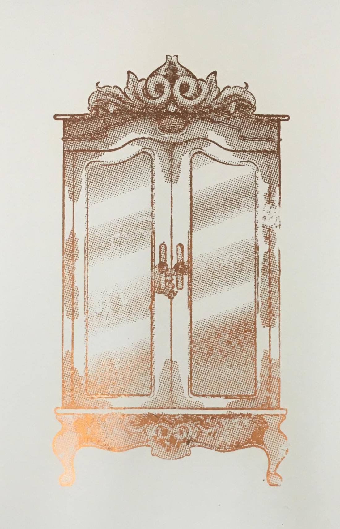
In yesterday’s blog post I did discuss the process of creating the screen and printing with it, so if this is something you are interested in or would like to know more about, please click here. So, following this process, instead of using printing medium, we used glue instead. By doing this, you did have to be more thorough with the cleaning of your screen, washing it as soon as possible because if you were to leave it to long, it could potentially dry and clog up your screen, making it unusable. Once the glue was printed onto the page, you would then choose a foil, which had come in multiple colours and tones, but for my piece, I had chosen to use a copperish colour. You would then place a sheet of your chosen foil over the glued sections, the colour/reflective side facing upwards, then sandwhiching the page and foil inbetween sheets of scrap paper, you then put it into the heat press for 30-60 seconds. Once you have removed this sandwich from the heatpress, wait for it to cool down slightly, then when you peel away the foil, it should have stuck to the glue and should reveal your design underneath.

50489412_309963246296030_8504261388993036288_n

Using a normal printer.

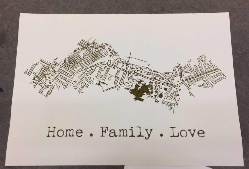
A while back, I had decided to make my mam a present which was based on a map of the areas where she has lived in her life. I had seen places online like ‘Not on the Highstreet’ doing this with a foiling effect, but instead of paying quite a bit of money for it, I decided I would just try to do it myself instead, using the facilities available to me within the college. At that time, I had no idea how I would go about making this effect, so I had gone to see Steph within the print room for her advice. She had suggested a technique where you would just print out the line work using a normal printer, then the foil would stick to it when under the heat press. So, after creating my line work, I printed it out onto a sheet of good paper with the normal printer in her room, I cut a sheet of foil which was big enough to cover the area of the design, then again, sandwiched the page and foil between sheets of scrap paper and placed it into the heat press for 30-60 seconds. Once done, I removed the foil and it had stuck down to the areas that were black in my design.

51424072_292910317950644_7496476359850459136_n

My opinion.

Although using the normal printer was a lot more efficient on time, and was a lot less messy as you didn’t have to worry about glue and cleaning screens etc, it did give a more subtle effect, as the foil appeared to be more crackled as opposed to full like I had achieved with the screen printing method. Overall I did have good experience with both techniques, however, if I were to use it again within my work, these would be factors that I have to consider, would I want the effect to be more subtle and still be able to make out the black line work underneath, or would I want the effect to be more solid?

All images are my own unless stated otherwise. Appologies that they may not best show the reflective qualities of the foil, I was going to upload a video, however this site thought otherwise. 

Screen Printing Class

When going into this class, I had did not have high hopes for it as the previous time that I had learnt the process, the outcomes did not come out the best, and the actual screen would fall apart after a couple of prints. However, in this class, we learnt a new process for making our screens, which did work a lot quicker and easier, and the screen actually lasted longer and gave better quality prints.

In the previous year, with our illustrations, we had to make them digitally and set them up within illustrator so that the image would be formed up of paths, but would be together in a compound shape. This was so that the design could run through the vinyl cutter, and it would recognise the paths and cut where needed. Once printed, you would then have to sit and weed out the sections of your design that you would want to be printed. I did actually enjoy this process, however, for time purposes, it wasn’t the best. When you had all the colour sections removed, you would then have to apply the vinyl to your screen by hand, which would often take two people to do as the screen was so big, and you would have to be meticulous with the process, making sure that there would be no air bubbles between the screen and vinyl, as this would potentially lead to your design bleeding when inked. Once the process of making your screen was complete, you would then place the screen facing down onto your paper but would have to use heavy weights or another person to hold the screen in place so that it wouldn’t move and potentially resulting in a bleed or smudge of your design. By working with another person, this also made it more awkward when pulling the ink down over the design, as it wasn’t just a smooth pull down, you would have to move around the arms that were holding your screen down. After all this effort, the screen would only last a couple of prints, at least in my own experience, as the ink would loosen the adhesive of the vinyl, which lead to some of my details falling off. Shown below are my results from this experience, which I hope show why I did not enjoy this experience and was not looking forward to trying it again.

HOWEVER, when beginning and learning this new process, it was SO much easier! When initially making the design, although I still had to make a monochrome design, as shown in my previous blog post, click here to see, I did not have to faff around with illustrator files, paths and compound shapes, I just needed to save my design as an A4 Jpeg.

When it came to creating the screen, we were all given frames which would be our own for the year. This would mean that we could repeat this process whenever we needed, as in previous years they have had a limited amount of screens, which could get damaged or take a while to dry after cleaning, so this would eliminate those issues, and if ours went missing, it would be of our own doing. With this frame, we were given a sheet of instructions to follow. Starting with it positioned so that there were two holes on the right and one in the top left corner, using double-sided tape, you’d then line all four sides. We were then given a sheet of mesh, which we stuck down onto the tape, making sure it was the rougher side facing upwards. This sheet acts as our screen and would be replaced from print to print. Using green tape, we then lined each side of the fame once again. This would ensure that the screen would not move during the process. With a craft knife and a cutting matt, we then carefully cut out the holes, the two on the right and one in the top left corner. Our screen was then ready for the design to be printed onto.

Using a new machine which burns the design onto the mesh, you would slot your frame into it, using the holes, then it would feed through, burning your design into the screen as it goes. I believe you do need to use a specific program for this to work, but it seemed simple enough to upload your Jpeg image and have it work. A couple of the other students did have issues with this process as they found the printer would glitch halfway through, but we discovered that this was due to the screen not being stable through the feeding process, as it would sometimes fall when coming out on the opposite side.

Below are images from the process of creating the screen, apologies if some are unclear as to what is going on within them.


When it had come to printing the designs, as the frame and screen were a lot thinner and lighter than the ones used in the previous process, it was no longer a two-man job to hold it in place, a couple of weights would suffice, meaning that when squeegeeing the ink down the screen, the process was a lot smoother.

The printing medium we had used was one part paint in the colour you wanted, I chose black as it fits with the style of work that I wish to create for the project, then two parts of acrylic medium. I believe the medium helped thin down the paint, making it a lot easier to transfer through the screen.  With a squeegee, you then put some of this medium in a line at the top of the screen, which should be faced downward on your page, then at a 45̊ angle, you then pull it down across your design. If you put too much medium, the print may bleed, but if you put too less, you may miss some details of your design. After a few runs, it is suggested that you wash your screen so that it does not get clogged, but once it is dry, you can go back to printing again.

This was unlike the previous process because if you were done with that screen, you would have to remove all of the vinyl, wash the screen, then you would not be able to print with the design again unless you went through the whole process of making your screen from vinyl once again.

Below are images of my results from this class, which as you can see I did experience a few learning curbs, using too much ink, or using the screen whilst it was still wet after cleaning, but I did get a few nice prints, and overall this class did give me a better perspective on the technique and process, and I do believe I will be using it again in the future. Potentially for final prints, but also for creating sellable products, as I believe it could be used to make good quality limited edition prints, bags, t-shirts, etc.

All images are my own unless stated otherwise.

Inktober: Days 15-20

Day 15: Weak – Snowdrop

43067436_1937100623250216_770439901669026784_n

On this day, I was really struggling to draw a face, the angles were just not my friend and they were just a mess. As I was doing this at college, I decided to leave it until I got home and work on something else, even though this would give me the same dilemma as the previous week, potentially battling with the natural light available.

This, however, was not an issue, as when I had gotten home, I was able to power through and finally draw a face that I liked, then I was able to ink it and get a photo whilst there was still a good amount of light available.

This was not the initial flower that I had chosen to do for this prompt, I was originally going to create a daisy, but I believe due to the hassle I found when drawing the faces, I had forgotten the prompt and had unconsciously started drawing the flower, a snowdrop, that my mother had suggested when I had initially started planning the project.


Day 16: Angular – Aloe Vera

44290197_2222330818027004_8368284530149785261_n

This piece seems to be quite similar to the ‘Cruel’ character, as their bodies are both wrapped by their plant’s leaves. Because of this, I have decided that this character is ‘Cruels’ sister, but is not evil. Although she has a harsh ‘angular’ appearance, she is a healing character. Like the plant, it has a prickly exterior, but inside, it has the ability to soothe and heal burns.

With the design, I wanted to take advantage of the angular prompt, and experiment with shapes. Although with the face, I have kept to the overall aesthetic of my designs, with the hair, I feel I have unconsciously taken inspiration from a tattoo artist named GreemTattoo on Instagram, who uses bold black in their designs and often has quite blocky and angular style. I do really enjoy the literal approach I have taken from the prompt and have applied to this character.


Day 17: Swollen – Bleeding Heart

43578335_2291757197718695_7552956570976621068_n

This was another plant that I had not initially intended to work with, however, when looking at the original plant again, the ‘Gasteria plant’, I did not feel much inspiration in the imagery that I could create from it, so decided to head in a different direction.

Since this flower has a very distinct shape, I decided to have the character facing head-on, as to best show her silhouette, which hopefully makes the plant that she is influenced by, more identifiable. As the heart shape is supposed to look as if it is bleeding (hence the name) I tried to include the drop within the characters anatomy, making the collar bones deeper in a way, and shaping them more like a teardrop.

I imagine this character to be very strong and caring, almost like a mother or big sister type figure. I feel she would be a heart over mind person, she will care and support the other characters, but if something is troubling them, she will go to sort out the problem no matter the extent of the issue, listening to her heart more than her brain.


Day 18: Bottle – Baby’s Breath

43631747_1285170044958951_8800325775310248427_n

I LOVED creating the hair for this character. As the flower that I had chosen for this prompt, baby’s breath, can look soft almost like a cotton ball, I wanted to create hair that would resemble this quality. I also decided to keep it black, as it would contrast the white of the flower.

I do see that there are problems within the face, mostly in the eyes, so when refining the pieces later on, I will fix this issue. If it weren’t for this little problem, I think this piece would be one of my favourites, maybe a close second to the ‘Flowing’ character.

I see this character being similar to the Jasmine and Kadupul characters, as she would be quite airy and have a relaxing essence to her like Jasmine, but like Kadupul, she would be beautiful to look upon as she is quite child-like and angelic, untarnished by the world.


Day 19: Scorched – Kniphofia

42898414_1981665145459856_5347744395750187251_n

This plant was initially chosen because of its colours, as they usually have a deep red to a yellow gradient from top to bottom, which to me resembled the prompt. Although I could not show this element within my design, (as I am working in black and white during this challenge) I still decided to use this plant as inspiration, as it does have an interesting silhouette.

The finished character almost reminds me of the guards at Buckingham Palace so she could have a similar occupation in her society. As a guard, she could potentially work for the Kadupul character, protecting her from any of the villainous characters.


Day 20: Breakable – Brittlebush

43914488_503549043389607_4701929598695823898_n

This character is quite mysterious in her facial expressions, (not necessarily intended, but I’m going with it) and with the flower placement on her head, it looks more of a hat, so to me, this character could be a detective of some sorts, or a potentially a private investigator. I’ve recently started watching Jessica Jones so this may have been where the idea of occupation came from, even though my character does not resemble Jessica Jones in the slightest.

I feel this character may have the most personality from my creations so far, she makes you question the type of character she is, what is she looking at? What is she thinking about? Who is she? etc. I think she is one of my top 10’s, even though her prompt does not really relate to the backstory I have given her, as I don’t imagine this character being very weak or breakable, as I see her being more strong headed and fierce.


6 Techniques I Used To Create Monochrome Illustrations Digitally

This tutorial had originally sprouted from my tutor telling everyone to create a monochrome illustration, which would then be used for screenprinting on Friday. I will post a tutorial/guide/tips I learnt from that lesson, after my class on Friday. From my previous knowledge of screenprinting, I believe you have to create a black and white image that will act almost as a stencil, so that is what I have tried to keep in mind throughout this experimentation.

wardrobe.5
Original Digital Painting of the Wardrobe – No added filters.

Starting with a piece I had digitally painted (tutorial on digital painting possibly coming soon?), which is of the wardrobe for my ‘Lion, the Witch and the Wardrobe’ project. With all the colour layers, I had grouped them all together then duplicated the group, I then flattened the second group. This was so that if anything went wrong during this experimentation process/phase, I would still have my original layers within the first group. I decided to keep the linework separate from the painting as I wanted my linework to remain clean and readable, I did not want it to possibly become distorted with one of the effects I’m about to show you.

For these techniques, you will be playing around with the flattened layer of colour, using filters from the ‘pixelate’ section within Photoshop. If you do not like any of the effects on your work, it is easy to undo by just going to edit and undo.

1.Colour Halftone

With this technique, it takes your image and pixelates it into rows of dots, which range from sizes, getting bigger in the deeper tones, and smaller in the lighter. You are able to change the size of these dots, making them finer or bigger, in the controls box that pops up before the change is made.

I personally liked this filter with a bigger scale of dots, as I feel when they are smaller, from a distance, the piece looks more square in the pattern, whereas when they’re bigger, it almost gives a pop art/comic type of effect.

test3 colourhalftone

2.Mezzotint – Dots

For the mezzotint filter, there are three types in which you can try, one being dots, another being lines and another being strokes. Within these options, you can then chose whether you want the effect to be bolder or finer, etc.

As an example, with the piece below, I have used fine dots, and to me, it has made my design look more fuzzy, specifically in the darker areas, but you can see that it has almost a similar effect as adding noise.

test2 finedot

3.Mezzotint -Lines

This is one of the other mezzotint filters, the short lines. As you can see, it builds up the image using lines, they are closer together in the darker areas and further apart in the lighter, forming the contrast of the tonal piece

I don’t really enjoy the outcome of this filter as I feel it had made my piece look more patchy as opposed to blended. I feel I just prefer a neater approach with these filters, whereas this design looks more scratchy in a way.

test5 mezzoint shortlines

4.Mezzotint – Strokes

This filter is quite similar to the mezzotint lines, however, I feel there are more areas of flat colour, you only really see the lines where the tones are changing, for instance from black to dark grey, dark grey to light grey, then light grey to white.

Although this filter is less fuzzy than the previous, I still feel it is a bit patchy moving from tone to tone, so it is not the style that I wish to work with, as I would want it to be neater and more refined.

test1

5.Mosaic

Moving away from the mezzotint filters, in the example below, I have shown the Mosaic filter. As you can see, this pixelates the shading, the effect almost reminds me of inappropriate blurring that you would see on tv when the show would blur out product placement, a persons face, a rude hand gesture, or any type of nudity.

Although this filter does give a softer shading, the blockiness is not really a route that I want to take with my designs, so again, I will not be using this filter during this project, but its good to know its there.

test6 mosaic

6.Pointillise

To me, this filter resembles monotone confetti being spilt over my design. I would like to see how this filter works with colour, as it could create some fun designs that I feel would appeal more to children, however it is not something I wish to use within my design.

I feel this filter would be similar to the halftone one, however, where the halftone works in rows of circles, this filter does not have a system, as there are circles overlapping each other, and I feel it works mostly on tones, as opposed to changing the sizes of the circles as I believe the halftone filter does.

test4 pointilise

Although I did not find a filter which had achieved the style that I desired, that being a crosshatch pattern, almost in the style of John Tenniel, as I need a design to use in the screenprinting class, I will choose the best of the results, for me this is the halftone filter, but I will expand the circle size a little, as I do not know how small the new printer for the screenprinting machine can go, and I do want my piece to be readable.


BONUS TIP 

7. Illustrator

When experimenting with the sizes of the circles within the halftone filter, I had formed 3 versions, the first I believe being 10, second I believe is 12 and the third is 14, then I had asked my tutor for advice in which would be most readable, and which would most likely print the best on a screen, in which he had responded the second. I did like the first as it had more of a subtle blend, however, I don’t believe the new printer would have picked up such small detail.

As the original version of this effect was picking up the other tones within this piece, such as the grey tones, I decided to save the image from Photoshop, then take it into Illustrator. In this program, I then ‘image traced’ the image, which had ended up taking away all of the other tones, and had just left me with the black line or dot work. I did this step, as the last time I had screen printed, I recall the design had to be stencil-like, meaning that it could only be one colour, so I did not feel the piece would work correctly if I had left all of the other tones in.

Competition Briefs

Both briefs for the competitions I have planned to participate in during the first semester have now been announced.


House of Illustration – Book Illustration Competition 

They have announced that the book in which you have to illustrate and make a cover for, will be Howls Moving Castle by Diana Wynne Jones. I am excited about this, as I had loved the Studio Ghibli adaptation of the story, and never actually knew that it was originally a book, so I am excited that I can read it and possibly see the differences from book to movie.

My only issue with this brief, I feel, will be trying to forget the imagery I already know from the movie. I feel Studio Ghibli makes the most beautiful movies with incredible scenery and amazing characters, so as the imagery I already know is so strong, I feel I might struggle when it comes to making the story my own, forgetting the visuals I already associate to the story.

bic2019


For the Penguin Student Design Awards, 3 books have been announced, one for Adult fiction, one for Adult non-fiction and one for a Children’s book.

Adult fiction cover Award – The Establishment – Owen Jones

From a brief read of the description, this seems like a political based book, which is something I am not really interested in. Although it would get me out of my comfort zone, working with themes I have never explored before, its not something I feel excited about, or something that I want to get involved in. Yes politics are important, and I do vote, and I’m all for other people getting involved and I respect their passion towards it, but its just not something I’m personally interested in. So, I think I’ll be choosing to go with another book instead.


Adult non-fiction cover Award – Norwegian Wood – Haruki Murakami

This I believe is a love story, based on a character who is reflecting back on his student days, in the 60’s, in Tokyo.

When reading through this brief I kind of got excited, as I feel it could be a chance for me to create more oriental themed work, which I had enjoyed doing at the end of Level 5, but also possibly include styles or themes from the 60’s.


Children’s cover Award – Wonder – R. J. Palacio

This is a story which has recently been turned into a movie, which I have not seen yet, slightly because I thought it would potentially make me cry, (I’m a wuss with emotional movies). It is about a young boy with facial deformities, who I believe just wants to be an ordinary boy, being able to go to school and have friends, without being stared at.


I am currently torn between choosing the Children’s book or the Adult fiction book. On one hand, I don’t want to create too much child based work over the year, as I do want to cover more audiences within my portfolio this year, however, I don’t necessarily think Wonder is anything like the other children’s books I am planning to work with over the year, as I believe it has a deeper themes which are more based on real life as opposed to a fantasy world, so if I did choose to work with this brief,  I don’t think it would resemble any other work I create this year.

With the adult’s fiction brief, however, I do feel it is well suited to me, as I do love creating oriental based designs, and I would enjoy working exploring 60’s themes, colours, etc. However, this may be a con, as I would not be challenging myself and could potentially end up creating work similar to previous designs.

So my dilemma is, do I create yet another childrens book, even if it’s not like the others have planned and could potentially take me out of my comfort zone, or do I work with an adults book with themes that I know I would enjoy working with, but would be settling into my comforts.

After talking to my friend, who had told me more about Wonder, and actually made it an option, as I initially I was adamant about not doing the children’s category, I discussed my dilemma and she had suggested that I just get both, (she’s going to send me Wonder to borrow, and I’ll purchase Norwegian Wood) then she said “read them both, come up with 3 concepts each, then choose your favourite from there”, which is the best advice I have been given so far this year, and is why she is my best friend. She has solved my issue and made my path much clearer for this specific project.

Psda


Bibliography

House of Illustration (2018) Book Illustration Competiton [Online] Available from: https://houseofillustration.org.uk/get_involved/bic-2019 [Accessed on 17 Oct. 2018]

Penguin (2018) Student Design Awards [Online] Available from: https://www.penguin.co.uk/company/work-with-us/student-design-award/student-design-award-2019.html [Accessed on 17 Oct. 2018]


Inktober: Days 8-14

Day 8: Star – Star Flower

42004249_301247550705283_4169723086840321521_n

From the previous post, it seems that I had jinxed myself, as with this piece, I had struggled with time. As I was at college during the day, working on other projects, I believe I had gotten home at 4/5 and had to rush my piece so that I could take a photo of it within the natural light. At the time of this photo, the natural light was more cool toned than previous pieces had been, and although I tried to fix this problem when editing the photo (as to make it cohesive with the other pieces) I feel you can still see the difference when looking at them all together.

Other than the lighting, I also feel this character has more issues with the drawing, specifically with proportions and angles and so on. When completing this challenge and compiling the designs into one zine, I believe I will go back and try to fix this character, as I do see her potential, but do not believe I achieved it on this day.

The flower I had chosen for this prompt was pretty self-explanatory, and I wanted the character to have a ‘stardom’ quality to her. Imagining this character in the society I have created, I believe she would be a celebrity figure, whether that is in a good or bad way. I want her to be in the limelight in this society, but the other characters could have different opinions of her, depending on what they’ve heard or believe.


Day 9: Precious – Kadupul

42604998_258396621532786_7518244085548651287_n

With this character, I had searched the rarest flowers and had found two that I felt most inspired by, one being Kadupul, and the other being a Kinabalu Orchid. For this specific prompt, I felt the Kadupul would be better suited as it looked more gentle, whereas the Kinabalu looked more sinister in a way. The Kinabalu will be used for another prompt ‘expensive’ as I see that character being more snobby than I would the Kadupul.

I wanted this character to be quite doll-like, angelic in a sense as if she has been untarnished by the world. As a character I feel she would be a princess figure, the other people may not see her very often, as I imagine she is protected a lot of the time, but when they do see her, they are enchanted by her beauty and grace.


Day 10: Flowing – Water Lily

42496735_336919253745736_101372563669345908_n

This is my favourite piece so far, I am so happy with how she turned out! For the prompt ‘flowing’, I instantly thought of water, so had chosen a flower to fit the theme, this being a water lily.

When creating her, I wanted a similar petal hairstyle as my piece for the Chick and Hen character. However, with the reference I was using, the model had hair flowing across her face, so I decided to keep this element, and I am so happy that I did, as I believe in my design, the hair almost looks wet on her face and could resemble roots from the flower, as if she has just been taken straight out of the water.


Day 11: Cruel – Ricinus Communis

42169565_1730118407098644_6127418098687153093_n (1)

With this prompt, I wanted to create a villainous character who is very upright and has a scheming look on their face.

When looking at the plant, the Ricinus Communis, it had big leaves and red spiky balls. My initial idea was to have the leaf as a collar of some sort, then have the balls growing from the character. However, when drawing this piece, the leaf had become bigger than I had intended, wrapping around her body, as opposed to just her neck. I do still like the design though, as I feel she does still have the villainous appearance, which I feel the other characters would be afraid of.


Day 12: Whale – Pansies

43495896_251294502252069_1406366792041196933_n

The link between flower and prompt for this character is a bit farfetched. As I could not necessarily find a flower by searching ‘whale flower’ or ‘whale plant’, I tried thinking of colours, specifically from an Orca whale, with the black and white patterns. This had led me to pansies, as they often had a dark centre, which is then surrounded by white, and then followed by another colour.

Although I like the design for this character, I don’t really have a backstory for her as of yet. She does look like a quite strong character, but as of the prompt, it has not given me much inspiration as of this moment in time. But I will come back to her another time and try to develop her story further.


Day 13: Guarded – Pycnostachys Urticifloia (Blue Witches Hat)

42645374_1065626340284123_2190835388786580352_n

With this character, as the appearance of the flower suggests, (although the colour is not shown) she is a witchy type character, but not an evil one, I believe she is a good witch that helps others with spells, love, healing, etc, but her speciality is with protection spells, linking back to the prompt  of  ‘guarded’. I feel she is a kind character but has her guards up as other characters may not react well when finding out she is a witch, even if she is good.

There are some issues that I can see within this character, specifically within the face, so again, like with my ‘Star’ character, I do plan to fix and refine these issues, when compiling all of the characters together in a zine.


Day 14: Clock – Passion Flower

43778589_514936458972963_7010897365447628305_n

I enjoyed working with this specific plant as it had so many different elements to play with.

I feel I slightly lost control within the inking process, as there are a few shaky lines (especially on the shoulder) and when shading her face, the ink on her chin had bled too much up into her face, whereas I had wanted it to bleed down into her neck instead, creating more shadow, as opposed to a beard.

Again, when it comes to creating the zine, I will come back to this piece and refine these problem areas, whether it is just done digitally, or whether I redraw the character.


So far, I do love every character that I have created, and even with the ones that have gone slightly wrong, I do still see their potential, either with their stories or the imagery I have created. So, I will come back and fix these characters, once the challenge is out of the way and when I start concentrating more on the creation of the zine. If anyone does buy the zine, I want them to get their money worth, so with any imperfections I see, I want to fix these problems beforehand, so that when the buyer receives their product, they won’t find any issues and won’t question why they spent their money on it.

Inktober: Days 4-7

Day 4: Spell – Yarrow

42004173_156298501974846_7624630574455391547_n

With the prompt, I had searched ‘flowers most commonly used in spells’ in which it had come up with a few suggestions, and for a while, I was back and forth between Yarrow and Lavender, however, I personally have not heard of yarrow a lot, so wanted to play around with that imagery.

I tried to approach this piece in a similar style to the bonsai tree pixie, but I feel it may be too similar, the only difference being the figure and the type of branches. I also feel I may have made the face too masculine, as the jaw is sharp, the neck wide and the shoulders do look broad. Although I felt this was an issue a couple of days ago, I have had time to reflect, and have since realised that the piece is not bad, as there are women who will have more masculine features, such as strong jawlines and are proud to have those features. So, through this piece, I have found that I don’t just have one face syndrome (a case in which an artist will unconsciously draw almost the same face in every design), I am able to work with different faces, features and shapes.

I imagine this character to be the owner of an apothecary in which other pixies will purchase medicine, or purchase ingredients for spells and so on.


Day 5: Chicken – Chick and Hen plant 

41891000_2021589737902715_7847559229684649995_n

I was really stumped with this prompt and how I could find a flower or plant that would relate to it, until I had searched ‘chicken plant’ in which the results had come up with a chick and hen plant, which is a type of succulent, which I believe has its name because they will often have one big plant, which I assume is the hen, which will be surrounded by a few little ones, which I assume are the hens.

For this character, I wanted to make it seem as if the plants were growing from her, so decided to plant a few big ones around her body, which would then be surrounded by the little ones. Then, instead of giving the character hair, I wanted to make it seem as if the leaves were her hair, so inevitably, I had given her a big succulent growing out of her head.

The ink within this piece had my bleeding issues than any of the previous ones, which I believe was due to all of the smaller leaves that I had drawn within the plants. Because of this issue, however, I have started to use a white ink pen within my designs, which has helped a lot, especially for covering up any accidental bleeds. I also feel it helped given the designs more lighter areas, particularly within this piece as I have been able to add highlights to specific leaves, which has helped break up a lot of the darkness from the ink.


Day 6: Drooling – Sundew

42589350_1268973386575634_5637119764783988331_n

This flower choice is based on the prompt ‘Drooling’. The plant itself produces a sap that attracts flies which I then believe it eats. When looking at photos of the plant, the sap does look like drops of drool, and I felt it would be fun to attempt to illustrate it, especially when using ink.

For this plant I had started by drawing out rough shapes for the curling spines, I then started adding in the little strands in which the sap would be produced from. Then with water and a paintbrush, I started bleeding out the ink, which had made the plant almost look more feathery and softer. Once the water and ink had dried, I then went in with my white pen, highlighting specific strands and adding in the sap drops to the end of them.

I do like this design as I have approached it in a different way to the previous designs, and believe the new technique has given her a more interesting look as she definitely has more contrast in comparison to the previous characters.

This character to me has a sense of ‘look but do not touch’ quality to her. I believe her beauty would draw other characters in, but like the flies with the actual plant, they would not have a very fortunate end.

42794193_735413196792911_6603772400417569500_n

Day 7: Exhausted – Jasmine

I had chosen this flower when searching ‘plants which help you sleep’ in which one of the answers had suggested jasmine.

I wanted to keep this character very light and airy in comparison to the last piece, as to give her a more dreamlike and airy quality to her.

To me, this character would be very kind and gentle, but also quite ditsy and airy. I believe she would sleep more than any of the other characters, but when she is awake, she is a joy to be around because she gives off a quiet peaceful energy, letting other characters stresses disappear, even just for a little while.


WEEK ONE IS COMPLETE!

I have enjoyed doing each of the pieces so far and believe I have discovered a good flow/system for creating them. I don’t believe I have struggled much with timing as of yet, but in the weeks to come, when other projects start to run alongside this one, I feel I may begin to struggle more with timing, but I will soldier on, as I refuse to miss a day!


Procrastination Station

It is currently the day before my first deadline, and what have I found myself doing? Procrastinating! You would think that I would be panicking during this time, which I am,  but the motivation to do work is just not here.

As a way to try and battle this issue, I had searched on google ‘How to stop procrastinating’ and the results had given me this one article which suggested ways in which you could ‘Get motivated to study’.Although this is an interesting article, and probably would help me in the long run over this final year, and possibly in life too, I had a brief read through and it had just made me want to hunt down my old DSi and play Dr Kawashimas Brain Training. This would be following step 13 of the article, exercising the brain.

I don’t believe this article is useful for me at this specific moment in time, as I am already in my procrastinating mindset, and it seems I’m just going to end up distracting myself more than I actually can.

I would, however, like come back to this article at later date though, possibly when I have less work to do and actually have free time to learn from it, as it could potentially stop me from having these moments again in the future.


As of this current deadline, all I have left to do is fluff out my research, by fluffing out, I just mean that I have already briefly written up the basics, I just need to go back in and add more detail. The ‘research’ includes artists and writing up all of the information I have found from each of the competitions that we were suggested, then discussing which I would like to do and which I would not.

I then need to give more narrative to my self-report, as I had bullet-pointed all of my strengths, weaknesses, opportunities and threats, but my tutor had suggested that I go into more depth, discussing why I believe my weaknesses are my weaknesses, how I will try to work on them over the year, what opportunities I will have to do so, and so on.

Then I just need to read through everything, make sure it actually makes sense and has not just come out of nowhere from auto-pilot Mel. Then I’ll add in all the photos, create a bibliography and list of illustrations at the end, then I should be dooooone; Once I’ve actually printed everything off at college as well, and have it all bound together. I’m gonna be fiiiiine, she says whilst still procrastinating and making this blog post.


Me with deadlines in general.


Bibliography

D. Wong (16 Aug. 2018) How to Get Motivated to Study: 23 Tips For Students Who Procrastinate. [Online] Available from https://www.daniel-wong.com/2018/04/23/get-motivated-to-study/ [Accessed on 07 Oct. 2018]

Giphy (2018) Trump Consequences. GIF. [Online] Available at :https://giphy.com/gifs/trump-consequences-NTur7XlVDUdqM/media [Accessed on 07 Oct. 2018]


Selling Within a Store

My Aunty Dawn, not really my aunty but my mams closest friend who is basically my aunty, who I actually see more than my real relatives, has recently opened her own store in Stanley, which is called Purple Dragon, which sells unique gifts, which are quite gothic, spiritual and very fantasy inspired. This includes crystals, skulls, tarot cards, cushions, cups, journals, and there is even a section of her shop just dedicated to incense, which is another business she owns called House of Incense.

She recently came round and was talking with my mam about the shop, in which I inquired about the possibility of selling my work in her store. If this was anyone else, I probably would not have been as forward or as confident to even ask, but I showed her some of the prints I still had left from last years exhibition, and she said that she would take two and see how they would sell.

riso print

I then showed her some of my other work, and she has chosen a few other pieces that she would like me to print off, again she only asked for 2 of each, to see how they would sell, and she would let me know how it goes. The prints in which she wants are as shown below, and do give me a better understanding of what she would like to sell in her shop, and gives me a better idea of what else I could create for her if the prints do well and if she wants new designs. As you can see, she likes the colour green!

I’m so excited about this opportunity and do hope that the prints she has with her now do sell. If so, this will be my first experience with selling work outside of the college, and will potentially be the first steps in which I take to forming my own business and selling my own work. Aghhhh I’m excited about the future, I just need to print out the other illustrations she wants, and get them to her. I will keep you informed of how this venture goes.

Current Artist Research Pt.2

John Tenniel

Figure 1 – John Tenniel, Alice’s Adventures in Wonderland, 1865

This is an artist from the Golden Age of Illustration, who I would like to take inspiration from during my Lion, the Witch and the Wardrobe project. He had created the original illustrations for ‘Alice’s Adventures in Wonderland’ by Lewis Carroll.

From the illustrations specifically from this book, Tenniel’s style is semi-realistic but with the theme of the book, he has played around with surrealism, illustrating things that you would not exactly see in the real world, and exaggerating some of the characters proportions, as seen in figure 1.

I believe these illustrations were hand-drawn with pen and ink, but I believe when it came to mass production, the design was etched into a plate, so the illustration could be printed multiple times for hundreds of books.

Because of this factor, during my Lion, the Witch and the Wardrobe project, I want to experiment with different mediums, working traditionally with pen and ink, but also playing around with different printing techniques, such as screen printing, linocut printing, etching, and even creating a plate with the laser cutter that is available within the college.

Primarily, I do want to work in black and white for this project, however, I do plan to also play around with foils, possibly adding hints of gold or silver to the designs, potentially giving my pieces a more regal appearance that I believe will fit the theme of the story.


Ana Godis

40653471_917673028417511_1146468823050747904_n
Figure 2 – Ana Godis, 2018

As the competitions are not yet known and I do not know what I will be creating, I want to keep an open mind of where I can go with these projects in sense of style and techniques I could use. I have however been enjoying the work of Ana Godis over the holidays, so would potentially like to use her work as inspiration for a project over the coming year.

I would explain her work as experimental in a way, although I believe she always works digitally,  I’d say her style can differ from piece to piece, as for one, she could be creating a beautiful digital portrait which is very realistic, but in another piece, she could be working very stylised, almost ‘cartoony’? But in another piece, she could be combining the two styles, which probably sounds confusing, but she is able to execute the style so well!

Over the holiday, as she does post process videos along with her pieces, I have tried to learn from these videos, trying to follow her steps, as to improve my own technique, and I had created two digital paintings. I could still do with some further practice, however, I do feel the process had given me smoother results, in comparison to the digital painting I had done the year previously.

I feel as her style is so flexible, if I were to take inspiration from her work, I would be able to apply it to any project, including the competitions. Her work is illustrative but quite contemporary in style, so if I were to learn more from her techniques, I could potentially apply them to book illustrations or editorial themes or possibly even use them for advertising.

Ana Godis does have a Patreon in which I believe she does go into more depth with her process, the tools she uses etc. I personally am not subscribed as I do not use Patreon (as I feel it would be a black hole for me, following too many artists and probably spending all of my student loan within it, which is not something I am committed to doing as of yet) But, if you are interested in her work and do wish to learn more in-depth about her process and tools, here is her link: www.patreon.com/ana_godis


Rafael Mayani

23507888_1928168667504955_2452883890356879360_n
Figure 3 – Rafael Mayani (2017)

Like Ana Godis, I will potentially be taking inspiration from Rafael Mayani during my commercial projects.

In comparison to the previous artist, I believe his work is more contemporary, possibly more editorial-based, so I believe he would be most useful within the Association of Illustrators – World Illustration Awards competition, especially if I decide to work in the editorial category.

His style is minimal, easily readable and overall it is easy on the eyes. I believe I would most likely see his work in commercial settings, such as in magazines, in advertising, on posters, etc. In figure 3 specifically, he had created an illustration for a magazine, which was honouring the people who helped clean up and take care of others after the earthquake in Mexico in 2017. I believe by not giving his characters faces, it is not singling out any particular person who had helped but instead is celebrating the community as a whole, and the reader could potentially fill in the spaces themselves, imagining the people they know, if that makes sense?

When taking inspiration from his work, it will be with the minimal almost papercut style, as I do believe it is very readable, and it does attract the eye, which I do feel is an important factor if I were to create a piece that would advertise a specific article.


List of Illustrations

Figure 1 – Tenniel, J. (1865) Alice’s Adventures in Wonderland [Online] Available at: https://medium.com/alice-s-adventures-in-wonderland/sir-john-tenniel-s-classic-illustrations-of-alice-in-wonderland-2c3bbdca3a77 [Accessed on 24 Sep. 2018]

Figure 2 – Godis, A (04 Sep. 2018) [Online] Available from: https://www.instagram.com/p/BnTw8cOnCra/ [Accessed on 24 Sep. 2018]

Figure 3 – Mayani, R (13 Nov. 2018) [Online] Available from: https://www.instagram.com/p/BbceF5PFQLR/?taken-by=rmayani [Accessed on 24 Sep. 2018]