When going into this class, I had did not have high hopes for it as the previous time that I had learnt the process, the outcomes did not come out the best, and the actual screen would fall apart after a couple of prints. However, in this class, we learnt a new process for making our screens, which did work a lot quicker and easier, and the screen actually lasted longer and gave better quality prints.
In the previous year, with our illustrations, we had to make them digitally and set them up within illustrator so that the image would be formed up of paths, but would be together in a compound shape. This was so that the design could run through the vinyl cutter, and it would recognise the paths and cut where needed. Once printed, you would then have to sit and weed out the sections of your design that you would want to be printed. I did actually enjoy this process, however, for time purposes, it wasn’t the best. When you had all the colour sections removed, you would then have to apply the vinyl to your screen by hand, which would often take two people to do as the screen was so big, and you would have to be meticulous with the process, making sure that there would be no air bubbles between the screen and vinyl, as this would potentially lead to your design bleeding when inked. Once the process of making your screen was complete, you would then place the screen facing down onto your paper but would have to use heavy weights or another person to hold the screen in place so that it wouldn’t move and potentially resulting in a bleed or smudge of your design. By working with another person, this also made it more awkward when pulling the ink down over the design, as it wasn’t just a smooth pull down, you would have to move around the arms that were holding your screen down. After all this effort, the screen would only last a couple of prints, at least in my own experience, as the ink would loosen the adhesive of the vinyl, which lead to some of my details falling off. Shown below are my results from this experience, which I hope show why I did not enjoy this experience and was not looking forward to trying it again.
HOWEVER, when beginning and learning this new process, it was SO much easier! When initially making the design, although I still had to make a monochrome design, as shown in my previous blog post, click here to see,I did not have to faff around with illustrator files, paths and compound shapes, I just needed to save my design as an A4 Jpeg.
When it came to creating the screen, we were all given frames which would be our own for the year. This would mean that we could repeat this process whenever we needed, as in previous years they have had a limited amount of screens, which could get damaged or take a while to dry after cleaning, so this would eliminate those issues, and if ours went missing, it would be of our own doing. With this frame, we were given a sheet of instructions to follow. Starting with it positioned so that there were two holes on the right and one in the top left corner, using double-sided tape, you’d then line all four sides. We were then given a sheet of mesh, which we stuck down onto the tape, making sure it was the rougher side facing upwards. This sheet acts as our screen and would be replaced from print to print. Using green tape, we then lined each side of the fame once again. This would ensure that the screen would not move during the process. With a craft knife and a cutting matt, we then carefully cut out the holes, the two on the right and one in the top left corner. Our screen was then ready for the design to be printed onto.
Using a new machine which burns the design onto the mesh, you would slot your frame into it, using the holes, then it would feed through, burning your design into the screen as it goes. I believe you do need to use a specific program for this to work, but it seemed simple enough to upload your Jpeg image and have it work. A couple of the other students did have issues with this process as they found the printer would glitch halfway through, but we discovered that this was due to the screen not being stable through the feeding process, as it would sometimes fall when coming out on the opposite side.
Below are images from the process of creating the screen, apologies if some are unclear as to what is going on within them.
When it had come to printing the designs, as the frame and screen were a lot thinner and lighter than the ones used in the previous process, it was no longer a two-man job to hold it in place, a couple of weights would suffice, meaning that when squeegeeing the ink down the screen, the process was a lot smoother.
The printing medium we had used was one part paint in the colour you wanted, I chose black as it fits with the style of work that I wish to create for the project, then two parts of acrylic medium. I believe the medium helped thin down the paint, making it a lot easier to transfer through the screen. With a squeegee, you then put some of this medium in a line at the top of the screen, which should be faced downward on your page, then at a 45̊ angle, you then pull it down across your design. If you put too much medium, the print may bleed, but if you put too less, you may miss some details of your design. After a few runs, it is suggested that you wash your screen so that it does not get clogged, but once it is dry, you can go back to printing again.
This was unlike the previous process because if you were done with that screen, you would have to remove all of the vinyl, wash the screen, then you would not be able to print with the design again unless you went through the whole process of making your screen from vinyl once again.
Below are images of my results from this class, which as you can see I did experience a few learning curbs, using too much ink, or using the screen whilst it was still wet after cleaning, but I did get a few nice prints, and overall this class did give me a better perspective on the technique and process, and I do believe I will be using it again in the future. Potentially for final prints, but also for creating sellable products, as I believe it could be used to make good quality limited edition prints, bags, t-shirts, etc.
On this day, I was really struggling to draw a face, the angles were just not my friend and they were just a mess. As I was doing this at college, I decided to leave it until I got home and work on something else, even though this would give me the same dilemma as the previous week, potentially battling with the natural light available.
This, however, was not an issue, as when I had gotten home, I was able to power through and finally draw a face that I liked, then I was able to ink it and get a photo whilst there was still a good amount of light available.
This was not the initial flower that I had chosen to do for this prompt, I was originally going to create a daisy, but I believe due to the hassle I found when drawing the faces, I had forgotten the prompt and had unconsciously started drawing the flower, a snowdrop, that my mother had suggested when I had initially started planning the project.
This piece seems to be quite similar to the ‘Cruel’ character, as their bodies are both wrapped by their plant’s leaves. Because of this, I have decided that this character is ‘Cruels’ sister, but is not evil. Although she has a harsh ‘angular’ appearance, she is a healing character. Like the plant, it has a prickly exterior, but inside, it has the ability to soothe and heal burns.
With the design, I wanted to take advantage of the angular prompt, and experiment with shapes. Although with the face, I have kept to the overall aesthetic of my designs, with the hair, I feel I have unconsciously taken inspiration from a tattoo artist named GreemTattoo on Instagram, who uses bold black in their designs and often has quite blocky and angular style. I do really enjoy the literal approach I have taken from the prompt and have applied to this character.
This was another plant that I had not initially intended to work with, however, when looking at the original plant again, the ‘Gasteria plant’, I did not feel much inspiration in the imagery that I could create from it, so decided to head in a different direction.
Since this flower has a very distinct shape, I decided to have the character facing head-on, as to best show her silhouette, which hopefully makes the plant that she is influenced by, more identifiable. As the heart shape is supposed to look as if it is bleeding (hence the name) I tried to include the drop within the characters anatomy, making the collar bones deeper in a way, and shaping them more like a teardrop.
I imagine this character to be very strong and caring, almost like a mother or big sister type figure. I feel she would be a heart over mind person, she will care and support the other characters, but if something is troubling them, she will go to sort out the problem no matter the extent of the issue, listening to her heart more than her brain.
I LOVED creating the hair for this character. As the flower that I had chosen for this prompt, baby’s breath, can look soft almost like a cotton ball, I wanted to create hair that would resemble this quality. I also decided to keep it black, as it would contrast the white of the flower.
I do see that there are problems within the face, mostly in the eyes, so when refining the pieces later on, I will fix this issue. If it weren’t for this little problem, I think this piece would be one of my favourites, maybe a close second to the ‘Flowing’ character.
I see this character being similar to the Jasmine and Kadupul characters, as she would be quite airy and have a relaxing essence to her like Jasmine, but like Kadupul, she would be beautiful to look upon as she is quite child-like and angelic, untarnished by the world.
This plant was initially chosen because of its colours, as they usually have a deep red to a yellow gradient from top to bottom, which to me resembled the prompt. Although I could not show this element within my design, (as I am working in black and white during this challenge) I still decided to use this plant as inspiration, as it does have an interesting silhouette.
The finished character almost reminds me of the guards at Buckingham Palace so she could have a similar occupation in her society. As a guard, she could potentially work for the Kadupul character, protecting her from any of the villainous characters.
This character is quite mysterious in her facial expressions, (not necessarily intended, but I’m going with it) and with the flower placement on her head, it looks more of a hat, so to me, this character could be a detective of some sorts, or a potentially a private investigator. I’ve recently started watching Jessica Jones so this may have been where the idea of occupation came from, even though my character does not resemble Jessica Jones in the slightest.
I feel this character may have the most personality from my creations so far, she makes you question the type of character she is, what is she looking at? What is she thinking about? Who is she? etc. I think she is one of my top 10’s, even though her prompt does not really relate to the backstory I have given her, as I don’t imagine this character being very weak or breakable, as I see her being more strong headed and fierce.
This tutorial had originally sprouted from my tutor telling everyone to create a monochrome illustration, which would then be used for screenprinting on Friday. I will post a tutorial/guide/tips I learnt from that lesson, after my class on Friday. From my previous knowledge of screenprinting, I believe you have to create a black and white image that will act almost as a stencil, so that is what I have tried to keep in mind throughout this experimentation.
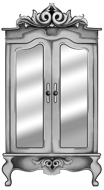
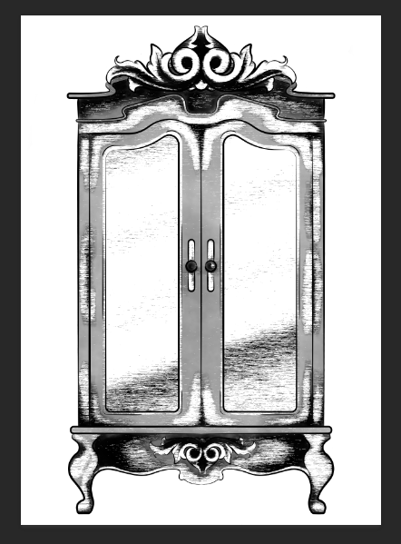
Original Digital Painting of the Wardrobe – No added filters.
Starting with a piece I had digitally painted (tutorial on digital painting possibly coming soon?), which is of the wardrobe for my ‘Lion, the Witch and the Wardrobe’ project. With all the colour layers, I had grouped them all together then duplicated the group, I then flattened the second group. This was so that if anything went wrong during this experimentation process/phase, I would still have my original layers within the first group. I decided to keep the linework separate from the painting as I wanted my linework to remain clean and readable, I did not want it to possibly become distorted with one of the effects I’m about to show you.
For these techniques, you will be playing around with the flattened layer of colour, using filters from the ‘pixelate’ section within Photoshop. If you do not like any of the effects on your work, it is easy to undo by just going to edit and undo.
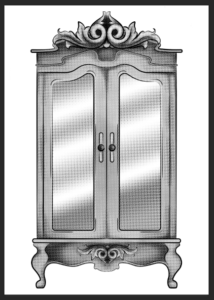
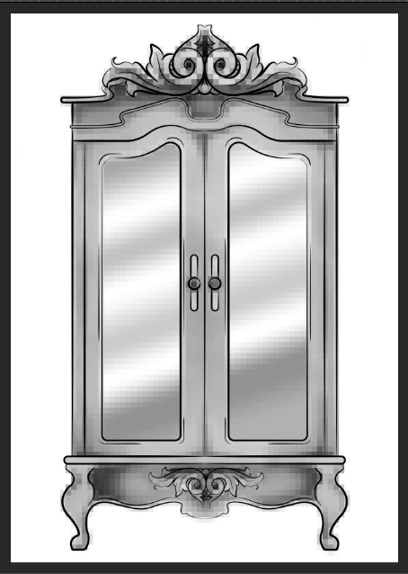
1.Colour Halftone
With this technique, it takes your image and pixelates it into rows of dots, which range from sizes, getting bigger in the deeper tones, and smaller in the lighter. You are able to change the size of these dots, making them finer or bigger, in the controls box that pops up before the change is made.
I personally liked this filter with a bigger scale of dots, as I feel when they are smaller, from a distance, the piece looks more square in the pattern, whereas when they’re bigger, it almost gives a pop art/comic type of effect.
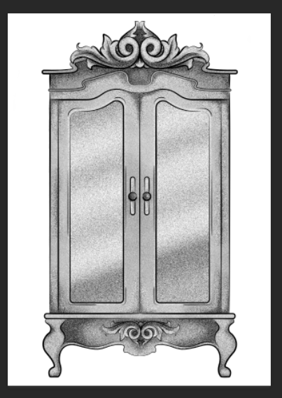
2.Mezzotint – Dots
For the mezzotint filter, there are three types in which you can try, one being dots, another being lines and another being strokes. Within these options, you can then chose whether you want the effect to be bolder or finer, etc.
As an example, with the piece below, I have used fine dots, and to me, it has made my design look more fuzzy, specifically in the darker areas, but you can see that it has almost a similar effect as adding noise.
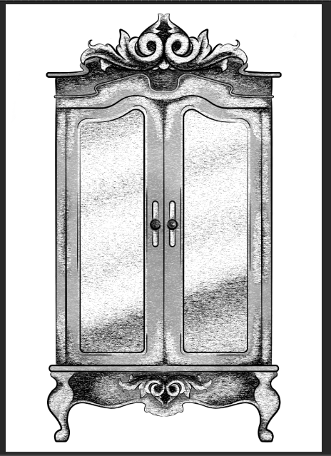
3.Mezzotint -Lines
This is one of the other mezzotint filters, the short lines. As you can see, it builds up the image using lines, they are closer together in the darker areas and further apart in the lighter, forming the contrast of the tonal piece
I don’t really enjoy the outcome of this filter as I feel it had made my piece look more patchy as opposed to blended. I feel I just prefer a neater approach with these filters, whereas this design looks more scratchy in a way.
4.Mezzotint – Strokes
This filter is quite similar to the mezzotint lines, however, I feel there are more areas of flat colour, you only really see the lines where the tones are changing, for instance from black to dark grey, dark grey to light grey, then light grey to white.
Although this filter is less fuzzy than the previous, I still feel it is a bit patchy moving from tone to tone, so it is not the style that I wish to work with, as I would want it to be neater and more refined.
5.Mosaic
Moving away from the mezzotint filters, in the example below, I have shown the Mosaic filter. As you can see, this pixelates the shading, the effect almost reminds me of inappropriate blurring that you would see on tv when the show would blur out product placement, a persons face, a rude hand gesture, or any type of nudity.
Although this filter does give a softer shading, the blockiness is not really a route that I want to take with my designs, so again, I will not be using this filter during this project, but its good to know its there.
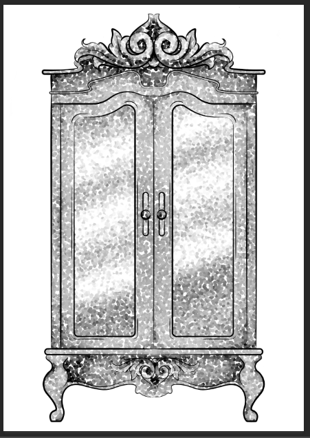
6.Pointillise
To me, this filter resembles monotone confetti being spilt over my design. I would like to see how this filter works with colour, as it could create some fun designs that I feel would appeal more to children, however it is not something I wish to use within my design.
I feel this filter would be similar to the halftone one, however, where the halftone works in rows of circles, this filter does not have a system, as there are circles overlapping each other, and I feel it works mostly on tones, as opposed to changing the sizes of the circles as I believe the halftone filter does.
Although I did not find a filter which had achieved the style that I desired, that being a crosshatch pattern, almost in the style of John Tenniel, as I need a design to use in the screenprinting class, I will choose the best of the results, for me this is the halftone filter, but I will expand the circle size a little, as I do not know how small the new printer for the screenprinting machine can go, and I do want my piece to be readable.
BONUS TIP
7. Illustrator
When experimenting with the sizes of the circles within the halftone filter, I had formed 3 versions, the first I believe being 10, second I believe is 12 and the third is 14, then I had asked my tutor for advice in which would be most readable, and which would most likely print the best on a screen, in which he had responded the second. I did like the first as it had more of a subtle blend, however, I don’t believe the new printer would have picked up such small detail.
As the original version of this effect was picking up the other tones within this piece, such as the grey tones, I decided to save the image from Photoshop, then take it into Illustrator. In this program, I then ‘image traced’ the image, which had ended up taking away all of the other tones, and had just left me with the black line or dot work. I did this step, as the last time I had screen printed, I recall the design had to be stencil-like, meaning that it could only be one colour, so I did not feel the piece would work correctly if I had left all of the other tones in.
They have announced that the book in which you have to illustrate and make a cover for, will be Howls Moving Castle by Diana Wynne Jones. I am excited about this, as I had loved the Studio Ghibli adaptation of the story, and never actually knew that it was originally a book, so I am excited that I can read it and possibly see the differences from book to movie.
My only issue with this brief, I feel, will be trying to forget the imagery I already know from the movie. I feel Studio Ghibli makes the most beautiful movies with incredible scenery and amazing characters, so as the imagery I already know is so strong, I feel I might struggle when it comes to making the story my own, forgetting the visuals I already associate to the story.
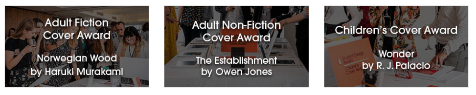
For the Penguin Student Design Awards, 3 books have been announced, one for Adult fiction, one for Adult non-fiction and one for a Children’s book.
Adult fiction cover Award – The Establishment – Owen Jones
From a brief read of the description, this seems like a political based book, which is something I am not really interested in. Although it would get me out of my comfort zone, working with themes I have never explored before, its not something I feel excited about, or something that I want to get involved in. Yes politics are important, and I do vote, and I’m all for other people getting involved and I respect their passion towards it, but its just not something I’m personally interested in. So, I think I’ll be choosing to go with another book instead.
Adult non-fiction cover Award – Norwegian Wood – Haruki Murakami
This I believe is a love story, based on a character who is reflecting back on his student days, in the 60’s, in Tokyo.
When reading through this brief I kind of got excited, as I feel it could be a chance for me to create more oriental themed work, which I had enjoyed doing at the end of Level 5, but also possibly include styles or themes from the 60’s.
Children’s cover Award – Wonder – R. J. Palacio
This is a story which has recently been turned into a movie, which I have not seen yet, slightly because I thought it would potentially make me cry, (I’m a wuss with emotional movies). It is about a young boy with facial deformities, who I believe just wants to be an ordinary boy, being able to go to school and have friends, without being stared at.
I am currently torn between choosing the Children’s book or the Adult fiction book. On one hand, I don’t want to create too much child based work over the year, as I do want to cover more audiences within my portfolio this year, however, I don’t necessarily think Wonder is anything like the other children’s books I am planning to work with over the year, as I believe it has a deeper themes which are more based on real life as opposed to a fantasy world, so if I did choose to work with this brief, I don’t think it would resemble any other work I create this year.
With the adult’s fiction brief, however, I do feel it is well suited to me, as I do love creating oriental based designs, and I would enjoy working exploring 60’s themes, colours, etc. However, this may be a con, as I would not be challenging myself and could potentially end up creating work similar to previous designs.
So my dilemma is, do I create yet another childrens book, even if it’s not like the others have planned and could potentially take me out of my comfort zone, or do I work with an adults book with themes that I know I would enjoy working with, but would be settling into my comforts.
After talking to my friend, who had told me more about Wonder, and actually made it an option, as I initially I was adamant about not doing the children’s category, I discussed my dilemma and she had suggested that I just get both, (she’s going to send me Wonder to borrow, and I’ll purchase Norwegian Wood) then she said “read them both, come up with 3 concepts each, then choose your favourite from there”, which is the best advice I have been given so far this year, and is why she is my best friend. She has solved my issue and made my path much clearer for this specific project.
Bibliography
House of Illustration (2018) Book Illustration Competiton [Online] Available from: https://houseofillustration.org.uk/get_involved/bic-2019 [Accessed on 17 Oct. 2018]
Penguin (2018) Student Design Awards [Online] Available from: https://www.penguin.co.uk/company/work-with-us/student-design-award/student-design-award-2019.html [Accessed on 17 Oct. 2018]
It is currently the day before my first deadline, and what have I found myself doing? Procrastinating! You would think that I would be panicking during this time, which I am, but the motivation to do work is just not here.
As a way to try and battle this issue, I had searched on google ‘How to stop procrastinating’ and the results had given me this one article which suggested ways in which you could ‘Get motivated to study’.Although this is an interesting article, and probably would help me in the long run over this final year, and possibly in life too, I had a brief read through and it had just made me want to hunt down my old DSi and play Dr Kawashimas Brain Training. This would be following step 13 of the article, exercising the brain.
I don’t believe this article is useful for me at this specific moment in time, as I am already in my procrastinating mindset, and it seems I’m just going to end up distracting myself more than I actually can.
I would, however, like come back to this article at later date though, possibly when I have less work to do and actually have free time to learn from it, as it could potentially stop me from having these moments again in the future.
As of this current deadline, all I have left to do is fluff out my research, by fluffing out, I just mean that I have already briefly written up the basics, I just need to go back in and add more detail. The ‘research’ includes artists and writing up all of the information I have found from each of the competitions that we were suggested, then discussing which I would like to do and which I would not.
I then need to give more narrative to my self-report, as I had bullet-pointed all of my strengths, weaknesses, opportunities and threats, but my tutor had suggested that I go into more depth, discussing why I believe my weaknesses are my weaknesses, how I will try to work on them over the year, what opportunities I will have to do so, and so on.
Then I just need to read through everything, make sure it actually makes sense and has not just come out of nowhere from auto-pilot Mel. Then I’ll add in all the photos, create a bibliography and list of illustrations at the end, then I should be dooooone; Once I’ve actually printed everything off at college as well, and have it all bound together. I’m gonna be fiiiiine, she says whilst still procrastinating and making this blog post.
Me with deadlines in general.
Bibliography
D. Wong (16 Aug. 2018) How to Get Motivated to Study: 23 Tips For Students Who Procrastinate. [Online] Available from https://www.daniel-wong.com/2018/04/23/get-motivated-to-study/ [Accessed on 07 Oct. 2018]
My Aunty Dawn, not really my aunty but my mams closest friend who is basically my aunty, who I actually see more than my real relatives, has recently opened her own store in Stanley, which is called Purple Dragon, which sells unique gifts, which are quite gothic, spiritual and very fantasy inspired. This includes crystals, skulls, tarot cards, cushions, cups, journals, and there is even a section of her shop just dedicated to incense, which is another business she owns called House of Incense.
She recently came round and was talking with my mam about the shop, in which I inquired about the possibility of selling my work in her store. If this was anyone else, I probably would not have been as forward or as confident to even ask, but I showed her some of the prints I still had left from last years exhibition, and she said that she would take two and see how they would sell.
I then showed her some of my other work, and she has chosen a few other pieces that she would like me to print off, again she only asked for 2 of each, to see how they would sell, and she would let me know how it goes. The prints in which she wants are as shown below, and do give me a better understanding of what she would like to sell in her shop, and gives me a better idea of what else I could create for her if the prints do well and if she wants new designs. As you can see, she likes the colour green!
I’m so excited about this opportunity and do hope that the prints she has with her now do sell. If so, this will be my first experience with selling work outside of the college, and will potentially be the first steps in which I take to forming my own business and selling my own work. Aghhhh I’m excited about the future, I just need to print out the other illustrations she wants, and get them to her. I will keep you informed of how this venture goes.
Figure 1 – John Tenniel, Alice’s Adventures in Wonderland, 1865
This is an artist from the Golden Age of Illustration, who I would like to take inspiration from during my Lion, the Witch and the Wardrobe project. He had created the original illustrations for ‘Alice’s Adventures in Wonderland’ by Lewis Carroll.
From the illustrations specifically from this book, Tenniel’s style is semi-realistic but with the theme of the book, he has played around with surrealism, illustrating things that you would not exactly see in the real world, and exaggerating some of the characters proportions, as seen in figure 1.
I believe these illustrations were hand-drawn with pen and ink, but I believe when it came to mass production, the design was etched into a plate, so the illustration could be printed multiple times for hundreds of books.
Because of this factor, during my Lion, the Witch and the Wardrobe project, I want to experiment with different mediums, working traditionally with pen and ink, but also playing around with different printing techniques, such as screen printing, linocut printing, etching, and even creating a plate with the laser cutter that is available within the college.
Primarily, I do want to work in black and white for this project, however, I do plan to also play around with foils, possibly adding hints of gold or silver to the designs, potentially giving my pieces a more regal appearance that I believe will fit the theme of the story.
As the competitions are not yet known and I do not know what I will be creating, I want to keep an open mind of where I can go with these projects in sense of style and techniques I could use. I have however been enjoying the work of Ana Godis over the holidays, so would potentially like to use her work as inspiration for a project over the coming year.
I would explain her work as experimental in a way, although I believe she always works digitally, I’d say her style can differ from piece to piece, as for one, she could be creating a beautiful digital portrait which is very realistic, but in another piece, she could be working very stylised, almost ‘cartoony’? But in another piece, she could be combining the two styles, which probably sounds confusing, but she is able to execute the style so well!
Over the holiday, as she does post process videos along with her pieces,I have tried to learn from these videos, trying to follow her steps, as to improve my own technique, and I had created two digital paintings. I could still do with some further practice, however, I do feel the process had given me smoother results, in comparison to the digital painting I had done the year previously.
My own work – Fan art of Mathilda from Leon: The Professional
My own work – Fan art of Jack Torrance from The Shining
I feel as her style is so flexible, if I were to take inspiration from her work, I would be able to apply it to any project, including the competitions. Her work is illustrative but quite contemporary in style, so if I were to learn more from her techniques, I could potentially apply them to book illustrations or editorial themes or possibly even use them for advertising.
Ana Godis does have a Patreon in which I believe she does go into more depth with her process, the tools she uses etc. I personally am not subscribed as I do not use Patreon (as I feel it would be a black hole for me, following too many artists and probably spending all of my student loan within it, which is not something I am committed to doing as of yet) But, if you are interested in her work and do wish to learn more in-depth about her process and tools, here is her link: www.patreon.com/ana_godis
Like Ana Godis, I will potentially be taking inspiration from Rafael Mayani during my commercial projects.
In comparison to the previous artist, I believe his work is more contemporary, possibly more editorial-based, so I believe he would be most useful within the Association of Illustrators – World Illustration Awards competition, especially if I decide to work in the editorial category.
His style is minimal, easily readable and overall it is easy on the eyes. I believe I would most likely see his work in commercial settings, such as in magazines, in advertising, on posters, etc. In figure 3 specifically, he had created an illustration for a magazine, which was honouring the people who helped clean up and take care of others after the earthquake in Mexico in 2017. I believe by not giving his characters faces, it is not singling out any particular person who had helped but instead is celebrating the community as a whole, and the reader could potentially fill in the spaces themselves, imagining the people they know, if that makes sense?
When taking inspiration from his work, it will be with the minimal almost papercut style, as I do believe it is very readable, and it does attract the eye, which I do feel is an important factor if I were to create a piece that would advertise a specific article.
List of Illustrations
Figure 1 – Tenniel, J. (1865) Alice’s Adventures in Wonderland [Online] Available at: https://medium.com/alice-s-adventures-in-wonderland/sir-john-tenniel-s-classic-illustrations-of-alice-in-wonderland-2c3bbdca3a77 [Accessed on 24 Sep. 2018]
Figure 2 – Godis, A (04 Sep. 2018) [Online] Available from: https://www.instagram.com/p/BnTw8cOnCra/ [Accessed on 24 Sep. 2018]
Figure 3 – Mayani, R (13 Nov. 2018) [Online] Available from: https://www.instagram.com/p/BbceF5PFQLR/?taken-by=rmayani [Accessed on 24 Sep. 2018]
She is an illustrator who I would like to potentially take inspiration from when creating work for my ‘Wizard of Oz themed project. As her work is very textural in style, (as I believe she uses pencil for tonal work, then scans the design in and colours it digitally) I felt if I were to create work in a similar method, I would be able to create work that may appeal more to a younger audience, as they could potentially recognise the textures as mediums they use too.
Figure 1 – Tina Nass, 2017
Another reason that I had chosen this artist, is again, because of the methods and techniques she uses. As I have been playing around with traditional and digital skills in my own illustrations over the holidays, and I have been enjoying the process of doing so, but have felt that my designs have been on the more ‘sketchy’ side, not being up to my usual standard of quality (even though I do love the outcomes), I wanted to take inspiration and learn from Tina Nass’s particular process, to potentially help in creating more refined designs whilst using these techniques.
Like Tina Nass, I believe Nuria Tamarit works in a similar process, creating all of her linework and textural qualities by hand, then colouring the designs digitally. I will be using her work as well as Nass’s for inspiration during my ‘Wizard of Oz’ project, however, I will be taking more inspiration from her characters rather than her textures or methods.
Figure 2 – Nuria Tamarit, 2017
Her characters will typically have a cartoon aesthetic, with exaggerated anatomy, especially in the limbs. From looking at some of her pieces, I would say that she creates a lot of Amazonian type of figures, as they are lengthier in the leg, and thicker proportioned.
When taking inspiration from her work, I will be playing around with my own characters proportions and anatomy, seeing which areas that I can potentially exaggerate as to possibly give the characters more personality, for instance, when creating the cowardly lion, I could give him more of a barreled chest, as he is supposed to be a fighter, and I feel this element would help to suggest that quality.
Audra Auclair is one of my favourite artists, I have mentioned her countless of times in previous projects throughout this course, the art and design course beforehand, and I may have even mentioned her within my secondary school projects. I am in love with her work and proudly own 3 of her prints and the book ‘fragments’ that she had made.
Figure 3 – Audra Auclair, 2017
My reason for mentioning her yet again within this course is because I wanted to take inspiration from her inked illustrations, (especially from figure 3 to the left) for my own inktober designs. As I will be creating flower people/pixie type characters, I would like them to be quite delicate and soft in style, so I will try to take inspiration from this specific piece of work, creating my own characters with similar line weights, as I feel the use of fine liners within this piece, has possibly made it even more delicate, as it is less heavy than a brush-tip pen, which she has also used in the past.
Bibliography
A. Auclair. (2018) Instagram [Online] Available at: https://www.instagram.com/audraauclair/ [Accessed on 24 Sep. 2018]
This year, it being my last in college, I want to make the most of it to improve my work. I will do this by trying new mediums and techniques, more so in the realm of traditional work as in the previous years I have mostly worked digitally. I also want to explore more areas of illustration, especially in the areas which my portfolio may be lacking, so I want to create more narrative based work, i.e book illustrations or covers, and I would like to create more editorial-based pieces, illustrations based on articles, current topics I feel strongly about, etc. Although I do enjoy creating pretty pieces with next to no context behind them, I do want to start creating more work that does contain stronger messages or can depict a story through them. I don’t feel I have done this a lot in my previous work, so would like to try to do so in my final year.
Strengths and Weaknesses:
I feel my current strengths are in digital work, but I have started trying to incorporate more traditional mediums, mostly within the linework. At the end of last year, I was using a Tombow calligraphy pen for my linework then colouring the pieces digitally, and during summer I wanted to be more experimental and had digitally coloured more sketch-based characters, either created with a pencil or a ball-point pen.
T. Hanuka, Spring Awakening (2017)
Another strength I believe is my colour palettes. I feel I have a good idea of colour theory, so I don’t tend to struggle when choosing a colour palette, but if I do, when working digitally I just have a play around with hue and saturation option in photoshop, until I reach a tone that I feel fits well with the others and allow the piece to be visually appealing to the eye. My palettes are usually inspired by the themes and/or content of the pieces I create, but I do also find inspiration from other artists, for instance, Tomer Hanuka has influenced a lot of my previous work as I love his work with colour. In his work, he uses quite a monochromatic palette, but then uses a complementary colour which helps offset the piece, and is very attractive to the eye. I have found a lot of inspiration from his work in the past and I feel I have learnt while doing so, so I have been able to form my own palettes from the knowledge of his, knowing which colours work well, what themes they may suggest, what other colours can I add to make the piece more intriguing or which I can add to make my work more easy on the eyes.
I believe my most common weakness is with traditional mediums. Before starting the course I did work more traditionally, using fine liners, markers, paints, pencils etc, but I feel as I have learnt more digital skills and my work has become more refined and of a higher standard over the years, I have lost more confidence with these mediums as the marks they make are a lot more set in stone than working digitally is, for instance, if you make a mistake digitally, you can just edit and undo it, but if you make a mistake with a traditional medium it is a lot harder to erase (unless you’re working with pencil).
I also had less confidence with traditional mediums when it came to linework as I felt my hand/line control would be a lot more wobbly than I intended, not creating as smooth of a line as I could in a program like Illustrator. I have however been trying to improve on my confidence with these issues, for instance in my last few projects last year, I had created the linework by hand, and although some of my lines were more wobbly than I would have liked, I would enjoy the overall piece as I felt they would be less static than my linework from illustrator was. Since not every line was smooth and perfect, I feel it added a more personal touch to my work and I would like to carry on creating my linework by hand, possibly using more mediums than fine liners or my Tombow pen in the future.
Like I had mentioned, I did try experimenting with sketch-based work in the holidays, so ideally I would like to try find a way to use these mediums and techniques but in a more refined way, so that my work would be of an industry standard and quality and would not look as ‘sketchy’.
Professional Development Plan:
As this first module is based around development, I would like to use it as a way to experiment and expand my knowledge. Ideally, I would like to take part in inktober, creating an inked illustration per day every day for the month of October, I believe it would help in improving my confidence with a traditional medium, specifically with my line control, but as I rarely work with ink, it would allow me to experiment with it, learning what marks I can make, if I can create gradients, etc, I’d be gaining more knowledge of the medium from my experience with it and potentially taking that information further into my future work.
Staying along the lines of traditional methods, I would also like to experiment more with printing methods, for instance, screenprinting, etching, linocut printing, printing with a laser cut plate, etc. With this, I would be gaining more knowledge in the form of output, how I could potentially create prints in the future, rather than just using a normal printer. I could potentially still work digitally with some of these methods, but if I were to output my illustrations through an alternative method to a normal printer, for instance using screenprint, it would add more of a personal touch to a possible product, being that I would have created it myself by hand and would have put more thought into how the design would work when printed, i.e with colours, specific layers, how they would be arranged and so on. In the past, I have not had great experiences with screenprinting, however, I know it is a common method used by other artists to create their own products i.e. prints, t-shirts, tote bags etc. so I do want to give it another try, to see if I just had a bad experience the first time, whether it was the design I was using, the method, if I was doing something wrong or whether screenprinting is just not for me?
As I mentioned before, I do want to create more narrative-based work, whether this is book illustrations, covers, or pieces with more backstory. Over the holidays we were asked to think about personal projects we’d like to do and I thought of making illustrations for the Wonderful Wizard of Oz and the Lion, the Witch and the Wardrobe. Both of these stories already have well-known imagery behind them, but I feel the imagery has mostly come from the movies as opposed to the books, so I want to read both of these books, see for myself if there are any differences from book to film, as is very common with movie adaptations, but I want to illustrate as true to the book’s descriptions as possible so that I may potentially give a fresh perspective to the stories, renewing them in my own style.
Looking into competitions for the more commercial side of this module, the ones coming soonest and the ones I feel most interested in are the more narrative-based ones. I have been looking into the Penguin Student Design Awards and House of Illustration – Book Illustration Competition. In both, I would be designing book covers, but for the House of Illustration one, I would also be creating a set of illustrations of the book they choose. In the Penguin Competition, you do get a choice in categories of stories, either adult’s fiction, adults non-fiction and children’s books.
So if I were to participate in both of these competitions, as well as my ideas for personal projects, I would be creating a lot of narrative-based work, but I would have to consider which routes to take, as I would not want my projects to clash or potentially come across as too similar, I do want to create a range of work for a range of different clients and audiences throughout this year.
As I assume my work is going to be based around existing stories, I believe my research will mostly be coming directly from the books, using quotes, finding characters, backgrounds and element descriptions straight from the sources so that I can create illustrations as accurate to the original stories as possible. I feel by not working from the imagery I already know that it will set me apart from other illustrations that may exist, especially if it is in context of a competition as other artists may rely too much on the imagery that is already known as opposed to reading the book themselves, especially if there is a time constraint.
As of other research, I mostly find style, artists or concept inspiration from social media, scrolling through the many artists I follow on Instagram or finding work/images on Pinterest, normally suggested to me by images I may have already pinned, or from a direct search of a theme. It may be due to being a Gen-Z…
(TANGENT – I like term post-millennial better for myself as although I missed the millennial status by 2 years, I do feel closer to those than the extremes of Gen-Z. I did probably grow up with more access to technology than the previous generation, but I believe I still had a ‘normal’ childhood without needing to have a phone in my hand, actually playing outside with my friends on a day to day basis. I hate when I see toddler nowadays with a tablet in their hands. I’m hoping that when my generation becomes parents, they will recognise this as a problem and will try to raise their children as they were. This in no way was supposed to be read as a hate to Gen-Z, I actually watched a video comparing millennials against Gen-Z’s and they did come out the more positive minded generation, I just don’t like the thought of being judged for having resources available to me now that older generations have not, but having that supposedly affect me in a negative way. All generations will have had factors that could have affected them, whether it has been war, politics, economy, but no one would want it to be held against them and told: “your generation is like … because of …” but the news especially loves to blame millennials and probably Gen-Z next for any changes going on, but they say it in such a negative light. I could make a whole seprate blog post about my views on this topic, but would you want to read that? Feel free to leave a comment if so! BACK TO THE TOPIC)
…but I love finding inspiration online, when I find new artwork on Pinterest, I love seeing the suggested images afterwards then falling down a rabbit hole of going from one piece to the next and to the next, by doing this I have formed a lot of ‘boards’ two of which I add to and use for inspiration the most you can go check them out here, one is of people, of all different ages, genders, nationalities and so on, and the other is of illustrations, these are pieces that I will have found over the past few years, which I enjoy for some reason or another, but I feel I can come back to at some point to use as inspiration. It’s actually funny when I don’t know what to create and I haven’t looked at the board for a while, as I do forget what is in there and I always refind something that I saved once upon a time which inspires a new concept, colour palette or style I want to use, and it does encourage me to create new work.
Anticipated Challenges:
Time management will always be a hidden challenge, especially with this year if I am estimating the dates of the competitions (when they start and their deadlines). As a module, I do need to plan out my semesters setting out my projects over the given timeframe so I will do my best to stick to the timetables I give myself. As to hopefully not have any issues with time, I do want to keep a planner with me at all times, keeping track of what I’m doing, what I still need to do, when does that task need to be achieved by and so on. I feel this will keep me more organised, keeping me on track of what needs to be done and when, and hopefully the organisation will encourage more workflow. In the past when I have not kept myself organised, I have battled with motivation, lost myself to procrastination and so on, but this year, my final one, I do want the best results for myself and I know I need to put in all the time, effort and motivation get myself those results. So I am determined to keep myself on track, and if I can achieve my goals with the least amount of stress, then that will be perfect.
If I am to work with multiple printing methods, another challenge could possibly be trying to book space within the printing room or the workshop. Since I am within a college with lots of other course and lots of other students, there may be times in which the print room or workshop will be full or the queue for the laser cutter will be too long, so to combat these potential problems, I will try to book a time in the print room if needed earlier on rather than later, as well as creating a plate on the laser cutter sooner rather than later. This will just ensure that I do not run out of time, I do not clash with any other classes and will have my prints created in time for the deadline.
List of Illustrations
Hanuka, T. (2017) Spring Awakening, The New Yorker. [Online] Available from: http://thanuka.com/#/spring/[Accessed on 17 Sep. 2018]
All other pieces are my own unless stated otherwise.
The Infographics Show. (2019). Millennials vs Generation Z – How Do They Compare & What’s the Difference?. YouTube. [online] Available at: https://www.youtube.com/watch?v=aqdm6aBUZII [Accessed 27 Apr. 2019].
Hello there! Welcome to my new blog, my name is Melissa Russell, also known as Mel and Melon.R on Instagram! I am currently studying in my third and final year of Illustration, looking forward to graduating with an Honours degree next year.
I chose to do this course as I already enjoyed creating illustrations but wanted to develop my knowledge of the industry, learning how I could transform my hobby into a career, and I also wanted to learn new skills and refine my work/style to a professional standard.
In terms of career, my goal is to become a freelance illustrator, working with multiple clients, but also running my own shop, in which I can sell products such as prints, tote bags, clothing, and so on.
I believe my inspiration can come from a lot of things, such as movies, books, pop-culture, mythology, colours, etc. Recently, I have fallen in love with Wes Andersen movies, the colour schemes mixed with the composition of the characters, props and scenery, have been set out so beautifully, that the films are art in their own right. Another useful source for inspiration that I commonly use during projects, would be Pinterest. As well as finding new artists, styles and stories, I also find photos of people, which have often influenced my characters. I have created a board of ‘Model inspirations’ in which I save photos of beautiful and unique looking people, which I often look through at a later dates, and have helped give me inspiration for a lot of projects in the past, whether it be story-wise, with colour schemes or helped me form overall characters.
In previous years I have mostly worked digitally, however, I have wanted to slowly get back into working with traditional mediums. So in my current process, I have started taking traditional elements, such as linework and painted textures, into photoshop where I will then colour the illustrations digitally. This to me is the perfect balance of traditional mediums and digital techniques, I am happy with the process at this moment in time but would enjoy exploring more ways in which I could further improve the method more.
My personal goals for this year is to not let stress get the better of me and to keep on track with my project work. Over the holidays, I discovered a good stress reliever for me, has been when I went to the gym for 1-2 hours three times per week. It helped me get out of the house, away from stresses at home, and out of my own head, at least for a couple of hours. Once I have gotten back into the routine and schedule of college, I do want to start going back to the gym, maybe on Tuesday and Wednesday mornings, and possibly Thursdays after my lessons. Other than improvements in my basic health, I feel it will also help improve on my mental health as well, as I just feel it would give me a good break during the week, it gives me time to stop overthinking about work, almost resetting my mindset, then I’d feel re-energised to get back on with the projects as soon as I got home.
My more career-based goals/overall goals for this year is to become more of a well-rounded illustrator, covering more areas of the illustration industry, creating work that I might have hidden from in the past, and also getting the bases of my shop/website created, so that when I do leave college, I will hopefully have a career doing what I love, whether as a freelance illustrator, self-employed and selling my work online, or a good mixture of both.
I will be posting at least once per week on this blog, if not more, however, if you want to find me on other social media platforms, you can find me at:


")