(End of Year Evaluation) Reflective Practice Presentation – Part 2

In part one of this post I had reflected on my performance in my reflective practice presentation, it wasn’t really the best experience, but you can click here if you would like to read more about it. In this post, I will be going through each of my slides along with the script I made, but I have added more detail as I am able to go into more depth on my blog, but in the presentation, I did have a time limit so the initial script was more brief. If you have read my previous post then you will know how well the script and time limit worked for me.

Slide1

1

For this final year I had set myself goals that I wanted to achieve.

I created two learning plans for both semesters, the reason for this is that with semester one I had more of a plan than I did with semester 2, for instance I knew which competitions I would be doing and had a better idea of when they would be released.

Starting with learning plan one. I wanted more experience and confidence with traditional mediums, as I have tended to work more digitally in the past.

Another goal was to work with more narrative based projects, creating book covers or illustrating stories, as this is an area my portfolio that was lacking, and I wanted to expand.

If you would like to read more about my learning plan for semester one, you can click here.


Slide2

2

In the first project, Inktober, I had created an inked illustration every day for the month of October.

I used fine liners for the line work and then with a brush and water, I bled the ink which allowed me to create tone and shadows within my characters.

I chose to illustrate flower girls as this was imagery I was confident with, and a theme which I believed would last me the full month.

Other than viewing previous art for Inktober, there was not a lot of research needed for this project, but I had used reference images of women and flowers to help inform my designs.

By the end of this project I did feel a lot more confident with the medium. There were a few times where the ink may have bled or faces/features may have been drawn wrong, but I was able to fix these errors digitally and I was able to create a zine of the 31 illustrations which I have sold since. If you would like to purchase a zine you can have a look at my store at: www.melon-r.com/shop-1
 

Slide3

3

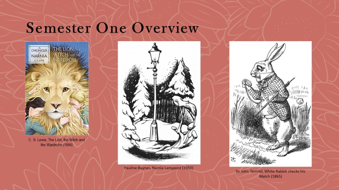
Moving onto the next project: the Lion, the Witch and the Wardrobe, I wanted to experiment with multiple printing techniques to give me more experience for potential output methods that I could use in the future. I also wanted to work with more narrative, following the goals set within my learning plan.

For research, I quoted directly from the book so that I could create accurate depictions of the story, rather than creating illustrations from the imagery I already knew. Initially, I was inspired by Sir John Tenniel and his intricate line work but had later found Pauline Baynes, who was the original illustrator of the Lion, the Witch and the Wardrobe, had worked in a similar style, but she had incorporated colour into her designs which I did not want to do with my own design so I felt my designs would still be different from illustrations already created for the story.
 

Slide4

4

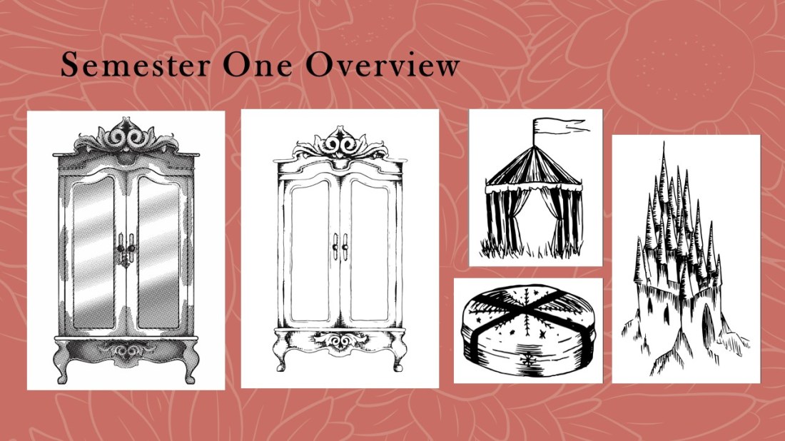
When I first started this project, I felt I had started strong, using the wardrobe imagery to test out each of the printing methods, I.e. screen-printing, etching, using a laser cut plate and lino printing.

With the inclusion of more projects, however, I do feel I lost momentum and felt like I rushed the pieces to the right in the last couple of weeks/days.

Given more time I would’ve refined the last pieces by creating them in illustrator, drawing the line work by hand then using the laser cut method to print them, as I had felt this was the best and cleanest methods from my wardrobe print tests. I believe the addition of illustrator would have made the pieces more proportional, fixing the errors within the symmetry and potentially making the linework straighter and cleaner.
 

Slide5

5

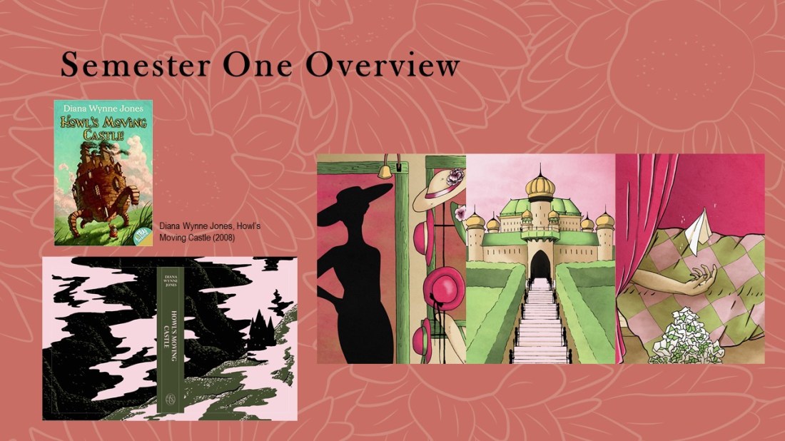
My next project was the House of Illustrations Book Illustration Competition. I had to create a set of 3 illustrations and a book cover for howls moving castle. Again this was narrative based brief, so it fit within the goals of my first learning plan. The only research that I had done for this project was just reading the book so that I again, could create an accurate depiction of the story, as opposed to working with content I may have already seen, for instance with Studio Ghibli’s adaptation of the book. (If you want to know my opinion of the original book and the movie adaptation, also listing the differences between the two, you can read about that here.)

Not researching other artists and styles may have been my downfall during this project as I did struggle when creating the pieces as I didn’t have a strong concept of the styles I wanted to use. I did, however, enjoy my choice of colour palette, as it is easy on the eyes and translates the themes of the book well, showing the magical essence without it being too being direct. The palace piece is my favourite, as I love the symmetry and perspective and it is how I had envisioned the king’s palace within the book. I have been able to translate my thoughts onto the page.
 

Slide6

6

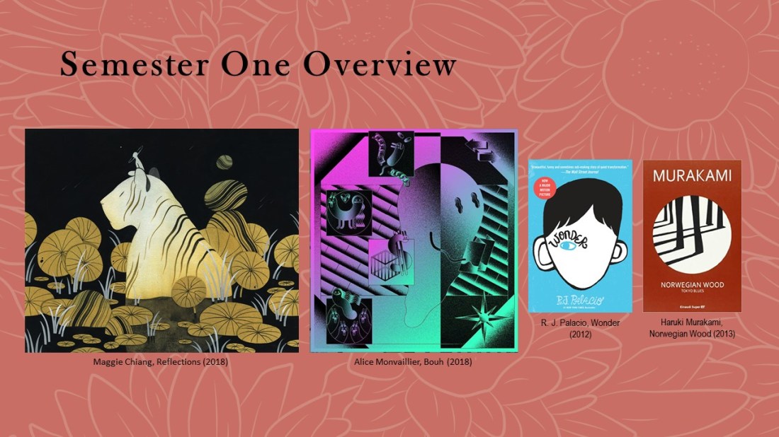
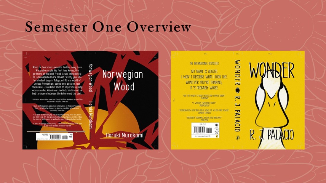
For the next project which was also a competition, this time for the Penguin Student Design Awards, I created 2 book covers for 2 separate categories; the adult’s fiction which was Norwegian Wood and the children’s book was Wonder.

For research I looked at entries from previous years, looking for common trends that I could potentially apply to my own work. I had noticed that a lot of the covers were minimal, and some had a noise effect applied, this had led me to think of artists such as Maggie Chiang and Alice Monvaillier as I believed their styles would work well among the other entries, so would be a good source of inspiration for myself during this project.

Again, I had read both of the books as research.  This allowed me to get a better understanding of the stories so that I could know the type of content I would be creating for the covers, especially considering both books have completely different themes and audiences.
 

Slide7

7

These are the two covers I created. I did complete them within a short amount of time, but I don’t feel as if they look rushed and I feel like these are a lot different from my usual style, as they are minimalistic within the colour pallets and imagery, which are styles/palettes that I have tried to dip into but have not fully achieved until these two creations.

I had struggled a lot with the text and titles, being able to make them readable against the illustrations. In the future, I will consider the type a lot further in advance so that I can work my illustrations around the text, instead of just trying to work the text around the images as I had in this project.
 

Slide8

8

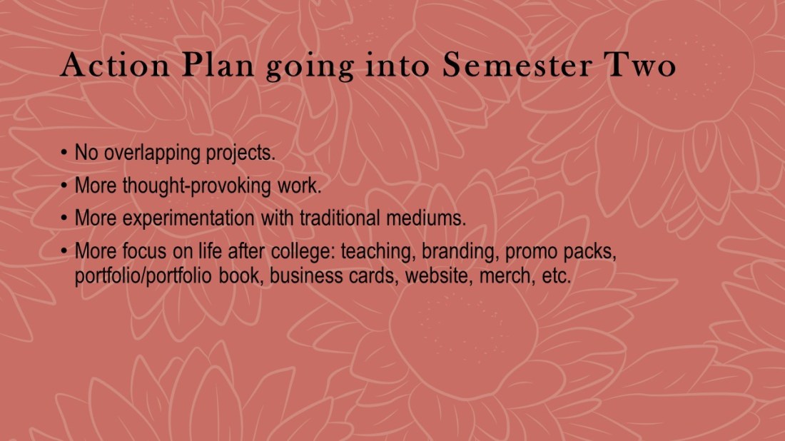
My weaknesses from the first semester were definitely to do with my time keeping and having too many projects in general which ended up overlapping, causing me confusion and stress.

From the first learning plan, I did achieve the goals I had set, working more traditionally and creating more narrative based pieces, so in the next learning plan my goal was to still try working more traditionally, this time using pencils, but I also wanted to create more thought-provoking pieces, that could potentially lean more towards the area of editorial.

I also wanted to use the last semester to focus on my branding, this would mean making a website, business cards, promo packs, merch etc. So that I had a base that I could grow from once I’ve finished the course.

From this point onwards, I vowed to not overlap any more projects, focusing on just one at a time. With the time plan I created for semester two, I was going to work more loosely with it, not having anything set in stone as at that time I still didn’t know when the competitions would be announced.
 

Slide9

9

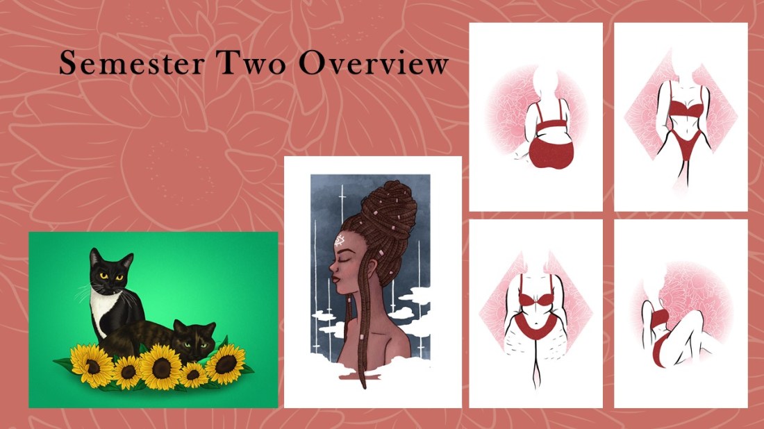
These are unplanned side projects which I ended up spending more time on than I necessarily had.

The first on the left was a commission piece for my friend.

The second was a ‘draw this in your style’ challenge in which I had to recreate an artist’s drawing in my own style, the piece here being a recreation of Chelsea Gracei’s work.

Then the final pieces on the right were a collection I created for ‘A Canny Collective’ which was a local exhibition that I was asked to be a guest artist for.

Although I had spent longer on these pieces than I should have, I do feel like I gained a lot of experience from them, especially with the exhibition pieces, as there was a whole process of creating the pieces and setting them up within the space, but I also worked on the stall on the opening night, so I was able to gain more experience of selling my own and others work one to one, which is something I do believe I will do again in the future. All of these pieces will also go towards my portfolio, hopefully allowing me to show more range of style, techniques and skill within it.
 

Slide10

10

My goal with this specific project was to create a more thought-provoking illustration, which links back to the goals I set in my second learning plan.

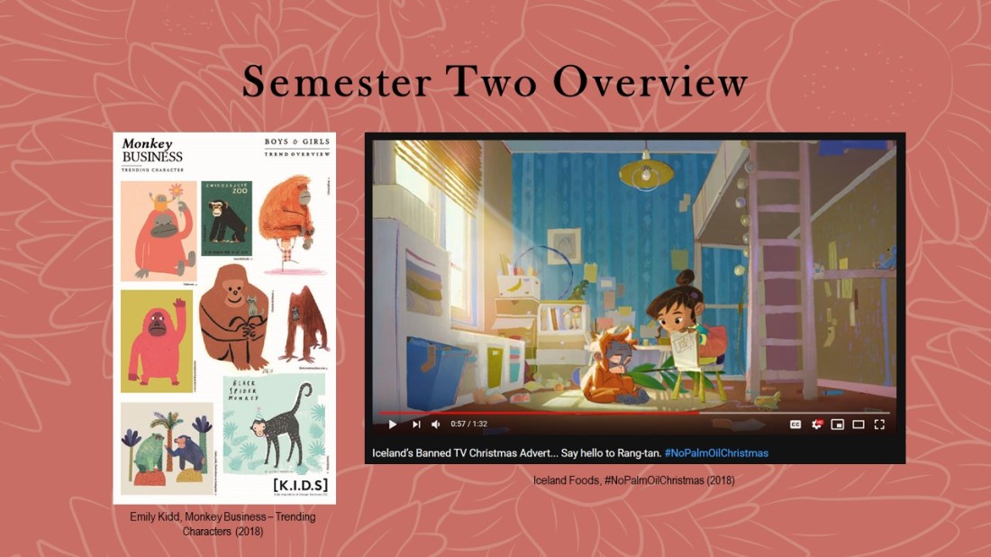
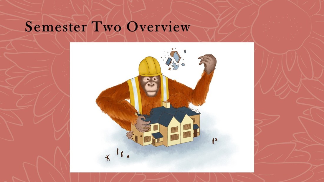
For the Northern Illustration Awards, a competition by the AOI, the brief was ‘monkey.’ When searching Pinterest for inspiration I came across the image on the left, and in the corner saw an orangutan which had been created in a looser style which helped suggest the animal’s fur. I wanted to work in a similar style to create my own monkey, but I did want to use a stronger theme. Thinking of Orangutans, it had reminded me of the banned Iceland advert, in which it discusses the destruction of rainforests (the orangutan’s habitats) for palm oil.
 

Slide11

11

Within this piece, I wanted to show a role reversal between humans and the orangutans, they being the ones that are destroying our homes with such carelessness instead.

I enjoyed working on this piece as it was more experimental and I was able to work more loosely. I was able to play around with different brushes, (in the end, I had used a gouache brush for the fur and a ‘scratchy pen’ for the linework, both from Kyle T. Webster brush packs) and these, in turn, allowed me to build up my own impression of fur, which helped give a sense of realism but the style was still loose and quite painterly for digital art.

I designed this piece to fit within a white page, so it is more minimal in that sense, but this factor could potentially make it more editorial as I could imagine it fitting within a magazine as an illustration for an article.

With this illustration, I had recorded the process and created my first ever YouTube video which was a speed paint of this piece. I do want to carry on uploading more speed paint process videos, potentially giving more information in the form of a voice-over, but one day I do want to live stream as well as/opposed to recording, as I believe I would prefer to talk live to an audience, having an active conversation as I go, rather than feeling like I am talking to myself in a voice over.


Slide12

12

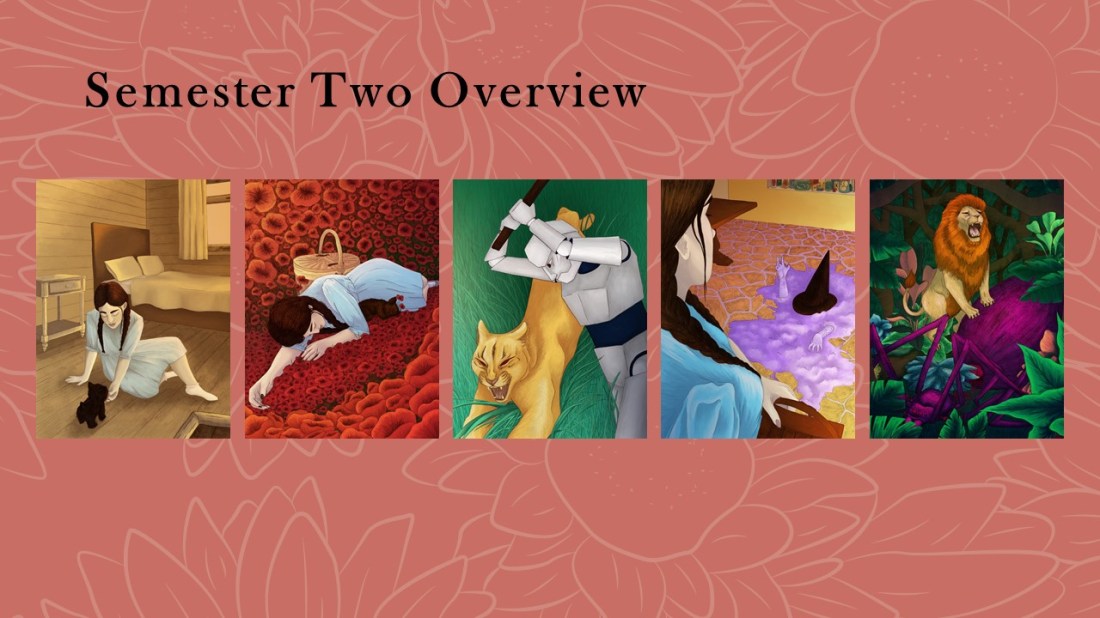
The next project was the Wizard of Oz, my goal with this project was to work more traditionally using pencil and then colouring the pieces digitally as I believed it would give me a better choice in colour palette. With this project, I did want to work with a more fun and vibrant colour palette than I may have used before, as I wanted my pieces to suit the colour themes suggested within the story, such as ‘Emerald City’ and the ‘yellow brick road’.

The idea for the mediums and techniques were initially inspired by Tina Nass, but as my project developed and I moved to a more realistic style within the project, I tended to take more inspiration from an artist named Chantal Hores as she still works with the same mediums and techniques as Tina Nass, however her style is more realistic, especially with her characters.

Again, my research had come directly from the book, finding quotes that would allow me to create an accurate depictions as possible, but in this project I did find it more useful as the movie adaptations were not completely true to the descriptions within the book, for instance, the famous ruby red slippers were actually silver in the story.
 

Slide13

13

These pieces have come a long way from the start, as I had originally sketched them out in a layout that looked flat and boring, I later repositioned and redrew the pieces using my own reference photos, as well as reference images online (more so for the animals) which allowed me to create more organic and dynamic viewpoints within my illustrations.

I’m extremely proud of the outcomes as there is a strong narrative throughout, one that I wouldn’t have thought that I would have been able to achieve at the beginning of the year. I love the colours as they are vibrant and express the themes of Oz. I did try to stay away from the known imagery when working on these pieces, and I do believe I’ve created my own unique interpretations of the story.

I loved the style of work and mediums that I had used and I hope to use them again more often in the future. If I find myself in a spot again where I feel my composition or layout of a piece is a bit boring, I will try to take my own reference images again, exploring different viewpoints and angles etc, so that I can potentially create more dynamic illustrations which are less boring and flat in the future.
 

Slide15

14

Branding has a lot of components within it, for instance I needed to create business cards, a website, a portfolio, creative CV and products and all of these would go into a promo pack which would be sent off to potential clients and or agencies.

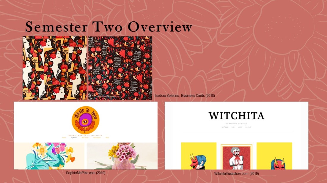
As far as research goes, I initially started the process of creating my business cards within semester one, so that they could be sent off with my zines. I was inspired by an artist named Isadora Zererino as on her cards she has an illustration on the front and her information on the back, they are also portrait, which is something that I hadn’t seen very often and this is how I wanted my own to be laid out.

When creating websites, I was researching as I was going, looking at how other artists laid their work out, what their buttons were, how they ordered them, and how they described themselves in their about pages etc. For this, I had used Sophie McPike and Nicole Nicholson’s (who is a student in my class and made her site first) websites as inspiration. I also took information from a talk we had with someone from AOI who had explained that a client will make their impression of you within the first couple of seconds of looking at your website, so it’s good to have 6-9 pieces on display on the front page.
 

Slide14

15

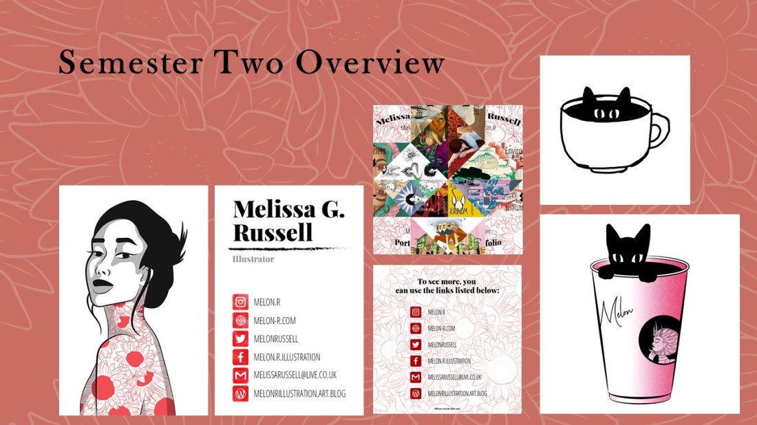
On this slide, to the left, I have shown my current business card with my website included which wasn’t present in semester one.

A mini-portfolio, which is actually a paper fortune teller. I felt this would be an interesting piece for someone to receive in my promo pack as it is a unique way for them to view mini clips of my work. On the back, I did provide links so that the receiver would be able to look at my portfolio more in depth, seeing the pieces that I have cropped down for this mini-portfolio in more detail.

The two pieces on the right side are merchandise ideas. On the top is a sketch of a potential pin. I want to create these in wood using the laser cutter in the workshop as ordering enamel pins is not in my budget or audience range at this moment in time. Maybe in the future, if I do build more of an audience, I could have a pre-order or made-to-buy system which would allow me to make a profit and would ensure that none would go to waste.

The second image on the right is going to be a sticker, potentially a little print.
 

Slide16

16

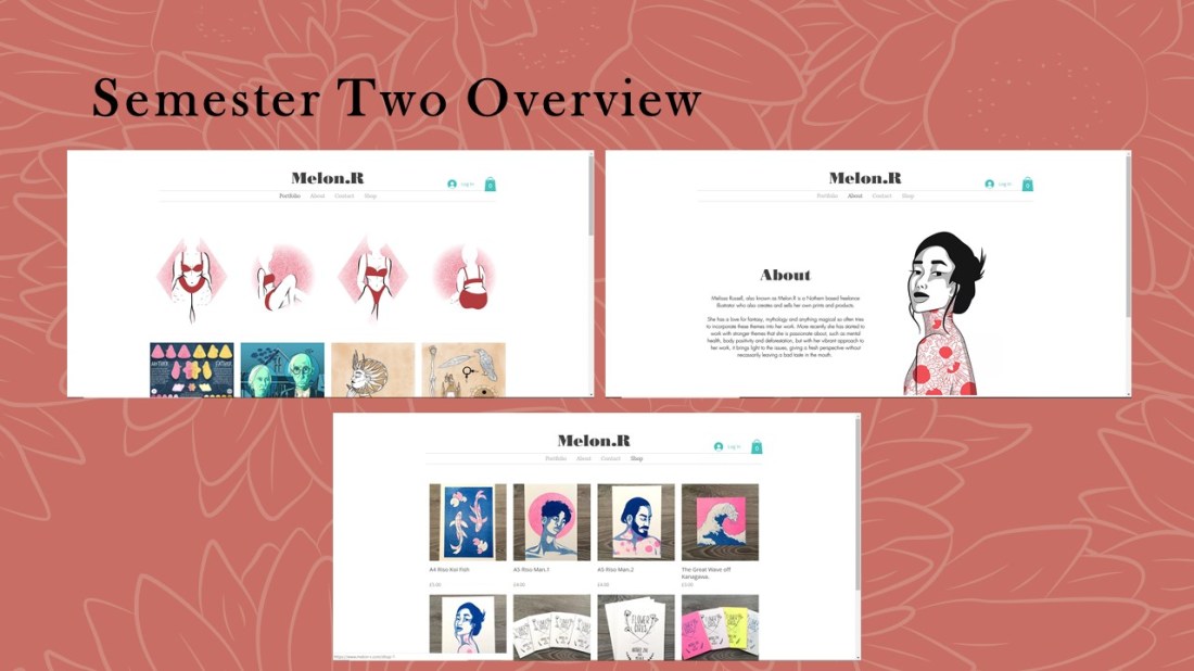
These are pages from my website. I still have work that needs to be added to the portfolio but I will want them to fit within a layout that is organised by colour or theme, which I believe will make the website more aesthetically pleasing to the eye, so I can potentially catch a client’s attention within the first couple of seconds, as the member of AOI had suggested. The website also has a shop which I do plan to work from in the future.
 

Slide17

17

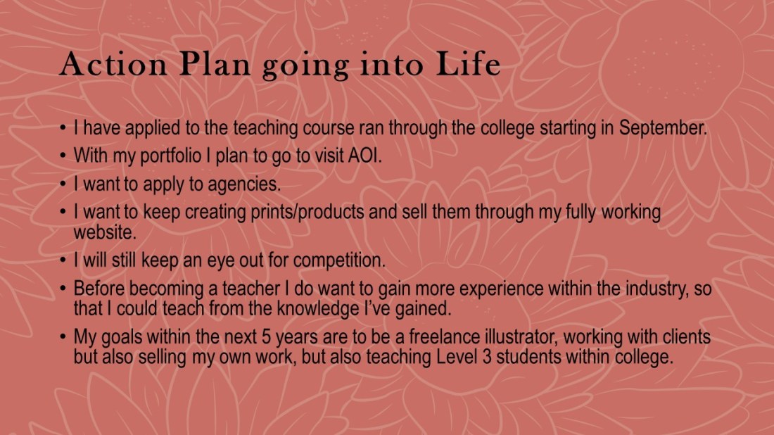
Going into the future, I have applied for a teaching course within the college that will start in September. Before teaching properly, I do wish to have more experience in the industry so that I can teach from my knowledge and experience that I may have gained.

With my portfolio, I plan to visit the AOI to get a review and more information about which direction it should go, if I need to take anything out, if I need to add anything more and so on.

I will also be applying to agencies hoping to get more freelance based work.

I will be continuing to create products and selling them through my website.

I will still try to keep an eye out for competitions.

I will also continue creating YouTube videos, ones that are more in-depth with voiceovers added. I also want to live stream more, having a more relaxed experience, potentially talking one to one with my audience as I create my work.

Overall my goal for the next 5 years is to be a freelance illustrator, working with clients and potentially have an agent. I will also be creating and selling my own work on the side, as well as hopefully teaching level 3 students within a college.
 

Slide18

18

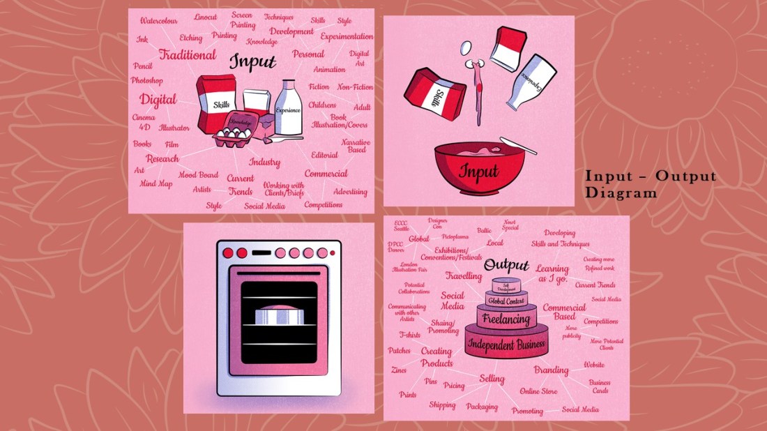
Following on with more self-reflection, I created a couple of diagrams within the space of the year that are up on my blog. This one is an input and output diagram, it describes the skills, knowledge and experience that goes into my work and what is output from it, being anything to do with business, freelance work, self-development and live briefs.

If you would like to read more about my Input-Output diagram, click here.
Slide19

19

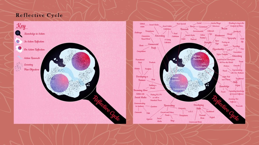
This next diagram is my reflective cycle, it shows my process of planning a project, the research that goes into it, my action plan, the actual practical work and the experience from said practical work. This then carries on and the cycle starts again.

The explanations of both of these diagrams are on my blog, as I wanted to have an easier explanation for someone who may not understand these types of reflective practices, but may want to understand my process of working, thinking etc.

If you would like to read more about my Reflective Cycle, click here.
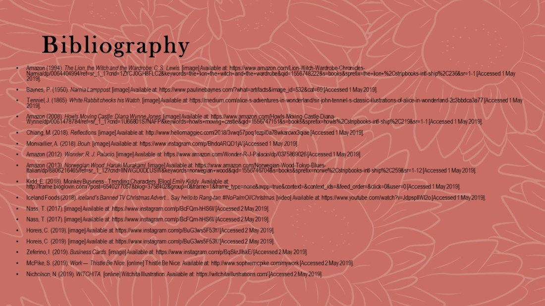
 

Slide20

20:

This is my bibliography. Thanks for your time do you have any questions?

Although this was more directed at my presentation if you do have any questions feel free to comment and I will try to answer as best as I can!


List of Illustrations

These are all jpeg images of the slides from my Reflective Practice Presentation. Within the slides, I have cited the images that were not mine, so if an image does not have a caption, it is my own work.
Figure 1.Amazon (1994). The Lion, the Witch and the Wardrobe: C. S. Lewis. [image] Available at: https://www.amazon.com/Lion-Witch-Wardrobe-Chronicles-Narnia/dp/0064404994/ref=sr_1_1?crid=1ZYCJ0GH8FLC2&keywords=the+lion+the+witch+and+the+wardrobe&qid=1556748222&s=books&sprefix=the+lion+%2Cstripbooks-intl-ship%2C236&sr=1-1 [Accessed 1 May 2019].
Figure 2.Baynes, P. (1950). Narnia Lamppost. [image] Available at: https://www.paulinebaynes.com/?what=artifacts&image_id=532&cat=69 [Accessed 1 May 2019].
Figure 3.Tenniel, J. (1865). White Rabbit checks his Watch. [image] Available at: https://medium.com/alice-s-adventures-in-wonderland/sir-john-tenniel-s-classic-illustrations-of-alice-in-wonderland-2c3bbdca3a77 [Accessed 1 May 2019].
Figure 4.Amazon (2008). Howls Moving Castle: Diana Wynne Jones. [image] Available at: https://www.amazon.com/Howls-Moving-Castle-Diana-Wynne/dp/0061478784/ref=sr_1_1?crid=1U66801S7NAFP&keywords=howls+moving+castle&qid=1556747151&s=books&sprefix=howls%2Cstripbooks-intl-ship%2C219&sr=1-1 [Accessed 1 May 2019].
Figure 5.Chiang, M. (2018). Reflections. [image] Available at: http://www.hellomaggiec.com/2018/3vwq57poq1ezpl0a78wkarcwx3qiae [Accessed 1 May 2019].
Figure 6.Monvaillier, A. (2018). Bouh. [image] Available at: https://www.instagram.com/p/BhdoARQD1jA/ [Accessed 1 May 2019].
Figure 7.Amazon (2012). Wonder: R. J. Palacio. [image] Available at: https://www.amazon.com/Wonder-R-J-Palacio/dp/0375869026 [Accessed 1 May 2019].
Figure 8.Amazon (2013). Norwegian Wood: Haruki Murakami. [image] Available at: https://www.amazon.com/Norwegian-Wood-Tokyo-Blues-Italian/dp/8806216465/ref=sr_1_12?crid=IINWGD0DLUSW&keywords=norwegian+wood&qid=1556746704&s=books&sprefix=norwe%2Cstripbooks-intl-ship%2C259&sr=1-12 [Accessed 1 May 2019].
Figure 9.Kidd, E. (2018). Monkey Business – Trending Characters. [Blog] Emily Kiddy. Available at: http://frame.bloglovin.com/?post=6540277057&blog=3758402&group=0&frame=1&frame_type=none&avpp=true&context=&context_ids=&feed_order=&click=0&user=0 [Accessed 1 May 2019].
Figure 10.Iceland Foods (2018). Iceland’s Banned TV Christmas Advert… Say hello to Rang-tan. #NoPalmOilChristmas. Available at: https://www.youtube.com/watch?v=JdpspllWI2o [Accessed 1 May 2019].
Figure 11.Nass, T. (2017). [image] Available at: https://www.instagram.com/p/BcFQm-hHS6I/ [Accessed 2 May 2019].
Figure 12.Nass, T. (2017). [image] Available at: https://www.instagram.com/p/BcFQm-hHS6I/ [Accessed 2 May 2019].
Figure 13.Horeis, C. (2019). [image] Available at: https://www.instagram.com/p/BuG3ws5F53Y/ [Accessed 2 May 2019].
Figure 14.Horeis, C. (2019). [image] Available at: https://www.instagram.com/p/BuG3ws5F53Y/ [Accessed 2 May 2019].
Figure 15.Amazon (2015). The Wizard of Oz: L. Frank Baum. [image] Available at: https://www.amazon.co.uk/Wizard-Oz-L-Frank-Baum/dp/1604335424/ref=sr_1_14?keywords=wizard+of+oz+book&qid=1557071553&s=gateway&sr=8-14 [Accessed 2 May 2019].
Figure 16.Zeferino, I. (2019). Business Cards. [image] Available at: https://www.instagram.com/p/BqSkrJllskE/ [Accessed 2 May 2019].
Figure 17.Zeferino, I. (2019). Business Cards. [image] Available at: https://www.instagram.com/p/BqSkrJllskE/ [Accessed 2 May 2019].
Figure 18.McPike, S. (2019). Work — Thistle Be Nice. [online] Thistle Be Nice. Available at: http://www.sophiemcpike.com/mywork [Accessed 2 May 2019].
Figure 19.Nicholson, N. (2019). WITCHITA. [online] Witchita Illustration. Available at: https://witchitaillustrations.com/ [Accessed 2 May 2019].

Juxtapoz – Issue 208, Winter 2019 Review

As a class, we were asked to find a copy of Hi-Fructose, an art based magazine which my tutor has recently found interest in, and review it, seeing whether it would be a potential source of information, inspiration and so on within the future. I did look for a copy within WHSmith and the Travelling Man in Newcastle but was not able to find it in either, I did look online but I had found that the shipping of the magazine would cost more than the actual piece.

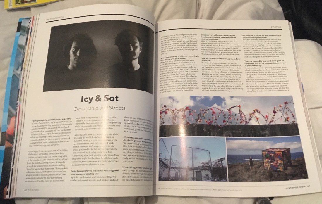
So, I thought instead of Hi-Fructose, I would go back to WHSmith and purchase the newest copy of Juxtapoz, another art based magazine which my tutor has in the past spoken highly of. I have reviewed another issue in the past, and I did not really think too highly of it, but I feel that was more based on the artists involved, as they weren’t necessarily my cup of tea, but I did find artists called Icy and Sot in an advertisement for their exhibition, and I have since followed them on social media from reading the magazine, as they would create pieces with deeper meanings, connecting to worldly issues, either with politics, the economy or the environment.

60731832_677305476037410_834042920435712000_n

So, from this good discovery, I decided to give Juxtapoz another chance, and the copy that I had picked up was, in fact, a 25 years celebratory issue and had come with a booklet called ‘Vans Vision Walks Volume #2’ which the company had made in collaboration with the brand Vans and consists of a lot of urban styled photography taken by multiple artists.

When reading through the magazine, I actually found an interview with Icy and Sot, called ‘Censorship and the Streets’ and is found in a category called ‘On the Outside’ in the contents page if you want to purchase the issue and read more about the artists for yourself.

60606636_603430260144634_5463869794094678016_n

If you would like to read my previous review of Juxtapoz: issue 202 back in 2017, click here.

So, what is the magazine?

Juxtapoz is an art based magazine which has run for 25 years now, (since 1994), and includes interviews with hundreds of artists over the year, of different backgrounds and multiple styles, some of which I shall be discussing within this blog post. The magazine also includes advertisements for many clothing companies, breweries, hairdressers and so on, but they will also include advertisements for art exhibitions, which is how I had initially discovered Icy and Sot. I do however believe all of these advertisements are American based, which makes sense because so is the company, but its a bit annoying when you would be interested in going to the exhibition but it turns out it is in Denver or Arizona or so on.

As the magazine has a variety of artwork it includes, such as street art, sculptural work, photography, paintings or illustrations, etc, the magazine can appeal to a wide audience of artists or art enthusiasts.  The magazine has the ability to inspire people, bring new artists to light, or highlight older more well-known artists with a fresh perspective. So overall, it is a way to keep up to date with current styles and trends within the industry, but in more areas than one, looking at contemporary art as a whole, as opposed to just specifically looking into illustration, street art, fine art and so on.


What does it contain?

It’s featured artists in this specific issue are Andy Warhol, one of the key icons and artists of the pop art movement within the ’60s. Kaws, whose work I have come to notice more regularly within pop culture, especially with his identifiable character, who I believe I had seen set up at a birthday party for Travis Scott, arranged by his girlfriend Kylie Jenner. There is also a featured artist named Swoon, who works with mixed media, creating huge installations, stop-motion animations and so on, and there is an artist named Jason Revok, who I believe is a street artist and I would say that he primarily works with patterns and a lot of colour. Another few notable mentions are James Jarvis, Louise Bonnet, Haroshi and Muzae Sesay.


The artists

There was not a lot of work that I had found appealed to me, or would inspire my work in the future. That is not to say that the work within the magazine was not good, some of it can be amazing to the right audience and reader, but personally, for me, it was not my cup of tea.

Mando Marie

Like how I discovered the artists Icy and Sot, I had also discovered another artist through the advertised exhibitions within the Juxtapoz magazine, this one being of the work by Mando Marie.

I believe she is a street artist, working with a lot of stencils and a flat and minimal colour palette, but what had drawn me to her work was the style, as her figures have a vintage illustration style to them, possibly 50’s as they remind me of the illustrations within Enid Blyton’s book of the magic faraway tree, by Dorothy M. Wheeler.  As I had read this book when I was younger, there is a sense of familiarity with Marie’s style which I do enjoy.

60573855_305052477093879_2781199265001635840_n

I do like the simplicity of the designs and do wish that I was able to see the work first hand, as I do believe I would make the effort to go if it were more local, but as it was in Canada, I do think the travel would be a little of a stretch. If I were to take inspiration from this artist, it would be within her technique, as I would like to create larger scaled work someday, ones that I have not worked on digitally, so I believe using stencils would be the way forward, but I would need to gain more experience with spray paint, as I have not used the medium before and would like to create clean designs.

If you would like to see more from this artist, her Instagram is @seeyouthroughit (as shown below) and she also has a Tumblr site at www.seeyouthroughit.com.

View this post on Instagram

@station16gallery #seeyouthroughit #mandomarie

A post shared by Mando Marie (@seeyouthroughit) on

Swoon

Swoon is one of the featured artists within the magazine, and she is described to be a therapeutic artist, referring to her work “as a balm” (Farr, 2019) as to heal the audience or recipients of her art.

She is a mixed media artist, working with materials from paper to large scale linoleum block printing, with room installations to street art. What had drawn me to her work was the piece called ‘The Canyon’ which was a huge room installation piece of a woman which seemed to be rising out of the ground through waves, and her dress seemed to be made from the imagery of sea creatures. There is a sense of collage to her work and I enjoy how the character is in greyscale, almost having a hand-drawn effect to her, but how the flat pastel colours of the fluid elements or animals included compliment the grey tones and make the design look very soft and appealing to the eye. I also feel the colour palettes make her work more feminine, but the papercut style complements the tones well.

61090264_370473957145844_2302764544159645696_n

Like with the previous artist, I would like to work at a larger scale with my work in the future, but looking at Swoons work, she does encourage me to try new mediums. I relate to this artist with her content as I do enjoy drawing women myself, so it is nice to see where else and what more I could do with that type of imagery.

If you would like to know more about this artist, her Instagram is @swoonhq, (as shown below) and she also has a website at www.heliotropefoundation.org, which is a non-profit organisation that the artist runs along with a team, to help communities that have been affected by natural disasters.

View this post on Instagram

Q&A ~ @amyeisenhoweromholt: “Do you ever feel insecure?” Me: YES. All the time. There’s a part of me which is determined to see myself as less than, to feel like an outsider, stepped on and left behind, and it takes very little to instigate that part. No matter where you’re at in your career you’re always dealing with rejections, even amidst success. Last year I did the largest show of my career and I was pretty proud of it. It was a really meaningful experience and got a lot of wonderful response from individuals. In the larger press and art world press though, it was basically ignored which got me feeling a little insecure. Then an online article came out which brought up an important criticism about the undiscussed role of white privilege in my community based work. It was a necessary subject to broach, one I had been working out how best to discuss when along comes a writer who wades in without comprehending whole show, or even doing the most minimal fact checking. They claimed that post disaster rebuilding projects which have taken the dedicated work of 8 years were the caprice of a few weeks and represented some kind of shallow voluntourism. Many people read the piece and believed its analysis without much question about its accuracy. I was surprised at the extent to which I felt shaken by this. Because the piece held a seed of important truth – there are some glaring, and often undiscussed privileges in my position as a white woman from the United States participating in projects within cultures that are not my own – it opened the door for the rest of the piece, which was largely just un-fact-checked internet bullying, to seep into my consciousness when I might have otherwise ignored it. (I challenged the piece which is down for fact checking). But all of these other insecurities got pulled up. “Maybe I won’t get past the hurdle of entrenched sexism in the art world, maybe my naivety around issues of privilege makes my work more destructive than constructive, maybe I’m at that age where women’s contributions get cast aside.” And on and on, reminding me that there’s no relationship between success and inner security, and self worth is my own to find.

A post shared by Swoon Studio (@swoonhq) on

Overall Opinion

Although I was able to discover these two amazing artists, I still do not hold a high opinion of Juxtapoz, at least for myself and my own preferences of artwork. I do feel this magazine could be a good source of inspiration and current knowledge of the industry for some people, especially if you are more interested in more modern/contemporary work, but as of yet, I have not found an issue of Juxtapoz that I was really excited about or would highly recommend. That’s not to say that there isn’t one out there that could fit my interests more, but with the two that I have read, issue’s number 202 and 208, neither really feel up my alley, so I do not feel encouraged as to purchase them again.


Bibliography 

Bogojev, S. (2019). Icy and Sot – Censorship on the Streets. Juxtapoz, (208), pp.66 – 68.

Farr, K. (2019). Swoon – The Catalyst. Juxtapoz, (208), pp.86 – 93.

Farr, K. (2019). Swoon – The Catalyst. Juxtapoz, (208), p.87.

Heliotrope foundation. (2016). [online] Available at: http://www.heliotropefoundation.org/ [Accessed 21 Feb. 2019].

Russell, M. (2017). Juxtapoz Review 18th November 2017,. [Blog] Melissa Russell’s Blog. Available at: https://melissagrussell.blogspot.com/2017/11/juxtapoz-review-18th-november-2017.html [Accessed 21 Feb. 2019].

List of Figures.

Figure 1 – Juxtapoz. (2019) Winter 2019, (208).

Figure 2 – Bogojev, S. (2019). Icy and Sot – Censorship on the Streets. Juxtapoz, (208), pp.66 – 67.

Figure 3 – Marie, M. (2018). Instagram. [image] Available at: https://www.instagram.com/p/BrIsUPLluFS/ [Accessed 21 Feb. 2019].

Figure 4 – Farr, K. (2019). Swoon – The Catalyst. Juxtapoz, (208), pp.86 – 87.

Figure 5 – Station 16 (2019). Mando Marie. Juxtapoz, (208), p.55.

Figure 6 – Swoon (2018). Instagram. [image] Available at: https://www.instagram.com/p/BmL9QQTDDr6/ [Accessed 21 Feb. 2019].

3 Historical Illustrators I Recently Discovered

As a class, we have been asked to find and research some historical artists who we could potentially take inspiration from in our own work, and will also allow us to expand our knowledge of the industry from a historical view, looking at the trends which may have been present then and how they may have changed over time,  and looking at the techniques/mediums/themes which were used and how I could learn from these artists and apply that knowledge to my own designs.

Over the years, throughout my coursework, I have continuously mentioned artists such as Aubrey Beardsley and Authur Rackham, as I love their work and I feel they have had a big influence on my own over the years. However, for this task, I did want to branch out and find new historical artists who I could learn more from, and who could potentially influence my work more.

Howard Pyle 

an-attack-on-a-galleon.jpg!Large
Fig.1. Howard Pyle, An Attack on a Galleon (1905)

He was an American illustrator who worked within the late 1800s to early 1900s. He had written his own children’s books which he illustrated himself as well as many other books and later started painting murals. It is said that the idea of how pirates dress nowadays initially originated from his work, as he wanted to create more flamboyant characters which were inspired by gypsies. I believe his depiction is a more romanticised version of a pirate as it is said if their clothing were as Pyle had illustrated, it would have been impractical.

Style

Within these two pieces specifically, I loved colour palettes and the softness to the pieces and when I think of romanticism this is what my mind goes to.

I believe there is a lot of emotion present within the artists work, for instance, in figure 1 the movement within the waves suggests the piece is a more action based narrative, whereas in figure 2, the sea is calm, it’s gentle, fitting the themes within the piece. I feel with the colour palettes used that it keeps a lightness to his paintings, but still communicates the story well.

the-mermaid-1910.jpg!Large
Fig.2. Howard Pyle, The Mermaid (1910)

Technique

Howard Pyle was primarily a painter, and I believe both of these pieces are oil paintings. I have never worked with the medium myself so I wouldn’t know how easy or hard it would be to make the soft blends in which he creates within his work. I, however, can’t deny that there is a lot of skill within his paintings, being able to use a lot of colour, creating movement, motion, showing realism and being able to create it so delicately while still conveying the emotions within the piece. His work is just so undeniably beautiful, and although he has more work that shows a lot more action, these two are my favourite of his work and were the attraction pieces that made me want to research him more and include him within this blog post.

My opinion

As I am soon to be working on quite a colourful project, The Wizard of Oz, I do want to take some inspiration from Pyle as I love the brightness of the colours and softness within the piece. It gives a dreamlike quality to his work, and that may be something I wish to translate within my own work when working on that project.

I have mentioned in previous projects that I would like to try using more traditional mediums, such as gouache or maybe even oil paints like Pyle someday, but as I do mostly work digital and have recently been working more blended tones as opposed to working in a cel-shaded style, I would like to start playing around with more brushes or settings, for instance with the opacity and flow, to see if I could potentially create a painting like these examples, using digital techniques.

My main take away from this artist is how he shows realism within his work, creating softness and dreamlike qualities with his colour palettes and painting methods. I am going to try take that information and apply it to my own work in the future.


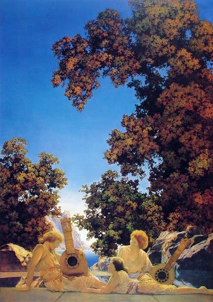
Maxfield Parrish

2.jpg!Large
Fig.3. Maxfield Parrish, Interlude (1922)

Following the work of Pyle, I also chose this artist because of his colour palette, but I also love that he worked with more mythological themes. Parrish was an American illustrator who worked in the early 1900s. He was one of the most popular artists of the Golden Age of Illustration, as well as Arthur Rackham and Howard Pyle, but was also apart of three other art movements, regionalism, symbolism and romanticism. These 3 movements I feel are very present within his work, in some pieces his composition reminds me of collage as he will have a beautiful scenic background, then position elements on top of it like characters or items, which can somewhat seem out of place but they do work. Like in figure 3 I feel the women look separate from the design but it’s not necessarily a bad thing, as the piece overall is so beautiful and the separation of the characters helps my eyes focus on them. I believe he did this with his colour palette as the warmer tones contrast against the cooler tones, but in between the two are the trees which have multiple tones of black, greens, reds and yellows so it complements both groups and makes the piece so attractive to the eye.

Style

I would say his style is definitely in the realm of realism, but there is a sense of magic to his work as there are dreamlike qualities to his pieces. In comparison to Howard Pyle, when I use the term ‘dream-like’, for Pyle I mean soft and airy, almost like a cloud, whereas with Parrish’s work, I feel it is less soft but has the whimsical nature of a dream.

What highlights these themes well was the artist’s knowledge of colour theory, as he would often use complementary colours, as seen in figure 4 which I believe adds more vibrancy and an overall sense of light and fun to his work. The bright colours within his work really help in attracting the audience’s eyes, but the artist knew when to stop, what other colours would need to be added as to not overpower the illustration. Referring back to figure 4 he has used a bright yellow against a deep blue which does help draw in the attention, but in between those colours he used quite neutral tones which helped in breaking up the tones, almost giving your eyes some breathing space.

the-lantern-bearers-1908
Fig.4. Maxfield Parrish, The Lanter Bearers (1908)

Technique 

I believe like Pyle, he used oil paints on canvas too, but whereas I feel Pyles work is soft and quite blended, I feel Parrish worked more realistically, as the people within the paintings could pass as photos, at least within figure 4, in figure 3 the women are quite godly, almost reminding me of Greek mythology, especially the way the characters are dress and how the sun is glowing down on them.

As I had mentioned before, I have not used this medium before so I do believe I would understand it until I did have more experience with it, or possibly watch a video/tutorial, as I know paints are different, for instance, I believe gouache dries lighter than it is laid down so it is a more buildable paint, but I think oil paints take longer to dry so you would have to work wet? I could be very wrong so I would definitely watch a video or do more research into it before trying myself especially as it is a pricey medium and I wouldn’t want it to go to waste. And that goes for both oil paints and gouache!

I would like to try creating digital paintings like this at some point, possibly within the new semester, but one day I would like to try out painting traditionally, and I would aspire to be at the level of Maxfield Parrish or Howard Pyle someday.

My opinion

Like with Pyle, as this Parrish uses beautiful and vibrant colour palettes, I would like to take inspiration from him for my Wizard of Oz project as I do want it to be a very colourful project. So this will mean thinking along the lines of Parrish, what colours may complement each other and attract the audiences attention and will I need to add more neutral tones to give the piece more breathing space.

I do enjoy working more realistically, but after discovering the work of Maxfield Parrish I will now try to find ways to make my work more vibrant and fun as I do really love the whimsical themes with his work.


Gustave Doré

This is a French illustrator who had worked within the mid-1800s and created finely detailed wood-engraved illustrations for books such as Inferno of Dante (1861), the large folio Bible (1866) and so on.

plate13
Fig.5. Gustave Doré, Paradise Lost (1866)

Style

Due to the methods he used, his work was primarily monotone, commonly printed with black ink and one of the first things I had noticed, was how incredibly detailed his illustrations are. At a distance, you could think that he had used pencils or graphite to create his work, however, when looking closer you notice all of the intricate lines which form up the tones but also give shape to the scenery or characters, for instance, if you look at the wings or the characters leg in figure 5 to the right, you can see the artist does not use a straight-lined crosshatching method but instead he curves the lines, which does help in creating shape and depth within the image as it does not look flat.

Doré worked within the period of realism and romanticism art movements, and I feel these are both very present in his work, what drew me to his work however was the religious and mythological themes, as he was able to bring the stories to life and as he does work in realism the characters are believable, which is already an amazing skill, but I assume his work would be even more mindblowing in his time, as it was before CGI and any of that technology, so the mythological beasts I see commonly on tv today, I don’t believe people of 1800s would ever have imagined, if it weren’t for artists like Doré.

Technique

Gustave_Doré_-_The_Holy_Bible_-_Judith_XIV_-_Judith_showing_the_head_of_Holofernes_-_original-detail
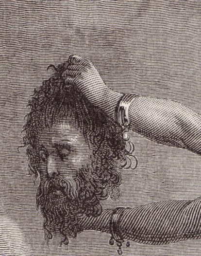
Fig.6. Gustave Doré, Judas Showing the head of Holofernes (1880)

The artist engraved his illustrations into the wood which would then be printed onto paper. I assume he worked at a large scale due to the tiny and intricate details, (I mean just look at all the tiny dots and lines withing figure 6!) but this may be due to the way I know artists work today, as they will work at a larger scale to get all the details then they will reprint at a smaller size and the details are a lot finer. This method may not have been doable at those times, so if I imagine that his plates would have been printed directly into books, then he would have been working at a smaller scale than I would ever have imagined and it’s unbelievable. I could be wrong as I am not fully aware of his process, I just have brief knowledge of how the technique is created nowadays, but either way you can’t dispute that his work was very detailed and he definitely knew how to work with light sources as he wasn’t afraid to work with too much black and he was able to add the right amount of light, so that he was able to achieve depth within his work, creating the realism within his illustrations.  

My opinion 

This would have been a great artist to take inspiration from during my Lion, the Witch and the Wardrobe project, as I was working in monotone, experimenting with different printing methods and using a somewhat similar lining method to build up depth. Like I had mentioned however, I had been working in more of a straight-lined crosshatching style, whereas Doré was working with more curved lines which gave more shape to his design, and helped in making it look more realistic. I do not believe I would have had the time to work as intricate as he had, but by using a more curved line I believe I could have shown more shape in my own work, and it may have helped in making my work look less flat.

I have recently started to work more realistically in my own work, especially with portraits, so in the future, I may try to create a character in his style, but I may do so by working at a larger scale first then scaling down as to achieve the finer details, as I believe my hand would be too unsteady to create as clean of a piece as his.


Bibliography 

Adropofart.com. (2019). Gustave Doré: Information, biography and art – see exhibitions and museums where their work is curated | adropofart.com. [online] Available at: http://adropofart.com/Artist/173/gustave-dore [Accessed 16 Jan. 2019].
Artbible.info. (2019). Artist: Gustave Doré. [online] Available at: https://www.artbible.info/art/biography/gustave-dore [Accessed 16 Jan. 2019].
Encyclopedia Britannica. (2019). Howard Pyle | American writer and illustrator. [online] Available at: https://www.britannica.com/biography/Howard-Pyle [Accessed 16 Jan. 2019].
Glover, T. (2015). Printmaking Artist Gustave Dore. [online] Ipoxstudios.com. Available at: https://ipoxstudios.com/printmaking-artist-gustave-dore/ [Accessed 16 Jan. 2019].
Gurney, J. (2015). Pyle as a Picture Maker – Illustration History. [online] Illustrationhistory.org. Available at: https://www.illustrationhistory.org/essays/pyle-as-a-picture-maker [Accessed 16 Jan. 2019].
Illustrationhistory.org. (2018). Maxfield Parrish – Illustration History. [online] Available at: https://www.illustrationhistory.org/artists/maxfield-parrish [Accessed 16 Jan. 2019].
Milton, J. (2014). Paradise Lost. [ebook] South Australia: The University of Adelaide, p.Book IV. Available at: https://ebooks.adelaide.edu.au/m/milton/john/paradise/complete.html [Accessed 16 Jan. 2019].
National Museum of American Illustration. (2019). HOWARD PYLE – National Museum of American Illustration. [online] Available at: https://americanillustration.org/project/howard-pyle/ [Accessed 16 Jan. 2019].
Newworldencyclopedia.org. (2019). Howard Pyle – New World Encyclopedia. [online] Available at: http://www.newworldencyclopedia.org/entry/Howard_Pyle [Accessed 16 Jan. 2019].
Rafoxsociety.com. (2012). What was the Golden Age of Illustration? | The R. A. Fox Society. [online] Available at: http://www.rafoxsociety.com/what-was-the-golden-age-of-illustration/ [Accessed 16 Jan. 2019].
The Editors of Encyclopaedia Britannica. (2019). Gustave Doré | French illustrator. [online] Encyclopedia Britannica. Available at: https://www.britannica.com/biography/Gustave-Dore [Accessed 16 Jan. 2019].

List of Illustrations

Figure 1 – Pyle, H. (1905). An Attack on a Galleon. [online] http://www.wikiart.org. Available at: https://www.wikiart.org/en/howard-pyle/an-attack-on-a-galleon [Accessed 16 Jan. 2019].
Figure 2 – Pyle, H. (1910). The Mermaid. [online] http://www.wikiart.org. Available at: https://www.wikiart.org/en/howard-pyle/the-mermaid-1910 [Accessed 16 Jan. 2019].
Figure 3 – Parrish, M. (1922). Interlude. [online] http://www.wikiart.org. Available at: https://www.wikiart.org/en/maxfield-parrish/interlude-1922 [Accessed 16 Jan. 2019].
Figure 4 – Parrish, M. (1908). The Lantern Bearers. [online] http://www.wikiart.org. Available at: https://www.wikiart.org/en/maxfield-parrish/the-lantern-bearers-1908 [Accessed 16 Jan. 2019].
Figure 5 – Dore, G. (1866). Paradise Lost. [ebook] South Australia: The University of Adelaide, p.Book IV. Available at: https://ebooks.adelaide.edu.au/m/milton/john/paradise/complete.html [Accessed 16 Jan. 2019].
Figure 6 – Dore, G. (1880). Judith showing the head of Holofernes. [online] Ipoxstudios.com. Available at: https://ipoxstudios.com/printmaking-artist-gustave-dore/ [Accessed 16 Jan. 2019].

Norweigan Wood – Review

For the Penguin Student Design Awards, I have been reading two books, one for the children fiction category and one for the adult’s fiction. The one I am about to review (or attempt to) is called Norweigan Wood by Haruki Murakami, and it is the adult fiction book.

Just a bit of pre-warning, I don’t know how to review books properly, as I don’t know how to give my opinion and explain what the story is about without giving away too much information or potential spoilers. Technically, I don’t know why I keep writing these reviews, but hey ho, here we go! POTENTIAL SPOILERS WARNING AHEAD!

Norweigan Wood is a story about a character named Toru Watanabe, who looks back on his younger/student days in Tokyo in the late 1960s. I believe the story is based on romance, but as opposed to a typical ‘boy meets girl’ scenario, the story does go more into depth with the complexities of relationships and life itself, discussing emotions and struggles between the characters etc. The story does contain some very sexual moments, but this was not my take away from the book as I feel it was more about the main characters daily life, his struggles, his connections between characters and things like that, as opposed to it just being an erotic novel, it had more of a storyline which by the end, I did feel quite invested in.

My initial thought about this book, as it is fictional, I had thought it was going to have more fictional themes, like fantasy or sci-fi, or anything along those lines, so whilst reading through the book, I could feel myself making assumptions of the direction I thought it could take. At one point, I did think that the girl he was interested in was going to turn out be a robot, but this was not the case and I do kind of feel bad for thinking so. Instead, the book was based on reality, set in the real world with characters you would think were real at some point, a world without robots, at least not ones that were mentioned? or any fantasy creatures, or ghosts or aliens or anything or the sort.

At the end of the story, there was a section which had explained that although the author Haruki Murakami has made more fantasy inspired books in his time, parts of this story were autobiographical in a way, as the author would be taking inspiration from his own days as a student. But although this story had some fans of his previous work questioning the more realistic themes of this one, he had explained that it was a challenge for himself, as real life is so complex but does have a simplicity to it, it has so many emotions and integrating parts to it, so I would imagine that it would be hard to make all of those elements seem simple, like ‘yes this book is based on the realities of life’ to the reader. So, in comparison to writing one of his other books, Murakami had found Norweigan Wood was the most challenging.

As I had mentioned, I did end up becoming quite emotionally invested in this book, with the characters day to day life, the emotions, experiences, thought process etc, so when I had finished, like with Howls Moving Castle, you can read my review of that here, I felt lost, it couldn’t end like that! I wanted to know more, what else happened to the character after the story finished, I did feel frustrated that I couldn’t follow him on his journey through life anymore.

I would recommend this book to a friend. If they don’t like the idea of the sexual themes and moments within the story, I would just tell them that I felt the actual story was worth the read. I feel the author has done an amazing job at capturing the reality and complexities of life, and he was able to explain them in such a way that was easy, readable and understandable. In a way that sucks you in and makes you feel emotionally invested to the characters journey.

Howls Moving Castle – Review

SPOILER WARNING! Possibly? If you have not read the story or have not seen the movie, there could potentially be spoilers within this blog. There may not be, but the warning is there just in case!

After finishing this book I have found that I have personal issues with letting go. I loved this story so much that I just wanted it to keep going, I wanted to know what else happened, even if it was just following the characters day to day life. This book had me well and truly hooked, and I’m sad that it is over and I can’t read onwards.

I had also come across this issue when watching Bohemian Rhapsody, I have become so drawn in by the people and the story, that I want to find out more about Queen and the members, especially Freddie, I just want to know more of their story, I want to know everything! I went to see the movie on Halloween, and since, I have been watching old interviews or documentaries, or interviews from the cast of Bohemian Rhapsody, etc, pretty much on a daily basis, it’s becoming a problem. If you haven’t seen the movie, I would definitely recommend!

Anyways, moving away from my tangent and getting back to the review at hand, I loved this story. I was going to try explaining the story, but I could not find the words to do so, to do it justice, or not give away too much of the story, so quoting from the book’s blurb by Diana Wynne Jones:

“In the land of Ingary, where seven-league boots and cloaks of invisibility really exist. Sophie Hatter attracts the unwelcome attention of the Witch of the Waste, who puts a curse on her. Determined to make the best of things, Sophie Travels to the one place where she might get help – the moving castle which hovers on the nearby hills.

But the castle belongs to the dreaded Wizard Howl whose appetite, they say, is satisfied only by the hearts of young girls” (Diana Wynne Jones, 2009)

The book managed to suck me in, not with the battles between Howl and the Witch or Sophie and the Witch, but more within the simplicities of the everyday happenings within Sophie’s life, because there was always something new happening, whether it was her conversations with Michael, Calcifer or even her disputes with Howl, there would always be a new interest within that day, whether Sophie was (SPOILERS?) jumping from place to place with seven-league boots, accidentally growing Howls suit too long,  getting lost around Kingsbury, the list just goes on and it is what I believe made the book so much fun to read, the battling with the Witch was just a bonus.

The book is different from Studio Ghiblis adaptation, although I did personally enjoy the book more, as I felt I learnt more about the characters than the movie had given, I do believe they are both amazing in their own rights.

DEFINITE SPOILERS AHEAD!

There have been changes made in the process of turning the story into a movie, some more obvious than others such as:

  • Studio Ghibli have definitely added their overall aesthetic to the movie, such as
    • the appearance of the characters and the castle. In the book, I believe Michael is supposed to be older, whereas, in the movie, Markl seems quite young, but does disguise himself as an older wizard a lot.
    • the castle is a lot more creature looking within the movie, with elements that could suggest eyes, a mouth and possibly wings, whereas the author had described a more typical castle, which is blockier with turrets and chimneys etc.
    • the Witches henchmen have a more blob-like appearance, they do not have faces so it is quite creepy.
  • The theme of war is more present within the movie. According to an interview at the end of the book, the author had said that this was Miyazaki’s influence as he “crammed the story full of flying machines and war scenes” which was based on a brief mention of war from the king in the story. This explains why:
    • Howl is more part of the war. He is more heroic in this adaptation, as he did seem quite cowardly within the book, not really wanting to work with the king.
    • Although the witch is still a threat in the movie and does still kind of do what she had intended within the book, I believe the King is more of a threat that the characters worry about, as the king wants Howl so that he will turn into a beast and fight in his war.
  • There was also a change with where the black door led. In the movie, it was to a memory of Howls childhood, whereas in the book, the door led to Howls family’s home in modern-day Wales, which REALLY took me by surprise. From the movie, I was not expecting it at all, and actually enjoyed discovering more about Howls life and his family.
  • Sophie’s magic in the book was not really present in the movie? She had the ability to talk to objects to give them power, for instance, her cane had a protection charm which had kept her safe and helped her in defeating the witch.
  • The girls family wasn’t really a big part, although you briefly met Lettie within the bake shop, it did not really go into depth, talking about how she had two sisters, Lettie and Martha, who were both sent to do different apprenticeships, one in a bakery, the other being trained in magic, but they swapped places, so that Martha was the one in the Bakery, and she was actually in love with Michael.
  • The scarecrow was waaaay more friendly in the movie, whereas, in the book, he terrified the characters, and even made Sophie’s old heart shiver.
  • As I have mentioned, the Witch was not as much of a threat, but Howl was not being chased or running away from a curse sent by the Witch that would potentially catch up with him. The Witch actually seems more weak within the movie, so it makes sense when Sophie takes pity on her and takes her in, not due to better judgment.

These are just some of the many changes from the book to Studio Ghiblis adaptation of it, but I am in no way saying that one is better than the other, because although you may have more information from the book, Studio Ghibli has given such a beautiful visualisation of the characters and scenery etc, for instance, you are actually able to see Sophie’s age changing throughout, and see what howl can see, whereas, in the book, you just find out that he has known about her curse the whole time.

If you have not read the book or have not seen the movie or both, after reading all of my spoiler warnings, I definitely would recommend doing both. If you have read the book but not watched the movie, do it! If you have seen the movie but have not read the book, do it! Both are so amazing in their own right so I would not recommend one above the other, you should just watch and read both!


Bibliography

Howls Moving Castle. (2004). [Film] Directed by H. Miyazaki. Japan: Studio Ghibli.

Jones, D. W. (2009) Howls Moving Castle. London: HarperCollins. Blurb.

Jones, D. W. (2009) Howls Moving Castle. London: HarperCollins. Anime and Author.


The Lion, the Witch and the Wardrobe – Review

As a personal project, I wanted to illustrate the story of ‘The Lion, the Witch and the Wardrobe’ by C. S. Lewis, as on screen it was a childhood favourite, and I always had the chronicles of Narnia in my cupboard but never actually read it (or don’t recall ever reading it, it did seem to be bigger when I was little so probably scared me). But as I had never read it, I wanted to see if there were any differences from book to the screen adaptation like there is in many book adaptations nowadays, and I planned to illustrate the original story as opposed to the imagery I already knew from the movies or the very dated BBC version.

When actually reading the book, I was surprised but not in a good way. The story is very brief in its descriptions and I was disappointed in the lack of detail that was given, because since I didn’t want to work with the imagery I already knew, I was leaning on the details to give me a better vision of the scenery or characters so that I could interpret them in my own way.

In this case, for once, I had felt the movie and even the BBC program adaptation of the story was more detailed than the book and did give better visuals.

It was, however, an easy read, so would be better suited to a younger reader, so I could possibly be overanalysing it due to my age and level of reading.

When I think about other adventure/fantasy books that I have read, I like to compare this book against J. R. R. Tolkiens Lord of the Ring series, as where C. S. Lewis has next to no detail, on the other side of the spectrum Tolkien almost goes too much into detail in his descriptions, to the point where I did get a bit bored when reading. In C. S. Lewis’s case, it was an easy read but I feel the visuals it gave were basic and it almost seemed too fast-paced in a way.

With this book, I will try to take as much from the descriptions as possible, but I will probably illustrate more from my imagination or create a mood board to help me flesh out the visuals to my ideas.

In conclusion, ‘The Lion, the Witch and the Wardrobe’ is probably better suited to a younger reader, but I still feel it definitely lacks in detail and the movie, for once, was better than the book.

Competition Briefs

Both briefs for the competitions I have planned to participate in during the first semester have now been announced.


House of Illustration – Book Illustration Competition 

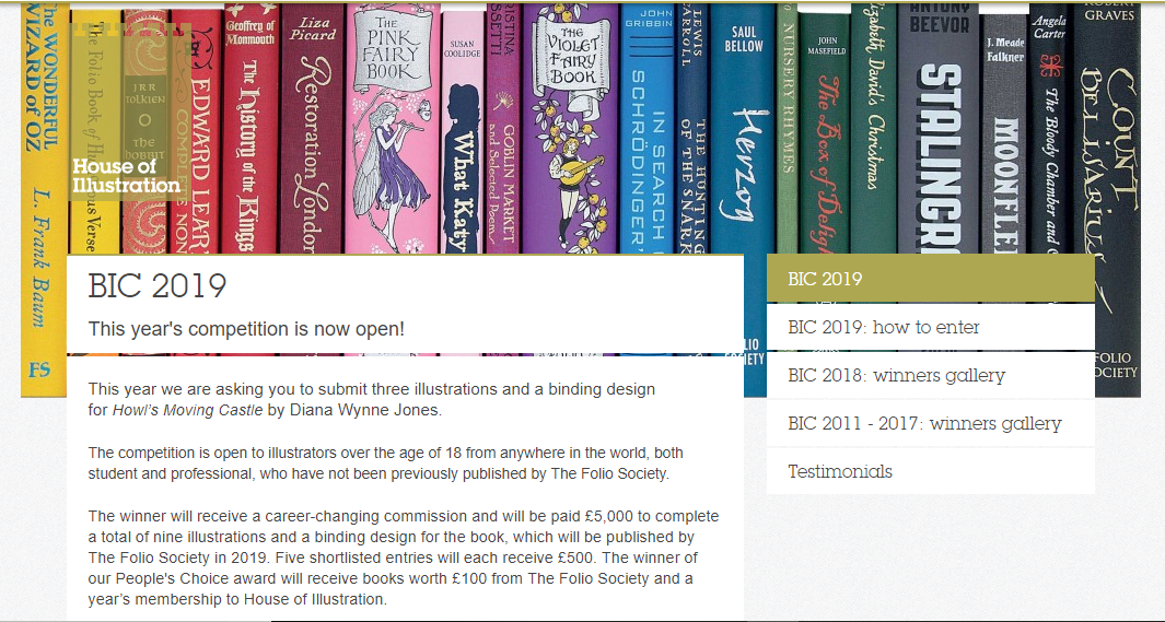
They have announced that the book in which you have to illustrate and make a cover for, will be Howls Moving Castle by Diana Wynne Jones. I am excited about this, as I had loved the Studio Ghibli adaptation of the story, and never actually knew that it was originally a book, so I am excited that I can read it and possibly see the differences from book to movie.

My only issue with this brief, I feel, will be trying to forget the imagery I already know from the movie. I feel Studio Ghibli makes the most beautiful movies with incredible scenery and amazing characters, so as the imagery I already know is so strong, I feel I might struggle when it comes to making the story my own, forgetting the visuals I already associate to the story.

bic2019


For the Penguin Student Design Awards, 3 books have been announced, one for Adult fiction, one for Adult non-fiction and one for a Children’s book.

Adult fiction cover Award – The Establishment – Owen Jones

From a brief read of the description, this seems like a political based book, which is something I am not really interested in. Although it would get me out of my comfort zone, working with themes I have never explored before, its not something I feel excited about, or something that I want to get involved in. Yes politics are important, and I do vote, and I’m all for other people getting involved and I respect their passion towards it, but its just not something I’m personally interested in. So, I think I’ll be choosing to go with another book instead.


Adult non-fiction cover Award – Norwegian Wood – Haruki Murakami

This I believe is a love story, based on a character who is reflecting back on his student days, in the 60’s, in Tokyo.

When reading through this brief I kind of got excited, as I feel it could be a chance for me to create more oriental themed work, which I had enjoyed doing at the end of Level 5, but also possibly include styles or themes from the 60’s.


Children’s cover Award – Wonder – R. J. Palacio

This is a story which has recently been turned into a movie, which I have not seen yet, slightly because I thought it would potentially make me cry, (I’m a wuss with emotional movies). It is about a young boy with facial deformities, who I believe just wants to be an ordinary boy, being able to go to school and have friends, without being stared at.


I am currently torn between choosing the Children’s book or the Adult fiction book. On one hand, I don’t want to create too much child based work over the year, as I do want to cover more audiences within my portfolio this year, however, I don’t necessarily think Wonder is anything like the other children’s books I am planning to work with over the year, as I believe it has a deeper themes which are more based on real life as opposed to a fantasy world, so if I did choose to work with this brief,  I don’t think it would resemble any other work I create this year.

With the adult’s fiction brief, however, I do feel it is well suited to me, as I do love creating oriental based designs, and I would enjoy working exploring 60’s themes, colours, etc. However, this may be a con, as I would not be challenging myself and could potentially end up creating work similar to previous designs.

So my dilemma is, do I create yet another childrens book, even if it’s not like the others have planned and could potentially take me out of my comfort zone, or do I work with an adults book with themes that I know I would enjoy working with, but would be settling into my comforts.

After talking to my friend, who had told me more about Wonder, and actually made it an option, as I initially I was adamant about not doing the children’s category, I discussed my dilemma and she had suggested that I just get both, (she’s going to send me Wonder to borrow, and I’ll purchase Norwegian Wood) then she said “read them both, come up with 3 concepts each, then choose your favourite from there”, which is the best advice I have been given so far this year, and is why she is my best friend. She has solved my issue and made my path much clearer for this specific project.

Psda


Bibliography

House of Illustration (2018) Book Illustration Competiton [Online] Available from: https://houseofillustration.org.uk/get_involved/bic-2019 [Accessed on 17 Oct. 2018]

Penguin (2018) Student Design Awards [Online] Available from: https://www.penguin.co.uk/company/work-with-us/student-design-award/student-design-award-2019.html [Accessed on 17 Oct. 2018]


Current Artist Research Pt.2

John Tenniel

Figure 1 – John Tenniel, Alice’s Adventures in Wonderland, 1865

This is an artist from the Golden Age of Illustration, who I would like to take inspiration from during my Lion, the Witch and the Wardrobe project. He had created the original illustrations for ‘Alice’s Adventures in Wonderland’ by Lewis Carroll.

From the illustrations specifically from this book, Tenniel’s style is semi-realistic but with the theme of the book, he has played around with surrealism, illustrating things that you would not exactly see in the real world, and exaggerating some of the characters proportions, as seen in figure 1.

I believe these illustrations were hand-drawn with pen and ink, but I believe when it came to mass production, the design was etched into a plate, so the illustration could be printed multiple times for hundreds of books.

Because of this factor, during my Lion, the Witch and the Wardrobe project, I want to experiment with different mediums, working traditionally with pen and ink, but also playing around with different printing techniques, such as screen printing, linocut printing, etching, and even creating a plate with the laser cutter that is available within the college.

Primarily, I do want to work in black and white for this project, however, I do plan to also play around with foils, possibly adding hints of gold or silver to the designs, potentially giving my pieces a more regal appearance that I believe will fit the theme of the story.


Ana Godis

40653471_917673028417511_1146468823050747904_n
Figure 2 – Ana Godis, 2018

As the competitions are not yet known and I do not know what I will be creating, I want to keep an open mind of where I can go with these projects in sense of style and techniques I could use. I have however been enjoying the work of Ana Godis over the holidays, so would potentially like to use her work as inspiration for a project over the coming year.

I would explain her work as experimental in a way, although I believe she always works digitally,  I’d say her style can differ from piece to piece, as for one, she could be creating a beautiful digital portrait which is very realistic, but in another piece, she could be working very stylised, almost ‘cartoony’? But in another piece, she could be combining the two styles, which probably sounds confusing, but she is able to execute the style so well!

Over the holiday, as she does post process videos along with her pieces, I have tried to learn from these videos, trying to follow her steps, as to improve my own technique, and I had created two digital paintings. I could still do with some further practice, however, I do feel the process had given me smoother results, in comparison to the digital painting I had done the year previously.

I feel as her style is so flexible, if I were to take inspiration from her work, I would be able to apply it to any project, including the competitions. Her work is illustrative but quite contemporary in style, so if I were to learn more from her techniques, I could potentially apply them to book illustrations or editorial themes or possibly even use them for advertising.

Ana Godis does have a Patreon in which I believe she does go into more depth with her process, the tools she uses etc. I personally am not subscribed as I do not use Patreon (as I feel it would be a black hole for me, following too many artists and probably spending all of my student loan within it, which is not something I am committed to doing as of yet) But, if you are interested in her work and do wish to learn more in-depth about her process and tools, here is her link: www.patreon.com/ana_godis


Rafael Mayani

23507888_1928168667504955_2452883890356879360_n
Figure 3 – Rafael Mayani (2017)

Like Ana Godis, I will potentially be taking inspiration from Rafael Mayani during my commercial projects.

In comparison to the previous artist, I believe his work is more contemporary, possibly more editorial-based, so I believe he would be most useful within the Association of Illustrators – World Illustration Awards competition, especially if I decide to work in the editorial category.

His style is minimal, easily readable and overall it is easy on the eyes. I believe I would most likely see his work in commercial settings, such as in magazines, in advertising, on posters, etc. In figure 3 specifically, he had created an illustration for a magazine, which was honouring the people who helped clean up and take care of others after the earthquake in Mexico in 2017. I believe by not giving his characters faces, it is not singling out any particular person who had helped but instead is celebrating the community as a whole, and the reader could potentially fill in the spaces themselves, imagining the people they know, if that makes sense?

When taking inspiration from his work, it will be with the minimal almost papercut style, as I do believe it is very readable, and it does attract the eye, which I do feel is an important factor if I were to create a piece that would advertise a specific article.


List of Illustrations

Figure 1 – Tenniel, J. (1865) Alice’s Adventures in Wonderland [Online] Available at: https://medium.com/alice-s-adventures-in-wonderland/sir-john-tenniel-s-classic-illustrations-of-alice-in-wonderland-2c3bbdca3a77 [Accessed on 24 Sep. 2018]

Figure 2 – Godis, A (04 Sep. 2018) [Online] Available from: https://www.instagram.com/p/BnTw8cOnCra/ [Accessed on 24 Sep. 2018]

Figure 3 – Mayani, R (13 Nov. 2018) [Online] Available from: https://www.instagram.com/p/BbceF5PFQLR/?taken-by=rmayani [Accessed on 24 Sep. 2018]

Current Artist Research Pt.1

Tina Nass

She is an illustrator who I would like to potentially take inspiration from when creating work for my ‘Wizard of Oz themed project. As her work is very textural in style, (as I believe she uses pencil for tonal work, then scans the design in and colours it digitally) I felt if I were to create work in a similar method, I would be able to create work that may appeal more to a younger audience, as they could potentially recognise the textures as mediums they use too.

22352470_513156755699542_839295880187084800_n
Figure 1 – Tina Nass, 2017

Another reason that I had chosen this artist, is again, because of the methods and techniques she uses. As I have been playing around with traditional and digital skills in my own illustrations over the holidays, and I have been enjoying the process of doing so, but have felt that my designs have been on the more ‘sketchy’ side, not being up to my usual standard of quality (even though I do love the outcomes), I wanted to take inspiration and learn from Tina Nass’s particular process, to potentially help in creating more refined designs whilst using these techniques.


Nuria Tamarit

Like Tina Nass, I believe Nuria Tamarit works in a similar process, creating all of her linework and textural qualities by hand, then colouring the designs digitally. I will be using her work as well as Nass’s for inspiration during my ‘Wizard of Oz’ project, however, I will be taking more inspiration from her characters rather than her textures or methods.

21577095_153172208601719_2441660350538448896_n
Figure 2 – Nuria Tamarit, 2017

Her characters will typically have a cartoon aesthetic, with exaggerated anatomy, especially in the limbs. From looking at some of her pieces, I would say that she creates a lot of Amazonian type of figures, as they are lengthier in the leg, and thicker proportioned.

When taking inspiration from her work, I will be playing around with my own characters proportions and anatomy, seeing which areas that I can potentially exaggerate as to possibly give the characters more personality, for instance, when creating the cowardly lion, I could give him more of a barreled chest, as he is supposed to be a fighter, and I feel this element would help to suggest that quality.


Audra Auclair

Audra Auclair is one of my favourite artists, I have mentioned her countless of times in previous projects throughout this course, the art and design course beforehand, and I may have even mentioned her within my secondary school projects. I am in love with her work and proudly own 3 of her prints and the book ‘fragments’ that she had made.

23824035_1782728085104670_4220521489692098560_n
Figure 3 – Audra Auclair, 2017

My reason for mentioning her yet again within this course is because I wanted to take inspiration from her inked illustrations, (especially from figure 3 to the left) for my own inktober designs. As I will be creating flower people/pixie type characters, I would like them to be quite delicate and soft in style, so I will try to take inspiration from this specific piece of work, creating my own characters with similar line weights, as I feel the use of fine liners within this piece, has possibly made it even more delicate, as it is less heavy than a brush-tip pen, which she has also used in the past.


Bibliography 

A. Auclair. (2018) Instagram [Online] Available at: https://www.instagram.com/audraauclair/ [Accessed on 24 Sep. 2018]

T. Nass. (2018) Instagram [Online] Available at: https://www.instagram.com/tinanass.illustration/ [Accessed on 24 Sep. 2018]

N. Tamarit. (2018) Instagram [Online] Available at: https://www.instagram.com/nuriatamarit/ [Accessed on 24 Sep. 2018]


List of Illustrations

Figure 1 – T. Nass. (08 Oct. 2017) Instagram [Online] Available at: https://www.instagram.com/p/BZ_bykbnumO/?taken-by=tinanass.illustration [Accessed on 24 Sep. 2018]

Figure 2 – N. Tamarit. (10 Sep. 2017) Instagram [Online] Available at: https://www.instagram.com/p/BY3yMX6gcfx/?taken-by=nuriatamarit [Accessed on 24 Sep. 2018]

Figure 3 – A. Auclair. (23 Nov. 2017) Instagram [Online] Available at: https://www.instagram.com/p/Bb2QKFoFHUT/?taken-by=audraauclair [Accessed on 24 Sep. 2018]