(End of Year Evaluation) Reflective Practice Presentation – Part 1

First thing I should explain is that I am bad when it comes to presenting within a specific timeframe, for this presentation it needed to be within 10 minutes. At the start of the year, I had given another presentation based on my proposal for the year and although I do believe I did well, I was told that I had gone over my time (not by how long though), so from this experience, I already had the fear of going over my time limit but little did I know of how much more of a concern this should have been.

In prep for this presentation, which was basically a review of the whole year, discussing projects, research outcomes and swot analysis throughout, I had tried to practice with my boyfriend, but he had noticed how long I was taking to get my words out just with the first slide, so suggested I make a script. We did this by having me first write out my information for the specific slide, then he would go in and brief it down, taking out any information that I may have repeated or rewording sentences so there was less babble. We had gotten the script done at half 12 in the morning of the presentation, so we had one run through before we went to bed. He had timed himself reading through it at his normal pace and it had taken him 10 minutes and 27 seconds, but this was without any breathing space between points and section so it was concerning. When I had read through it there were certain words I wanted to change, I didn’t add anything more, but I wanted the script just to sound more like me again, so, I decided I would make these changes once I had got to college.

I got to college at half 8 and my presentation was at 9:45, so I believed I would have enough time to make the changes and read through before I started. I believe this would have been the case if the colleges PC’s logged in at a normal speed, and did not have a Microsoft updating/loading screen every time anyone tries to log in. I tried turning off the computer from the plug socket, as my tutor normally suggests, I tried logging into another PC but the messages just ended up on that screen as well, so eventually, I ended up just moving to a Mac, which logged me in instantly. I’m not trying to put blame on the computers, but I do believe I lost practice time due to these issues. As well as making changes to the wording I had decided to highlight specific words or phrases from the specific slides and points so that I wouldn’t be reading directly from the script but I could look down, see the highlighted words and know what I’m talking about.

By the time I had finished making my changes ready to print my cards off, my tutor had come in and told me it was my time, meaning that I did not have time left to do my run through. I was panicking because of this, but I hoped with the addition of the highlighted words that I would be able to follow the script without having to constantly look down at it.

This, however, was not the case as I ended up going completely off script, using the highlighted words as starting points which I ended up expanding on. So, the whole night of myself and partner working on the script, shortening it so that I wouldn’t be babbling or going over my time limit was completely thrown out of the window, as I did go over; I had in fact gone on for 37 minutes.

When going back to my peers and talking about my presentation, we did all have a laugh at my timing as no one could believe it, I could barely believe it! It definitely did not feel that long to me at the time! Once more and more of my peers had done their own presentations and had come back with such good results though, I was extremely proud of them but it made me realise how better I could have done myself. I was told that from my presentation I had still got 60% which is a 2-1 (which could still be changed when others come to mark it) but I started questioning if I had lost a certain percentage due to going over my time and how much that percentage was? Could I have gotten the first if I had just been within time or would I still have gotten a 2-1 because I had missed information? Before this presentation, I had gotten a first in both modules I completed, so although I know 2-1 is still a good mark (especially for going over my limit by so much) I did build a higher expectation for myself, so I am gutted that I couldn’t achieve that level this time.

The presentation was 30% of my reflective practice module, my blog being 70%, so a 2-1 is not necessarily my overall grade for this module as of yet, but I was told that I would need to achieve 75% in my blog to pick it back up to a first, so I hope that I can make it to that level, making sure that I have hit all the criteria within the brief, but have also gone beyond and above that so that I can potentially achieve the higher grade.

What I wish I had done:

  • Started writing my script sooner.
  • Started practising with it sooner.
  • If it could have helped me more I would have just read directly from my cards, which could have allowed me to finish within the 10-minute mark as my boyfriends run through had, but I believe that this wouldn’t have shown good presentation skills and might’ve taken my marks down further.

What I can learn from this experience:

  •   Start making my presentations sooner. This would allow me to potentially write a script, practice with it, and possibly learn it off by heart so that I wouldn’t even need any cards.
  • I need to babble less. One of my teachers once said to me that I write very directly, I get to the point but I wouldn’t necessarily expand. Since this comment I do feel my written work has gotten more detailed, I am still direct with my points but then I do expand on them further now. I feel this has translated to my communication skills as well though, so although this habit may be good for my written work (or may not as it may just come across as more babble, but I haven’t had any complaints?) it may not be good when it comes to a presentation, especially one with a time limit, as I evidently will babble on.
  • I do believe I have taken more priority with my blog this year than I have in previous and I do feel it is strong, but I will make sure that I have been hitting the criteria within my brief and I will try to go above and beyond so that hopefully I will get my mark back up.
  • It’s not useful to focus on everything that went wrong and what more you could have done, but it is good to reflect on that experience and refocus on the things you can still do. I do wish I could redo my presentation but I know that I can’t and it is done, so what I can do now is focus on my blog, as well as my other projects, to make sure I am still working at the level I want to be at within those modules and hopefully achieve my goals of a first overall.


In part two of this blog, I show the slides and script of my presentation. I have expanded on the initial briefer script, going into more depth with the specific projects, discussing my goals, overview of the projects, outcomes, self-reflection and so on. What will be ironic about this is that the expanded version of the briefer script will probably be closer to what I had said within the actual presentation, allowing me to go on for 37 minutes.

Juxtapoz – Issue 208, Winter 2019 Review

As a class, we were asked to find a copy of Hi-Fructose, an art based magazine which my tutor has recently found interest in, and review it, seeing whether it would be a potential source of information, inspiration and so on within the future. I did look for a copy within WHSmith and the Travelling Man in Newcastle but was not able to find it in either, I did look online but I had found that the shipping of the magazine would cost more than the actual piece.

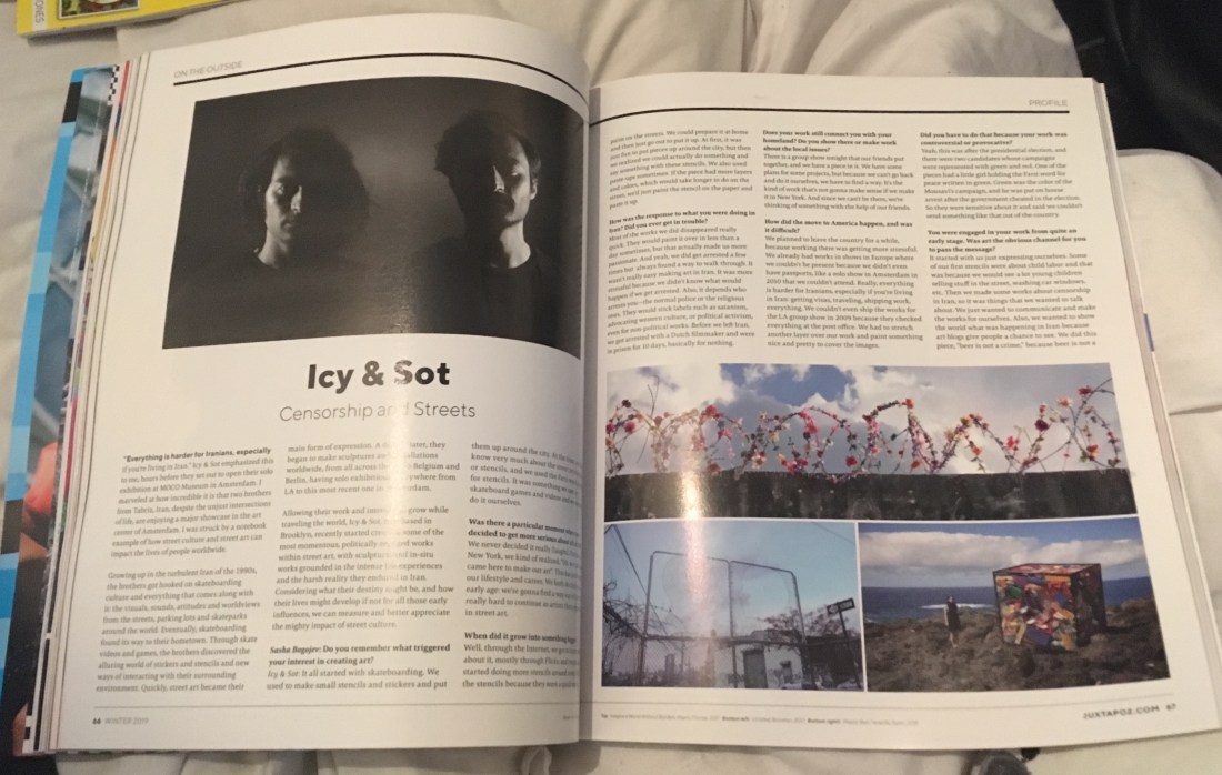
So, I thought instead of Hi-Fructose, I would go back to WHSmith and purchase the newest copy of Juxtapoz, another art based magazine which my tutor has in the past spoken highly of. I have reviewed another issue in the past, and I did not really think too highly of it, but I feel that was more based on the artists involved, as they weren’t necessarily my cup of tea, but I did find artists called Icy and Sot in an advertisement for their exhibition, and I have since followed them on social media from reading the magazine, as they would create pieces with deeper meanings, connecting to worldly issues, either with politics, the economy or the environment.

60731832_677305476037410_834042920435712000_n

So, from this good discovery, I decided to give Juxtapoz another chance, and the copy that I had picked up was, in fact, a 25 years celebratory issue and had come with a booklet called ‘Vans Vision Walks Volume #2’ which the company had made in collaboration with the brand Vans and consists of a lot of urban styled photography taken by multiple artists.

When reading through the magazine, I actually found an interview with Icy and Sot, called ‘Censorship and the Streets’ and is found in a category called ‘On the Outside’ in the contents page if you want to purchase the issue and read more about the artists for yourself.

60606636_603430260144634_5463869794094678016_n

If you would like to read my previous review of Juxtapoz: issue 202 back in 2017, click here.

So, what is the magazine?

Juxtapoz is an art based magazine which has run for 25 years now, (since 1994), and includes interviews with hundreds of artists over the year, of different backgrounds and multiple styles, some of which I shall be discussing within this blog post. The magazine also includes advertisements for many clothing companies, breweries, hairdressers and so on, but they will also include advertisements for art exhibitions, which is how I had initially discovered Icy and Sot. I do however believe all of these advertisements are American based, which makes sense because so is the company, but its a bit annoying when you would be interested in going to the exhibition but it turns out it is in Denver or Arizona or so on.

As the magazine has a variety of artwork it includes, such as street art, sculptural work, photography, paintings or illustrations, etc, the magazine can appeal to a wide audience of artists or art enthusiasts.  The magazine has the ability to inspire people, bring new artists to light, or highlight older more well-known artists with a fresh perspective. So overall, it is a way to keep up to date with current styles and trends within the industry, but in more areas than one, looking at contemporary art as a whole, as opposed to just specifically looking into illustration, street art, fine art and so on.


What does it contain?

It’s featured artists in this specific issue are Andy Warhol, one of the key icons and artists of the pop art movement within the ’60s. Kaws, whose work I have come to notice more regularly within pop culture, especially with his identifiable character, who I believe I had seen set up at a birthday party for Travis Scott, arranged by his girlfriend Kylie Jenner. There is also a featured artist named Swoon, who works with mixed media, creating huge installations, stop-motion animations and so on, and there is an artist named Jason Revok, who I believe is a street artist and I would say that he primarily works with patterns and a lot of colour. Another few notable mentions are James Jarvis, Louise Bonnet, Haroshi and Muzae Sesay.


The artists

There was not a lot of work that I had found appealed to me, or would inspire my work in the future. That is not to say that the work within the magazine was not good, some of it can be amazing to the right audience and reader, but personally, for me, it was not my cup of tea.

Mando Marie

Like how I discovered the artists Icy and Sot, I had also discovered another artist through the advertised exhibitions within the Juxtapoz magazine, this one being of the work by Mando Marie.

I believe she is a street artist, working with a lot of stencils and a flat and minimal colour palette, but what had drawn me to her work was the style, as her figures have a vintage illustration style to them, possibly 50’s as they remind me of the illustrations within Enid Blyton’s book of the magic faraway tree, by Dorothy M. Wheeler.  As I had read this book when I was younger, there is a sense of familiarity with Marie’s style which I do enjoy.

60573855_305052477093879_2781199265001635840_n

I do like the simplicity of the designs and do wish that I was able to see the work first hand, as I do believe I would make the effort to go if it were more local, but as it was in Canada, I do think the travel would be a little of a stretch. If I were to take inspiration from this artist, it would be within her technique, as I would like to create larger scaled work someday, ones that I have not worked on digitally, so I believe using stencils would be the way forward, but I would need to gain more experience with spray paint, as I have not used the medium before and would like to create clean designs.

If you would like to see more from this artist, her Instagram is @seeyouthroughit (as shown below) and she also has a Tumblr site at www.seeyouthroughit.com.

View this post on Instagram

@station16gallery #seeyouthroughit #mandomarie

A post shared by Mando Marie (@seeyouthroughit) on

Swoon

Swoon is one of the featured artists within the magazine, and she is described to be a therapeutic artist, referring to her work “as a balm” (Farr, 2019) as to heal the audience or recipients of her art.

She is a mixed media artist, working with materials from paper to large scale linoleum block printing, with room installations to street art. What had drawn me to her work was the piece called ‘The Canyon’ which was a huge room installation piece of a woman which seemed to be rising out of the ground through waves, and her dress seemed to be made from the imagery of sea creatures. There is a sense of collage to her work and I enjoy how the character is in greyscale, almost having a hand-drawn effect to her, but how the flat pastel colours of the fluid elements or animals included compliment the grey tones and make the design look very soft and appealing to the eye. I also feel the colour palettes make her work more feminine, but the papercut style complements the tones well.

61090264_370473957145844_2302764544159645696_n

Like with the previous artist, I would like to work at a larger scale with my work in the future, but looking at Swoons work, she does encourage me to try new mediums. I relate to this artist with her content as I do enjoy drawing women myself, so it is nice to see where else and what more I could do with that type of imagery.

If you would like to know more about this artist, her Instagram is @swoonhq, (as shown below) and she also has a website at www.heliotropefoundation.org, which is a non-profit organisation that the artist runs along with a team, to help communities that have been affected by natural disasters.

View this post on Instagram

Q&A ~ @amyeisenhoweromholt: “Do you ever feel insecure?” Me: YES. All the time. There’s a part of me which is determined to see myself as less than, to feel like an outsider, stepped on and left behind, and it takes very little to instigate that part. No matter where you’re at in your career you’re always dealing with rejections, even amidst success. Last year I did the largest show of my career and I was pretty proud of it. It was a really meaningful experience and got a lot of wonderful response from individuals. In the larger press and art world press though, it was basically ignored which got me feeling a little insecure. Then an online article came out which brought up an important criticism about the undiscussed role of white privilege in my community based work. It was a necessary subject to broach, one I had been working out how best to discuss when along comes a writer who wades in without comprehending whole show, or even doing the most minimal fact checking. They claimed that post disaster rebuilding projects which have taken the dedicated work of 8 years were the caprice of a few weeks and represented some kind of shallow voluntourism. Many people read the piece and believed its analysis without much question about its accuracy. I was surprised at the extent to which I felt shaken by this. Because the piece held a seed of important truth – there are some glaring, and often undiscussed privileges in my position as a white woman from the United States participating in projects within cultures that are not my own – it opened the door for the rest of the piece, which was largely just un-fact-checked internet bullying, to seep into my consciousness when I might have otherwise ignored it. (I challenged the piece which is down for fact checking). But all of these other insecurities got pulled up. “Maybe I won’t get past the hurdle of entrenched sexism in the art world, maybe my naivety around issues of privilege makes my work more destructive than constructive, maybe I’m at that age where women’s contributions get cast aside.” And on and on, reminding me that there’s no relationship between success and inner security, and self worth is my own to find.

A post shared by Swoon Studio (@swoonhq) on

Overall Opinion

Although I was able to discover these two amazing artists, I still do not hold a high opinion of Juxtapoz, at least for myself and my own preferences of artwork. I do feel this magazine could be a good source of inspiration and current knowledge of the industry for some people, especially if you are more interested in more modern/contemporary work, but as of yet, I have not found an issue of Juxtapoz that I was really excited about or would highly recommend. That’s not to say that there isn’t one out there that could fit my interests more, but with the two that I have read, issue’s number 202 and 208, neither really feel up my alley, so I do not feel encouraged as to purchase them again.


Bibliography 

Bogojev, S. (2019). Icy and Sot – Censorship on the Streets. Juxtapoz, (208), pp.66 – 68.

Farr, K. (2019). Swoon – The Catalyst. Juxtapoz, (208), pp.86 – 93.

Farr, K. (2019). Swoon – The Catalyst. Juxtapoz, (208), p.87.

Heliotrope foundation. (2016). [online] Available at: http://www.heliotropefoundation.org/ [Accessed 21 Feb. 2019].

Russell, M. (2017). Juxtapoz Review 18th November 2017,. [Blog] Melissa Russell’s Blog. Available at: https://melissagrussell.blogspot.com/2017/11/juxtapoz-review-18th-november-2017.html [Accessed 21 Feb. 2019].

List of Figures.

Figure 1 – Juxtapoz. (2019) Winter 2019, (208).

Figure 2 – Bogojev, S. (2019). Icy and Sot – Censorship on the Streets. Juxtapoz, (208), pp.66 – 67.

Figure 3 – Marie, M. (2018). Instagram. [image] Available at: https://www.instagram.com/p/BrIsUPLluFS/ [Accessed 21 Feb. 2019].

Figure 4 – Farr, K. (2019). Swoon – The Catalyst. Juxtapoz, (208), pp.86 – 87.

Figure 5 – Station 16 (2019). Mando Marie. Juxtapoz, (208), p.55.

Figure 6 – Swoon (2018). Instagram. [image] Available at: https://www.instagram.com/p/BmL9QQTDDr6/ [Accessed 21 Feb. 2019].

I can’t draw.

As a class, we had watched a TED talk by Graham Shaw in which he was talking about peoples perceptions about drawing. In this talk, he discusses how everyone can draw its basically just your own doubts that prevent you from doing so or improving your skills. In the talk, he does give a follow along example explaining his theory in which he gets the audience to draw characters with him, resulting in a lot of people realising they can draw. I am not going to show my results from the experiment as I just feel they’re a mess. They were fine in the beginning but then they just went downhill quick. I believe this was because I don’t work as fluid as Shaw does with his characters, so was more focused on trying to get the lines right and when he was onto the next steps, I had already created a mess. So no, I will not be showing my results, but I definitely think the talk is worth a watch and you may be intrigued to see what you could create, especially if you are one of those people who think you cannot draw.

I feel when people use this quote of “I can’t draw”, which usually follows “omg, you’re so good, I can’t even draw a…” they just assume that it is a natural gift that you must have been born with. This at least was not the case for myself. When I was younger, I don’t believe I was good at drawing but I did enjoy the process so I just kept going. I am quite a perfectionist with my work, and always have been, a trait which I believe I’ve gained from my Mum, thanks, mum! so after making a drawing, I would usually get disheartened when I could see the issues, but this wouldn’t stop me from drawing entirely, I would just try to keep improving.

In my teens, I would regularly use a site called DRAGOART, which I believe is still active to this day, and posts step by step tutorials of how to draw certain characters, icons, images, etc, which are usually inspired by current trends with the media and pop culture. From these tutorials, I would be able to draw the image quite well, but I would focus more on trying to replicate the image as opposed to actually trying to learn from the process. So, once I had noticed this when I would try to draw something that wasn’t from the tutorial,  I did start to try learning from the process, specifically from the beginning steps in which you form the image using shapes. From this day I believe this is still how I work, but over time I have improved my skills by learning the fundamentals of art first, and a lot of practice, more from real life or proper reference photos, as opposed to working from someone else characters/art. In my opinion, as an artist, you should never stop learning or improving or wanting to learn or improve. I feel if you reach the point where you think that you have nothing more to learn or no more areas for improvement, then there would be no purpose for creating work. You would have reached your peak, where else would there be to go from there?

I myself know that I have a lot of areas to improve within my work, and a lot of new techniques and mediums that I want to explore, and although things may not work out, I will be excited to see how my art grows within the next 10 years, or 5 or 1, or even just within a couple of months. Below I have shown two illustrations of mine, the one on the left being one I had made in 2013 when I was 14-15? I remember how proud I was of it at the time, but looking back now, I’m sooooo happy with how much my work, style and aesthetic has grown since, especially when looking at the piece on the right, from late 2018, where I have drawn a more anatomically correct and more aesthetic character of my own, instead of just imitating someone else’s.

In conclusion, from watching the TED talk, I do believe that anyone can draw, they’ve just got to be willing to put the doubts aside and put the time into it for it to look as “good” as someone else’s they may compliment. I can’t think of any artist who was just magically gifted at their craft, at least not with a little practice at first. If I try to think about it in other terms, you don’t just learn maths overnight, you practise and practise over the space of basically 16 years, and once you’ve mastered counting, you then go on to adding, subtracting, timetables, division, then algebra gets thrown in and all sorts of equation stuff. So with this example, an artist is always improving, but it does take that understand and practice in order to do so.

Bibliography

Dragoart.com. (2016) How to Draw, Draw Step by Step.. [online] Available at: https://www.dragoart.com/ [Accessed 6 Feb. 2019].

Garner, C. (2017). Why Should You Study The Fundamentals of Art?. [online] Medium. Available at: https://medium.com/the-art-squirrel/why-should-you-study-the-fundamentals-of-art-1368efcbf446 [Accessed 6 Feb. 2019].

Shaw, G. (2015). Graham Shaw: Why people believe they can’t draw. Available from: https://www.ted.com/talks/graham_shaw_why_people_believe_they_can_t_draw [Accessed 6 Feb. 2019]

All images are my own unless stated otherwise.

Imagine FX – Issue 171 March 2019 Review

60674939_2256770794414411_7863332619230904320_n

I initially set out to purchase this magazine as an artist named Audra Auclair, who’s work I admire so much and have followed for years now, had her art on the cover and I believed it would contain an interview with the artist inside, however, after purchasing the magazine, I had found the artist had discussed more of her process, showing more of a step by step guide as to how she creates her work.

I had also found that the magazine included another artist that I follow called Loish, or otherwise known as Lois Van Baarle, who has shown and discussed her sketches which I recognise to be from the recent inktober challenge which I myself had taken part in.

So, what is the magazine?

ImagineFX is a digital art based magazine which includes interviews, process guides, reviews and so on, which help look into the current trends within digital art, but also help the reader to potentially discover new artists, learn new techniques and find out more information about the products that are newly released which could help artists throughout their process.

60817839_1196694837177357_5569202252121374720_n

The magazine has been running since 2006, so I would say it is a more new age magazine, focusing on the new technologies and movements within the digital arts industry. I would say the art featured does cater more to the fantasy/sci-fi realm of work, so the audience who this may be directed to is potentially game or concept designers, but I would recommend this magazine to any artist working digitally or wanting to try it out.

Although the majority of the magazine is digital oriented, there is a good section that is traditionally based, for instance, there is a workshop on figure drawing within this specific issue, discussing how to work with tonal value in order to create a 3D figure.


What does it contain?

This magazine’s featured artists are Audra Auclair, who works both traditionally and digitally, but creates beautiful and strong female characters, which in this case she has combined with sci-fi elements to form a whole new being. This issue also features Loish who I had mentioned previously, who typically works mostly digital, but in this case, has shown her sketches and inked work which she had created for inktober.  The final artist that is featured is Goro Fujita, who I had not heard about previously, who works with virtual reality creating his own world, but he has a more painterly style as opposed to realistic which is what I am used to when I think of VR, but I feel his work would appeal to younger audiences, as I feel they would give the child a sense of being inside of a real-life children’s book.

Other than the featured artists, the magazine also has an ‘FX Posé’ and ‘fresh paint’ section in which they showcase new artists, showing their work and a little information about themselves. I do like the addition of this to the magazine because it allows the artist to get their name out there, if they have been working on their craft for a while but may have not gotten recognition or enough publicity with their work, having it shown within this magazine, which is directed at the right type of audience of other artists who work in the same genre, or clients who are potentially looking for new artists, is good publicity for those artists. If you are an artist yourself and feel your work is of standard, you can also apply to be featured within this section, by tagging the magazine on Twitter or Instagram which will help in getting your work noticed. So, with a little more development in my own work, this is something that I will think about in future illustrations, especially for once I have left college as I want to keep the ball rolling with my work and progression, I don’t just want to stop and not have an idea of where to go once I’ve left the comforts of education.


The Illustrators

Audra Auclair 

This is an artist that I have been following on social media for at least 5 years, I am in love with her work and style, and have purchased three of her prints and one of her books in the past. She is one of my favourite artists and she works at a level that I aspire to be at. I have learnt so much from her over the years as I have used her work as inspiration in countless projects, and I would say that she is one of the reasons in why I love drawing women, how my skills have progressed with drawing them over the years and how I still aspire to grow, now more so with anatomy.

60901206_317225819181863_2313378666773479424_n

Auclair’s style is a mixture of semi-realistic female characters, with surrealistic twists, including elements of fantasy/sci-fi and in the cover for the magazine, she has created a female figure with cyborg elements, such as head equipment, the body is formed of separate panels, but in the figures hip, you can see all of the mechanics within the character. I feel there is always a lot of thought that goes into this artists work, but Audra Auclair does have a good understanding of anatomy which she has developed over the years, so it does allow her to create these intricate and in-depth characters.

This artist is not afraid to work with colour and she often uses it to help in communicating a message or tone throughout her work. A common colour she uses is pink, but I believe she does have a good sense of colour theory, so she has a good sense of which colours would work well in a specific piece and how to best apply them within her pieces as to highlight key elements or communicate a specific message.

Audra Auclair has come to work a lot more traditionally over the years, using gouache, oil paints, watercolour, pencils, ink, posca markers etc, but in this magazine, she discusses her process when working digitally, I believe whilst working in Procreate on an Ipad, and she talks the reader through her design, almost teaching them from step to step. One day, maybe in one of my upcoming projects, I would like to follow her workshop to create my own work. I do not have Procreate, but I do feel this guide could also be applied to any software, or I know that I could work in a similar fashion to her through photoshop, so I would like to try to do so in the future, to see if I could potentially learn even more from her.

If you would like to follow the process yourself, I would highly recommend purchasing the magazine. If you would like to see more of the artists work, I have shown an Instagram post of hers below, but you can find her at AudraAuclairor she does have a website at www.audraauclair.com

Zelda Devon

Moving on to the next artist which I had not known so much about, and who I had found through the magazines FX Pose section, her name is Zelda Devon and she is a fulltime illustrator, who creates beautiful narrative based illustrations, which I feel have quite a vintage style to them, as they remind me of old carnival posters, with slightly burnt out tones, maybe thinking along the lines of Bioshock: Infinite, as I believe the game is set in the future with advanced technology, but still has western settings, architecture and posters/art.

60647735_363541864271933_7904158826000023552_n

I love this artists style as it is more painterly and loose, so her characters do show a sense of movement within the frame. I feel her colouring method and mark making techniques are expressive and I feel she does have a good idea of colour theory so her work does flow nicely and it is appealing to the eye.

I believe I have worked with similar techniques to this artist in my own work, but I have not been able to get my own to a high standard that I have come to expect within my work. So, with this artist as inspiration, I would like to experiment with these methods further, as I have now seen that this artist has been able to use these techniques and methods to a professional standard, so I do have more confidence that I may be able to do so as well with more practice and development.

Again, I have shown an Instagram post from the artist below, but if you would like to see more of her work, you can find her at ZeldaDevon.Art and she also has a website at zeldadevon.com

View this post on Instagram

Steampunk Mama

A post shared by Zelda Devon (@zeldadevon.art) on


Overall Opinion

In comparison to other art based magazines that I have read in the past, such as Juxtapoz, I do feel this one suits my own personal interests and work more and I was surprised that it is more informative, in the sense that it does have workshops that you can follow along with (if you have the programs/materials) and can learn from in the long run. So as well as having interviews with current well-established artists that you can take inspiration from, the magazine also introduces you to new artists, ones you may not have heard of before but will potentially take more inspiration from in the future.

Once I feel I have improved my work and skill enough, I do feel I will come back to this magazine and potentially try to get my work noticed by them on social media, as having your work within the magazine would be such an amazing opportunity as you would be getting more publicity from artists with similar interests and/or work processes, and you could potentially get noticed by more clients. I feel if you were to get into the magazine, it could be the first stepping stone of many, one day potentially managing to get in Audra Auclair’s spot, designing a cover and discussing my own process of its creation to the readers.

If you are an artist, working traditionally or digitally, or if you have an interest in fantasy or Sci-Fi themes, I would definitely recommend ImagineFx, as I do feel it has the power to inspire and inform their readers, and I do feel you can also learn a new technique or two from it, whether digital or traditional.


Bibliography 

Auclair, A. (2019). [online] Available at: https://www.audraauclair.com/ [Accessed 29 Jan. 2019].
ImagineFX. (2019) March, (117).
Auclair, A. (2019). Render a Surreal Sci-Fi Character. ImagineFX, (171), pp.62-67.
Carter, D. (2019). Create surreal characters with ImagineFX. [Blog] ImagineFX. Available at: https://www.creativebloq.com/news/create-surreal-characters-with-imaginefx [Accessed 29 Jan. 2019].
Devon, Z. (2019). [online] Available at: http://zeldadevon.com/ [Accessed 29 Jan. 2019].

List of Figures.

Figure 1 – ImagineFX. (2019) March, (117).
Figure 2 – Jones, P. (2019). Create Depth Using Value. ImagineFX, (171), pp.86-87.
Figure 3 – Auclair, A. (2019). Render a Surreal Sci-Fi Character. ImagineFX, (171), pp.64-65.
Figure 4 – Auclair, A. (2018). Instagram. [image] Available at: https://www.instagram.com/p/Bq5UW2Cl6Vq/ [Accessed 29 Jan. 2019].
Figure 5 – ImagineFX. (2019) March, (117), pp.18.
Figure 6 – Devon, Z. (2019). Instagram. [image] Available at: https://www.instagram.com/p/BtPlVVuBAJw/ [Accessed 31 Jan. 2019].

Just a little update..

I currently have only 5 weeks left of the first semester, before I have to hand in all of my projects for the development module. So, as I have been updating my blog, but not so much in terms of my progression, I thought I’d briefly talk about the work I’ve done so far, what I still need to do, and discuss the goals that I want to achieve, which will be more long-term based.

The Lion, the Witch and the Wardrobe

  • Research is complete – both directly from the book and my artist research.
  • I have created a mind map and chose the imagery I’d like to create.
  • Drawn up on of the quotes, the Wardrobe.
  • Experimented with digital techniques.
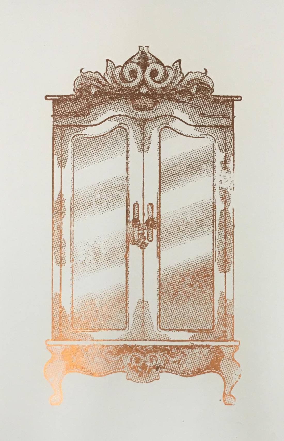
  • Experimented with different printing methods – screen printing, and adding foils, etching, Linocut, laser cut plate.
  • I’ve chosen that I want to create the rest of my illustrations with the laser cut plate technique as I feel I had gotten the cleanest results.

Still to do:

  • Create the other illustration with the printing method.
  • Possibly edit the outcomes digitally.
  • Mount them.
  • Evaluate the final products and project as a whole.


Inktober

  • I have completed the challenge, creating 31 illustrated characters for each day of October.
  • I have fixed or edited the designs digitally. Compiling them all into a zine format.
  • I’ve experimented with different forms of printing – through the colleges normal printer, reprographics and creating some on the zine.
  • With the finished products, I have begun to sell them online.

Still to do:

  • Write up some of the days – I have written them up on this blog, however, I feel I need to write them more formally and with much more information, for my actual project.
  • Write up the experimentation with printing methods. Opinions of the different outcomes of the zines.
  • Evaluate the final products and project as a whole.


House of Illustration – Howls Moving Castle

  • Read the book, highlighting areas and quotes that I could possibly illustrate.
  • Created sketches from the quotes.
  • Narrowed down my selection and had drawn thumbnails.
  • Narrowed down my selection yet again, so that I was left with 3 potential illustrations and 1 potential cover.
  • Started sketching the thumbnails digitally.

Still to do:

  • Write up artist research.
  • Refine the digital sketches with traditional line work.
  • Scan in the line work.
  • Colour digitally and potentially add a textured overlay.
  • Write up all of the progression, thoughts and opinions throughout.
  • Mount/submit the final designs.
  • Evaluate the final product and the project as a whole.


Penguin Illustration Awards

  • Read the children’s book – Wonder by R.J.Paolo
  • Read the adults fiction book – Norwegian Wood by Haruki Murakami.
  • Have thought about the imagery I could potentially illustrate for both of the books.
  • Have thought about the styles I could potentially use.

Still to do:

  • Actually start the project, not next week but the one after.
  • Write up research – from the books and potential artists/styles I will be using.
  • Form a mind map/mood board of potential imagery I could create.
  • Create 3 thumbnail sketches for each book.
  • Refine my choices and refine the designs digitally.
  • Choose which concept I think is best, possibly refine it more if needed.
  • Write up progression, thoughts and opinions throughout the project.
  • Mount and submit the final design.
  • Evaluate the final product and the project as a whole.


Long-Term Targets

  • Get better at time management. Thinking more practically, how long will it take me to work on a project, then follow my timetables as efficiently as I can.
  • Draw more full-length bodies. Over the year I feel I have gotten better at drawing faces, however, I do still struggle with the anatomy of the body, so I do wish to practise more in the future.
  • Boosting effort levels, getting rid of that ‘it’ll do’ attitude. I believe this can be done by just taking a break from my work then going back to it again with a fresh mindset, ready to make further improvements, as opposed to just being sick of the piece and wanting to just get it out of the way. I don’t think this can be done overnight, hence why it is in my long-term goals, as I feel in a way I will have to train my mind to do this more often, especially during future projects, in college and out.

Norweigan Wood – Review

For the Penguin Student Design Awards, I have been reading two books, one for the children fiction category and one for the adult’s fiction. The one I am about to review (or attempt to) is called Norweigan Wood by Haruki Murakami, and it is the adult fiction book.

Just a bit of pre-warning, I don’t know how to review books properly, as I don’t know how to give my opinion and explain what the story is about without giving away too much information or potential spoilers. Technically, I don’t know why I keep writing these reviews, but hey ho, here we go! POTENTIAL SPOILERS WARNING AHEAD!

Norweigan Wood is a story about a character named Toru Watanabe, who looks back on his younger/student days in Tokyo in the late 1960s. I believe the story is based on romance, but as opposed to a typical ‘boy meets girl’ scenario, the story does go more into depth with the complexities of relationships and life itself, discussing emotions and struggles between the characters etc. The story does contain some very sexual moments, but this was not my take away from the book as I feel it was more about the main characters daily life, his struggles, his connections between characters and things like that, as opposed to it just being an erotic novel, it had more of a storyline which by the end, I did feel quite invested in.

My initial thought about this book, as it is fictional, I had thought it was going to have more fictional themes, like fantasy or sci-fi, or anything along those lines, so whilst reading through the book, I could feel myself making assumptions of the direction I thought it could take. At one point, I did think that the girl he was interested in was going to turn out be a robot, but this was not the case and I do kind of feel bad for thinking so. Instead, the book was based on reality, set in the real world with characters you would think were real at some point, a world without robots, at least not ones that were mentioned? or any fantasy creatures, or ghosts or aliens or anything or the sort.

At the end of the story, there was a section which had explained that although the author Haruki Murakami has made more fantasy inspired books in his time, parts of this story were autobiographical in a way, as the author would be taking inspiration from his own days as a student. But although this story had some fans of his previous work questioning the more realistic themes of this one, he had explained that it was a challenge for himself, as real life is so complex but does have a simplicity to it, it has so many emotions and integrating parts to it, so I would imagine that it would be hard to make all of those elements seem simple, like ‘yes this book is based on the realities of life’ to the reader. So, in comparison to writing one of his other books, Murakami had found Norweigan Wood was the most challenging.

As I had mentioned, I did end up becoming quite emotionally invested in this book, with the characters day to day life, the emotions, experiences, thought process etc, so when I had finished, like with Howls Moving Castle, you can read my review of that here, I felt lost, it couldn’t end like that! I wanted to know more, what else happened to the character after the story finished, I did feel frustrated that I couldn’t follow him on his journey through life anymore.

I would recommend this book to a friend. If they don’t like the idea of the sexual themes and moments within the story, I would just tell them that I felt the actual story was worth the read. I feel the author has done an amazing job at capturing the reality and complexities of life, and he was able to explain them in such a way that was easy, readable and understandable. In a way that sucks you in and makes you feel emotionally invested to the characters journey.

Vistaprint Review

In May/June of this year, for my end of year exhibition, through Vistaprint, I had created a portfolio book and a set of business cards.

Although I have had a change of heart with the design/pattern of the original business cards and the cover of the portfolio book, I do not believe that was the fault of Vistaprint, as I actually loved the quality of my products, and the time in which it took to deliver the items was quite efficient. Vistaprint are specific on their website about their delivery times and for me, the estimated delivery dates were spot on.

It was from my experience with this company, (and the enticing black Friday sales) that I had wanted to use the site again, as to order new business cards. I had also checked out a company called ‘Moo’, as suggested by one of my tutors, but when comparing prices, at that current time, Vistaprint was cheaper for the quantity of product I was getting. I believe with Moo, I could get 50 for the price of £15, whereas on Vistaprint I could get 100 for the same price, this including the extra price for the design on both sides. 

If anything, when designing the product on the layout of the website, I wish you could zoom in to see for yourself if the quality of your image is good or not, rather than the site just saying ‘this image is good quality’. I believe if I was able to do this, I would have been able to see that the original business cards I had created in May/June, were a bit blurry in the text, and I may have been able to make changes at that time, as opposed to ordering them then noticing the problem after it was too late. However, I probably still would have fallen out of love with the overall design, so it’s all good.

Review of the product.

My business cards have arrived, 3 business days after ordering them; I had ordered them on Friday night, the 23rd, and the delivery date was estimated to be for the 30th, but they have come today on Wednesday the 28th, so I have had good experiences with their deliveries, both with this order and my previous. I believe the delivery times do change depending on the item you’re expecting, for instance with my last order, I had ordered both my cards and book at the same time, but the cards had arrived well before my book, but I do feel they are good with their estimated times, if not better as shown by my early delivery today.

I was so nervous to receive these cards after my previous experience, but when opening the box, the quality is SOOOO much better than my last business cards! This just proves to me that it was just a problem on my side, with the quality of the image within my last set of business cards, as opposed to the problem coming from the companies end.

Now looking over the card, if I can nitpick at anything, I would say that the black and grey tones have come out a bit warmer than I had intended, but its not a huge problem in my eyes, it would have been more annoying if it had only happened in a specific area, or only on one side, however as it is the same throughout and on both sides, there is more cohesion to it so it is less noticeable.

Personal opinions (Not concerning the company)

I am absolutely IN LOVE with the results of these prints! I feel in comparison to my previous business cards, it is much more simple, minimal and professional, but still shows my work and what a potential client can expect from me. I feel with my old business cards, they were a bit too overpowering and did not really show my work within the design. Although yes, I did create the pattern, I do not feel it was visible enough for someone to say ‘ooh yes, I like this person’s work’, so I do like these new cards, as it is almost like a product in itself.

In the past, I have collected other artists business cards, as it is still a piece of their artwork, so I feel in a similar way, if someone were to take my business card, they could potentially want to keep it, as it is a piece of my artwork in itself, even if it is smaller than my average print.

I feel I will be much more confident to give people my business cards now, as I am more happy with the design and quality of the imagery, whereas I was a bit more embarrassed to give away my cards previously, as I was less proud of the design and the text did have a slight blur, so I did not feel as if it were the best representation of myself.


Howls Moving Castle – Review

SPOILER WARNING! Possibly? If you have not read the story or have not seen the movie, there could potentially be spoilers within this blog. There may not be, but the warning is there just in case!

After finishing this book I have found that I have personal issues with letting go. I loved this story so much that I just wanted it to keep going, I wanted to know what else happened, even if it was just following the characters day to day life. This book had me well and truly hooked, and I’m sad that it is over and I can’t read onwards.

I had also come across this issue when watching Bohemian Rhapsody, I have become so drawn in by the people and the story, that I want to find out more about Queen and the members, especially Freddie, I just want to know more of their story, I want to know everything! I went to see the movie on Halloween, and since, I have been watching old interviews or documentaries, or interviews from the cast of Bohemian Rhapsody, etc, pretty much on a daily basis, it’s becoming a problem. If you haven’t seen the movie, I would definitely recommend!

Anyways, moving away from my tangent and getting back to the review at hand, I loved this story. I was going to try explaining the story, but I could not find the words to do so, to do it justice, or not give away too much of the story, so quoting from the book’s blurb by Diana Wynne Jones:

“In the land of Ingary, where seven-league boots and cloaks of invisibility really exist. Sophie Hatter attracts the unwelcome attention of the Witch of the Waste, who puts a curse on her. Determined to make the best of things, Sophie Travels to the one place where she might get help – the moving castle which hovers on the nearby hills.

But the castle belongs to the dreaded Wizard Howl whose appetite, they say, is satisfied only by the hearts of young girls” (Diana Wynne Jones, 2009)

The book managed to suck me in, not with the battles between Howl and the Witch or Sophie and the Witch, but more within the simplicities of the everyday happenings within Sophie’s life, because there was always something new happening, whether it was her conversations with Michael, Calcifer or even her disputes with Howl, there would always be a new interest within that day, whether Sophie was (SPOILERS?) jumping from place to place with seven-league boots, accidentally growing Howls suit too long,  getting lost around Kingsbury, the list just goes on and it is what I believe made the book so much fun to read, the battling with the Witch was just a bonus.

The book is different from Studio Ghiblis adaptation, although I did personally enjoy the book more, as I felt I learnt more about the characters than the movie had given, I do believe they are both amazing in their own rights.

DEFINITE SPOILERS AHEAD!

There have been changes made in the process of turning the story into a movie, some more obvious than others such as:

  • Studio Ghibli have definitely added their overall aesthetic to the movie, such as
    • the appearance of the characters and the castle. In the book, I believe Michael is supposed to be older, whereas, in the movie, Markl seems quite young, but does disguise himself as an older wizard a lot.
    • the castle is a lot more creature looking within the movie, with elements that could suggest eyes, a mouth and possibly wings, whereas the author had described a more typical castle, which is blockier with turrets and chimneys etc.
    • the Witches henchmen have a more blob-like appearance, they do not have faces so it is quite creepy.
  • The theme of war is more present within the movie. According to an interview at the end of the book, the author had said that this was Miyazaki’s influence as he “crammed the story full of flying machines and war scenes” which was based on a brief mention of war from the king in the story. This explains why:
    • Howl is more part of the war. He is more heroic in this adaptation, as he did seem quite cowardly within the book, not really wanting to work with the king.
    • Although the witch is still a threat in the movie and does still kind of do what she had intended within the book, I believe the King is more of a threat that the characters worry about, as the king wants Howl so that he will turn into a beast and fight in his war.
  • There was also a change with where the black door led. In the movie, it was to a memory of Howls childhood, whereas in the book, the door led to Howls family’s home in modern-day Wales, which REALLY took me by surprise. From the movie, I was not expecting it at all, and actually enjoyed discovering more about Howls life and his family.
  • Sophie’s magic in the book was not really present in the movie? She had the ability to talk to objects to give them power, for instance, her cane had a protection charm which had kept her safe and helped her in defeating the witch.
  • The girls family wasn’t really a big part, although you briefly met Lettie within the bake shop, it did not really go into depth, talking about how she had two sisters, Lettie and Martha, who were both sent to do different apprenticeships, one in a bakery, the other being trained in magic, but they swapped places, so that Martha was the one in the Bakery, and she was actually in love with Michael.
  • The scarecrow was waaaay more friendly in the movie, whereas, in the book, he terrified the characters, and even made Sophie’s old heart shiver.
  • As I have mentioned, the Witch was not as much of a threat, but Howl was not being chased or running away from a curse sent by the Witch that would potentially catch up with him. The Witch actually seems more weak within the movie, so it makes sense when Sophie takes pity on her and takes her in, not due to better judgment.

These are just some of the many changes from the book to Studio Ghiblis adaptation of it, but I am in no way saying that one is better than the other, because although you may have more information from the book, Studio Ghibli has given such a beautiful visualisation of the characters and scenery etc, for instance, you are actually able to see Sophie’s age changing throughout, and see what howl can see, whereas, in the book, you just find out that he has known about her curse the whole time.

If you have not read the book or have not seen the movie or both, after reading all of my spoiler warnings, I definitely would recommend doing both. If you have read the book but not watched the movie, do it! If you have seen the movie but have not read the book, do it! Both are so amazing in their own right so I would not recommend one above the other, you should just watch and read both!


Bibliography

Howls Moving Castle. (2004). [Film] Directed by H. Miyazaki. Japan: Studio Ghibli.

Jones, D. W. (2009) Howls Moving Castle. London: HarperCollins. Blurb.

Jones, D. W. (2009) Howls Moving Castle. London: HarperCollins. Anime and Author.


Foiling

Following yesterdays class and blog post about screen printing, in the class, we had also learned how to foil your designs using that method, but I wanted to make a separate post about it as I have also used another technique for foiling in the past and wanted to discuss and compare the two methods.

Screen Printing

In yesterday’s blog post I did discuss the process of creating the screen and printing with it, so if this is something you are interested in or would like to know more about, please click here. So, following this process, instead of using printing medium, we used glue instead. By doing this, you did have to be more thorough with the cleaning of your screen, washing it as soon as possible because if you were to leave it to long, it could potentially dry and clog up your screen, making it unusable. Once the glue was printed onto the page, you would then choose a foil, which had come in multiple colours and tones, but for my piece, I had chosen to use a copperish colour. You would then place a sheet of your chosen foil over the glued sections, the colour/reflective side facing upwards, then sandwhiching the page and foil inbetween sheets of scrap paper, you then put it into the heat press for 30-60 seconds. Once you have removed this sandwich from the heatpress, wait for it to cool down slightly, then when you peel away the foil, it should have stuck to the glue and should reveal your design underneath.

50489412_309963246296030_8504261388993036288_n

Using a normal printer.

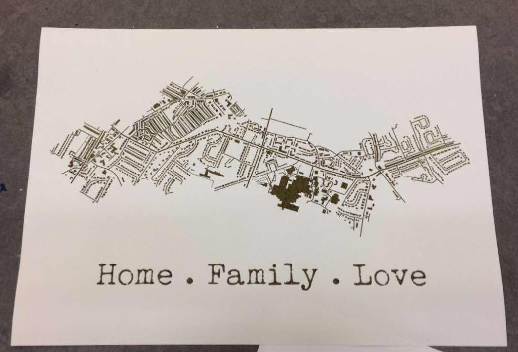
A while back, I had decided to make my mam a present which was based on a map of the areas where she has lived in her life. I had seen places online like ‘Not on the Highstreet’ doing this with a foiling effect, but instead of paying quite a bit of money for it, I decided I would just try to do it myself instead, using the facilities available to me within the college. At that time, I had no idea how I would go about making this effect, so I had gone to see Steph within the print room for her advice. She had suggested a technique where you would just print out the line work using a normal printer, then the foil would stick to it when under the heat press. So, after creating my line work, I printed it out onto a sheet of good paper with the normal printer in her room, I cut a sheet of foil which was big enough to cover the area of the design, then again, sandwiched the page and foil between sheets of scrap paper and placed it into the heat press for 30-60 seconds. Once done, I removed the foil and it had stuck down to the areas that were black in my design.

51424072_292910317950644_7496476359850459136_n

My opinion.

Although using the normal printer was a lot more efficient on time, and was a lot less messy as you didn’t have to worry about glue and cleaning screens etc, it did give a more subtle effect, as the foil appeared to be more crackled as opposed to full like I had achieved with the screen printing method. Overall I did have good experience with both techniques, however, if I were to use it again within my work, these would be factors that I have to consider, would I want the effect to be more subtle and still be able to make out the black line work underneath, or would I want the effect to be more solid?

All images are my own unless stated otherwise. Appologies that they may not best show the reflective qualities of the foil, I was going to upload a video, however this site thought otherwise. 

The Lion, the Witch and the Wardrobe – Review

As a personal project, I wanted to illustrate the story of ‘The Lion, the Witch and the Wardrobe’ by C. S. Lewis, as on screen it was a childhood favourite, and I always had the chronicles of Narnia in my cupboard but never actually read it (or don’t recall ever reading it, it did seem to be bigger when I was little so probably scared me). But as I had never read it, I wanted to see if there were any differences from book to the screen adaptation like there is in many book adaptations nowadays, and I planned to illustrate the original story as opposed to the imagery I already knew from the movies or the very dated BBC version.

When actually reading the book, I was surprised but not in a good way. The story is very brief in its descriptions and I was disappointed in the lack of detail that was given, because since I didn’t want to work with the imagery I already knew, I was leaning on the details to give me a better vision of the scenery or characters so that I could interpret them in my own way.

In this case, for once, I had felt the movie and even the BBC program adaptation of the story was more detailed than the book and did give better visuals.

It was, however, an easy read, so would be better suited to a younger reader, so I could possibly be overanalysing it due to my age and level of reading.

When I think about other adventure/fantasy books that I have read, I like to compare this book against J. R. R. Tolkiens Lord of the Ring series, as where C. S. Lewis has next to no detail, on the other side of the spectrum Tolkien almost goes too much into detail in his descriptions, to the point where I did get a bit bored when reading. In C. S. Lewis’s case, it was an easy read but I feel the visuals it gave were basic and it almost seemed too fast-paced in a way.

With this book, I will try to take as much from the descriptions as possible, but I will probably illustrate more from my imagination or create a mood board to help me flesh out the visuals to my ideas.

In conclusion, ‘The Lion, the Witch and the Wardrobe’ is probably better suited to a younger reader, but I still feel it definitely lacks in detail and the movie, for once, was better than the book.