Input-Output – Illustrated Diagram

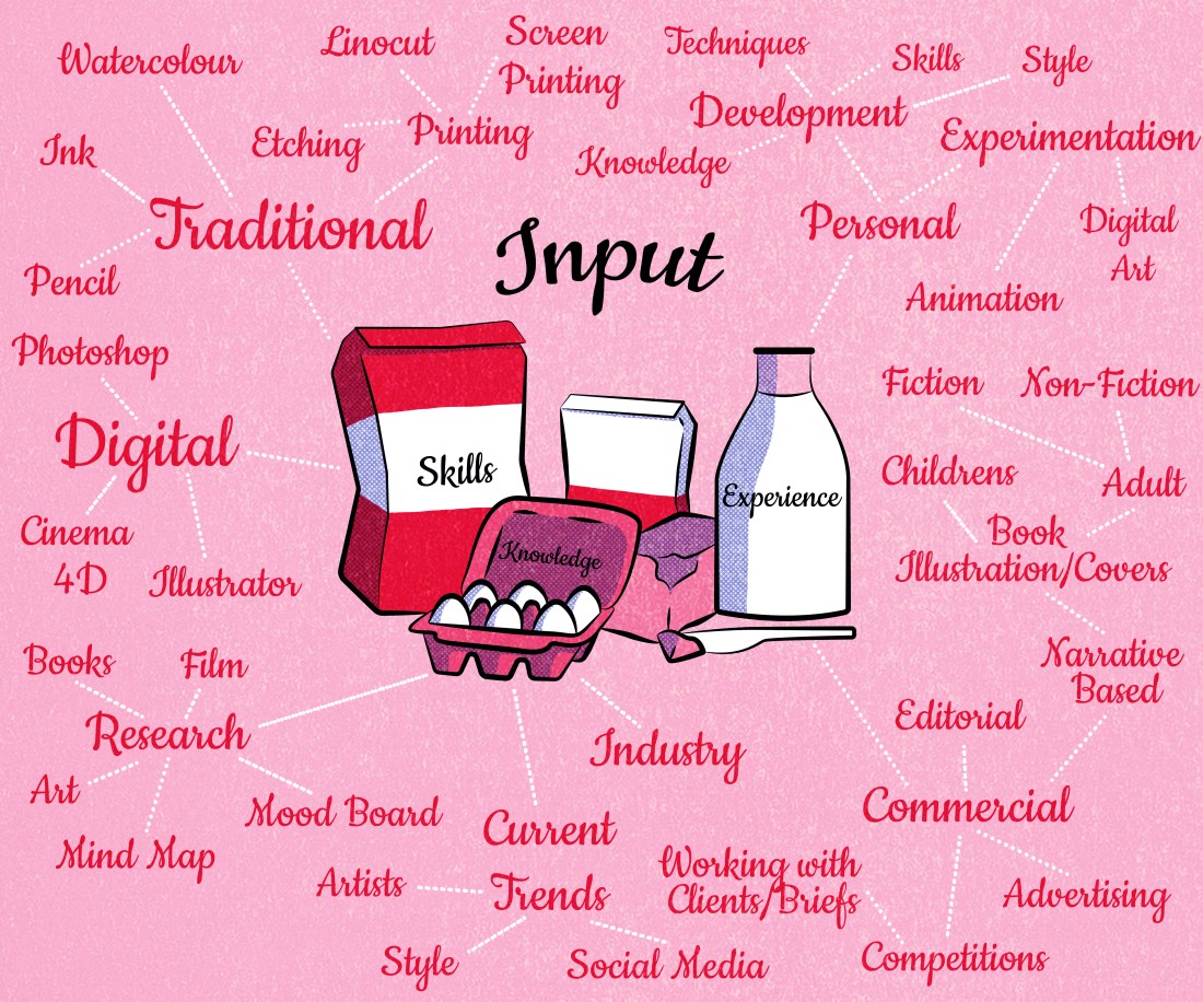
As a task, the class was asked to reflect on themselves and their workflow, thinking in terms of an input and output system. We had to think of what goes into our work, i.e skills, research, experience etc. And then think about what all these elements allow me to create within my work, so this relates to my business, creating a product, selling that product, branding, socialising, promoting myself and so on.

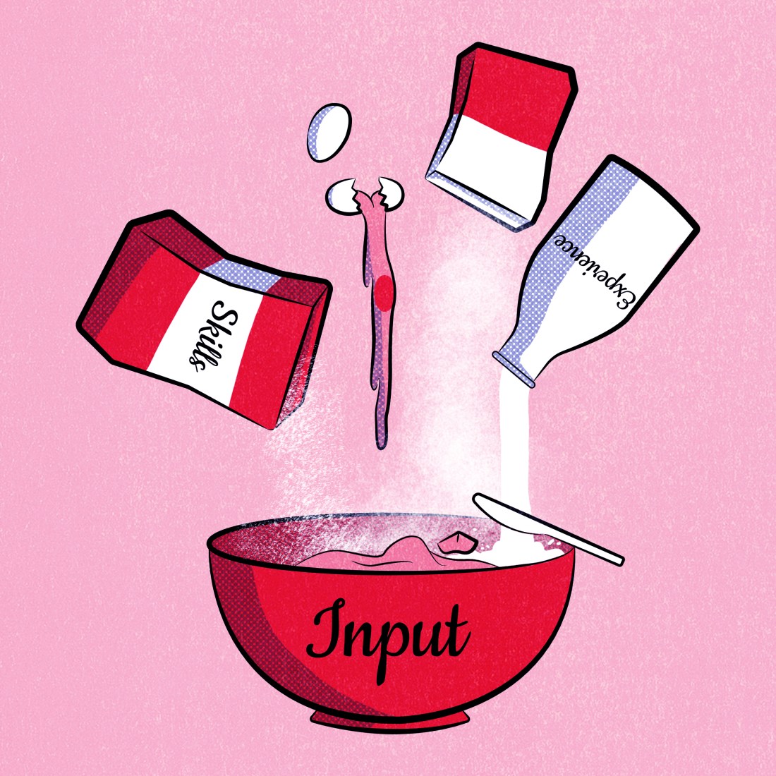
Once we had thought about this, we then had to create a diagram. As of the Illustration we were to think about imagery that worked in a similar way, meaning that it would have an input and output system. When I got told about this theory, my first thought was of Cat in the Hat, how they had the ‘KUPKAKE-INATOR!’ in which you could make cupcakes out of anything!

“Anything?”

“Yes anything!”

“Anyythiing?”

“I’ll get you and it’ll look like a bloody accident!”

(Cat in the Hat, 2003)

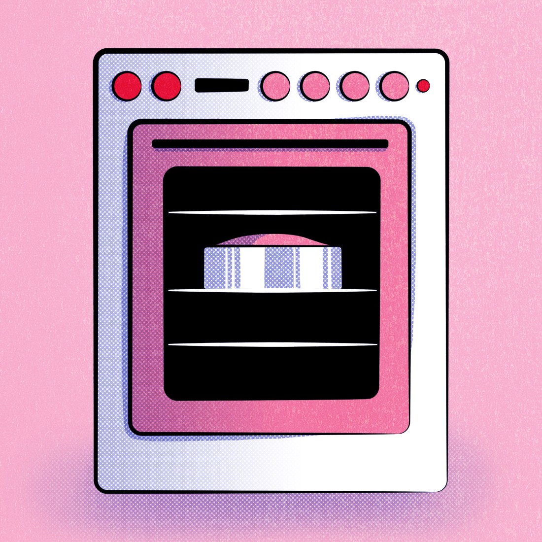
So, in my head, I imagined the input going all into a machine, then the output becomes the amazing cupcakes in the process.

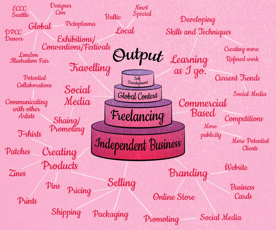
This idea had developed through the drawing phase, but the concept was still the same, the ingredients are all the elements in which go into my input, then the final cake is my output, each layer dedicated to a specific area in which my workflow leads to.

inputinge=redoutputsovenoutput

For the input, the main influences within my work process I believe come from my skills, knowledge and experience. Each of these elements can link back to one another, like how my knowledge can grow from the experience, more experience can help improve on skills, etc. From each of these elements, however, I have expanded on them, showing more detail of what factors go into my work.

With the output, I have categorised things that are produced from my work, and have separated them into layers of cake, the bottom is my small business that I wish to expand on, which includes all of the elements that would go into that, such as branding, selling, packaging, promoting myself, and actually creating the product I would sell. The next is based on freelancing, which I would associate more as a commercial side of my work, as I would be working more one to one with a client/brief. The third layer is based on a global context, i.e. where I could potentially show/sell my work, but it would also mean connecting more with other artists and businesses on more of a global scale. This could be done either through social media or travelling around the world to events like pictoplasma, or even going to conventions like Designer Con, which a few of the artists I follow attended last year.  The final layer is Self Development, as I do always try to improve on my work with every piece, whether its trying new techniques, playing around with colour pallets, or experimenting with current trends. I have actually tried to do that with this diagram, as I believe the colour halftone effect is quite popular at this moment in time due to the release of ‘Spider-man: Into the Spider-Verse’, so have tried to incorporate the pattern within the shading.


Bibliography

Cat in the Hat. (2003). [film] Directed by B. Welch. Universal Pictures.


Organisation Method

This week, my boyfriend had gone to therapy and had come back with information he felt I could find useful too. In these sessions, they discuss ways in which you could overcome stress, and in this weeks, they were talking about ways in which you could plan out your day/week/month more efficiently, in order to help become more organised, which would hopefully result in less stress. As I had struggled a lot through semester one with my timekeeping and organisation, my boyfriend felt that what he had learnt could be very helpful for me within the second semester.

He had been taught a method which I believe was mentioned in a book called Eat that Frog and is called the ABCDE model. With this, you write out a list of everything you need to do, again, this could be over the space of a day, week, month or even a year, but once you have your list, you then start to categorise each of the tasks according to which is more of a priority.

A is a task of highest priority, one that you need to do or will risk big consequences. If there are multiple tasks which fall into this category, you then label them A1, A2, A3 and so on. Within the method, these tasks are known as the frogs.

B is a task which you should complete, but the consequences are slightly milder than with A tasks. These are referred to as the tadpoles because although they are lesser than the frogs if you leave them too long, they will turn into frogs.

C tasks are ones that are nice to do but don’t necessarily have any consequences to them. I see this as being a task that I would prefer to be doing as opposed to A and B’s, but should not as they are not on the top of my list of priorities.

D tasks are ones that you can delegate to someone else. This one may work better in terms of life tasks, as opposed to work tasks as I do mainly work by myself, so don’t imagine being able to delegate my work to anyone else.

And finally, E tasks are ones which can essentially be eliminated from the list and no difference would be made. According to the method, this could relate to a task you wanted to achieve at a specific time, but you feel it is no longer an issue.

The method does go on to discuss rules, but these fall along the lines of only working on the tasks in order, for instance not working on a B task before an A, or a C task before a B. It also mentions that self-discipline is the key to following the method, making sure that you are seeing all of the tasks through to the end, in exact order from A all the way to C.

I do like the sound of this method and do plan to use it throughout the second semester, as I feel it could potentially help me a lot, keeping me organised and hopefully less stressed, as I will have a better visualisation of my priorities and things I have to achieve. I will try creating a list for the day, a list for the week, and a list for the overall project. By creating one for the whole project I feel it would be more brief, but when getting to the day to day tasks, they will be more direct and specific as to what I need/want to achieve on that said day.


Bibliography 

Tracy, B. (2001). Eat that frog!. The ABCDE Model.


Evolution of the Cat

2016 – Arya and Tilly

chriiiiiiistmas

2017 – Percy

tk2

2018 – Labyrinth

labyrinth4

2019 – Trixie and Mia (COMING SOON)

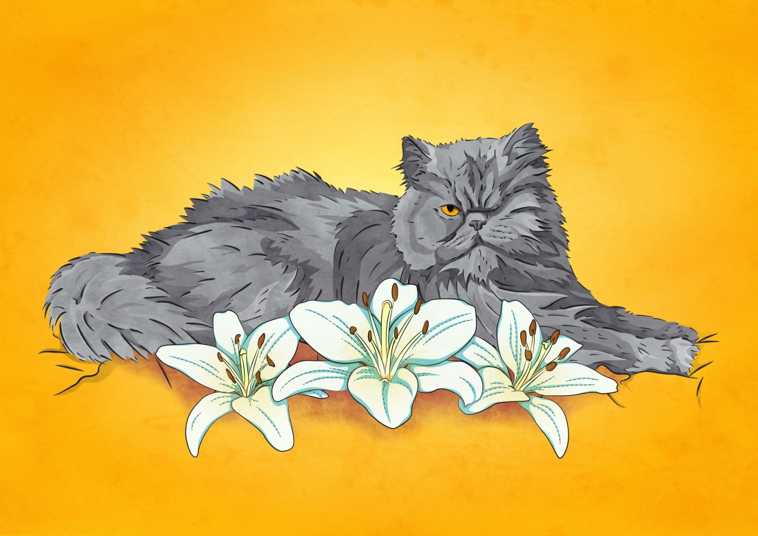
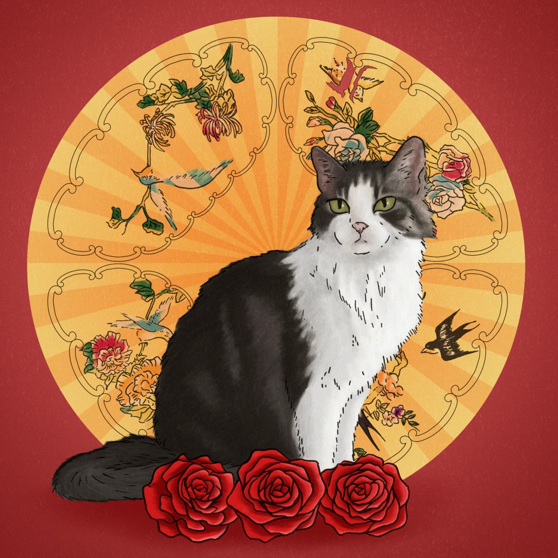
Over the past 3 years, I have created a cat portrait per year, and have already planned another which will be a commisioned piece at the start of next year, for my boyfriend or his family.

As the pieces have had some time between one another, I feel you can somewhat see the growth of my style from piece to piece, so I wanted to show that within my blog. In the first, I was starting to use a cel-shading method a lot in my work and this piece was quite experimental, as I still wanted to use the style, but did not want the cats to look flat, so decided to play around with some textured brushes. In the second piece, I have used a similar method to colour, but I feel it does look a lot softer, and I have built up separate layers of colour as to give the cat a fluffier appearance.

Now, looking at the illustration I have recently created, I feel as I have been experimenting more with digital painting, and I have been inspired by artists such as Ana Godis, following her process etc, in this design, I have moved away from the cel-shading style, creating a more blended and somewhat more realistic illustration. By doing this technique, I don’t want my work to become too airbrushed which is how I feel a lot of digital paintings can look, so to try battle this, I tried to use brushes that would give the design texture and could give it a more realistic look, as opposed to looking too smooth and somewhat flat.

I like being able to see all of these illustrations together as I feel they do show my progression within my work. I feel since they are all cats, you are able to see my skill development better, but since they are different types of cats, some with shorter hair, some with long and each with their own individual patterns, you can somewhat see my thought process, what methods I may have used to give the impression of the length of their fur as I have made each of them unique in themselves, I have not just stuck to one formula of ‘THIS IS THE METHOD YOU HAVE TO USE’ I have experimented with each of the cats/designs.

Although I plan to start working on the next illustration on the 15th of January, the day after my deadline, and that is not too far off the time that I have created my most recent piece, I am excited to experiment with the new cats, seeing how best to create their fur, patterns and feature etc.

If you are reading this blog, and like my work, and you do have your own pets or know someone who might want an illustration of theirs, feel free to comment down below, or contact me through Instagram @Melon.rMy college timetable may be an issue, but I would be willing to work with you, to figure out a timeslot, if you were to commision me.  

The week from Hell.

Due to my incapability to follow my own timetable, which I had even reorganised after not managing to follow it the first time, this week was supposed to be the last week I had given myself to work on the House of Illustration, Book Illustration Competition, in which I had to create 3 illustrations and a book cover for the story ‘Howls Moving Castle’ by Diana Wynne Jones.

Instead, for the majority of this 3-week project, I spent a lot of time trying to catch up or finish off previous projects that I had fallen behind on. I also decided to work on an illustration which would be a gift for my boyfriends mum. This was supposed to be completed and printed for her birthday in September, but as we all know by now, I can’t follow my own time plans! So I said I would give it to her for Christmas instead, not that she knows (a blog post for this piece will be coming soon). So, the time I should have been spending on this project had been spent on others, but I refused to fall behind on the project starting next week, so I decided I had to finish this one by today!

In what should have been one week of researching, one week of creating concepts and experimenting and the final week creating the final design, I have basically had to do all of this in the space of a week.

When creating my pieces, I didn’t really have an idea of styles or techniques I was going to use, I had thought about artists, but I hadn’t thought about potential ways in which I could apply the styles or techniques to my own work, so basically in the process of creating my pieces, I have just been winging it, seeing “does this thing work? No, not really, scrap it! Does this? Okay, we’ll just roll with it”. I had kept doing right up until now.

I am currently happy with these designs, but I would say I do still need critique and outsiders perspectives so that I can potentially make further improvements. At this moment in time, however, I still have a lot of work to complete within other projects so this one may have to fall to the back of the pack. Because of this, I may not end up submitting my designs to the competition, as I’m not sure if it fits the standards of previous entries in the years before, especially not without further refinement. And since the competition does have a fee to enter, I feel it could be a waste of my money.

Even if I don’t submit these design to the competition, I will still include them in my portfolio, as through this project, I have been able to show more skills with narrative, and I have created more landscape designs, two areas of which I felt were lacking in my portfolio.

SO, what have we learnt from this post? I am my own worst enemy and I only have myself to blame! From this experience, I will strive to keep myself more organised and actually follow my own set time plans. I believe this information will be very important for when starting next semester, as I will try to plan out my time better, using my experience from this first semester, as I feel I will have more knowledge of my pace of working and what I am capable of doing in specific timeframes.

Vistaprint Review

In May/June of this year, for my end of year exhibition, through Vistaprint, I had created a portfolio book and a set of business cards.

Although I have had a change of heart with the design/pattern of the original business cards and the cover of the portfolio book, I do not believe that was the fault of Vistaprint, as I actually loved the quality of my products, and the time in which it took to deliver the items was quite efficient. Vistaprint are specific on their website about their delivery times and for me, the estimated delivery dates were spot on.

It was from my experience with this company, (and the enticing black Friday sales) that I had wanted to use the site again, as to order new business cards. I had also checked out a company called ‘Moo’, as suggested by one of my tutors, but when comparing prices, at that current time, Vistaprint was cheaper for the quantity of product I was getting. I believe with Moo, I could get 50 for the price of £15, whereas on Vistaprint I could get 100 for the same price, this including the extra price for the design on both sides. 

If anything, when designing the product on the layout of the website, I wish you could zoom in to see for yourself if the quality of your image is good or not, rather than the site just saying ‘this image is good quality’. I believe if I was able to do this, I would have been able to see that the original business cards I had created in May/June, were a bit blurry in the text, and I may have been able to make changes at that time, as opposed to ordering them then noticing the problem after it was too late. However, I probably still would have fallen out of love with the overall design, so it’s all good.

Review of the product.

My business cards have arrived, 3 business days after ordering them; I had ordered them on Friday night, the 23rd, and the delivery date was estimated to be for the 30th, but they have come today on Wednesday the 28th, so I have had good experiences with their deliveries, both with this order and my previous. I believe the delivery times do change depending on the item you’re expecting, for instance with my last order, I had ordered both my cards and book at the same time, but the cards had arrived well before my book, but I do feel they are good with their estimated times, if not better as shown by my early delivery today.

I was so nervous to receive these cards after my previous experience, but when opening the box, the quality is SOOOO much better than my last business cards! This just proves to me that it was just a problem on my side, with the quality of the image within my last set of business cards, as opposed to the problem coming from the companies end.

Now looking over the card, if I can nitpick at anything, I would say that the black and grey tones have come out a bit warmer than I had intended, but its not a huge problem in my eyes, it would have been more annoying if it had only happened in a specific area, or only on one side, however as it is the same throughout and on both sides, there is more cohesion to it so it is less noticeable.

Personal opinions (Not concerning the company)

I am absolutely IN LOVE with the results of these prints! I feel in comparison to my previous business cards, it is much more simple, minimal and professional, but still shows my work and what a potential client can expect from me. I feel with my old business cards, they were a bit too overpowering and did not really show my work within the design. Although yes, I did create the pattern, I do not feel it was visible enough for someone to say ‘ooh yes, I like this person’s work’, so I do like these new cards, as it is almost like a product in itself.

In the past, I have collected other artists business cards, as it is still a piece of their artwork, so I feel in a similar way, if someone were to take my business card, they could potentially want to keep it, as it is a piece of my artwork in itself, even if it is smaller than my average print.

I feel I will be much more confident to give people my business cards now, as I am more happy with the design and quality of the imagery, whereas I was a bit more embarrassed to give away my cards previously, as I was less proud of the design and the text did have a slight blur, so I did not feel as if it were the best representation of myself.


Melon and Lime Comics – Biggest Fan

This comic is based on a recent event, in which I had gone to see Liam in a play called ‘Education, Education, Education’. He had performed so well in this play, making everyone laugh, there were even moments when myself and his sister couldn’t stop laughing, sometimes at inappropriate moments, which we had apologised afterwards, but I was so proud of him and said so in detail after the play, in which he replied with a simple ‘Thank you’.

It has been a concept of ours for a while to create a comic about our talents, but we could never think of a way in which best to design it so that it was not too cringy or too braggy about ourselves.

So, with this comic, I had shown my experience with his show, then compared it to when Liam had come to my exhibition, which I believe was a similar experience but roles were reversed, him being proud of me, and my response of a modest ‘thank you’.


I did have worries if this comic would fit within our work, as it is not as humorous as our previous comics have been. However, Liam had reassured me that our comics our about relatability, and shows that as a couple we do support one another, we are essentially each other’s biggest fans, which I agree that other couples would be able to relate to.

When designing this comic, I did have struggles with anatomy. Although our characters are more cartoony and not exactly anatomically correct, I did struggle with certain poses, especially in the 3rd and 6th frame, trying to express the emotion of excitement and modesty/shyness of the characters. I believe I did get the characters to a place that I’m ok with, but anatomy and poses will definitely be something that I will have to work on whilst producing these comics, as I do want my characters to be able to communicate a specific emotion from their poses, as well as their expressions.

If you enjoy this comic and would like to see more, please have a look at our Instagram @MelonandLimeComics, we appreciate any likes or follows that we get! I have also made a couple of blog posts about some of the newer comics, so if you would like to know more about the thought processes behind them, and how they have come to life, feel free to check those out too. Thank you!

Business Cards

From the pressures of Black Friday, and with the desire to make new business cards, as I can’t find or remember where the last ones are, and the fact that I had ended up not really liking them when comparing them to the rest of my classes, they did match my portfolio book, however by themselves, the pattern was a bit busy and over overpowering in a sense, I decided to take this opportunity to design new business cards, and potentially get a good deal for them.

Recently, I had seen an artist I follow on Instagram, by the name of @Imzeferino post an image of her new business cards, and I had really enjoyed the layout of them.  As shown in the images below, she had created a character, which may be a representation of herself, on the front of her card and had put all of her information on the back. I like the idea of this, as her business card is so beautiful that it is almost a print in itself, so when people receive her work, they would also receive the business card, which in my mind, would be like getting two prints for the price of one, even if the second is smaller.


business cards woman

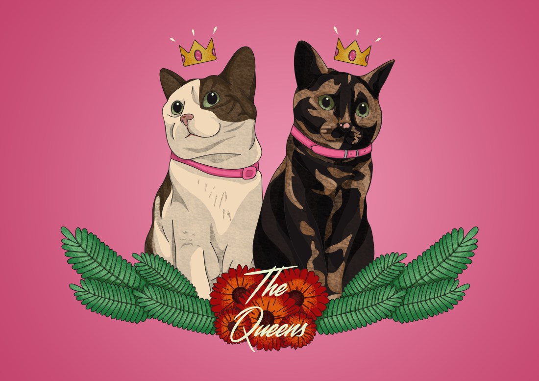
So taking inspiration from this layout, I tried choosing one of my own designs, that could be the best representation of my work. I had initially planned to use one of my queens, click here to see which, but I could not seem to fit her correctly into the template I was using, and I had started to lose faith in her, whether she was, in fact, the best representation of myself and my work. So back to the drawing board, I decided that I would use a different design, one which I am quite proud of, which I have not seemed to get sick of as of yet. I am talking about the piece to the right, which I had initially designed to go on the window inside of my classroom, using a vinyl, but as that was a representation of my work during the exhibition and will be until it is taken down, and as I have not fallen out of love with it yet, after seeing it in class for the past however many weeks I have been back at college for, I decided it will be a good motif to use for my business card.

When first designing this, using the templates on Vistaprint, (review possibly coming when the business cards arrive?) due to pressures of the Black Friday sales, as I had started this process on Wednesday night, I did partially rush the process, basically only using sources available to hand, as opposed to putting some actual time and effort into the design, which I do regret now looking back, but I have gone back into the design and refined it further, putting the actual time and effort into it, as I should have done in the beginning, so, as the woman did not need much work, other than positioning her on the layout, I tried taking shortcuts with the back of the card, using the fonts available from the website for the titles, and for the social links I had tried to take the ones I had hand-drawn for my inktober zine, which were pretty rough but at that time, I just thought ‘it’ll do’.


I am so glad that I had decided to get a second opinion the following day, however, as there was a lack of effort within the design, and I believe it would have been visible if I had sent them off, which would not have been a good selling point to potential clients, for them to see that if I can not put the effort into my own branding, why would they want to hire me. So, my second opinion had come from my tutor Laura during a one to one, who had suggested that I have look on google fonts. This suggestion was mostly directed at the font I had used for the social links as the one I had drawn is very common and quite ‘indie/hipster’ these days, (if the term hipster is still even used nowadays?). So once home, I had searched google fonts and found a couple which could work. The sans serif ones were more directed at the titles, as my tutor said that since I create more fantasy inspired pieces, I would be more able to get away with this type of font, but personally sans serif fonts are my favourite, as I feel they are more historical or fantasy inspired than serif fonts? The serif fonts I had selected were more directed at the social links. Taking inspiration from the original (but rough) layout, I still wanted to use a thin and slightly elongated text. Again when talking to Laura, I had found this was another preference of mine, as I do tend to like tall and slim things, like models or illustrations of women with elongated necks, or creepy hands with long thin fingers, (I’m trying my hardest not to make this sound weird).46849209_206065056988570_6106583255912284160_n.jpg

So I had decided to work with both types of fonts, but from a list of options, I had asked my friend Kellie if she thought the fonts would work together or whether she thought I should keep looking. My friend is currently studying Graphic Design at Lincoln University but has more knowledge, more love and a better eye for typography so her opinion was very valuable to me! From the options I had shown her, she had selected two fonts that she felt would work together, one being a serif and the other being sans serif, and I had very much agreed with her choices beforehand, but I did want her genuine opinion so did not tell her until afterwards.

So getting back to my design, using the two new fonts, I had redesigned the information side of my business cards, and I had also created new social icons by using a watercolour brush in photoshop, taking a swatch from the red on the woman, then I painted it into a selected area that I had made from a specific icon.


From Laura’s advice, once I had recreated my business card, (with more effort this time) she had told me to ask one of my other tutors, Sarah, who teaches graphic design, and will have a better idea about layout, typography and so on, so I had asked her the following day.  Although we were both somewhat sidetracked at that time, more focused on creating zines with the risograph, she had explained to me the improvements I could make, one being making more difference between each set of words, my name, job title, then the social links, and she had drawn me a diagram which did help in showing her view, but as I had gotten sidetracked for a while then came back to it, I was more confused than I originally was, wondering whether I had actually gotten the layout correct and so on. At this point of the day, Sarah had already gone home, so it was too late to get her opinion again.

So, I had rallied up a few classmates, Katie and Grant, to try to get their opinion and potentially make any more improvements. From this, I had moved together with the spacing between my forename and surname, I had resized the job title and had repositioned the social media links. Then, with the help and suggestion of Grant, I had added in a line between my name and job title, so that they would be more separate from one another, this did make it look more professional, but also helped in tying the design together, especially as Grant was experimenting with the line, and had turned it into a textured brush stroke instead. This again made my business card look more professional, but also gave a hint to my job with the brush stroke.

For a final nod of approval, I sent the design back to my friend Kellie to get her opinion of the design, and all she had suggested was centring the design so that there was the same amount of white space above as there was below, but other than that, she loved it. So after making this final adjustment, I uploaded the designs to Vistaprint and have now sent them off. From my email, the expected delivery date will be on the 30th, so next Friday, so I will potentially review the company and the quality of my business cards then.


I would like to say a great big thank you to all of the people who had helped me through this process, two of my tutors, Laura and Sarah, who I believe read my blogs because they have to (I’m sorry, but thank you for your input) and I would like to thank my fellow classmates Katie Marshall, otherwise known as NosticArt on both Instagram and WordPress, and Grant Oliphant who goes by his name on both Instagram and WordPress. I don’t believe either will probably read this post or get this far if they do, let’s be honest. And lastly my friend Kel, who again, probably won’t read this blog, but she is the most amazing and valued adviser, and she is amazing at what she does, so if anyone is still reading at this point, you should definitely have a look at her work on Instagram @Kxllixdesign.


business cards

Edit/Addition – 18/04/2019

Since creating a website for myself, I felt this would be a key link missing from my business card so I decided to redo the information side. In this second attempt, I had downloaded free vector social media icons from iconfinder.com, a group which was named ‘Social Media (Solid) Icons created by Bagus Kusnadar, click here to download them yourself. By downloading the icons from the same group, this made them more uniform than the previous ones I used, as they are all square, as opposed to a mixture of circles and squares. I still applied the same colours and textures to the icons, however since there are now more links, the layout has changed slightly so below is shown the new information.


List of Illustrations

Figure 1 and 2 – Zeferino, I. (17 Nov. 2018) Instagram. [Online] Available from:  https://www.instagram.com/p/BqSkrJllskE/ [Accessed on 23 Nov 2018]

Icons Downloaded – [Online] Available from: https://www.iconfinder.com/iconsets/social-media-solid-2 [Accessed on 18 Apr 2019]

All of the other imagery used is my own.
 

The Timeplan

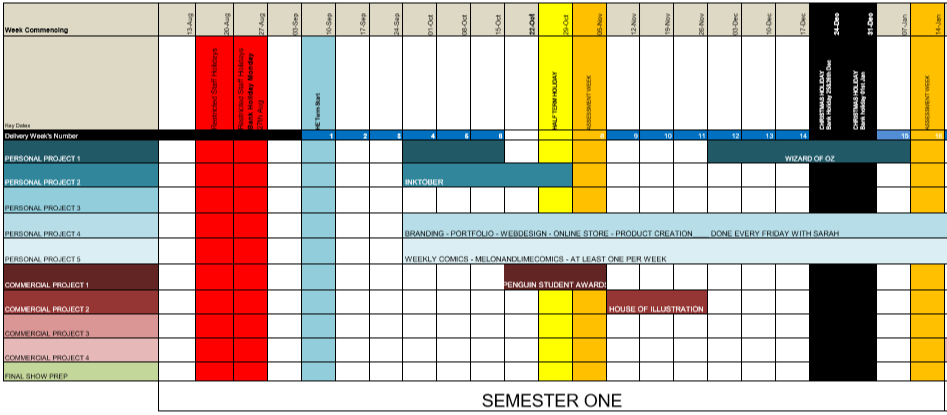
9 weeks into the first semester and I’m already not following the timetable I had originally planned within my proposal for the year.


original
Original Timetable (Before I had switched the Wizard of Oz project with the L.W.W project in Semester 2)

I believe this is due to multiple confusing factors from the beginning till now, one of them being that I have chosen to read all of the books. After finishing The Lion the Witch and the Wardrobe, and realising how long it had taken, (which wasn’t exactly long, but longer than I had initially expected) I decided to start reading ‘Howls Moving Castle’ for the House of Illustration competition, then after I finished that, I started and am currently reading Norwegian Wood, but I still have to read Wonder, both books being apart of the Penguin competition.

Another factor to my confusion is that my tutor has been wanting specific things done by a certain point, such as a statement of intents or the research for the projects, so instead of working at my own pace, following my set timetable, I have been trying to complete them all at once which has not done me very well.

So, with these factors, I feel I have just gotten confused in which project I should be working on, so probably have not done as much as I could have if I were specifically concentrating on one.

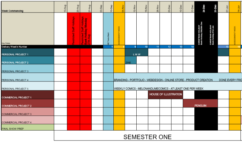
SO, with 9 weeks left, (8 now that I am posting this) I am going to replan my timetable so that I can properly concentrate on one project at a time.

newtime
New and Improved Timetable, Starting 12/11/18

Inktober – I have spent wayyyy too long on this project, so this week (and possibly a bit of next) I am going to try round off this project, getting the zines printed, making sure that everything is fully annotated, making an evaluation, and just getting this project out of the way so that I can concentrate on the others properly.

The Lion, the Witch and the Wardrobe – I know I need time to work within the college, using the facilities available, so I believe I am going to work on this project next week, then break off for a month or so to do the competitions, then during the last 2 weeks before deadline, I will print my final designs and round off the project

House of Illustration – 3 (now 2) weeks from now, I plan to focus on my House of Illustration project, creating a book cover and set of illustrations for the book ‘Howls Moving Castle, over a 3-week time period. This time will be spent on researching, sketching, experimenting, then producing the final designs.

Penguin Student Design Awards – 6 (now 5) weeks from now, I will start working on yet another competition, which again I plan to do within a 3-week timeframe. Again, I will be working in a similar routine/method to the previous project, researching, sketching, experimenting, then producing the final designs, however, this time I will be doing this process with two books, one being Wonder by R. J. Palacio, and Norweigan Wood by Haruki Murakami.

I hope that with this new timetable, that there will be less confusion, I will be able to focus on one project at a time, and inevitably, I will be able to get more work done.

Melon and Lime Comics – The Routine

One week later and we’re still going, are you amazed? I’m amazed!

This comic is based on my love for my new kitten Wednesday. My partner made a comment that we were basically the same, just constantly eating and sleeping, so he had suggested that be the bases for our next comic, so HERE WE ARE!

routine-f5

I did have struggles with this piece, not necessarily with the content, but more with the process of creating it, I found it took waaaaaaay too long to create this piece, as my photoshop file would have too many glitches or would buffer a lot, especially when I was trying to colour. Ideally I think this piece should have taken 20 minutes per frame at maximum, but instead, it had taken me 5 hours to finish the whole piece. I was not pleased in the slightest.

I don’t know if this had meant that the file was too large, or whether I need a new computer, but I don’t believe I could have done much else to make the document smaller, and I probably have attachment issues to my laptop, I’m scared to get rid of it and get a new one, which I probably should do, but probably won’t, not until its very much dead.

So, this may be a recurring issue in weeks to come, when I work on the comics once again. Soooo, FUN TIMES AHEAD!

HAPPY HALLOWEEN! Inktober: Days 29-31

Day 29: Double – Azalea

43914922_317761805672640_5597004542500540936_n

For this piece, I had chosen a flower that grows in bunches but decided to only draw two, as to fit the theme of the prompt, and with it, create two sisters.

These sisters were initially planned to be twins, however when it came to drawing them at different angles, I seemed to struggle with the features, so they look more like sisters as opposed to twins.

On one hand there is an older sister who protects her younger sibling, but on the other hand, the younger sister is quite mischevious and gets her self into trouble. So, the older sister often has to look after the younger one, and often has to apologise for her sister’s actions.


Day 30: Jolt – Dianthus

43778462_302329973703316_9113760141124284977_n

For this piece, similar to previous ones, I had wanted to create an afro silhouette with the petals from the flower I had taken inspiration from. With the Dianthus flower, it has a ‘jolt’ of colour going in an almost circular pattern around the petals, and I had wanted to incorporate this element, but when I have done so, the petals almost look more like butterfly wings, which as our Lord and Saviour, Bob Ross says, is a happy little accident that I had came across, as I feel it makes the character look sweeter in a sense.

I feel this character would be very caring and gentle, with an almost healing and calming essence to her.


Day 31: Slice – Calibrachoa Lemon Slice

43242319_2198183530421814_4379516291604802399_n

As this is my final piece for inktober, and it falls upon the day of Halloween, other than the already given pattern of the flower, I decided to keep the colours black and white, in a stripe pattern, which I believe also fits well with a Halloween theme and style. The style also reminds me of Beetlejuice, which is one of my favourite Tim Burton movies, especially for Halloween.

I really like how this character turned out, and feel she is a good ending to the challenge. I feel I may have had good and bad pieces during the month, however, I am very happy to end with this character.

As of her backstory, I feel she would be an entertainer of some sorts, possibly the ringleader of a circus, as she is very upright and I feel she could command an audience.


My opinion on the experience as a whole.

OH MY GOD! I can’t believe I’ve actually made it to this point! I have managed to complete every design within the time frames, posting one to social media each day, and not missing one!

Although there have been some pieces where I have struggled with shaky lines, bleeding ink or positioning of features, I believe this challenge has made me more confident with working traditionally, especially with ink, and I would like to do more linework by hand in future projects.

I have worked quite small during this project, so maybe in future, I will try to work a bit bigger, as this may have given me more issues than necessary, as the little mistakes would be more noticeable on a smaller illustration.

But I am excited to work traditionally again in the future, as I have gained more confidence and would like to see how the techniques and process I have learnt would work when applied to different imagery.

I have missed working digitally though so I may give myself a little break from ink, just for a little while, once this project is out of the way and the zine has been created.


Future plans.

As I have stated throughout these blog posts, especially with some pieces in particular, when it comes to putting all of these characters into a zine, I will be returning to some of the pieces to refine them further, whether it be by doing so digitally, or by redrawing the whole piece.

I also wish to add in items that would go along with these characters. Not for each of them, maybe just for the ones who have a stronger backstory, as I don’t want to be spending another 31 days on this challenge, and I feel 62 pages may be a bit too much for a zine?

I do still plan to make the zine, possibly by using the risograph available in college. Once I have refined all of the characters to my standard, I will scan them all in digitally, edit them properly so that the colours are richer, and the white background of the sheet will not be visible, then I will lay them out into pages for the zine, ready print out and to make masters with on the risograph. I believe I will only be using the black ink on the riso, as I want to keep the designs as similar to the original pieces as I can, keeping the theme of inktober very apparent.

I’m so happy to be done but so excited to start the next steps of the process, creating my first professional zine! If you have been reading my blogs and have enjoyed my inktober posts, if the zine is something that you would be interested in purchasing, please let me know.

HAPPY HALLOWEEN FROM MELON.R!!🎃