Inktober: Days 21-28

Day 21: Drain – Dandelion

43985779_1193916924110928_5358035894994912958_n

I’m not really sure on this character’s hairstyle, but I do feel the type of plant is identifiable.

For this prompt, I tried to think of plants that could possibly grow in drains, which led me to think of weeds, which led to thinking of dandelions. With the prompt as it is quite a yucky place, I decided to draw the yellow type of dandelion, as opposed to the wishy one, as I feel it is commonly known as the more annoying and less pretty version of the plant.

Like the plant, I think this character tries to be villainous but just ends up being more annoying than evil. I expect her to just turn up at unnecessary times, and instead of harming any of the other characters, she just ends up annoying them instead. This could potentially be a developing character, where the others discover that she has other emotional issues going on, which make her annoying tendencies more understandable. If I could relate this character to one from another tv series, I could potentially compare her to Peridot from Steven Universe, as she had started off on the evil side, but did not necessarily cause any real problems for the main characters, but was just more of an annoyance for them, but the character then developed and she became one of the crystal gems, converting to the good side.


Day 22: Expensive – Kinabalu Orchid
43578463_1908359406140505_8052881774282917726_n

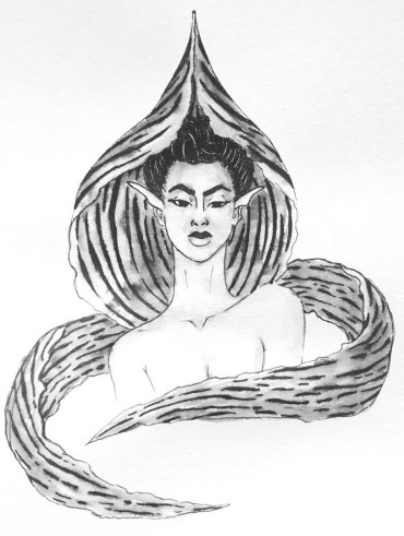
This flower had originally come from my search of the rarest flowers in the world, and as I had said with the ‘Precious’ prompt on day 9, I had found two flowers, the Kadupul and the Kinabalu Orchid, which I felt most inspired by, but had felt the Kinabalu Orchid would be better fitted for this prompt, as it looked more sinister than the other had.

With this character, thinking of ‘Expensive’ I wanted to create a rich b*tch character, who would be more snobby and look down on all the other characters. In her eyes, she would be at the top of the hierarchy of the society, and everyone else would be peasants.

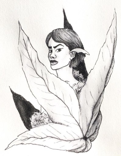
I enjoyed working on this character, as I was able to play around with patterns and new shapes, experimenting with how I could incorporate the unique flower into the character. Like with the ‘Cruel’ character, I wanted to use the main petal as a collar/hood, and with the two side petals, although they are usually sticking right out on the actual flower, I wanted to wrap them around the character, as if it was a fox scarf or expensive shawl of some sort, to give her more of the expensive look.


Day 23: Muddy – Daffodil 

43292113_360360371373823_703080925605083910_n

For ‘Muddy’ I thought of springtime, where the weather is still changing from rain to sun so there would be more mud, and the flowers that most commonly grow within this time are daffodils.

As I had loved working on the hair for the ‘bottle’ prompt on day 18, I wanted to do something similar within this piece, as to contrast with the lighter flowers.

With this piece, I knew that I did want to add actual mud splatters, however, I was scared of possibly going too overboard, so probably did go more light-handed than I could have, however, I am glad that I did, as they could pass off as freckles, meaning that they are just natural markings of the character, rather than she had been playing in the mud.

I’m starting to think that ‘Baby’s breath’, ‘Jasmine’ and now ‘Daffodil’ could possibly all be friends with one another, as I am imagining them to have similar traits and personalities. They are all quite carefree soles, with calming and caring personalities, so I do think they’d really fit well together.


Day 24: Chop – Cherry Blossom

44538823_250055122359011_7466049743999395746_n

With chop, I feel she would be quite a strict character, very organised and likes things being right. I could see her being a sergeant or police officer of some sort, being a character of authority. I assume she’d take care of the society, and properly discipline anyone out of line.

For the prompt, I had thought of flowers that grew on trees, which led to thinking of cherry blossoms. Although this character would have a beautiful exterior,  I can imagine her being very tough and possibly cold on the inside.


Day 25: Prickly – Thistle
44833020_468961213592626_2194932873311779686_n

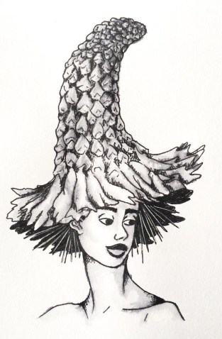
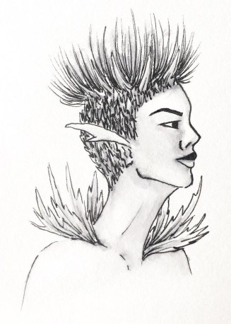
I did struggle slightly with the imagery for this character, trying to figure out how best to show the influence of the specific flower, being a thistle. So, in the end, I had chosen to give her a prickly leafed collar, and prickle all around her head with the flower section growing from the top. With this character, I had wanted to give her a more androgynous look, with a mixture of both masculine and feminine features. So, with the hair, I had decided to create a shaved sides with a high top sort of look, incorporating the flowers elements.

I enjoyed working on this character, as she is unlike any of the other characters I have created so far, and it kind of gave me the chance to work with a new face, creating an alternative look which is still relevant to women nowadays.

To see how this piece was made, and the method I use to create the other designs as well, I have created a blog post about my process.


Day 26: Stretch – Sunflower
43778850_320176052096600_6809819923661768525_n

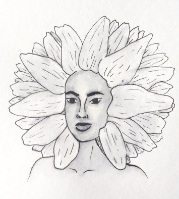
I struggled when coming up with a flower for this prompt, until my boyfriend had suggested a sunflower, explaining that it ‘stretches up to the sun’ which all plants do, however, this one is usually taller, so it made sense.

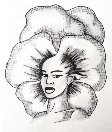
This is actually one of my favourite flowers, so I did want to justice. I wanted to create an almost afro silhouette with the petals of the flower, and create a darker toned character to match the bud of the sunflower.

Ideally, I would have liked the skin to be darker on this character, however, I was scared of the ink bleeding too much and leaving my character with a patchy and muddy mess. When creating my zine, I may try to recreate this character, going darker with the skin tone, to achieve the contrast that I had desired.


Day 27: Thunder – Thunder Lily
41516234_2211100269147346_3974982028563890547_n

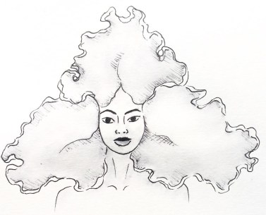
I don’t really like how this character turned out, although I feel she has an interesting silhouette like with the last piece, I do not feel she has enough contrast, especially as the original flower is so much darker in colour.

Again, when it comes to creating the zine, I will definitely be going back to this piece to darken up the petals, hopefully giving the piece and character more contrast and appeal to the eye.


Day 28: Gift – Roses
43704393_176606326614052_4395769119823814973_n

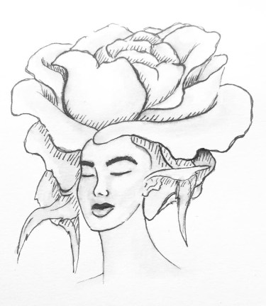
For this prompt, I had thought of flowers that were most commonly given as gifts, this being roses.

I see this character almost in the same light as the ‘Star’ prompt character that I had created on day 8, I feel she would be a sort of celebrity within her society, mostly because of her beauty. But, I see this character being very two-faced, in front of her fans, she is caring, loving and sickly sweet, yet behind closed doors, she is a diva and complete b*tch, especially to the people who work for her.

WE’RE BACK! Getting Back into Comics

Melon and Lime comics has been on a bit of a break whilst both me and my partner have gotten back into the swing of college but now, WE HAVE RETURNED! With a comic that gives a bit of an update as to what we’ve been up to whilst we’ve been away.

I’m so excited to get back into the flow of working on new comics again. We aren’t necessarily going to have a set day in which we will post as of yet, as we don’t want to make any promises we can’t keep, however, we will be attempting to create at least one comic per week.

If anyone reading enjoys this piece, we have more content on our Instagram @MelonandLimeComics, so please have a look, we promise there will be more content coming soon, now that we’re back into the rhythm of college, maybe? NO PROMISES! But we’re gonna try! We also plan to create a zine or book over the year, which we plan to release sometime in June next year, so keep an eye out for that too.


8 Tools I Use For Inktober

1.Pinterest

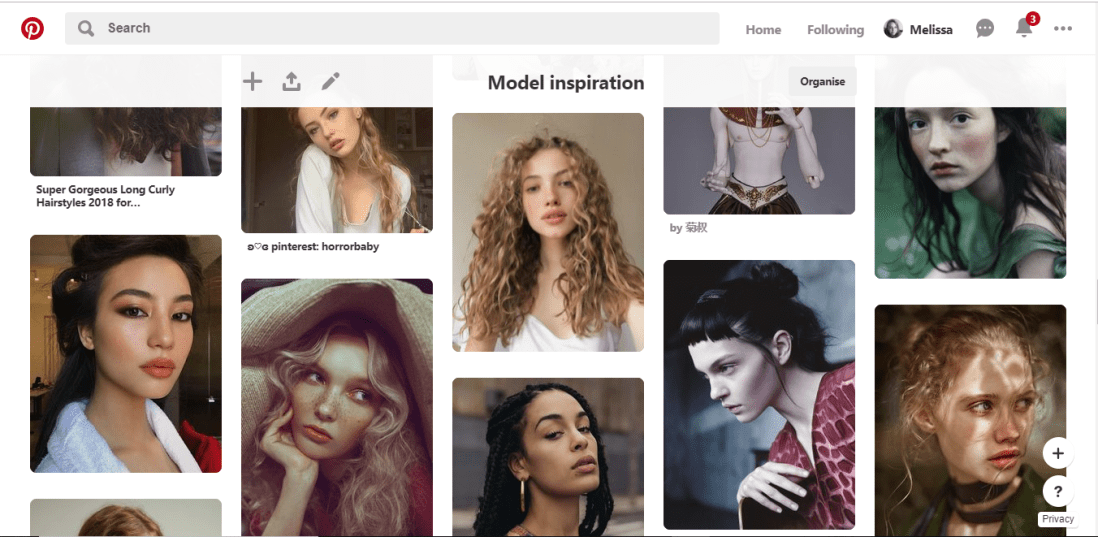
Pinterest has been my main source of inspiration throughout this project so far and during many previous projects. Over time I have built a collection of ‘Model Inspiration’ which include photos of different faces shapes, hairstyles different ethnicities and so on. I constantly refer to this board for inspiration, and if you were to look in it, you would most likely see the faces I have used as inspiration/reference during this challenge.

pinterest


2.Sketchbook

Throughout the challenge, I have been sketching each design out within my sketchbook, this allows me to make any changes necessary before I start inking the design.


3.A4 Light Pad

Once I am happy with the sketch, I rip out a page from the back of the book to create the inked design on, (yes my sketchbook is probably going to be very thin by the end of the challenge), then using an A4 light tray, which I had purchased from Amazon, and plugs into your computer or laptop with a USB, I start lining the sketch.


4.Derwent pens

For the inking process, I use Derwent Graphik Line Maker Drawing Pens, which are a pack of 6, varying from 0.05mm, to 0.8mm. I often use 0.1mm for the facial features, 0.2 for face or petal outlines, 0.05 for very fine details, sometimes even cross-hatched shading, and for flat black areas, I use 0.3 or 0.8.


5.Water + Paint brush

To add more shading with a softer blend, to the linework, I dip a thin paintbrush into a glass of water and bleed, drag and blend out some of the inked line work. If I feel it is bleeding too much or is too wet, I have often blotted it down with my sleeve or a piece of tissue.

44972115_2279412198755543_3778573181749559296_n


6.White pen

In some area, possibly where I have lost any highlights or the ink may have bled too much, once the piece is dry, I use a white ink pen and start adding back in the highlights or cleaning up some of the areas that may have come out too dark. If the white pen has gone slightly over some of the linework, I then just go back over with one of the fine liners.

45179285_292486278141594_8399343043123085312_n


7.Phone camera

Once the piece is complete, I take the design to a place which has good natural lighting, then take a picture of the piece using my iPhone camera. I do feel the lighting is an important factor, as you want to take the best photo you can of your design, and if taken too late on in the day, it can make your piece look more cool toned, or if you are using the lights within your house, I don’t know about yours, but mine are very orange/yellow, so would make my designs look too warm toned.


8.Whitagram for editing

With the photo, I then crop the design, making the illustration the only part visible, removing any background or any white, unused space from the page. I then take the photo into an app called Whitagram, which I originally solely used as to make my images square, for the way in which Instagram is set out, but for this project, I have also been using the editing tools within the app, playing with the lighting, exposure and shadows, as to make my pieces as white as possible.

This step would be much easier if I had scanned in the designs and edited them within Photoshop instead, however, I do not have a scanner at home, and as this was a daily challenge, I would not have been able to take advantage of the colleges each day of the week. So for the time being, I just have to make do with the resources I do have.

When it comes to creating my zine, however, I will be doing this step properly, by scanning in all of my designs and editing them with photoshop. I believe it will give me better results especially with quality, which I feel is very important for the product I will be producing, as I do want any potential buyers of the zine, to get their money worth.

Inktober: Days 8-14

Day 8: Star – Star Flower

42004249_301247550705283_4169723086840321521_n

From the previous post, it seems that I had jinxed myself, as with this piece, I had struggled with time. As I was at college during the day, working on other projects, I believe I had gotten home at 4/5 and had to rush my piece so that I could take a photo of it within the natural light. At the time of this photo, the natural light was more cool toned than previous pieces had been, and although I tried to fix this problem when editing the photo (as to make it cohesive with the other pieces) I feel you can still see the difference when looking at them all together.

Other than the lighting, I also feel this character has more issues with the drawing, specifically with proportions and angles and so on. When completing this challenge and compiling the designs into one zine, I believe I will go back and try to fix this character, as I do see her potential, but do not believe I achieved it on this day.

The flower I had chosen for this prompt was pretty self-explanatory, and I wanted the character to have a ‘stardom’ quality to her. Imagining this character in the society I have created, I believe she would be a celebrity figure, whether that is in a good or bad way. I want her to be in the limelight in this society, but the other characters could have different opinions of her, depending on what they’ve heard or believe.


Day 9: Precious – Kadupul

42604998_258396621532786_7518244085548651287_n

With this character, I had searched the rarest flowers and had found two that I felt most inspired by, one being Kadupul, and the other being a Kinabalu Orchid. For this specific prompt, I felt the Kadupul would be better suited as it looked more gentle, whereas the Kinabalu looked more sinister in a way. The Kinabalu will be used for another prompt ‘expensive’ as I see that character being more snobby than I would the Kadupul.

I wanted this character to be quite doll-like, angelic in a sense as if she has been untarnished by the world. As a character I feel she would be a princess figure, the other people may not see her very often, as I imagine she is protected a lot of the time, but when they do see her, they are enchanted by her beauty and grace.


Day 10: Flowing – Water Lily

42496735_336919253745736_101372563669345908_n

This is my favourite piece so far, I am so happy with how she turned out! For the prompt ‘flowing’, I instantly thought of water, so had chosen a flower to fit the theme, this being a water lily.

When creating her, I wanted a similar petal hairstyle as my piece for the Chick and Hen character. However, with the reference I was using, the model had hair flowing across her face, so I decided to keep this element, and I am so happy that I did, as I believe in my design, the hair almost looks wet on her face and could resemble roots from the flower, as if she has just been taken straight out of the water.


Day 11: Cruel – Ricinus Communis

42169565_1730118407098644_6127418098687153093_n (1)

With this prompt, I wanted to create a villainous character who is very upright and has a scheming look on their face.

When looking at the plant, the Ricinus Communis, it had big leaves and red spiky balls. My initial idea was to have the leaf as a collar of some sort, then have the balls growing from the character. However, when drawing this piece, the leaf had become bigger than I had intended, wrapping around her body, as opposed to just her neck. I do still like the design though, as I feel she does still have the villainous appearance, which I feel the other characters would be afraid of.


Day 12: Whale – Pansies

43495896_251294502252069_1406366792041196933_n

The link between flower and prompt for this character is a bit farfetched. As I could not necessarily find a flower by searching ‘whale flower’ or ‘whale plant’, I tried thinking of colours, specifically from an Orca whale, with the black and white patterns. This had led me to pansies, as they often had a dark centre, which is then surrounded by white, and then followed by another colour.

Although I like the design for this character, I don’t really have a backstory for her as of yet. She does look like a quite strong character, but as of the prompt, it has not given me much inspiration as of this moment in time. But I will come back to her another time and try to develop her story further.


Day 13: Guarded – Pycnostachys Urticifloia (Blue Witches Hat)

42645374_1065626340284123_2190835388786580352_n

With this character, as the appearance of the flower suggests, (although the colour is not shown) she is a witchy type character, but not an evil one, I believe she is a good witch that helps others with spells, love, healing, etc, but her speciality is with protection spells, linking back to the prompt  of  ‘guarded’. I feel she is a kind character but has her guards up as other characters may not react well when finding out she is a witch, even if she is good.

There are some issues that I can see within this character, specifically within the face, so again, like with my ‘Star’ character, I do plan to fix and refine these issues, when compiling all of the characters together in a zine.


Day 14: Clock – Passion Flower

43778589_514936458972963_7010897365447628305_n

I enjoyed working with this specific plant as it had so many different elements to play with.

I feel I slightly lost control within the inking process, as there are a few shaky lines (especially on the shoulder) and when shading her face, the ink on her chin had bled too much up into her face, whereas I had wanted it to bleed down into her neck instead, creating more shadow, as opposed to a beard.

Again, when it comes to creating the zine, I will come back to this piece and refine these problem areas, whether it is just done digitally, or whether I redraw the character.


So far, I do love every character that I have created, and even with the ones that have gone slightly wrong, I do still see their potential, either with their stories or the imagery I have created. So, I will come back and fix these characters, once the challenge is out of the way and when I start concentrating more on the creation of the zine. If anyone does buy the zine, I want them to get their money worth, so with any imperfections I see, I want to fix these problems beforehand, so that when the buyer receives their product, they won’t find any issues and won’t question why they spent their money on it.

Procrastination Station

It is currently the day before my first deadline, and what have I found myself doing? Procrastinating! You would think that I would be panicking during this time, which I am,  but the motivation to do work is just not here.

As a way to try and battle this issue, I had searched on google ‘How to stop procrastinating’ and the results had given me this one article which suggested ways in which you could ‘Get motivated to study’.Although this is an interesting article, and probably would help me in the long run over this final year, and possibly in life too, I had a brief read through and it had just made me want to hunt down my old DSi and play Dr Kawashimas Brain Training. This would be following step 13 of the article, exercising the brain.

I don’t believe this article is useful for me at this specific moment in time, as I am already in my procrastinating mindset, and it seems I’m just going to end up distracting myself more than I actually can.

I would, however, like come back to this article at later date though, possibly when I have less work to do and actually have free time to learn from it, as it could potentially stop me from having these moments again in the future.


As of this current deadline, all I have left to do is fluff out my research, by fluffing out, I just mean that I have already briefly written up the basics, I just need to go back in and add more detail. The ‘research’ includes artists and writing up all of the information I have found from each of the competitions that we were suggested, then discussing which I would like to do and which I would not.

I then need to give more narrative to my self-report, as I had bullet-pointed all of my strengths, weaknesses, opportunities and threats, but my tutor had suggested that I go into more depth, discussing why I believe my weaknesses are my weaknesses, how I will try to work on them over the year, what opportunities I will have to do so, and so on.

Then I just need to read through everything, make sure it actually makes sense and has not just come out of nowhere from auto-pilot Mel. Then I’ll add in all the photos, create a bibliography and list of illustrations at the end, then I should be dooooone; Once I’ve actually printed everything off at college as well, and have it all bound together. I’m gonna be fiiiiine, she says whilst still procrastinating and making this blog post.


Me with deadlines in general.


Bibliography

D. Wong (16 Aug. 2018) How to Get Motivated to Study: 23 Tips For Students Who Procrastinate. [Online] Available from https://www.daniel-wong.com/2018/04/23/get-motivated-to-study/ [Accessed on 07 Oct. 2018]

Giphy (2018) Trump Consequences. GIF. [Online] Available at :https://giphy.com/gifs/trump-consequences-NTur7XlVDUdqM/media [Accessed on 07 Oct. 2018]


Selling Within a Store

My Aunty Dawn, not really my aunty but my mams closest friend who is basically my aunty, who I actually see more than my real relatives, has recently opened her own store in Stanley, which is called Purple Dragon, which sells unique gifts, which are quite gothic, spiritual and very fantasy inspired. This includes crystals, skulls, tarot cards, cushions, cups, journals, and there is even a section of her shop just dedicated to incense, which is another business she owns called House of Incense.

She recently came round and was talking with my mam about the shop, in which I inquired about the possibility of selling my work in her store. If this was anyone else, I probably would not have been as forward or as confident to even ask, but I showed her some of the prints I still had left from last years exhibition, and she said that she would take two and see how they would sell.

riso print

I then showed her some of my other work, and she has chosen a few other pieces that she would like me to print off, again she only asked for 2 of each, to see how they would sell, and she would let me know how it goes. The prints in which she wants are as shown below, and do give me a better understanding of what she would like to sell in her shop, and gives me a better idea of what else I could create for her if the prints do well and if she wants new designs. As you can see, she likes the colour green!

I’m so excited about this opportunity and do hope that the prints she has with her now do sell. If so, this will be my first experience with selling work outside of the college, and will potentially be the first steps in which I take to forming my own business and selling my own work. Aghhhh I’m excited about the future, I just need to print out the other illustrations she wants, and get them to her. I will keep you informed of how this venture goes.

Idea proposals 💍 Semester 2

Carrying on from the previous post, for the projects during semester two, I want to…

Produce chapter illustrations for ‘The Lion, the Witch and the Wardrobe’.

In this project, like with the Wizard of Oz project I have planned, I want to create work for a younger based audience, which I have not had a lot of experience working within the past. With this project, however, I want to create work for teens as opposed to children, working in what I believe to be more of a mature style, taking inspiration from John Tenniel’s illustrations in the original ‘Alice’s Adventures in Wonderland’ by Lewis Carroll.

As well as giving me more experience of working with a younger audience, (in a different approach to the Wizard of Oz project) I believe this project will allow me to play around and develop my skills with some printing techniques, such as screen printing, Linocut printing, etching, etc, I believe it will allow me to take full advantage of the facilities available to me within the college, such as the laser cutter, to create a plate in which I can print with.


Take part in the Association of Illustrators – World Illustration Awards.

In comparison to the other competitions I want to take part in, this one has multiple categories in which you can apply to. As well as children’s illustration, you also have the option of creating work for an editorial category, advertising, design, etc.

Like with the other projects, I believe the outcomes I create for this brief will help in expanding my portfolio of work throughout the year. At this moment in time, I am swaying more to the editorial category, as I feel it will allow me to work in more areas of the industry. For this category, I would potentially create an illustration for an article, trying to entice the viewer to read the article, but not give too much information so that the reader already feels like they know the story.


Create work for the Cheltenham Illustration Awards.

This is a competition that I will be taking part in for my third year in a row. The brief that they announce will have a specific theme in which I will have to work with, creating a narrative based illustration which will relate to or have been inspired by the specific theme.

In previous years, the themes have been ‘tales through others eyes’ and ‘tangled tales’. I believe the competition is pretty open in the sense that you are not limited to what you can potentially create. For instance, last year I had created my illustration using photography and embroidery, whereas in the year before I had created a surrealistic digital painting and a looped animation.

Because of the flexibility of this competition, being able to explore the theme and work in any possible medium, I am excited to take part again next year, but hopefully next time my work might actually be chosen. If not though, I will still enjoy the experience, and the work I create will still contribute to my portfolio.


The two projects which I want to do over the course of the year are…

Concentrating on branding and start to form a business, preparing for my career once I have left the comforts of college.

This project would include creating new business cards, forming a new set of portfolios, including a handheld a3 one, a website and a new portfolio book, these will also include all of the work that I have created over the year as well.

As of my potential business, I will be creating an online store (potentially in collaboration with one of the graphics students) and for this, I will be creating content that would be sold their, ie prints, pins, clothing, mugs, zines, stickers etc.

In the final month, I also plan to set time aside so that I can get ready for a final show, with this, I will possibly create new content to be put up in the exhibition, and this will also be the time in which I can start to order everything, so that it will come in time for the final show, such as the portfolio book, business cards, and any merchandise that I may have created with outside businesses.


And finally, I want to work on the weekly comics that both me and my partner had created together over the holidays, we named this collaboration Melon and Lime Comics.

Me and my partner have always been interested in mini-comics, most commonly from artists such as Ketnipz, Sarah Andersen and Catana Comics, sending their comics to each other saying ‘this is you’ or ‘me’, and we had even started to come up with our own ideas for potential comics, that we knew we would make someday, but had always kept pushing it off to the side, at least until summer had came. We had not really planned for this collaboration to go further than between the two of us, but one day, we decided to make our own Instagram and try posting the comics on there, to see if anyone else could possibly relate or find humour within our designs.

We have currently got a small following of 40ish people, however, I believe as we post more, our audience will eventually start to grow more. The problem is, as we are back at college, it is going to be more challenging to create content, as we are both going to struggle with time. So, this is why I wanted to incorporate this project into my year, so that I could allow myself the time to work on the comics, without feeling guilty because I am not going ‘college work’.

I do have high hopes for this collaboration as I feel we do have the potential to someday be at the level of the artists we admire, such as Ketnipz, Sarah Anderson and Catana Comics, but I feel it will only do well if we are to put the work and effort into it.  I do love working on these comics because they are personal to my relationship, but I believe the themes are open enough that a lot of other people or couples can also relate to them. This collaboration has also allowed me to expand my work, exploring outside of my comfort zones, such as working with characters, minimalism, creating narratives and I have also been able to incorporate humour into the designs, which is something that I don’t believe I have ever done in my work before, or have even attempted to do before. Because of these developments within my own type of work, I am excited to continue working on these comics, seeing where else they could take me and what else we could potentially create in the future.


As these two last projects will be worked on over the space of the whole year, (I believe on Fridays for the branding project and Tuesdays for the comics) I will be solely keeping the progression, development and any potential research used, all updated within my blog, so you can keep your eyes peeled for those updates in the future.


Bibliography

The Association of Illustrators. (2018). World Illustration Awards. [Online] Available from https://theaoi.com/world-illustration-awards/ [Accessed on 20 Sep. 2018]

Cheltenham Illustration Awards. (2018). Cheltenham Illustration Awards. [Online] Available from: http://www.cheltenham-illustration-awards.com/ [ Accessed on 20 Sep. 2018]

Idea proposals 💍 Semester 1

For my final year of college, we have been given free reign to choose what projects and live briefs we want to participate in over the next year. I have decided to do four projects per semester, the commercial projects being shorter and the personal projects being longer. This will allow me to work to an industry type of deadline during the commercial projects, but create more developed/refined pieces for myself and portfolio within the personal projects. I  also want to have two more projects that will run throughout the year, which I will be working on at least one day per week.

In semester one, I want to…

Take part in Inktober.

For the month of October, I will be creating an inked illustration on a daily bases, posting them on Instagram and hopefully end the month with 31 illustrations, if I do not falter or give up beforehand. These illustrations will all later be compiled into a zine/book, to later be sold on an online store.

I want to take part in this challenge so that I can develop my skills and gain more confidence with ink mediums, especially with my line control. I feel if I were to gain more confidence with this medium, I will be able to use it more in future projects, hopefully making my digital designs look less static, more organic and more unique to myself.


Create children’s illustrations for the book ‘The Wonderful Wizard of Oz’.

I chose this story to illustrate as it is a children’s book (which I believe is more commonly known as a movie) and I have wanted to create more work for a younger audience, as I have not done this a lot in previous projects, so feel it will help me expand my portfolio.

With the stories themes, characters and it specific colour palette, i.e. the ruby red slippers, the yellow brick road and emerald city, I believe with these elements, I will be able to create a set of illustrations unlike any of my previous work, filled with fun characters, vibrant colours and most importantly to me, the pieces will have a narrative, with characters interacting with one another and interacting with the scenery around them. I know I have not created any narrative pieces within my portfolio of work so this project will help in filling that area in which my portfolio is lacking.


Take part in the Penguin Student Design Awards competition.

This is a competition in which I will design a book cover for either a children’s book, an adults fiction, or an adults non-fiction book. As of this moment in time, the stories for each category have not been announced yet. However, once they are, I believe I will most likely be working with one of the adult books. This is so that my work for this project won’t clash with any other work I may create during this year, for instance, I already have in mind two child based projects that I want to take part in, so I feel if I were to choose the children’s book category for this project, the designs would potentially clash with one another. So, by choosing an adult book, I will be covering more audiences, hopefully helping expand my portfolio more.


And finally, in semester one, I plan to enter the House of Illustration – Book Illustration Competition.

Again this is another competition in which I will be designing a book cover, however, I will also be designing illustrations that will be submitted alongside it. In comparison to the previous competition mentioned, from looking at previous years entries, this competition seems more sophisticated in style, so I believe when I create my own designs, I would be working to a higher standard, possibly catering to a higher class of book lovers. Again, I believe this competition will allow me to expand my portfolio, creating work for a different audience and possibly working in new styles, but this will be determined once the specific story has been released.

Bibliography

House of Illustration. (2018). BIC 2018: Winners Gallery. [Online] Available at: https://www.houseofillustration.org.uk/get_involved/bic-2018-winners-gallery [Accessed on 20 Sep. 2018]

Penguin. (2018). Student Design Awards. [Online] Available at: https://www.penguin.co.uk/company/work-with-us/student-design-award/student-design-award-2018.html [Accessed on: 20 Sep. 2018]


Welcome!

Hello there! Welcome to my new blog, my name is Melissa Russell, also known as Mel and Melon.R on Instagram! I am currently studying in my third and final year of Illustration, looking forward to graduating with an Honours degree next year.

I chose to do this course as I already enjoyed creating illustrations but wanted to develop my knowledge of the industry, learning how I could transform my hobby into a career, and I also wanted to learn new skills and refine my work/style to a professional standard.

In terms of career, my goal is to become a freelance illustrator, working with multiple clients, but also running my own shop, in which I can sell products such as prints, tote bags, clothing, and so on.

I believe my inspiration can come from a lot of things, such as movies, books, pop-culture, mythology, colours, etc. Recently, I have fallen in love with Wes Andersen movies, the colour schemes mixed with the composition of the characters, props and scenery, have been set out so beautifully, that the films are art in their own right. Another useful source for inspiration that I commonly use during projects, would be Pinterest. As well as finding new artists, styles and stories, I also find photos of people, which have often influenced my characters. I have created a board of ‘Model inspirations’ in which I save photos of beautiful and unique looking people, which I often look through at a later dates, and have helped give me inspiration for a lot of projects in the past, whether it be story-wise, with colour schemes or helped me form overall characters.

In previous years I have mostly worked digitally, however, I have wanted to slowly get back into working with traditional mediums. So in my current process,  I have started taking traditional elements, such as linework and painted textures, into photoshop where I will then colour the illustrations digitally. This to me is the perfect balance of traditional mediums and digital techniques, I am happy with the process at this moment in time but would enjoy exploring more ways in which I could further improve the method more.

My personal goals for this year is to not let stress get the better of me and to keep on track with my project work. Over the holidays, I discovered a good stress reliever for me, has been when I went to the gym for 1-2 hours three times per week. It helped me get out of the house, away from stresses at home, and out of my own head, at least for a couple of hours. Once I have gotten back into the routine and schedule of college, I do want to start going back to the gym, maybe on Tuesday and Wednesday mornings, and possibly Thursdays after my lessons. Other than improvements in my basic health, I feel it will also help improve on my mental health as well, as I just feel it would give me a good break during the week, it gives me time to stop overthinking about work, almost resetting my mindset, then I’d feel re-energised to get back on with the projects as soon as I got home.

My more career-based goals/overall goals for this year is to become more of a well-rounded illustrator, covering more areas of the illustration industry, creating work that I might have hidden from in the past, and also getting the bases of my shop/website created, so that when I do leave college, I will hopefully have a career doing what I love, whether as a freelance illustrator, self-employed and selling my work online, or a good mixture of both.

I will be posting at least once per week on this blog, if not more, however, if you want to find me on other social media platforms, you can find me at:

Melon.R on Instagram

Melon628 on Pinterest