Foiling

Following yesterdays class and blog post about screen printing, in the class, we had also learned how to foil your designs using that method, but I wanted to make a separate post about it as I have also used another technique for foiling in the past and wanted to discuss and compare the two methods.

Screen Printing

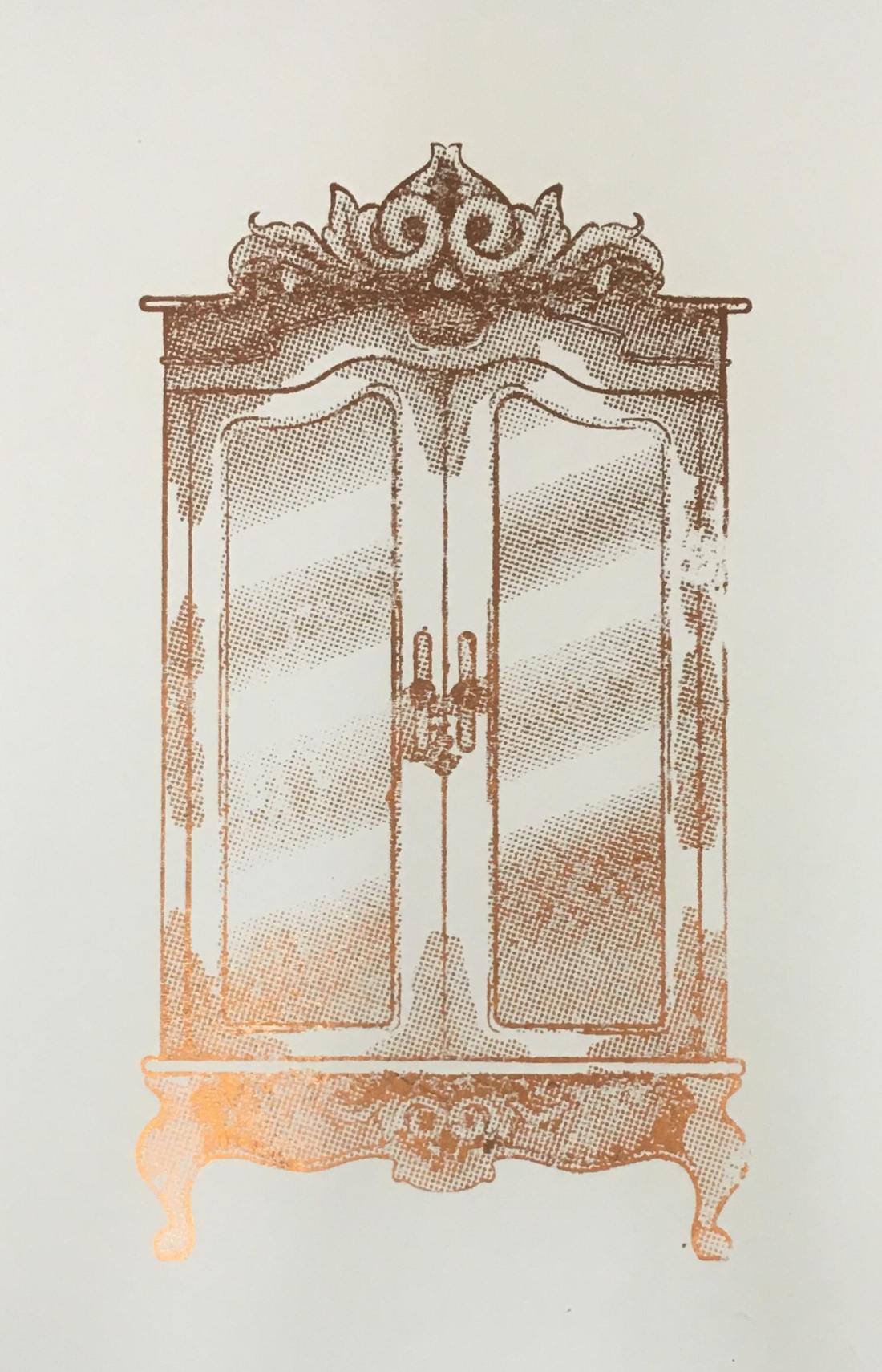
In yesterday’s blog post I did discuss the process of creating the screen and printing with it, so if this is something you are interested in or would like to know more about, please click here. So, following this process, instead of using printing medium, we used glue instead. By doing this, you did have to be more thorough with the cleaning of your screen, washing it as soon as possible because if you were to leave it to long, it could potentially dry and clog up your screen, making it unusable. Once the glue was printed onto the page, you would then choose a foil, which had come in multiple colours and tones, but for my piece, I had chosen to use a copperish colour. You would then place a sheet of your chosen foil over the glued sections, the colour/reflective side facing upwards, then sandwhiching the page and foil inbetween sheets of scrap paper, you then put it into the heat press for 30-60 seconds. Once you have removed this sandwich from the heatpress, wait for it to cool down slightly, then when you peel away the foil, it should have stuck to the glue and should reveal your design underneath.
50489412_309963246296030_8504261388993036288_n

Using a normal printer.

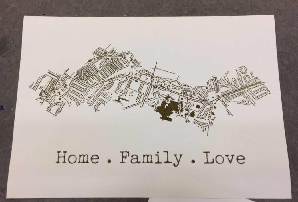
A while back, I had decided to make my mam a present which was based on a map of the areas where she has lived in her life. I had seen places online like ‘Not on the Highstreet’ doing this with a foiling effect, but instead of paying quite a bit of money for it, I decided I would just try to do it myself instead, using the facilities available to me within the college. At that time, I had no idea how I would go about making this effect, so I had gone to see Steph within the print room for her advice. She had suggested a technique where you would just print out the line work using a normal printer, then the foil would stick to it when under the heat press. So, after creating my line work, I printed it out onto a sheet of good paper with the normal printer in her room, I cut a sheet of foil which was big enough to cover the area of the design, then again, sandwiched the page and foil between sheets of scrap paper and placed it into the heat press for 30-60 seconds. Once done, I removed the foil and it had stuck down to the areas that were black in my design.
51424072_292910317950644_7496476359850459136_n

My opinion.

Although using the normal printer was a lot more efficient on time, and was a lot less messy as you didn’t have to worry about glue and cleaning screens etc, it did give a more subtle effect, as the foil appeared to be more crackled as opposed to full like I had achieved with the screen printing method. Overall I did have good experience with both techniques, however, if I were to use it again within my work, these would be factors that I have to consider, would I want the effect to be more subtle and still be able to make out the black line work underneath, or would I want the effect to be more solid?

All images are my own unless stated otherwise. Appologies that they may not best show the reflective qualities of the foil, I was going to upload a video, however this site thought otherwise. 

Screen Printing Class

When going into this class, I had did not have high hopes for it as the previous time that I had learnt the process, the outcomes did not come out the best, and the actual screen would fall apart after a couple of prints. However, in this class, we learnt a new process for making our screens, which did work a lot quicker and easier, and the screen actually lasted longer and gave better quality prints.

In the previous year, with our illustrations, we had to make them digitally and set them up within illustrator so that the image would be formed up of paths, but would be together in a compound shape. This was so that the design could run through the vinyl cutter, and it would recognise the paths and cut where needed. Once printed, you would then have to sit and weed out the sections of your design that you would want to be printed. I did actually enjoy this process, however, for time purposes, it wasn’t the best. When you had all the colour sections removed, you would then have to apply the vinyl to your screen by hand, which would often take two people to do as the screen was so big, and you would have to be meticulous with the process, making sure that there would be no air bubbles between the screen and vinyl, as this would potentially lead to your design bleeding when inked. Once the process of making your screen was complete, you would then place the screen facing down onto your paper but would have to use heavy weights or another person to hold the screen in place so that it wouldn’t move and potentially resulting in a bleed or smudge of your design. By working with another person, this also made it more awkward when pulling the ink down over the design, as it wasn’t just a smooth pull down, you would have to move around the arms that were holding your screen down. After all this effort, the screen would only last a couple of prints, at least in my own experience, as the ink would loosen the adhesive of the vinyl, which lead to some of my details falling off. Shown below are my results from this experience, which I hope show why I did not enjoy this experience and was not looking forward to trying it again.

HOWEVER, when beginning and learning this new process, it was SO much easier! When initially making the design, although I still had to make a monochrome design, as shown in my previous blog post, click here to see, I did not have to faff around with illustrator files, paths and compound shapes, I just needed to save my design as an A4 Jpeg.

When it came to creating the screen, we were all given frames which would be our own for the year. This would mean that we could repeat this process whenever we needed, as in previous years they have had a limited amount of screens, which could get damaged or take a while to dry after cleaning, so this would eliminate those issues, and if ours went missing, it would be of our own doing. With this frame, we were given a sheet of instructions to follow. Starting with it positioned so that there were two holes on the right and one in the top left corner, using double-sided tape, you’d then line all four sides. We were then given a sheet of mesh, which we stuck down onto the tape, making sure it was the rougher side facing upwards. This sheet acts as our screen and would be replaced from print to print. Using green tape, we then lined each side of the fame once again. This would ensure that the screen would not move during the process. With a craft knife and a cutting matt, we then carefully cut out the holes, the two on the right and one in the top left corner. Our screen was then ready for the design to be printed onto.

Using a new machine which burns the design onto the mesh, you would slot your frame into it, using the holes, then it would feed through, burning your design into the screen as it goes. I believe you do need to use a specific program for this to work, but it seemed simple enough to upload your Jpeg image and have it work. A couple of the other students did have issues with this process as they found the printer would glitch halfway through, but we discovered that this was due to the screen not being stable through the feeding process, as it would sometimes fall when coming out on the opposite side.

Below are images from the process of creating the screen, apologies if some are unclear as to what is going on within them.


When it had come to printing the designs, as the frame and screen were a lot thinner and lighter than the ones used in the previous process, it was no longer a two-man job to hold it in place, a couple of weights would suffice, meaning that when squeegeeing the ink down the screen, the process was a lot smoother.

The printing medium we had used was one part paint in the colour you wanted, I chose black as it fits with the style of work that I wish to create for the project, then two parts of acrylic medium. I believe the medium helped thin down the paint, making it a lot easier to transfer through the screen.  With a squeegee, you then put some of this medium in a line at the top of the screen, which should be faced downward on your page, then at a 45̊ angle, you then pull it down across your design. If you put too much medium, the print may bleed, but if you put too less, you may miss some details of your design. After a few runs, it is suggested that you wash your screen so that it does not get clogged, but once it is dry, you can go back to printing again.

This was unlike the previous process because if you were done with that screen, you would have to remove all of the vinyl, wash the screen, then you would not be able to print with the design again unless you went through the whole process of making your screen from vinyl once again.

Below are images of my results from this class, which as you can see I did experience a few learning curbs, using too much ink, or using the screen whilst it was still wet after cleaning, but I did get a few nice prints, and overall this class did give me a better perspective on the technique and process, and I do believe I will be using it again in the future. Potentially for final prints, but also for creating sellable products, as I believe it could be used to make good quality limited edition prints, bags, t-shirts, etc.

All images are my own unless stated otherwise.

6 Techniques I Used To Create Monochrome Illustrations Digitally

This tutorial had originally sprouted from my tutor telling everyone to create a monochrome illustration, which would then be used for screenprinting on Friday. I will post a tutorial/guide/tips I learnt from that lesson, after my class on Friday. From my previous knowledge of screenprinting, I believe you have to create a black and white image that will act almost as a stencil, so that is what I have tried to keep in mind throughout this experimentation.

wardrobe.5
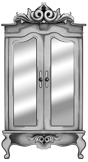
Original Digital Painting of the Wardrobe – No added filters.

Starting with a piece I had digitally painted (tutorial on digital painting possibly coming soon?), which is of the wardrobe for my ‘Lion, the Witch and the Wardrobe’ project. With all the colour layers, I had grouped them all together then duplicated the group, I then flattened the second group. This was so that if anything went wrong during this experimentation process/phase, I would still have my original layers within the first group. I decided to keep the linework separate from the painting as I wanted my linework to remain clean and readable, I did not want it to possibly become distorted with one of the effects I’m about to show you.

For these techniques, you will be playing around with the flattened layer of colour, using filters from the ‘pixelate’ section within Photoshop. If you do not like any of the effects on your work, it is easy to undo by just going to edit and undo.

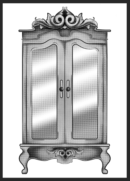
1.Colour Halftone

With this technique, it takes your image and pixelates it into rows of dots, which range from sizes, getting bigger in the deeper tones, and smaller in the lighter. You are able to change the size of these dots, making them finer or bigger, in the controls box that pops up before the change is made.

I personally liked this filter with a bigger scale of dots, as I feel when they are smaller, from a distance, the piece looks more square in the pattern, whereas when they’re bigger, it almost gives a pop art/comic type of effect.

test3 colourhalftone

2.Mezzotint – Dots

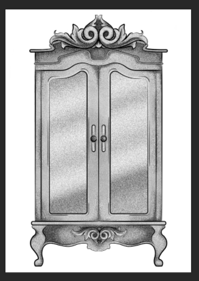
For the mezzotint filter, there are three types in which you can try, one being dots, another being lines and another being strokes. Within these options, you can then chose whether you want the effect to be bolder or finer, etc.

As an example, with the piece below, I have used fine dots, and to me, it has made my design look more fuzzy, specifically in the darker areas, but you can see that it has almost a similar effect as adding noise.

test2 finedot

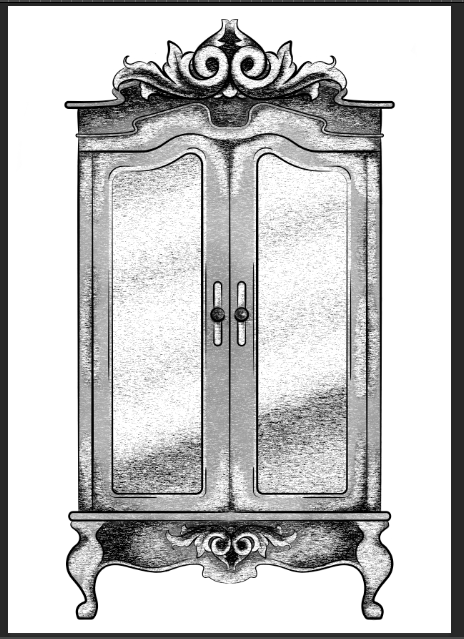
3.Mezzotint -Lines

This is one of the other mezzotint filters, the short lines. As you can see, it builds up the image using lines, they are closer together in the darker areas and further apart in the lighter, forming the contrast of the tonal piece

I don’t really enjoy the outcome of this filter as I feel it had made my piece look more patchy as opposed to blended. I feel I just prefer a neater approach with these filters, whereas this design looks more scratchy in a way.

test5 mezzoint shortlines

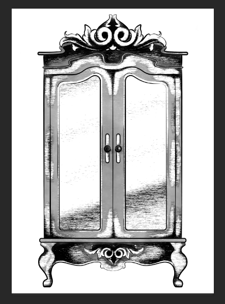
4.Mezzotint – Strokes

This filter is quite similar to the mezzotint lines, however, I feel there are more areas of flat colour, you only really see the lines where the tones are changing, for instance from black to dark grey, dark grey to light grey, then light grey to white.

Although this filter is less fuzzy than the previous, I still feel it is a bit patchy moving from tone to tone, so it is not the style that I wish to work with, as I would want it to be neater and more refined.

test1

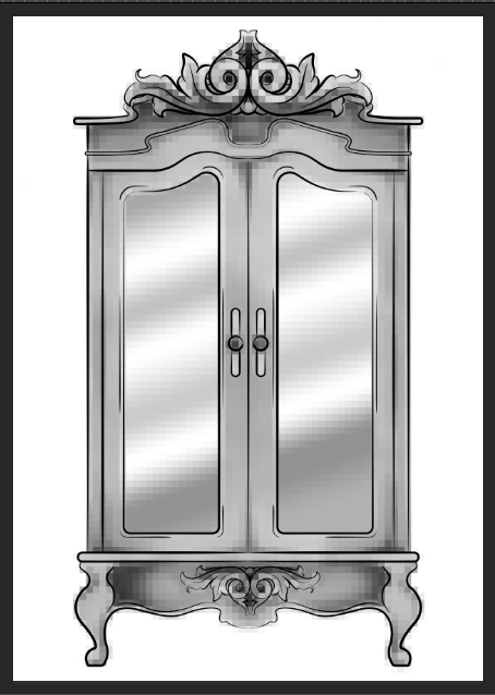
5.Mosaic

Moving away from the mezzotint filters, in the example below, I have shown the Mosaic filter. As you can see, this pixelates the shading, the effect almost reminds me of inappropriate blurring that you would see on tv when the show would blur out product placement, a persons face, a rude hand gesture, or any type of nudity.

Although this filter does give a softer shading, the blockiness is not really a route that I want to take with my designs, so again, I will not be using this filter during this project, but its good to know its there.

test6 mosaic

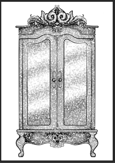
6.Pointillise

To me, this filter resembles monotone confetti being spilt over my design. I would like to see how this filter works with colour, as it could create some fun designs that I feel would appeal more to children, however it is not something I wish to use within my design.

I feel this filter would be similar to the halftone one, however, where the halftone works in rows of circles, this filter does not have a system, as there are circles overlapping each other, and I feel it works mostly on tones, as opposed to changing the sizes of the circles as I believe the halftone filter does.

test4 pointilise

Although I did not find a filter which had achieved the style that I desired, that being a crosshatch pattern, almost in the style of John Tenniel, as I need a design to use in the screenprinting class, I will choose the best of the results, for me this is the halftone filter, but I will expand the circle size a little, as I do not know how small the new printer for the screenprinting machine can go, and I do want my piece to be readable.


BONUS TIP 

7. Illustrator

When experimenting with the sizes of the circles within the halftone filter, I had formed 3 versions, the first I believe being 10, second I believe is 12 and the third is 14, then I had asked my tutor for advice in which would be most readable, and which would most likely print the best on a screen, in which he had responded the second. I did like the first as it had more of a subtle blend, however, I don’t believe the new printer would have picked up such small detail.

As the original version of this effect was picking up the other tones within this piece, such as the grey tones, I decided to save the image from Photoshop, then take it into Illustrator. In this program, I then ‘image traced’ the image, which had ended up taking away all of the other tones, and had just left me with the black line or dot work. I did this step, as the last time I had screen printed, I recall the design had to be stencil-like, meaning that it could only be one colour, so I did not feel the piece would work correctly if I had left all of the other tones in.

Current Artist Research Pt.2

John Tenniel

Figure 1 – John Tenniel, Alice’s Adventures in Wonderland, 1865

This is an artist from the Golden Age of Illustration, who I would like to take inspiration from during my Lion, the Witch and the Wardrobe project. He had created the original illustrations for ‘Alice’s Adventures in Wonderland’ by Lewis Carroll.

From the illustrations specifically from this book, Tenniel’s style is semi-realistic but with the theme of the book, he has played around with surrealism, illustrating things that you would not exactly see in the real world, and exaggerating some of the characters proportions, as seen in figure 1.

I believe these illustrations were hand-drawn with pen and ink, but I believe when it came to mass production, the design was etched into a plate, so the illustration could be printed multiple times for hundreds of books.

Because of this factor, during my Lion, the Witch and the Wardrobe project, I want to experiment with different mediums, working traditionally with pen and ink, but also playing around with different printing techniques, such as screen printing, linocut printing, etching, and even creating a plate with the laser cutter that is available within the college.

Primarily, I do want to work in black and white for this project, however, I do plan to also play around with foils, possibly adding hints of gold or silver to the designs, potentially giving my pieces a more regal appearance that I believe will fit the theme of the story.


Ana Godis

40653471_917673028417511_1146468823050747904_n
Figure 2 – Ana Godis, 2018

As the competitions are not yet known and I do not know what I will be creating, I want to keep an open mind of where I can go with these projects in sense of style and techniques I could use. I have however been enjoying the work of Ana Godis over the holidays, so would potentially like to use her work as inspiration for a project over the coming year.

I would explain her work as experimental in a way, although I believe she always works digitally,  I’d say her style can differ from piece to piece, as for one, she could be creating a beautiful digital portrait which is very realistic, but in another piece, she could be working very stylised, almost ‘cartoony’? But in another piece, she could be combining the two styles, which probably sounds confusing, but she is able to execute the style so well!

Over the holiday, as she does post process videos along with her pieces, I have tried to learn from these videos, trying to follow her steps, as to improve my own technique, and I had created two digital paintings. I could still do with some further practice, however, I do feel the process had given me smoother results, in comparison to the digital painting I had done the year previously.

I feel as her style is so flexible, if I were to take inspiration from her work, I would be able to apply it to any project, including the competitions. Her work is illustrative but quite contemporary in style, so if I were to learn more from her techniques, I could potentially apply them to book illustrations or editorial themes or possibly even use them for advertising.

Ana Godis does have a Patreon in which I believe she does go into more depth with her process, the tools she uses etc. I personally am not subscribed as I do not use Patreon (as I feel it would be a black hole for me, following too many artists and probably spending all of my student loan within it, which is not something I am committed to doing as of yet) But, if you are interested in her work and do wish to learn more in-depth about her process and tools, here is her link: www.patreon.com/ana_godis


Rafael Mayani

23507888_1928168667504955_2452883890356879360_n
Figure 3 – Rafael Mayani (2017)

Like Ana Godis, I will potentially be taking inspiration from Rafael Mayani during my commercial projects.

In comparison to the previous artist, I believe his work is more contemporary, possibly more editorial-based, so I believe he would be most useful within the Association of Illustrators – World Illustration Awards competition, especially if I decide to work in the editorial category.

His style is minimal, easily readable and overall it is easy on the eyes. I believe I would most likely see his work in commercial settings, such as in magazines, in advertising, on posters, etc. In figure 3 specifically, he had created an illustration for a magazine, which was honouring the people who helped clean up and take care of others after the earthquake in Mexico in 2017. I believe by not giving his characters faces, it is not singling out any particular person who had helped but instead is celebrating the community as a whole, and the reader could potentially fill in the spaces themselves, imagining the people they know, if that makes sense?

When taking inspiration from his work, it will be with the minimal almost papercut style, as I do believe it is very readable, and it does attract the eye, which I do feel is an important factor if I were to create a piece that would advertise a specific article.


List of Illustrations

Figure 1 – Tenniel, J. (1865) Alice’s Adventures in Wonderland [Online] Available at: https://medium.com/alice-s-adventures-in-wonderland/sir-john-tenniel-s-classic-illustrations-of-alice-in-wonderland-2c3bbdca3a77 [Accessed on 24 Sep. 2018]

Figure 2 – Godis, A (04 Sep. 2018) [Online] Available from: https://www.instagram.com/p/BnTw8cOnCra/ [Accessed on 24 Sep. 2018]

Figure 3 – Mayani, R (13 Nov. 2018) [Online] Available from: https://www.instagram.com/p/BbceF5PFQLR/?taken-by=rmayani [Accessed on 24 Sep. 2018]