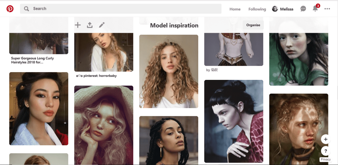
Pinterest has been my main source of inspiration throughout this project so far and during many previous projects. Over time I have built a collection of ‘Model Inspiration’ which include photos of different faces shapes, hairstyles different ethnicities and so on. I constantly refer to this board for inspiration, and if you were to look in it, you would most likely see the faces I have used as inspiration/reference during this challenge.
2.Sketchbook
Throughout the challenge, I have been sketching each design out within my sketchbook, this allows me to make any changes necessary before I start inking the design.


3.A4 Light Pad
Once I am happy with the sketch, I rip out a page from the back of the book to create the inked design on, (yes my sketchbook is probably going to be very thin by the end of the challenge), then using an A4 light tray, which I had purchased from Amazon, and plugs into your computer or laptop with a USB, I start lining the sketch.


4.Derwent pens
For the inking process, I use Derwent Graphik Line Maker Drawing Pens, which are a pack of 6, varying from 0.05mm, to 0.8mm. I often use 0.1mm for the facial features, 0.2 for face or petal outlines, 0.05 for very fine details, sometimes even cross-hatched shading, and for flat black areas, I use 0.3 or 0.8.


5.Water + Paint brush
To add more shading with a softer blend, to the linework, I dip a thin paintbrush into a glass of water and bleed, drag and blend out some of the inked line work. If I feel it is bleeding too much or is too wet, I have often blotted it down with my sleeve or a piece of tissue.

6.White pen
In some area, possibly where I have lost any highlights or the ink may have bled too much, once the piece is dry, I use a white ink pen and start adding back in the highlights or cleaning up some of the areas that may have come out too dark. If the white pen has gone slightly over some of the linework, I then just go back over with one of the fine liners.

7.Phone camera
Once the piece is complete, I take the design to a place which has good natural lighting, then take a picture of the piece using my iPhone camera. I do feel the lighting is an important factor, as you want to take the best photo you can of your design, and if taken too late on in the day, it can make your piece look more cool toned, or if you are using the lights within your house, I don’t know about yours, but mine are very orange/yellow, so would make my designs look too warm toned.
8.Whitagram for editing
With the photo, I then crop the design, making the illustration the only part visible, removing any background or any white, unused space from the page. I then take the photo into an app called Whitagram, which I originally solely used as to make my images square, for the way in which Instagram is set out, but for this project, I have also been using the editing tools within the app, playing with the lighting, exposure and shadows, as to make my pieces as white as possible.
This step would be much easier if I had scanned in the designs and edited them within Photoshop instead, however, I do not have a scanner at home, and as this was a daily challenge, I would not have been able to take advantage of the colleges each day of the week. So for the time being, I just have to make do with the resources I do have.
When it comes to creating my zine, however, I will be doing this step properly, by scanning in all of my designs and editing them with photoshop. I believe it will give me better results especially with quality, which I feel is very important for the product I will be producing, as I do want any potential buyers of the zine, to get their money worth.


